How The Boston Globe visualized extreme sports and ramped up excitement for Big Air at Fenway
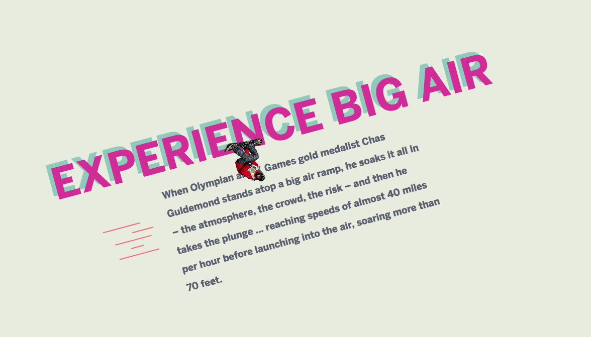
On February 11 and 12, 2016, Boston hosted “Big Air at Fenway,” a snowboarding and free skiing event held at Fenway Park that featured an array of world class skiers and snowboarders facing a rather formidable challenge: a 140-foot-tall ramp.
An extreme sports demonstration at one of the city’s most hallowed locations rightfully attracted considerable attention, especially from the hometown Boston Globe. In the weeks leading up to the event, the news organization produced a series of pieces including “Experience Big Air,” a digital storytelling experience featuring insight from U.S Olympian snowboarder Chas Guldemond and a sprawling array of videos and graphics.
Elaina Natario, a former visual journalist for The Boston Globe, played a large role in the creation of the project. Storybench sat down with her to discuss how it came to fruition.
How did this project kick off? I feel as though sports pieces don’t often receive this treatment from the Globe.
[The Sports section] is particularly fun to work on, just because there seems to be a lot more creative license there. We did an interactive piece for the marathon not too long ago, but [sports] ones don’t often come through. Sometimes it’s a matter of bandwidth, due to number of people available and other enterprise projects, and a lot of times we didn’t have a sports evangelist who could connect with us, but this one was big in conversation. Someone mentioned it in a daily story meeting and it eventually found the design team. It’s a little more streamlined and legitimized now, but back then it was a little more serendipitous.
At what point in the process did you become involved?
The point at which I, as a designer, get into a project really varies. [The design team] tries to get in from the beginning, or before the reporting even starts so we can kind of figure out the best way to tell it. That doesn’t always happen, so sometimes you have to work with what you’ve got. For this particular project, the reporting team had already figured out they wanted to do a story around this. They had already sent out a video team to get shots of the snowboarders going down the ramp and had already done a little reporting on the featured snowboarders. It was me and another developer, Russell Goldenberg, working on this. We ended up consulting pretty early on about how we could tell the story online.
What tools and techniques did you employ in the creation of “Experience Big Air?”
Our team works outside of the normal confines of the Boston Globe website. We work on a different server, apps.bostonglobe.com. A lot of visual teams do this, just because you get a lot more creative license than working within a traditional content management system. Our Boston Globe CMS is great because it allows anyone to put in content at any time, but it’s very “template-ized.” When you do custom stuff, you want more freedom without having to battle the confines of a CMS. What we have is a setup that essentially outputs the three basic kinds of languages that a browser can read: HTML, CSS, and JavaScript [find a quick debrief on types of code here]. All of these are super custom; we have a generator that we built that scaffolds out the basics of things so we can get right into developing.
I could make a basic website in a matter of 15 minutes with our scaffolding tool, which is really handy. We work in that environment, and build it quickly. We also like to factor in performance, as in how fast the website loads, and accessibility. Something that’s multimedia heavy, so as “Experience Big Air” needed to be optimized so that the site is going to load very quickly no matter what device or network someone’s on. That also involves the coding, and it’s all packed into the tool set that we’ve built for our apps.
What were the biggest challenges with this specific project?
The videos on this project are not traditional videos; they’re more like gifs. They’re quick and looping, which makes things a little easier because we didn’t have to deal with sound. We’ve gotten a lot better with videos, but it was definitely a challenge to make sure they loaded very quickly and that they loaded in images before fully loading. That way, if the video takes a long time to fully load, the reader can see a snapshot of it to get a rough idea. These videos are a lot lighter, so that helps though. Another challenge that came through was the editorial aspect of it. Since we work in a different format than the traditional CMS, we had to do some work with Google Docs to get the reporting and bring it down into our environment.
What was the thought process behind making the project video-heavy?
I think the team really wanted it to be super visual, more so than wordy. The original plan was to have this blue sky, and do this crazy 360-degree matrix type situation, so the you could break apart all of the snowboarders’ moves and tricks. But, with some of the assets that we had going into it, it was going to work like that. But we knew from the beginning that it was going to be super visual so we continued down that path. We aim to work directly with the reporters. We’re not just “hodgepodging” what they have together and putting it in the piece. We’re working together as a group to make the best storyboard for this, suggesting different design aspects and different flows but also where their copy should be. It’s a very collaborative process.
What were you, as a group, hoping the reader took away from this project?
“We’re working together as a group to make the best storyboard for this, suggesting different design aspects and different flows but also where their copy should be. It’s a very collaborative process.”
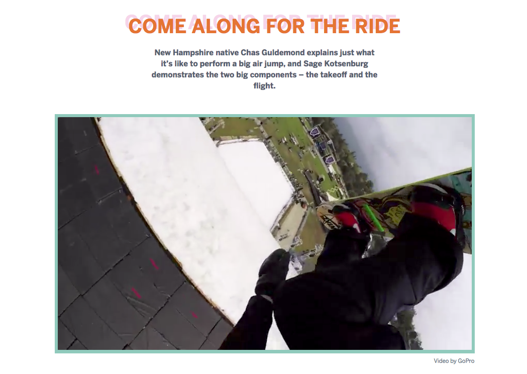
The aim of this project was to document these two snowboarders, but also break apart the tricks they were doing. The question posed was, “how might we allow readers to really see what goes into these intricate tricks?” Having these “slo-mo” videos formatted with explainer text was really helpful in visualizing what might seem complicated. The great thing about these projects is that they’re very light and fun in nature. There’s a big difference between ones like this and the serious ones, as well as the data heavy ones that require a lot of written explanation. This one was a little easier in that sense, in that it was just meant to entertain readers with the story of these snowboarders and excite people with the idea of this giant event at Fenway.
What advice do you have for journalists and designers working on similar projects?
I kind of fell into doing this serendipitously. It just sort of happened, and I think that’s true for a lot of people who do what I do. A lot of people coming into the field with different backgrounds, whether its design, development or journalism. They just kind of learn the other parts as they go along. Knowing how to code is extremely helpful I must say. There are a lot of resources out there to learn, so definitely take advantage of those to create your own projects and be able to pick apart other people’s code [Begin learning how to code on Codeacademy here]. Having a generally good design sense and experience in journalism is important. Knowing how to write, storyboard, and explain something to a reader is valuable. It’s all about problem solving – with words, visuals and code. If you’re interested in picking apart those things and delivering cool products like “Experience Big Air,” it’s a good route to go down.