Climate change data visualizations around the web
With global climate talks currently underway in Paris, Storybench has taken a look around the web for some of the most compelling visualizations of climate change data. Submissions? Suggestions? Tweet us @storybench.
UN Climate Change Conference: The Factions
CORRECT!V, December 1, 2015
Simon Jockers and the data journalism team at Correct!v, the Germany investigative news organization, plotted CO2 emissions against GDP and compared the dependency on fossil fuels and major industries of almost 200 countries. Change the scale to linear for a true eye opener. Using D3 and published in both German and English, this visualization is quite an achievement. Hans Rosling would be proud.
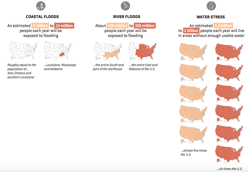
Two degrees will change the world
Huffington Post, November 30, 2015
The Huffington Post’s Alissa Scheller compares global carbon dioxide emissions and communities most vulnerable to the effects of temperature rise. Great color scheme and clean design.
Most of Scheller’s graphics work well. However, shading U.S. states to convey vulnerable populations is misleading–there’s no way of knowing if those shaded states will be affected.
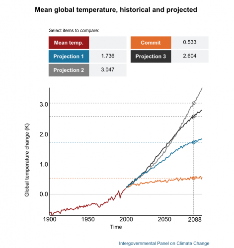
How a 2 C temperature increase could change the planet
CBC News, November 29, 2015
The Canadian Broadcasting Corporation’s News Interactives team designed a nice package including an interactive of global temperature projections and an interface to explore the effects of climate change by global region.
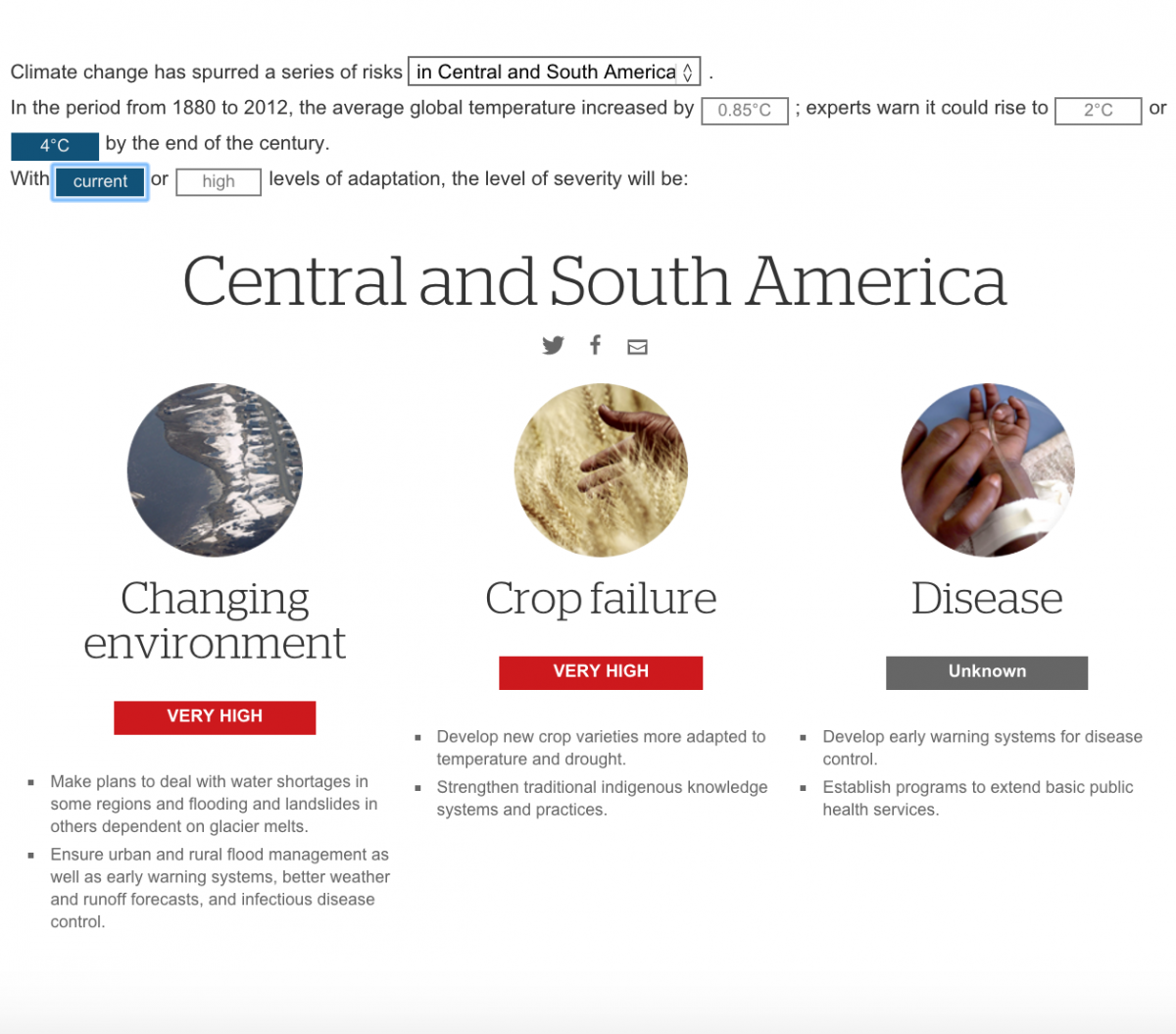
As with most data visualizations of raw scientific data, a careful reading of the explanation behind each line plot is necessary to appreciate these projections.
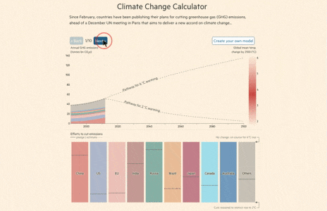
What is at stake at the Paris climate change conference?
Financial Times, October, 2015
John Burn-Murdoch and Pilita Clark created a climate change calculator with European climate change initiative Climate-KIC explains pledges and estimates of emissions cuts through 2100. They also allow readers to explore the data and adjust the emissions and pledges themselves. Great idea and well done.
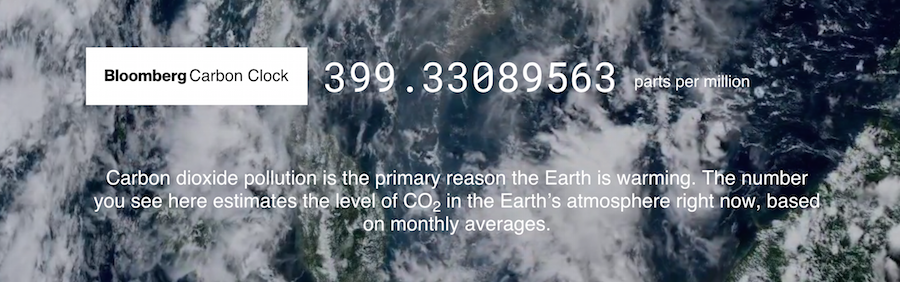
Bloomberg Carbon Clock
Bloomberg Carbon Clock, October, 2015
Eric Roston, Blacki Migliozzi, and a team at Bloomberg put together a clock that counts up atmospheric CO2 in parts per million. Simple text blurbs explain the context as the user scrolls down. Nicely done, especially because a running clock conveys a sense of urgency on the issue. Page load time is an issue.
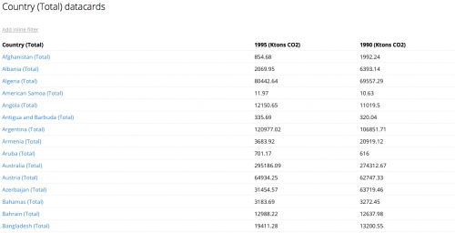
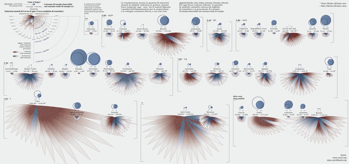
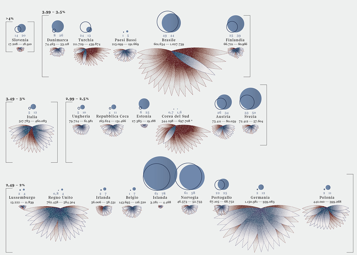
Carbon Dioxide Emissions
Federica Fragapane, November 16, 2015
Visual designer Federica Fragapane, who has worked with Wired Italy and has appeared on Storybench, visualized the carbon dioxide emissions of 39 countries between 1992 and 2012. Using data from the World Bank and the OECD, Fragapane’s visualization is no doubt beautiful, if a bit difficult at first to comprehend. Blue petals show a decrease in emissions while red pedals–see the bloom of China and the United States–show an increase. The eclipsing circles convey each country’s renewable energy consumption as a percentage of total energy in 1992 and in 2012–for Denmark, for example, this renewable energy consumption rate jumped from 8 percent in 1992 to 26 percent in 2012.
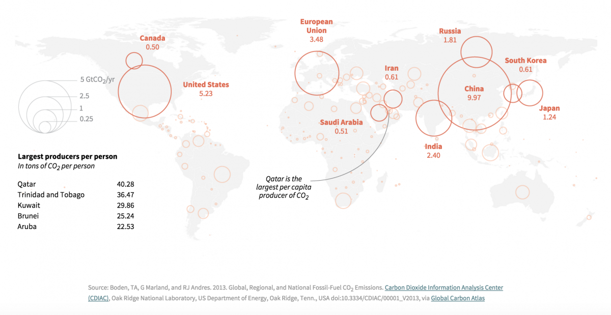
Global Emissions
Silk, December 2015
Silk, a data organization and visualization platform we’ve covered on Storybench in the past, visualized top greenhouse gas emitters around the world.
Nice color scheme and interactive design though this may be a little too much data being visualized. The upside is that their structured data is all visible.