How I created Accio Data, a data-driven visual guide to all things Harry Potter
The wizarding world created by J.K. Rowling is full of complex characters, magic, creatures, adventures and more. I grew up having the stories read to me, reading them myself countless times, as well as enjoying every Harry Potter movie marathon that I encountered. By the time I reached my senior year at Northeastern, I possessed an incredible amount of knowledge about the series. In order to break down all the wonders that come from Rowling’s beloved world, I decided to create Accio Data, a data-driven visual guide to all things Harry Potter.
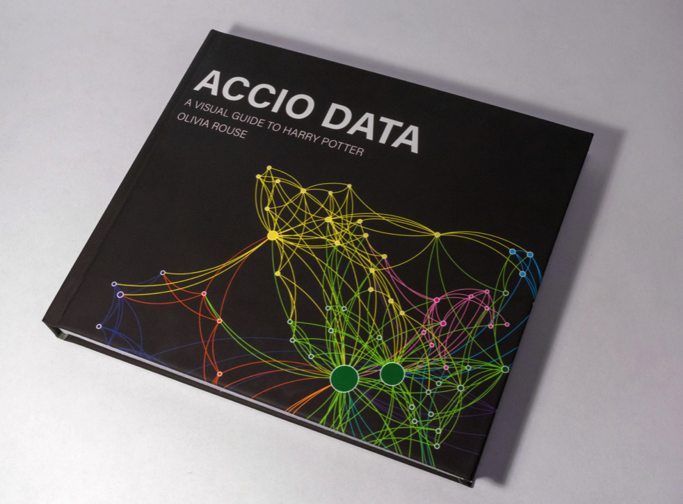
Although the project started with a mere handful of posters pertaining to Harry Potter, the amount of information and the project’s possibilities soon escalated into a full blown 80-page book. The guide was named “Accio Data,” as accio is a summoning spell used throughout the series. As the name suggests, I began this project by gathering as much data as I could, through books, articles, fan pages, the official Harry Potter website, Pottermore, and through my own personal observations and knowledge acquired over the years.
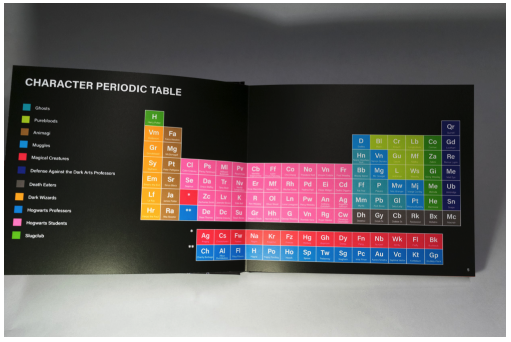
Thus began a running list of topics for possible infographics, like a periodic table of characters, box office sales, character affiliations, and potion recipes. With all of these ideas in front of me, it was easy to begin designing and bringing the ideas to fruition.
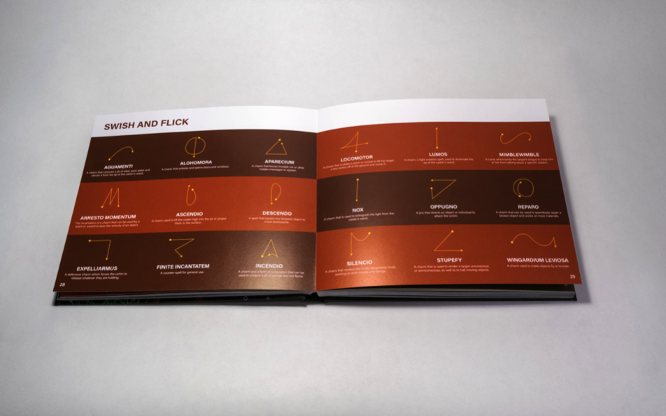
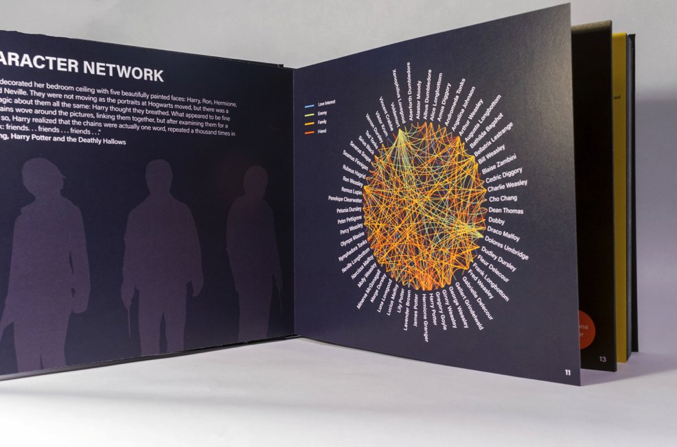
I made at least five new infographics per week over a three-month period and revised them continuously throughout the process. To better organize my designs, the guide was broken down into four sections – Characters, Magic, Wizarding Life and Film/Book Data. Each section contains ten infographics totaling forty individual data visualizations. My goal was to capture the reader’s attention while educating them through various types of charts and graphs including pie graphs, bar graphs, sankey diagrams, family trees and more.
Aiming to use as many different types of data visualization tools as possible, I sought to keep the book complex and interesting while demonstrating the wide set of tools available to a designer wishing to interpret and visualize data. The majority of work was done from scratch in Adobe Creative Cloud, while more complex infographics such as the text network analysis of the “Story of Three Brothers” was created with tools like Textexture.
Although each infographic is visually linked by typography, I decided to use a massive color palette, to allow the reader to experience each spread as one artistic piece and avoid any connections between colors throughout the book so as not to confuse the data.
This work is a fusion of my love for this fascinating series by J.K. Rowling and my interest in information design. I believe that using a popular topic such as Harry Potter can bring greater interest to the field of graphic and information design and show readers the importance and fun of visual learning.