How The Economist visualized Spotify data on the Beatles on deadline
At the end of last month, the Beatles album “Sgt. Peppers’ Lonely Hearts Club Band” turned 50. To celebrate, The Economist’s James Tozer published a review and data analysis of the album on the magazine’s Prospero blog, which tracks books, arts and culture. (Matt McLean, a visual data journalist at the magazine, drew up the charts.)
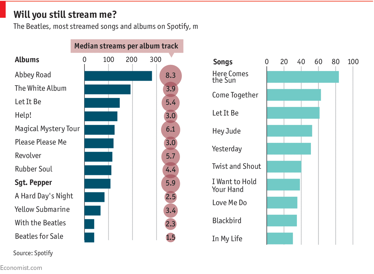
In his piece, Tozer explains why the psychedelic album is a milestone in the band’s history while wondering out loud if its genius has been lost on the Spotify generation. He illustrates that second point with data from Spotify, showing that on the music streaming service, “not a single track from the album appears in the top 25 most played.”
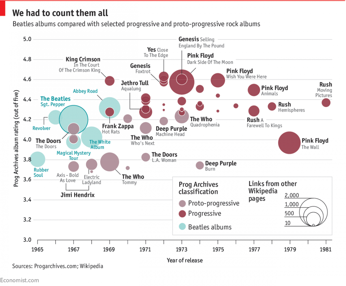
Tozer concludes on a more positive note, though, suggesting that Sgt. Pepper, with its loose storyline, may have ushered in the era of concept albums, from The Who’s “Tommy” to Pink Floyd’s “The Wall.” Storybench caught up with Tozer to talk about being inventive in data sourcing and reporting data stories on deadline.
How did you get the data for this Beatles story?
There’s a Spotify dataset and there’s a progressive rock dataset. I ended up listening to the entire Beatles catalog and then the entire progressive rock dataset while I was working on it. I literally went through my Spotify account and looked at play counts. I collected the data in two different sections but none of the play counts had moved which is slightly suspicious. I didn’t have the time to go through the Spotify API.
How long did it take?
About a week.
Why take a data-driven approach to the Sgt. Pepper anniversary?
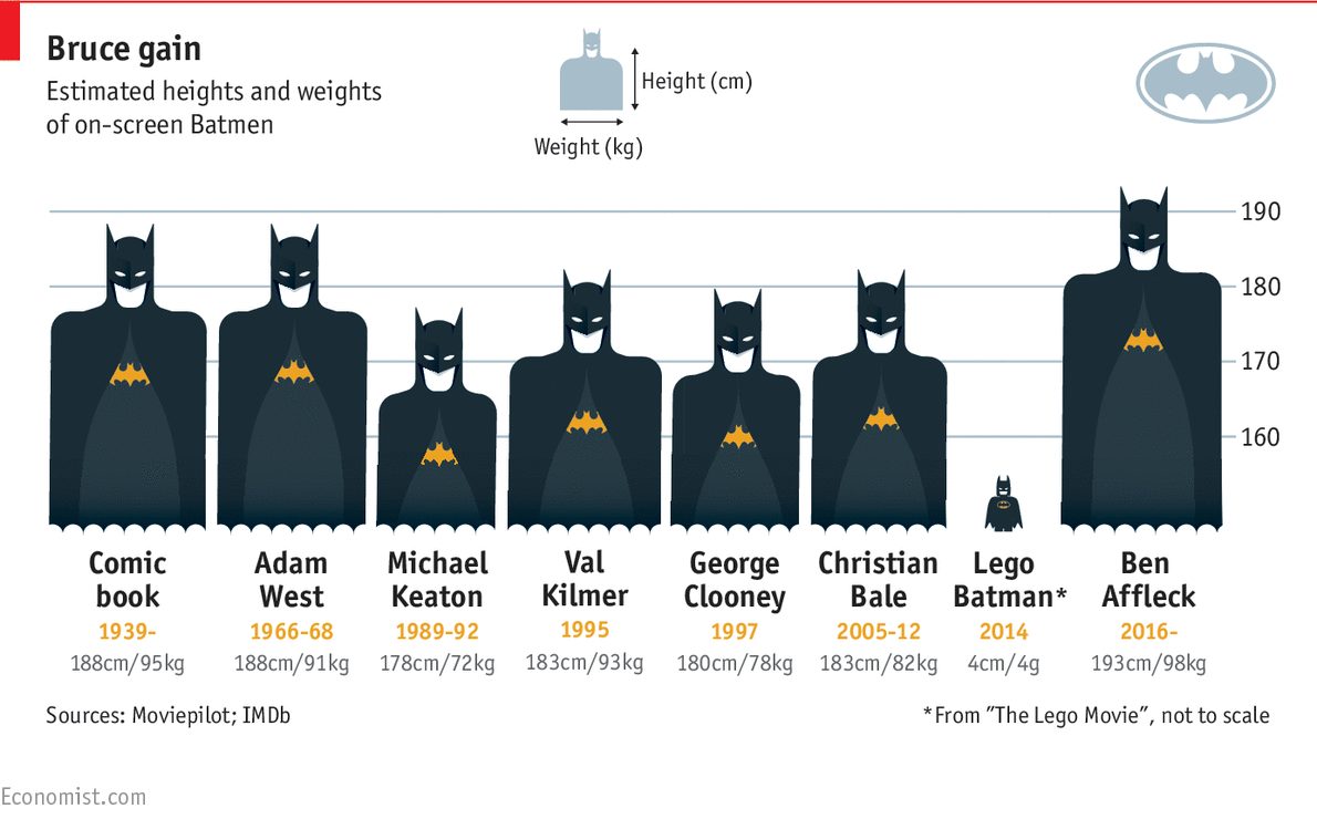
One of things distinctive things that the culture team tries to do, especially on Prospero, is to offer something empirical about a field that’s not that empirical. It’s something different. Take a film review, for example, everyone reviews the same film. But we try to do data-driven stuff for cultural stories. Like for new Batman film last year, one of our culture editors looked at the physical history of Batman. We took height and weight measurements of every actor that’s played Batman, from Adam West to Ben Affleck who looks like he’s on steroids. Quantitative stories tend to be more successful.
How do you find data on cultural stories that you wouldn’t necessarily associate with data?
You often have to think out of the box about where you’re going to get data or what you want to measure. For a lot of these pop culture stories, there are very few effective measures of quality. It’s hard to know how influential something is, for example. I think Wikipedia is a very underused resource for this kind of thing. As a yardstick of popular opinion, it’s almost unsurpassable because of the number of people that are contributing to it.
“As a yardstick of popular opinion, Wikipedia is almost unsurpassable because of the number of people that are contributing to it.”
What advice do you have for people hoping to explore a story through data?
Try and think first about what you’re trying to measure. What are you trying to quantify and then be inventive about how you quantify it. You’re often talking about things that are very intangible and subjective. A film review in isolation, for example, is subjective. But if you’re inventive about it, you can add user ratings, Google search traffic, and more. You try and use some of kind of proxy for something that’s intangible.
Some of the most interesting things you can do is create your own datasets.
What tools did you use to clean, explore and visualize the data?
This was done in Excel. I didn’t really have time for anything else. If I’m doing something more ambitious I’ll use Python and matplotlib. I’m starting to use [Python’s] Seaborn and Plotly.
With more time, I’m sure you would have written a script for the Spotify API or done some deeper analysis. What’s your approach to different kinds of data stories?
It depends on how quantitatively ambitious you want to be. I have basic Python skills, it’s a really fun language and I use that for various things but that I tend to use on longer term projects. I think you can get through a lot using basic Excel. All the data-driven stories I write currently, probably fifty percent of them are things that I can quickly copy and paste or scrape out of a website and stick into a spreadsheet. Five hundred datapoints or less. There is a lot you can do on the lower end of the scale in terms of technical requirements.
Did you learn a lot of your data skills on the job?
Before I started here I only had very basic data literacy. It’s all kind of stuff I’ve acquired. There’s a lot that you can do just self-teaching. I think if you draw it as a learning curve, there are two plateaus. You can quickly get to the first hump.