How The Guardian updated maps and live graphics during the Thai cave rescue
Last summer, for nearly three weeks, a Thai soccer team trapped inside a cave gripped the world with the prospect that 12 boys and their coach wouldn’t make it out of the Tham Luang cave alive. The mission to rescue the team was one of heroism and bravery, with advanced divers and Navy SEALs volunteering to help with the rescue.
The first four boys were rescued on July 8, then four more on July 9, before the final four and the coach were guided to safety on July 10. By the time the final members of the team were rescued, it had been 18 days since the team first ventured into the cave before being trapped inside by rising flood waters.
Storybench spoke with Seán Clarke, special projects editor at The Guardian, who was part of a 7-person team that produced a live updated piece on the Thailand cave rescue. Clarke oversaw the team in the London office while one journalist was on the ground in the vicinity of the Tham Luang cave.
How did the project come to be?
The first thing to say is that what you’re looking at is the end point of an evolving project. So, I think it had been running for 10 days at that point. And so some of those elements were added in. And some of them were more or less behind the point by the end. And that’s why by the end the project has sort of a day by day structure, so that some of the stuff that was very pertinent at any given point in relation to the story has now been overtaken by events. They’re still there for context, but they’re relegated to this day by day section.
This was an evolving story. How did you deal with changing information?
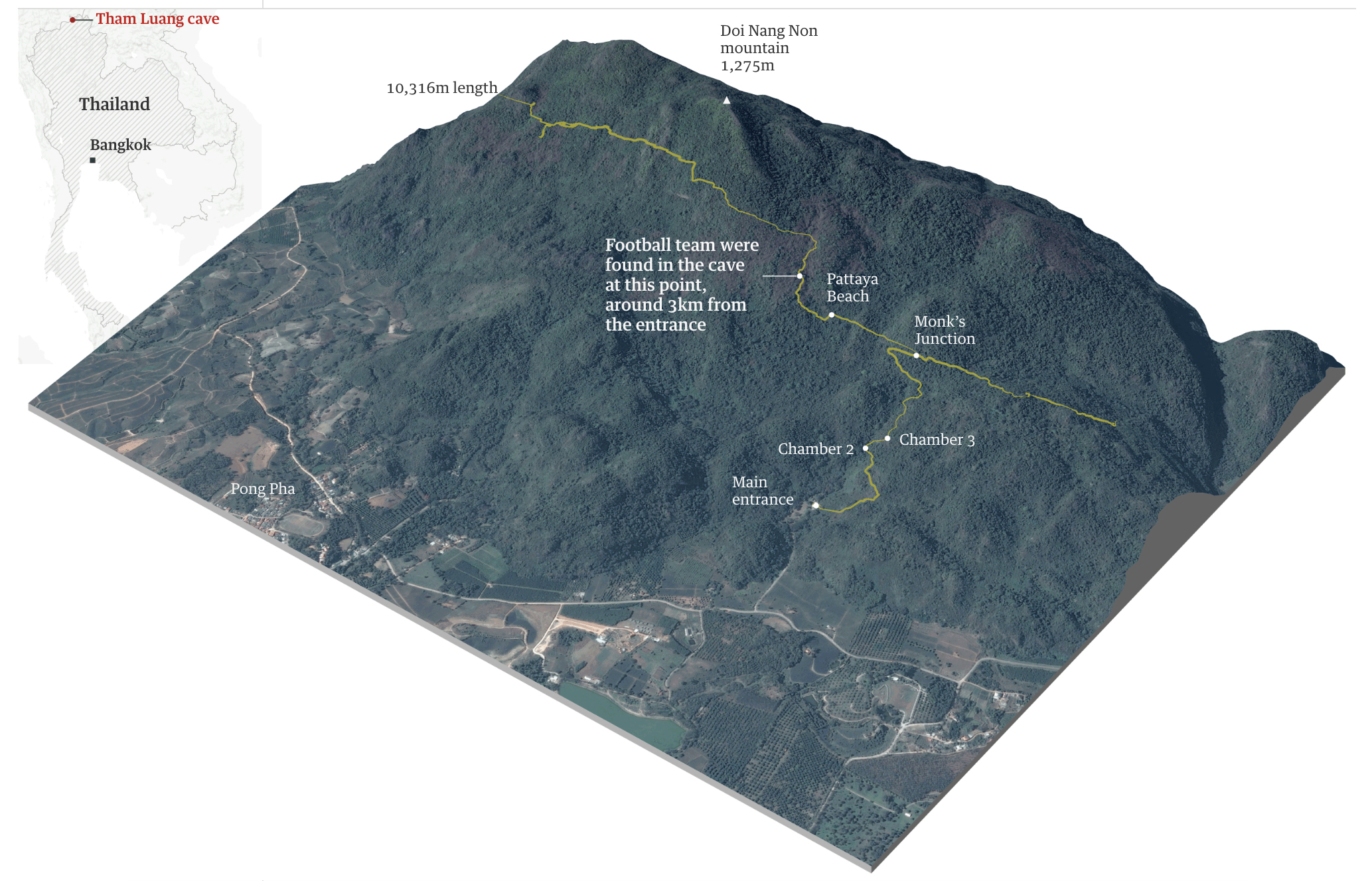
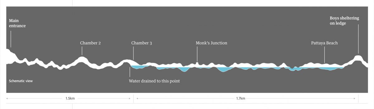
By the time they were actually coming out, everything was pretty much settled. I think some of the words may have changed. But I think on the day that we decided that we were going to do this as sort of a project, we started with a diagram, a locator map for Thailand as a whole, and then we added things in. So, a couple of days later, we had pictures all along, and the pictures were changing. The first day we did it there were pictures of the boys themselves, and earlier iterations had quite a lot more pictures in. So, we started with the cave diagram and a locator map. It was looking then, the next day, if rainfall was a really key part of the story at that point, because there was this fear that if there was heavy rainfall – heavy rainfall predicted – then that would drastically change the rescue effort.
So that became a focus for a while. We did several takes on the schematic cross section view, because for one thing it became clearer over time. Initially it was very unclear because nobody really – I think even the divers weren’t entirely sure what point they’ve reached. But also because the pumping was changing the point at which the cave was flooded. So on our initial take we said it had gone up to here, and then they pumped more water and then it was a point a lot further in. The other thing that happened was that we were originally working from surveys undertaken during the dry season that we knew were a bit rough and ready. And then later we were working a lot more from those surveys plus information from the divers themselves and from our reporter on the ground, Michael Safi. As time went on, our understanding of that cross section (schematic view) got deeper and deeper and we were able to make it more and more accurate. There were elements that were added in and there were also elements that were upgraded over time, the original – we had an aerial map and I think that’s like iteration three of the aerial map.
What were the challenges creating these graphics under the breaking news pressure?
I think one of the biggest challenges was the epistemology of it. What can we know, what can we say for certain? And so, we were keen to avoid imagining the cutaway views that made the caves look bigger or deeper than they were. Which is why that schematic view is careful. So that was difficult. We knew that the survey wasn’t very exact because the surveyors said so. And so being able to tread that line between giving a sense of what the cave structure was like without trying to stray too far from the verifiable information, I think was the challenge.
How many reporters were on the ground versus in the newsroom?
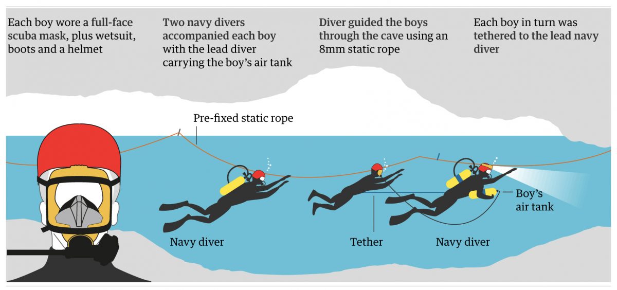
I think Safi was the only person we had on the ground and then we had a range of people in the office who had different sets of skills. We can go through the bylines there. There’s me. Paul Torpey was doing a lot of the research and he was talking to Safi, so he was the person who was getting the details on the ground. Paul Scruton worked on some of the graphics. Daniel Levitt worked on the weather stuff which is his sort of specialty. Pablo Gutiérrez worked on the mapping. Chris Watson worked on the graphic of the diver.
With seven bylines, how did you collaborate working on one piece?
It was mostly fine. One of the things that we had to do was it was evolving and we were replacing individual elements. So, to a certain extent, I think Pablo did one map and then we looked at it again and said this story is still going on, so maybe we can get a better 3D view and combine the 3D view with the locator map into one thing. So that was the same person working on the same element and upgrading. Similarly, for the schematic view, Paul Scruton did several takes at it. So, to a certain extent, there were these separable elements which we would iterate over, which made it a bit easier. We were all having to work together on each of those elements though.
Paul was talking to Michael, so he had a better understanding than anyone in the office, sort of how the cave structure worked together. We were all obviously working on that. So, we were all talking to each other for each of those elements, but each of those elements were self-contained. Very shortly before the final rescue push, we took the whole thing apart and put it all back together again, because we felt that we needed to move to this day by day structure, at least for the second part. So, the top part we say the overview is this, these are things you absolutely need to know and probably won’t change very much, and then everything which got us here went into the day by day section at that point. But that involved starting from scratch.
- How The Guardian updated maps and live graphics during the Thai cave rescue - October 15, 2018


I don’t mean to be rude, but in light of last year’s documentary and the books that have come out on the subject, it seems like the stories/infographics published by the Guardian were quite a bit off mark. I understand that facts change when reporting incidents in real time, but even the graphics of the tow system and the cave cross-section and diver affiliations are off. Maybe this an example of how live reporting and graphic work gets it wrong?
this article from the South China Post seems to also understate the diving aspect of the rescue (in a comical, but oddly excellent infographic way)
https://multimedia.scmp.com/news/world/article/2154457/thai-cave-rescue/
In the Guardian profile/x-section graphic though, it appears that there was only 5-10 meters of diving involved. The South China Post article was a tad looser with that figure (20% of the 5 hour trip)