How Bacteria in New York City’s Subways Brought Scientists and Journalists Together
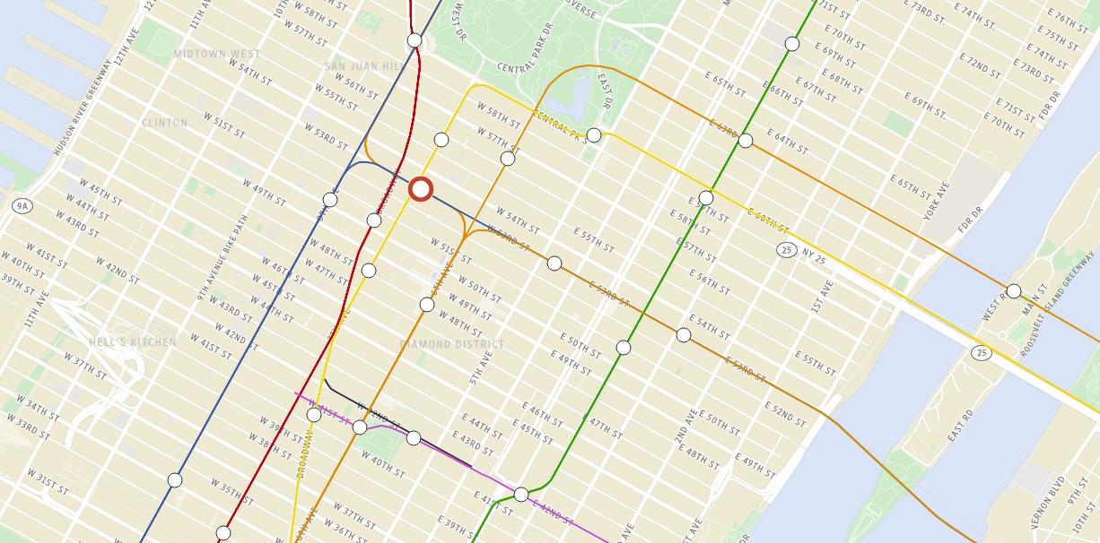
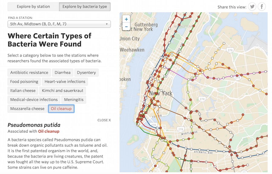
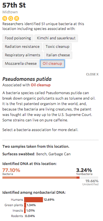
Hop on the New York City subway at 57th street in Midtown and you may unknowingly be inviting some additional passengers along on your travels. They won’t introduce themselves, but they are known as Pseudomonas putida, a species of bacteria that thrives on chemicals found in urban pollutants like oil, car exhaust, and cigarette smoke. In fact, this particular species of toxin-consuming bacteria can be found in 221 out of the city’s 466 open subway stations.
How do I know this tantalizing bit of microbial trivia?
Scientists at Weill Cornell Medical College did the dirty work of profiling more than one thousand DNA samples swabbed off of surfaces found in the city’s stations with the goal of mapping out the distribution of microorganisms across NYC. Their results, published in the journal Cell Systems last February under the title “Geospatial Resolution of Human and Bacterial Diversity with City-Scale Metagenomics,” are teeming with information on some of the city’s smallest dwellers.
However, my knowledge of the whereabouts of Pseudomonas putida wasn’t gained from reading their article or personally analyzing the overwhelming amount of genomic data. Rather, I explored a virtual, bacteria-laden NYC transit system based on the study’s findings through the interactive graphic “Mapping the Bacteria in New York’s Subways” created by The Wall Street Journal. The graphic’s navigable design and aesthetic appeal successfully had me clicking my mouse, memorizing bacterial names, and thinking about how many microbes I’ll meet on my next trip to the Big Apple.
The Wall Street Journal‘s interactive graphic not only helped disseminate important and new scientific research, it represented a unique collaboration between Weill Cornell scientists and reporters at the newspaper that could serve as a model for future science journalism.
Having an interactive graphic published on a mass media website is a powerful way for scientists to share their research results with a wide audience. But despite the growing number of scientific studies published every year, very few studies make it out of the pay-per-view and highly esoteric domain of scientific journals and into visual stories accessible to the public. With public opinion of scientific topics greatly differing from that of scientists (take climate change, for instance) it is increasingly important for scientists to better communicate their latest findings in fun and engaging ways aimed at a general audience. One obvious solution: get more scientific studies made into interactive graphics for the public. The question is: How? Storybench asked the Wall Street Journal reporter responsible for the interactive graphic on NYC subway bacteria for his thoughts.
The Origin Story
“Normally, a scientific project gets going, the researchers do their thing, [their results] get published in a peer-reviewed journal, and that’s when the journalists show up,” says Robert Lee Hotz, a science reporter at The Wall Street Journal. He says that is how science reporters typically come across a story. However, to make the “Mapping the Bacteria in New York’s Subways” interactive graphic, Hotz and the graphics team at The Wall Street Journal had the unique opportunity to work with the scientists at Weill Cornell Medical College at a very early stage in the research project: during the data gathering and analysis phase.
 Despite Hotz’s thirty years of experience as a reporter covering science and technology , this was the closest he worked with a research project. “It was a very unusual collaboration,” he told Storybench.
The partnership started in 2013 when Hotz and his team saw a news clip from a local media outlet mentioning volunteers running around subway stations with cotton swabs to collect DNA samples for the study. “We thought, ‘Wow, wouldn’t it be amazing if we could do an interactive DNA map, microbial map, of the entire New York City subway system and put that in front of our readers’,” explains Hotz. They believed an interactive graphic about microbiology, particularly one centered on the urban environment in which their readers lived, would make relevant public health and environmental issues more vivid and clear to those readers. So they reached out to the scientists at Weill Cornell Medical College. Their proposal? “We want your data.”
But, as with most scientists, there were concerns with sharing their early, unpolished and incomplete data with a media outlet. “Most scientists are a bit skeptical of working with media because they are worried that their work will be reported either incorrectly or sensationalized,” says Christopher Mason, an assistant professor at Cornell University and lead researcher of the study. But Mason quickly became convinced. He viewed their proposal as “a good opportunity to have many people have access to the data and start to think about large scale genetic approaches to studying cities, [to think] about health, and to really get introduced to genomics.” Plus, he had faith that Hotz would report their data accurately because of his respected reputation in the science journalism field.
Unforeseen benefits of collaboration
For thirteen months, Weill Cornell scientists and the data reporters at The Wall Street Journal independently analyzed the subway DNA dataset. Each team had their own specific goals. The scientists: to publish the first metagenome covering bacteria and other organisms on a large city-scale in an academic journal. The reporters: to publish for public consumption an interactive graphic that maps bacteria.
Throughout the process, what surprised the scientists was how working with The Wall Street Journal helped to improve data quality in their own analysis. “It was actually amazingly beneficial to have another set of eyes, independent eyes, curating and fact-checking the data,” says Mason. “At the end of it all, I actually said to them, ‘Do you guys want to be authors on the [scientific] paper?’ because I really felt like they really helped us a lot.”
Hotz and his team respectfully declined Mason’s offer to be scientific co-authors. For The Wall Street Journal, an important component of their partnership was maintaining journalistic independence and avoiding the pitfalls of becoming just an arm of the scientists’ public relations effort. Their success relied on the fact that Mason and his group were willing to be completely open and honest about the ups and downs of their research progress while also giving up all control on how The Wall Street Journal was going to publish their data. “It was a real exercise in trust,” Hotz explains.
In the end, trusting each other paid off for both parties. The Wall Street Journal got their insider’s view of the project that allowed them to create not only an interactive graphic, but also a video and a pair of articles that set them apart from other publications. “We had much more extensive knowledge of what [the scientists] had found and were able to share that with our readers,” says Hotz.
Mason, who is still doing interviews about the project three to four times a week, says that the attention drawn by The Wall Street Journal coverage has been almost overwhelming. Engineers, architects, data visualization experts, visual artists, and even financial analysts have contacted him to get involved or use his research. His hope now is to bring together these people from across disciplines to grow MetaSUB, a newly-launched global initiative to study the metagenomes of large cities around the world.
When speaking of their unique collaboration, Mason and Hotz could only say good things. As Mason puts it, “It was really an integrated and frankly splendid interchange between scientific and media worlds.”
Fostering future collaborations between scientists and the media
The successful partnership between The Wall Street Journal and Weill Cornell Medical School could serve as a model for future collaborations between media outlets and scientists and perhaps improve the public conversations about science. Realistically, though, not every scientific project can get the attention of the graphics department at The Wall Street Journal or other large news organizations that have the resources and staff to produce data visualizations.
And not every scientific study is amenable to having the media involved in the early stages of development. Therefore, it is important to keep in mind other ways to create more clickworthy interactive graphics about science, like hiring third-party visualizers and designers to create a la carte interactive projects.
Still, starting a collaboration early in the publishing process is a great way to get more scientific studies made into interactive graphics aimed at the public. Similar to the symbiotic relationship between the human riders of New York City’s subways and the toxin-consuming Pseudomonas putida, and as evidenced by the partnership between The Wall Street Journal and Weill Cornell Medical School, collaborations between scientists, journalists, and designers in the creation of science-related interactive graphics can be beneficial to all parties.
Rachel Tsunemoto is a Ph.D. candidate studying neuroscience at the University of California San Diego and loves communicating science through visual storytelling. For more examples of science-related graphics, art, and visualizations, follow her on Twitter.
- How Scientific American makes its infographics - September 11, 2015
- How Bacteria in New York City’s Subways Brought Scientists and Journalists Together - April 15, 2015