How Gizmodo quantified the Christmas spirit using Spotify data
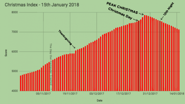
Ever notice how the Christmas spirit tends to disappear right after the holiday season is over? Gizmodo UK measured and visualized the “spirit of Christmas” using Spotify data. Gizmodo UK calls it the Christmas Index. It turns out Christmas music streaming actually peaks three days after Christmas Day, according to Gizmodo UK’s analysis.
Storybench spoke with James O’Malley, editor over Gizmodo UK, about the inspiration behind the project, “Data Reveals We Were Already Getting Sick Of Christmas By December 28th,” and how he analyzed and visualized Christmas songs from the Spotify API.
What was the thought process behind this piece?
I first started playing with the Spotify API late October and I saw that you could measure the popularity on each Spotify song from zero to a hundred. I thought then I could track that and see how it relates to Christmas songs before the days leading up to Christmas. Previously I had planned to use the Spotify API to analyze the ‘musicality’ of past Eurovision Song Contest winners and to try to determine a dataset that could describe what sort of musical attributes contribute to the popularity of the songs. Obviously, that was far too ambitious but this then led to me trying out the Christmas angle.
How does Gizmodo UK differ from Gizmodo US?
Gizmodo UK is operated under license. The company that runs Gizmodo UK is called Future Publishing who operate under license of Gizmodo US. We take content from Gizmodo US and pick out what is best or relevant for the British audience and add our own articles on top of it as well. My bosses trust me to know what is best or relevant to our British audience.
Can you tell me about the process of acquiring the data?
 I’d like to think that our audience is a little bit like me. They’re a little bit nerdy, they like clever things and it’s the latitude of that and playing with the API that led to me there. Once I wrote the code, I tucked it away in a server in my house and left it running for a month or so. Basically, I wrote the code to extrapolate from the API in PHP. I found someone who had prewritten a code on Github for a Spotify API interface in PHP and then I looked over it and found that it was only 84 lines of code. So I was running it on my home server and had it trigger every half an hour and it would give the metadata of a playlist each time.
I used two popular Christmas playlists. One was more US-focused and the other was UK-focused. I wrote another little bit of code to drive the data back out again into Google sheets, summed it all up and turned it into the graphs you see in the article.
What were the tools used to visualize these data?
I used Google Sheets – the web tool. I took a screenshot of it and photoshopped and annotated it. I’m not a professional data journalist so this was the best way I could manage.
What was the main objective of this article besides confirming our suspicions about Christmas music?
I’m always looking for something that can grab people’s attention. I was looking for a data-driven way to look at a problem that could be interesting. I was thinking that if Christmas peaked before Christmas that would be a very interesting thing to talk about and this was before I got any of the datasets and I thought that’d be a very interesting story.
Instead I found that Christmas spirit peaks three days later, and I still thought that’d be very interesting to talk about.
What were the biggest challenges of this project?
The biggest challenge was finding the Spotify API. I spent some time messing with data and learning along the way whilst swearing at the computer waiting for something to finally work.
Another challenge I faced was that my internet may have died and I lost a day’s worth of data. I was in Portugal at the time and I found out when I logged in from there. If I did it again I would definitely store everything on maybe an external server that didn’t rely on [my computer] remaining online.
Do you have any advice for journalists out there who are still unfamiliar with data gathering or data visualization?
I think learning to code is one of the most important things to know. But even knowing enough PHP to take a dataset and mess around with it is very useful and it is different from just having an Excel spreadsheet. A lot of the time you need to process and interpret data in a much more complex way.
- How Gizmodo quantified the Christmas spirit using Spotify data - February 8, 2018