How ProPublica used data and design to reveal the injustice of roadside drug tests
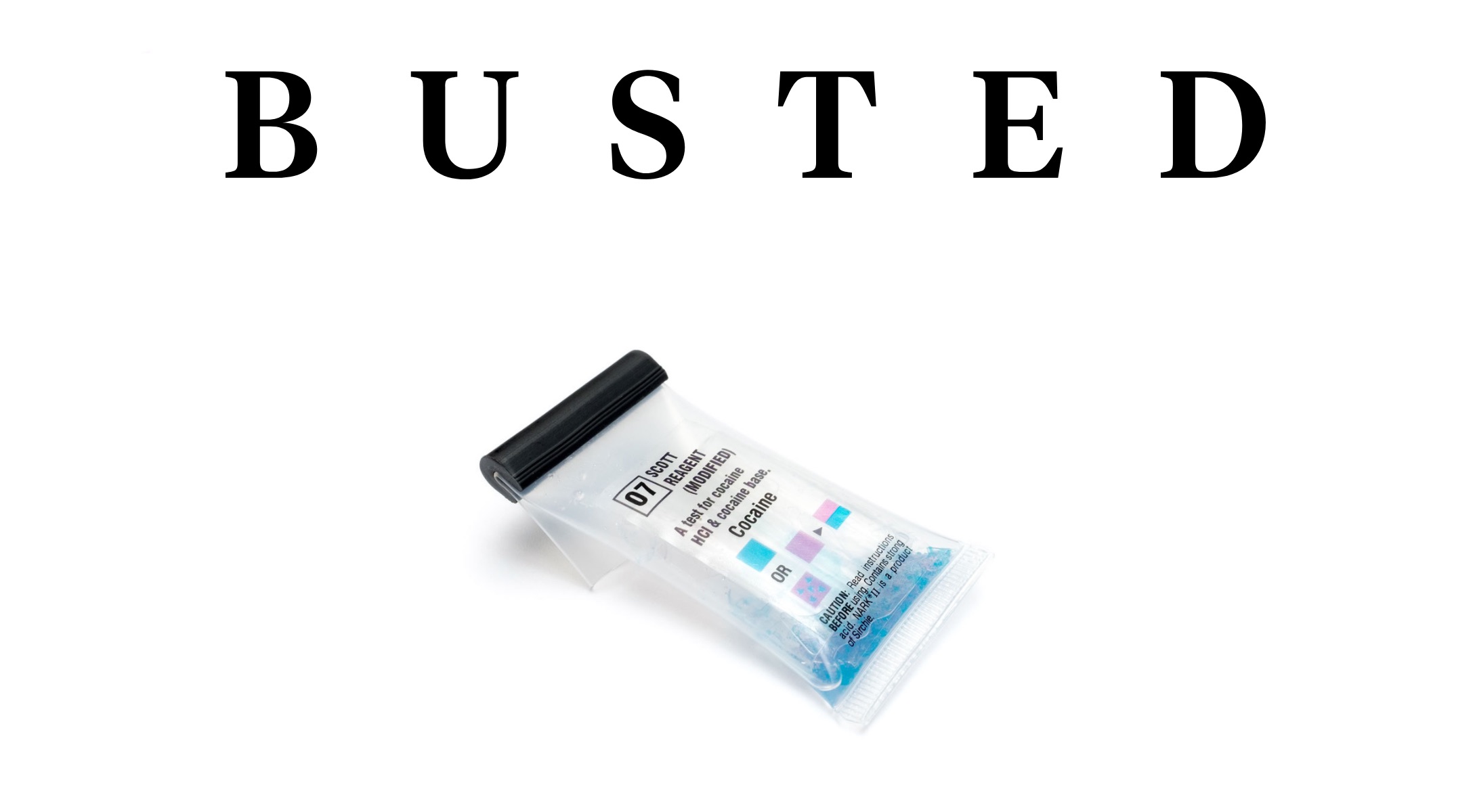
We arrest a whole lot of people in this country for drug offenses. Last year, over 1.5 million people found themselves in cuffs due to some drug-related crime, according to data from the FBI, making drug offenses the leading cause of arrests in 2016. Of that group, tens of thousands are sent to jail based on a simple roadside drug test. The test kit costs roughly $2 and has changed little since the 1970s. And, as it turns out, it frequently results in false positives.
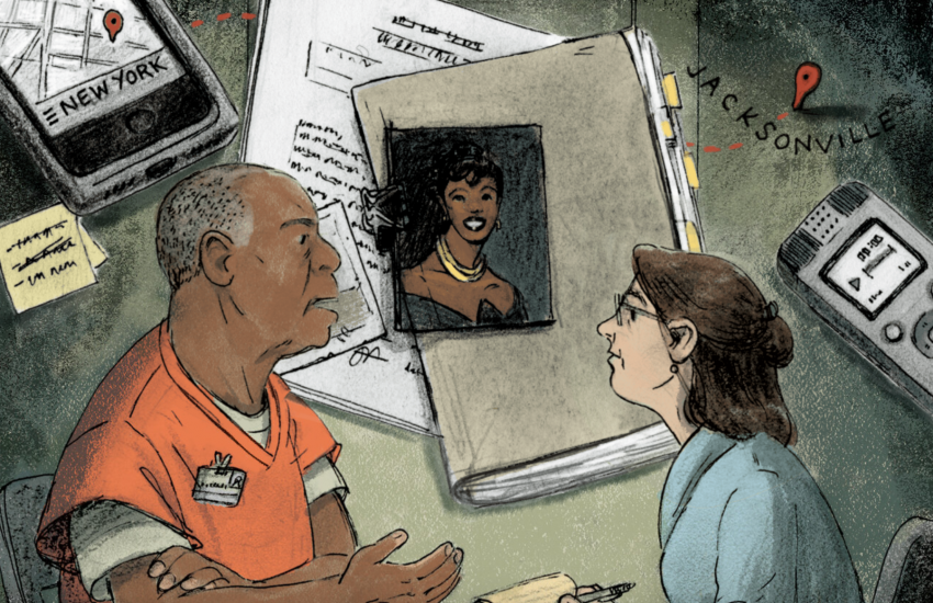
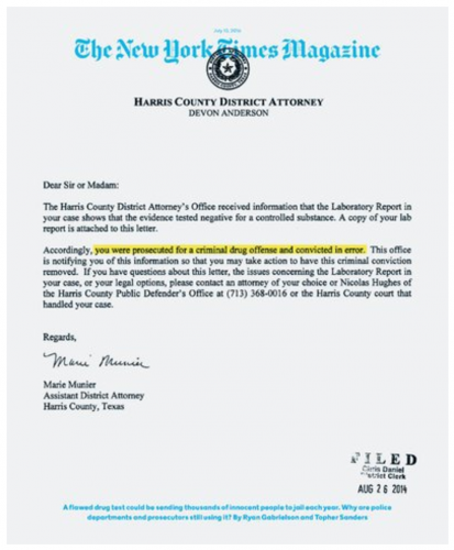 This injustice was investigated by Ryan Gabrielson and Topher Sanders, two reporters at ProPublica, resulting in a 7,200-word piece titled “Busted,” which was published in July 2016 on ProPublica’s website and as a cover story for The New York Times Magazine.
Storybench caught up with Gabrielson, a 2009 Pulitzer Prize winner, to learn how the package came together and what advice he has for journalists tackling similar projects.
Reading through the article, it’s pretty clear that you and Topher Sanders had to wade through a lot of data for this story. What was the process like of getting your hands on that data?
We filed records requests all over the place, pulling in datasets, converting paper records to spreadsheets… everything. We did that by hand. It was enormous, but things like this always are. There were many records battles. Actually, I still have some records battles underway right now. I’m still awaiting records for the DEA, for example.
What was the design process like? Were you keeping design in mind from the outset, or was it something you focused more on once you did the writing?
It was a little complex because we were working on two tracks, one for ProPublica and one for the Times Magazine. Once I had done 90 percent of the reporting, we started really talking to both our production team [at ProPublica] and the Times editors about what they envisioned, what kind of storytelling structure they were thinking, what visuals they wanted and how it would all sort of roll together. Once I did most of my reporting, it was all design from there.
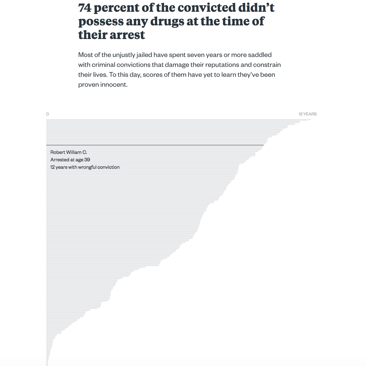
One of my favorite parts of the piece is the interactive graphic about halfway through that shows details about every case in which someone was wrongfully accused. I’d love to know a little more about how that graphic was developed.
All credit for that goes to my editor, Joe Sexton. While I was doing my reporting, I put together a dataset on all the Houston cases I could find. So when I was still trying to get [Sexton] enthusiastic, I was reading off data points to him, just the details of the cases I found. That stuck with him, so later he used those data points again as we pitched the story to the top bosses [at ProPublica] and then to the editors at the Times Magazine. He really fell in love with the idea of a visual representation of the numbers that had compelled him to take on the story.
Now, we have people [at ProPublica] who can do really cool and incredible things [with visualizations], but at the time of the story, we didn’t have a team that could tackle those themselves, so we actually got an outside firm called Fathom. I basically just handed them the dataset from the Houston cases. In terms of what [Fathom] would do with it, we may have put out a few ideas to them, but we figured that this is what they do, so let’s give them a chance to go through the data themselves.
So it sounds like your team for this project was pretty large?
At the end of the process, most of our production team was involved, which would be three or four people plus my editor, and then the editors above us as well. On the Times side, there were photographers, fact checkers, and designers. And then we were working with Fathom, too. At the end there, it felt like we were a huge army trudging forward.
Were there certain qualities you wanted the graphics to have?
“Creating data dictionaries, even for your own in-house files, is really important.”
This story was kind of unique in the sense that it eventually took on both a digital form and a print form. What was it like trying to keep track of both story designs as the story unfolded?
At that point, I was just trying to keep my head above water [laughs]. I let my editor keep track of all those moving parts. We would certainly try to generate ideas and some of the ideas we came up with ended up in the final [products]. But at a certain point I switched from, “Here are all my ideas” to “How can I get everybody what they need to do their jobs?”
What advice do you have for journalists looking to create digital story packages like this one?
A lot of us build our own datasets when you’re working on projects like these. Because of that, creating data dictionaries, even for your own in-house files, is really important. There’s a ton of collaboration that happens when you’re putting together a package like this, and people will be looking at your work. They need to be able to understand what your variables mean and what your coding means.