How the Guardian used pixel art mini Trumps, Bernies and other candidates to display election results
During recent presidential primary elections in Maine, Kentucky, Louisiana, Kansas and Nebraska, the Guardian ran a tongue-in-cheek, real-time interactive story as the election results rolled in. The candidates were displayed as pixelated mini cartoon versions of themselves, spray-painting in the counties they were winning with funny commentary like Ted Cruz saying, “Maine is mine” as he sprayed in his results. We asked Rich Harris, an interactive journalist at the Guardian, to take us under the hood of the project, which we found to be one of the most thoughtful – and playful – ways we’ve seen polling results reported in this election so far. (Ed note: Nadja Popovich and Kenan Davis also contributed answers.)
How were these candidate avatars pitched at the Guardian?
One of our many mottos is that it’s better to ask forgiveness than permission, particularly when it’s hard to describe the end product that you envision which is so often the case in visual journalism.
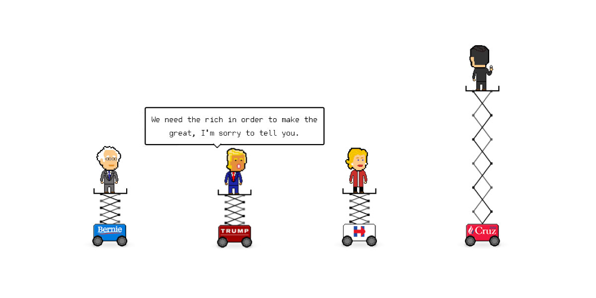
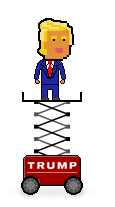 So the pixel art primaries weren’t pitched, as such – instead, we built a prototype and did a round of in-office user testing before showing it to editors. We’ve worked hard to build up to the level of trust where we can get away with that, and we don’t take it for granted. Luckily it paid off! When our editors saw a miniature Donald Trump riding around in a scissor lift, coloring in his counties, they gave us their full support.
What was the biggest challenge in coding the pixel art?
There were a great many technical challenges, compounded by the fact that we only had eight days to create the project. For one thing, the app is what we’d call ‘aggressively asynchronous’ – new results come in periodically, potentially invalidating old ones, and you need to make sure that the pixel avatars (who might be in the process of painting a very large shape) don’t get confused and start glitching out all over the place. But you can’t just let everything queue up, especially while things are idle (i.e. the map is out of view or in an inactive tab), because then the results fall behind while we’re waiting for counties to be painted. Meanwhile, you need to keep the avatars behaving naturally – blinking, talking at the right moments, etc. So you need to have really robust abstractions for co-ordinating all that chaotic asynchronous activity and manipulating queues of tasks. Thankfully, modern JavaScript has something called Promises, which are very useful in this context.
Perhaps the trickiest part, and an area where there’s still room for improvement, was figuring out how to ‘fill in’ an arbitrary set of polygons. Because the motion is always left-right, up-down (because they’re on scissor lifts) we opted for a grid-based system. First, we calculate which boxes in our grid include part of the county we want to paint, using a couple of different algorithms (one for speed, one for precision), then we generate a ‘plan’ for traveling through each box as quickly as possible. With particularly oddly-shaped regions (hello, Alaska!) it can sometimes look slightly unnatural, but it mostly works reasonably well.
As far as the actual rendering goes, it’s a mish-mash of techniques – spritesheets, procedural artwork, multiple layered canvases, CSS transforms synced to a small physics engine. Below, a somewhat simplified CodePen showing how to use a spritesheet to create the illusion of movement without using GIFs (which you have almost no control over).
See the Pen yOgrLq by Al Baj (@aleszu) on CodePen.
I first saw your pixel art work when you used it to illustrate a football story. Why do you like the medium? How can it help tell journalistic stories?
We visual journalists are often guilty of representing concepts a bit too abstractly, because it’s easy to forget that we tend to be more data-literate than our audience. At the Guardian US, we strive to both increase someone’s understanding of a story and delight them at the same time – even if it means introducing what purists might term ‘chart junk’. In that way, our sensibilities at Guardian US are a bit more Nigel Holmes than Edward Tufte.
So if you’re doing a story about people fighting over turf – which is essentially what elections are – why not make that explicit by having them come on to the screen and mark their territory? We were a bit worried about striking the wrong tone or confusing our readers, but our initial user testing showed that people were more engaged with these graphics than plain old maps and spent more time on page too.
Why pixel art, specifically? Mostly, we just think it’s fun and different enough to distinguish our work – and a lot easier to animate than other types of illustration.
What advice do you have for young journalists to think creatively with code?
Look outside journalism for inspiration. See what ad agencies are doing, for example. Subscribe to things like Hover States and Codrops and follow creative coders on Twitter to see what new ideas are nibbling around.
Always be sharpening your skills, even (especially?) if it means working on completely experimental side projects. Aim for broad rather than deep knowledge – it’s better to have a basic working grasp of many different tools, libraries and web APIs than to be an expert in one or two. Creativity depends on it, because otherwise you have no way to follow up on the crazy ideas your brain generates. Once you’ve had an idea that’s just outside your comfort zone, that’s the time to level up.