How The Pudding visualized the structure of Ali Wong’s stand-up comedy
Stand-up comedy is evolving. The top specials of recent years — Hannah Gadsby’s Nanette, Hasan Minhaj’s Homecoming King, James Acaster’s Repertoire, to name a few — are distinct from traditional stand-up for a host reasons. For one, more diverse voices are finding room on the stage. Additionally, comics are embracing the blurred line between politics and entertainment, challenging the way that their audiences think about the world.
The genre itself is adapting — not only to more politically conscious audiences, but also to meet the binge-worthy demand of Netflix as the dominant platform.
As such, stand-up is transcending a stream of one-liners. Now, the best specials tell stories. Comedians can elevate their humor by weaving multiple stories throughout the set, and finding the perfect punchlines to tie them all together.
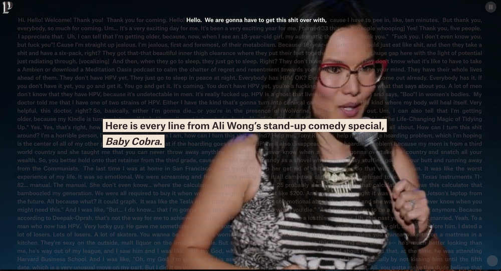
In order to explain this structure of stand-up, Russell Goldenberg and Matt Daniels from The Pudding visualize Ali Wong’s 2016 breakout Netflix Special, Baby Cobra.
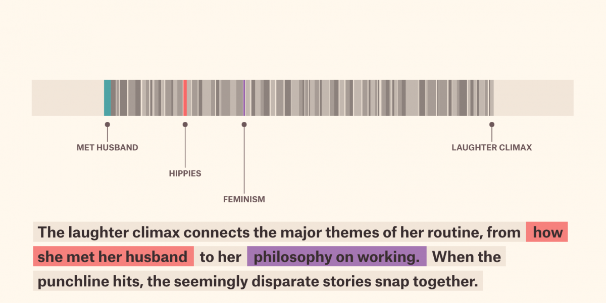
In “The Structure of Stand-Up,” Goldenberg and Daniels find that narrative form makes jokes funnier: rather than simply setting up a joke, spiking the punchline, and moving on, comedians are crafting multi-plot stories, and snapping them together to bring screenplay-like satisfaction to comedy.
Their methodology involved hand-collecting data (with additional help from Amber Thomas and Caitlyn Ralph). After converting the captions to csv format, they individually annotated each line, reviewed as a group, and merged their findings into a single data set.
The final product takes readers through an integrated audio and visual breakdown of Baby Cobra, tracing how Ali Wong takes her audience to the show’s “laughter climax.” Storybench sat down with Goldenberg and Daniels to learn how they did it all.
How did you come up with the idea for this piece?
I was watching a Mike Birbiglia stand-up special. I noticed he kept going down these rabbit holes of stories only to resurface at a place he left off. So I wondered what it would like if I mapped his routine, was there any sort of structure to it?
What did those individual annotations look like? What were you looking for?
The annotations were each line of the routine according to closed-caption data. A group of us independently went through line by line, and looked to identify where a new joke started and ended, and if it was nested within another one.
Could you walk us through the design process, especially with the interactive audio and visual elements?
We experimented a lot of different ways to visually present this data. After creating a bunch of different chart types, we decided to set it aside for a few months since nothing was resonating. When we came back to it with fresh eyes we decided to build the story around understanding why this one point towards the end of the show got so much laughter. Instead of just producing some visual charts, we thought it was critical to include some media elements to make the data come to life.
What program/tools did you use for creating the interactive experience?
We used your standard web stuff – HTML, JavaScript, and CSS – and relied heavily upon the D3 JavaScript library which is typical of most our work.
What were the biggest challenges in this project?
The biggest challenge in this story was not knowing what the data would look like. We had to create the dataset ourselves so the unknown the shape it would take made it hard to imagine where the story would go.
Why do you think the narrative form of this stand-up lends itself to visualization?
We actually tagged a lot of different stand-up routines in addition to Ali Wong’s. We were going to do a story that tried to synthesize all the routines into a single chart/story, but we found it more interesting to keep it about a single routine to make the content more accessible.
There’s a famous quote from E.B. White: “Analyzing humor is like dissecting a frog. Few people are interested and the frog dies of it.” To counter that, what do you think is the value of analyzing humor like this?
It is true that few people are interested in doing it, but our hope is that by us doing it and presenting it in a fun way, more people will be exposed to thinking about humor in stand-up routines deeper than just the surface level. There is even more to appreciate from the comedian when you unpack it .
What advice would you give someone hoping to trace a different stand-up special to make a similar data visualization?
Have a goal in mind when you start. We had a few specific questions in mind to start which helped determine how to go about the process. Constraint makes it easier to limit the scope of things and stay focused rather than getting overwhelmed with possibility.
Can you share any data viz tools or techniques on your radar right now?
We are actively curious about the power of WebGL. There are lots of physical limitations with what you can do with SVG and even Canvas, so WebGL is something that allows for more exploration.
Bonus question: If you could follow up with a different comedian this time, who would you choose?
I’d have to say the inspiration to begin with – Mike Birbiglia. His overall structure is really interesting since he really thinks about the narrative threads as they run throughout a routine.
- How The Pudding visualized the structure of Ali Wong’s stand-up comedy - February 7, 2019
- “The Immigration Experience” humanizes the history of immigration law. Here’s how. - November 9, 2018
- Behind the scenes with Galen Druke and FiveThirtyEight’s Politics podcast - October 30, 2018