How The Texas Tribune is tracking record-breaking early turnouts state-wide
Early voting may be the most-decisive but least talked about factor of the 2016 election. Thirty-seven states and the District of Columbia now allow for voters to cast ballots either by mail or in-person before election day, six more than in 2012.
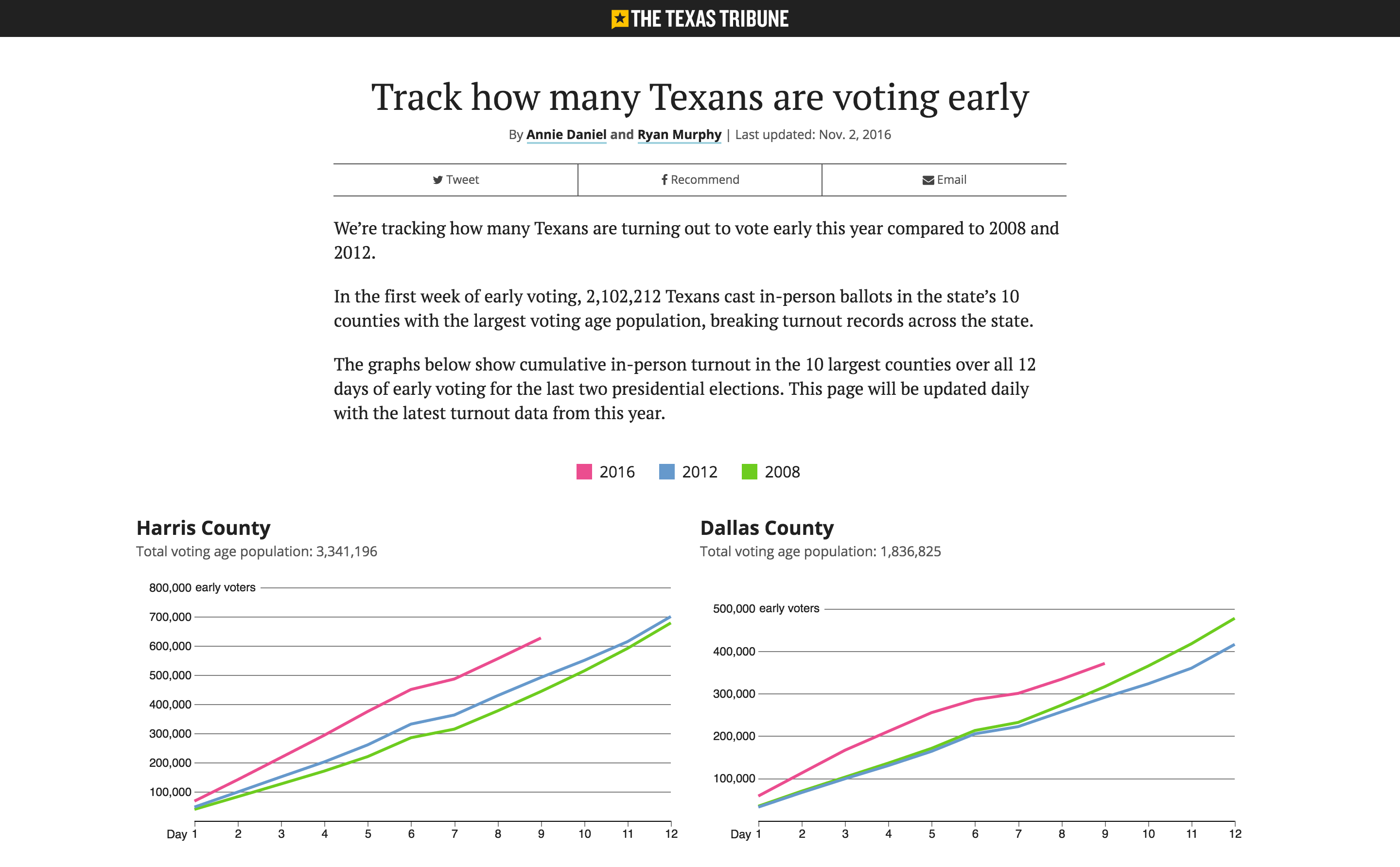
Lines have been long at some early polling stations. And in general the turnouts has been exceeding expectations in many states. The Texas Tribune is tracking the record-breaking turnouts in Texas since early voting began in October 24th.
Storybench spoke to Annie Daniel, a journalist and developer at The Texas Tribune, about how the tool was developed around D3, a Javascript library created for manipulating data and creating visualizations on the web, how the data is being scrapped, and her thoughts on using data and visual journalism for covering politics.
Why did The Texas Tribune decide to build a tracker for early voting?
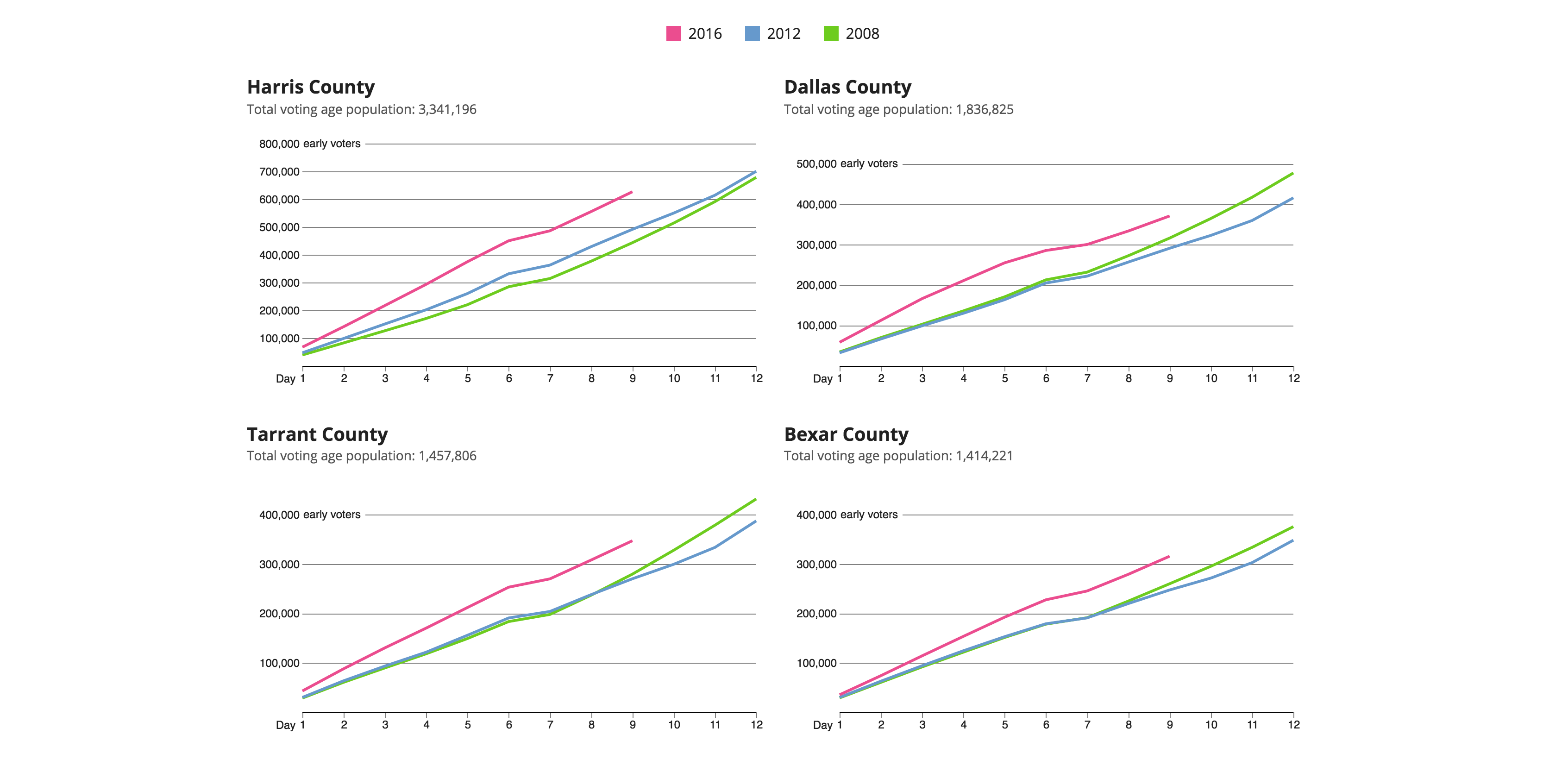
We knew the [Texas’] Secretary of State was going to release this data day-by-day. They have done this every year, and every year we have done something with this data. Our audience is here for reports on policy, and we can count on them to be excited about something like early voting.
I think this year we weren’t really expecting it to be much. We expected a normal trend, almost to point out that Texas’ turnout is still pretty low. But it really spiked. And it turned into something much different from what we had envisioned, much more telling of the election landscape this year.
Where are you getting the data from?
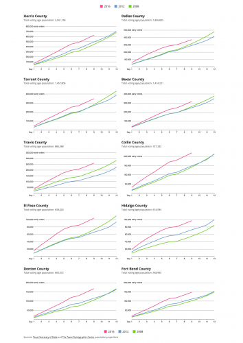
Texas’ Secretary of State has an early voting section on their website. They have data form every year, and everyday they post a new spreadsheet. So they don’t have all Texas counties at least at this point. For these initial day-after reports, they just have the 15 counties with the highest registered voters counts.
I just copy and paste it on a spreadsheet that generates the JSON file that I use to generate the charts. Their release includes a little bit more data, but we have only use the cumulative person count data.
Do they release data on republican or democratic turnout?
They don’t. In Texas you are not required to register your party affiliation. The only time you would need to do that is in the primaries. Otherwise, you don’t have to specify your party. There is no real way for us to collect that data other than polls, which, of course, the Secretary of State doesn’t rely on.

How were the line charts built?
It is a bunch of D3 charts that I generate on a single flat page. It is powered by JSON and Google spreadsheets that I split out by county. It is a little bit manual, but a lot of it is quickly generated so I can just update as quickly as possible when the Secretary of State release their data.
What were the challenges building this tracker?
This assignment came to us pretty quickly. We didn’t have a ton of time with it and didn’t really get started on it before the Thursday [October, 20th] before early voting started on Monday [24th]. We had maybe four days to crank this thing out.
It was though seeing a lot of these record-breaking numbers [of votes] on the first day. We had a big push to get this out even faster. So, it was a challenge to push back and not release it, because we really needed a line. We could have released dots or a line chart where 2008, 2012 and 2016 had a dot for the first day. But that is not really as telling as watching a line grow. That can really tell this story better.
We got other kinds of challenges. Anytime you are dealing with a bunch of JSON files that you have to arrange manually, anytime you have to go pull data manually is always going to present risks. We have to be super careful that we are grabbing the right day and the right number. There were a couple of times where the Secretary of State had some number miscalculations that I had to call them on and ask them to fix it, because it was something almost collaborative. We want their numbers to be right.
It is always though when you are doing things manually and on deadline.
How do you choose the tools to use on a given project?
I think it is very story-specific. We have an arsenal of tools we can use and so many options, and it is always really important to go back to the story you want to tell, to what you judge is the most important part of whatever you are telling.
We didn’t really know that 2016 was going to be a such a banner year for early voting turnout in Texas. I think the main point was just a reference for people to see day-by-day how their counties were doing. Nothing flashy, we weren’t trying to highlight anything. And I think a line chart was the easiest way to go about that. The years 2008 and 2012 were included for context.
These charts are able to stand on their own, no need for an analysis to illustrate the point that they are serving. We decided to keep it super simple and let the charts speak for themselves.
What advice can you give for journalist who want to cover politics and elections with data?
The most important thing is picking the root of your narrative and focusing on that. And if there is anything you want to add, add to that idea later. Make sure that whatever method you choose — a bar chart, a map, a line chart or even a written story, maybe it doesn’t need a chart — is the best way to illustrate your main point.
And don’t go crazy. Don’t try to cram a million things into a chart. Focus on one thing and move on from there. I think people can get carried away with their visualizations because there are so many tools and options that you can pick from, but it is really important to go back to the story and the point that you are trying to make.
You have to put your users first: what it is that they have to take away from this visualization.
- SXSW: ‘Excel is okay’ and other tweet-size insights for data journalists and news nerds - March 17, 2018
- NICAR: Data stories from last year that you could be doing in your newsroom - March 13, 2018
- How to scrape Reddit with Python - March 12, 2018