How to animate a map in Adobe After Effects
Deforestation and sea level rise are two very important parts of environmental news. Having recently worked on a piece tackling deforestation, I wanted to create a map that showed Amazon rainforest loss over time.
This tutorial works with any image overlay of information, so it can easily be translated to another kind of map or similar animation.
Drag your files in
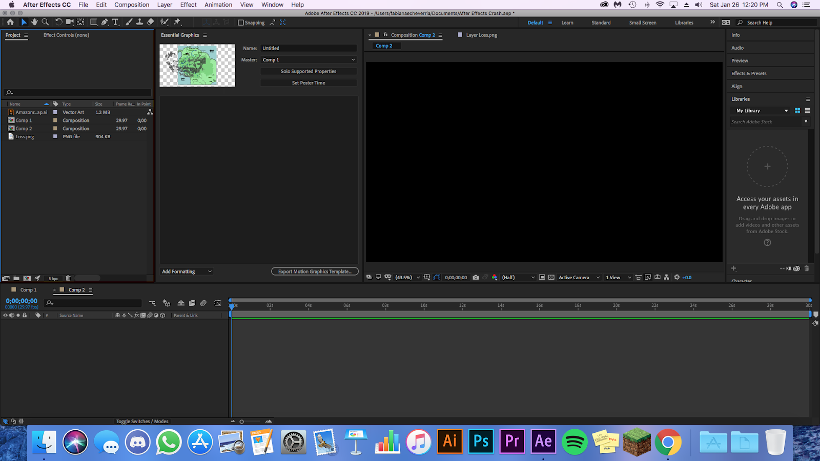
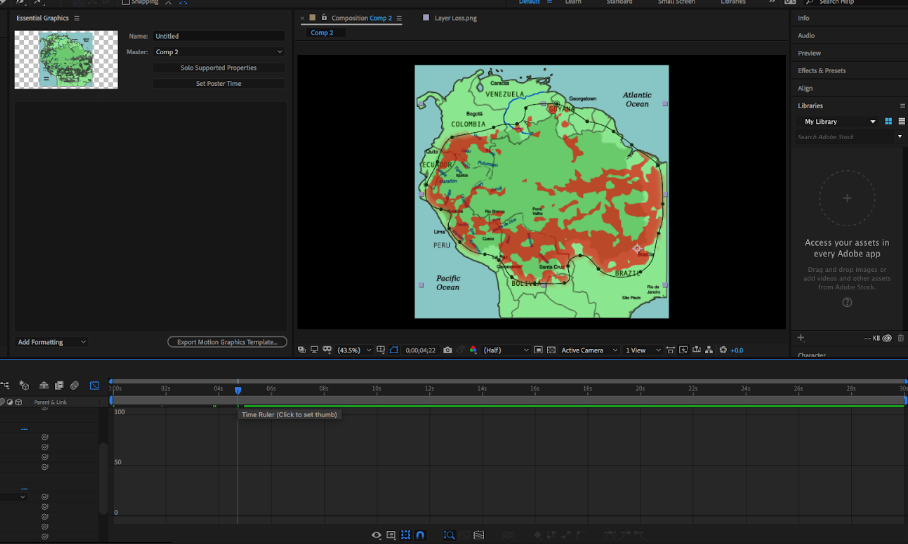
In this case I’m using a vector map found on wikimedia that highlights the contour of the Amazon and another vector I created from an image that showed the current state of deforestation. Drag both files into Adobe After Effects and place them on your timeline.

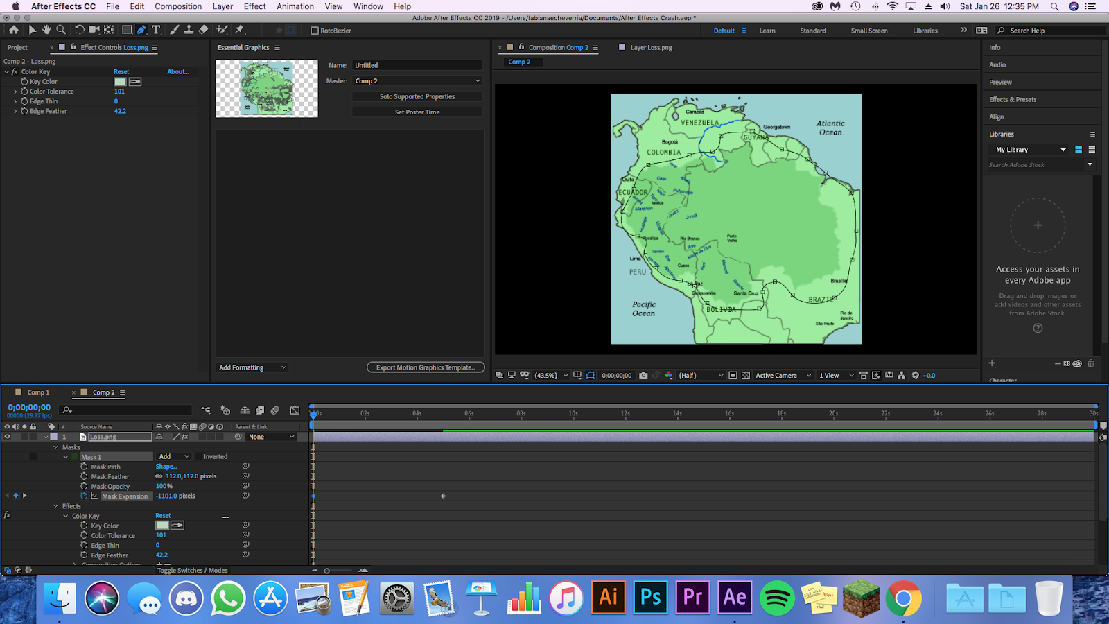
Color Key
This step may vary depending on what your file with the information has, but it’s often going to be an important step. Once you’ve dragged the layer in, you will go on to Effects > Obsolete > Color Key. Color Key lets you remove a color or colors on the image that you don’t want visible. In my case I got rid of the lighter colors that weren’t signifiers of the loss in forest.
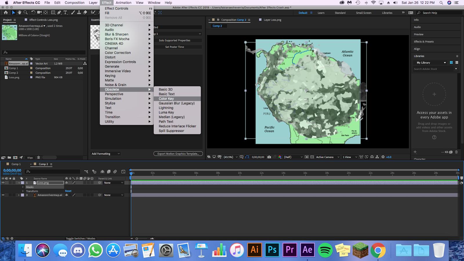

Once the effect has been applied, click on the down arrow of the Color Key effect on your file and change the tolerance until you see only the colors you need.
Mask

On the top of the screen you will see the pen tool, click on it or use the shortcut (P) to access it. With this you will draw a shape around the area of the data. Let the shape be slightly irregular as this will affect the animation later on.
- Open the dropdown menu of the mask effect and find the Mask Expansion option.
- Reduce the expansion until everything in side the mask is invisible.
- Click the keyframe button (the little clock at the left of the Mask Expansion option)
- Move the time bar ahead to however long you want your animation to be, in my case just 5 seconds.
- Change mask expansion until you see everything within the mask. The change will be automatically logged and it will create the next keyframe so there is no need to press the keyframe button again.

The irregularity of the mask selection you made will dictate the shape of the animation as it expands. For aesthetic reasons I prefer the shape to not be uniform as it gives a more organic feel to the piece.
Optional Changes
These changes are more for the aesthetic of the piece. You can edit the opacity, blur and speed of the animation. For the opacity and the blur look for the Opacity and Feather Edge options on the layer and mask drop down menus.
Another interesting change you can make is the speed of the animation within the graph editor. On the toolbar above the timeline box where you dragged your files in there is a little graph icon. If you click on it, the timeline will change to a diagonal slope line. This signifies the speed at which the animation moves. In my case I moved it so that it mimicked the slowdown of deforestation in more recent years.

One last optional step is changing the fill color of the overlaid image. In my case I did it because there different tones of green that I thought didn’t look good and signified small variations in deforestation density.

To generate the fill you go to Effect > Generate > Fill. It will auto populate a red fill, which you can change to a different color or change its opacity.
Export
Go to File > Export > Add To Render Queue. Choose the output source and file type. I usually choose Quicktime and to be saved on to my external drive. Then give the okay to Render and let it do its thing. Once it has rendered, you can view it as a video or add it to a larger video project.


- How to animate a map in Adobe After Effects - February 20, 2019
- Five Venezuelans that are explaining the situation unfolding in my country - February 4, 2019
- Five Latin American media platforms experimenting with illustrated news - December 20, 2018