How to build a clustered bubble chart without Javascript
Mike Bostock is one of today’s leading data reporters. He was hired by The New York Times after building D3.js, a Javascript library for turning hard data into beautiful, interactive visualizations. Hundreds of people in (and outside of) journalism use D3, as it’s known, to visualize data. D3 stands for data-driven documents. Bostock’s website has plenty of examples of the kinds of interactives, charts, graphs, maps, and diagrams you can build with D3.
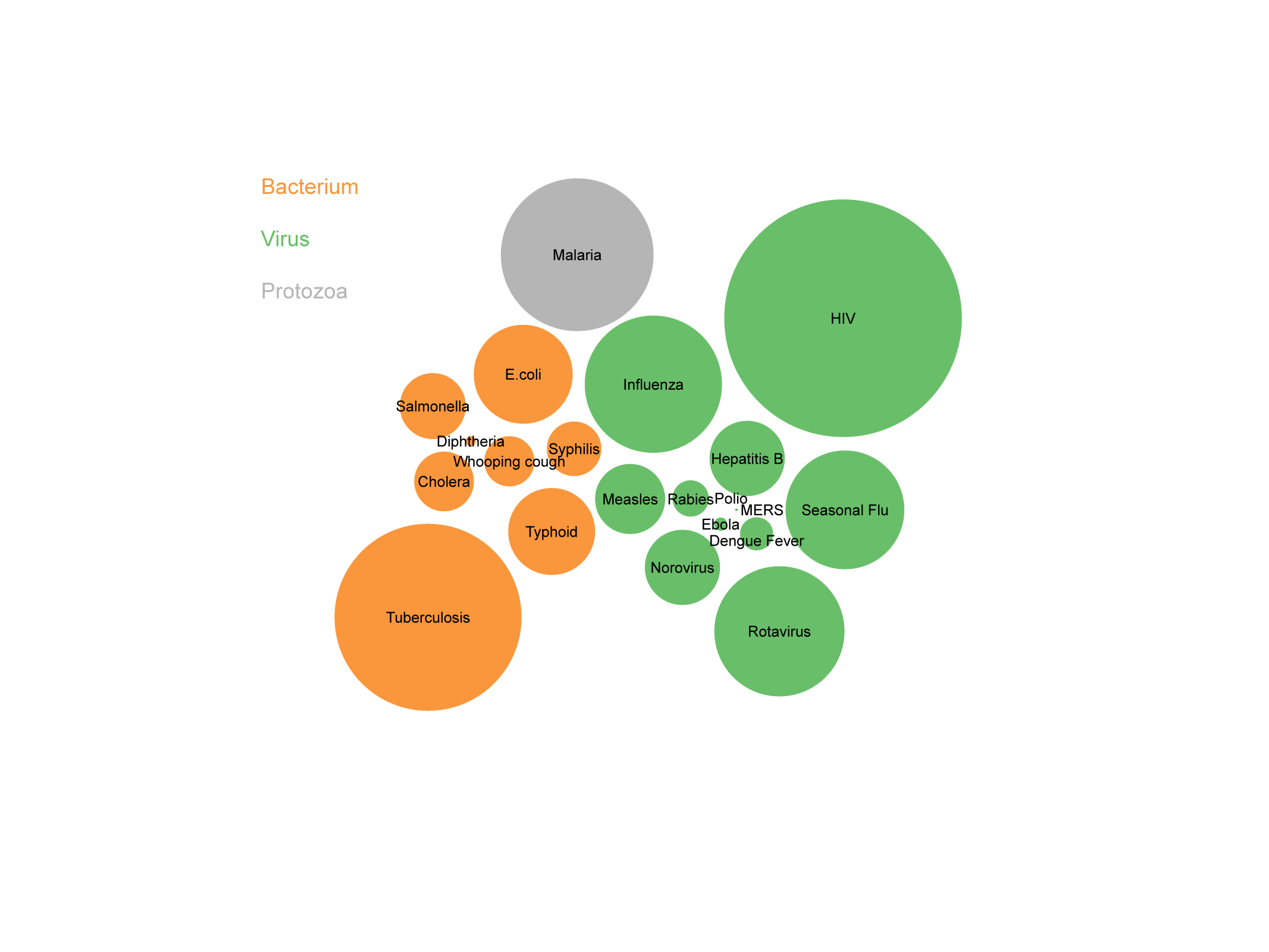
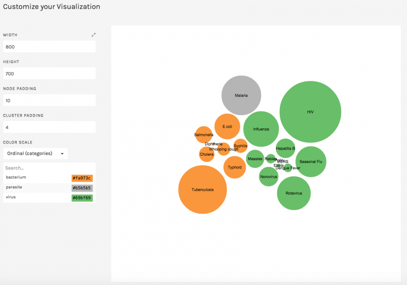
One of the charts in D3 is a bubble chart. Bubble charts help communicate hierarchy and compare values. Using a data visualization service called RAW, from the Politecnico di Milano’s DensityDesign Lab, we built a clustered bubble chart to compare annual fatalities from different diseases like malaria, tuberculosis and HIV. RAW calls itself the “missing link between spreadsheets and vector graphics” and is built on D3.js.
Finding the data
To start, we had to find the data for these diseases. Information is Beautiful recently published a visualization (and dataset) called the Microbe-scope that compared these and other diseases. Graphs like this really help contextualize questions like: How deadly is Ebola when you compare it to other diseases in the world?
Cleaning the data
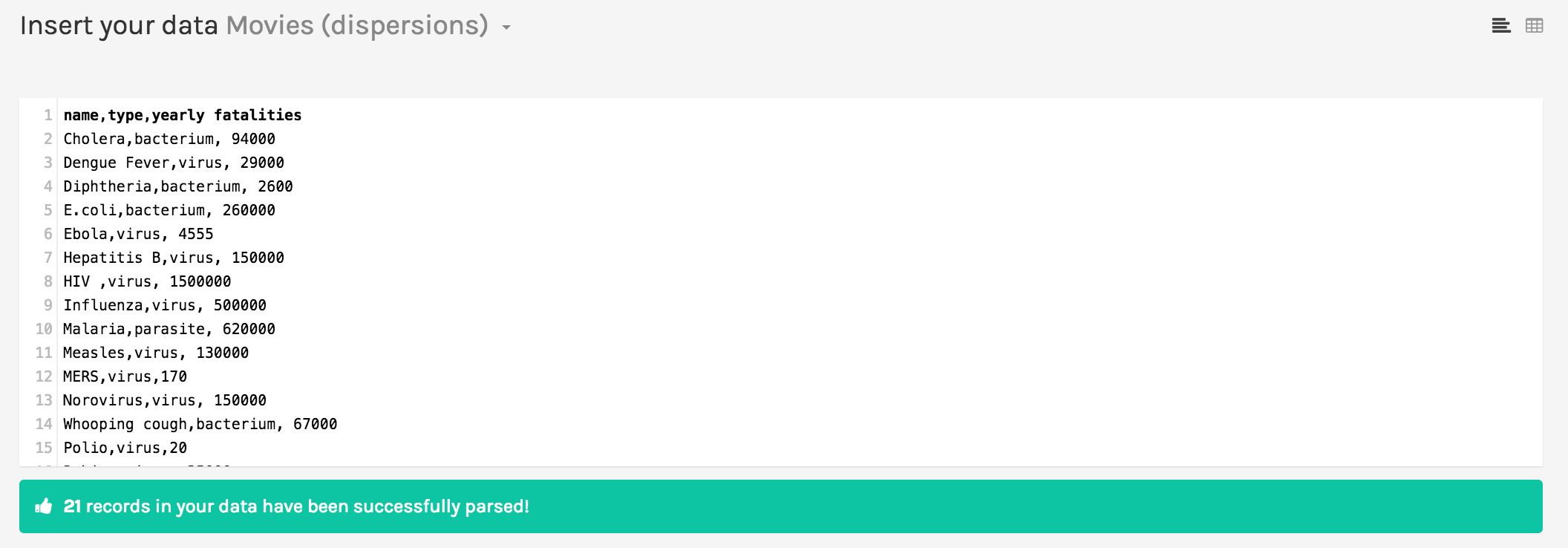
After downloading the spreadsheet of data, we removed every column but the pathogen name, the pathogen type, and the yearly fatalities. This was then exported as a CSV file. We opened the CSV file in a separate program, like TextEdit, and copied all the comma-separated values. Next, we navigated over to app.raw.densitydesign.org.
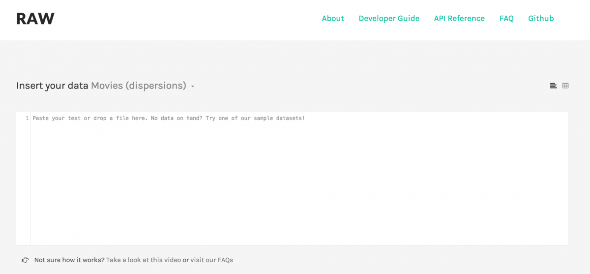
Paste data into RAW
We pasted the CSV data into RAW.
Choose a chart
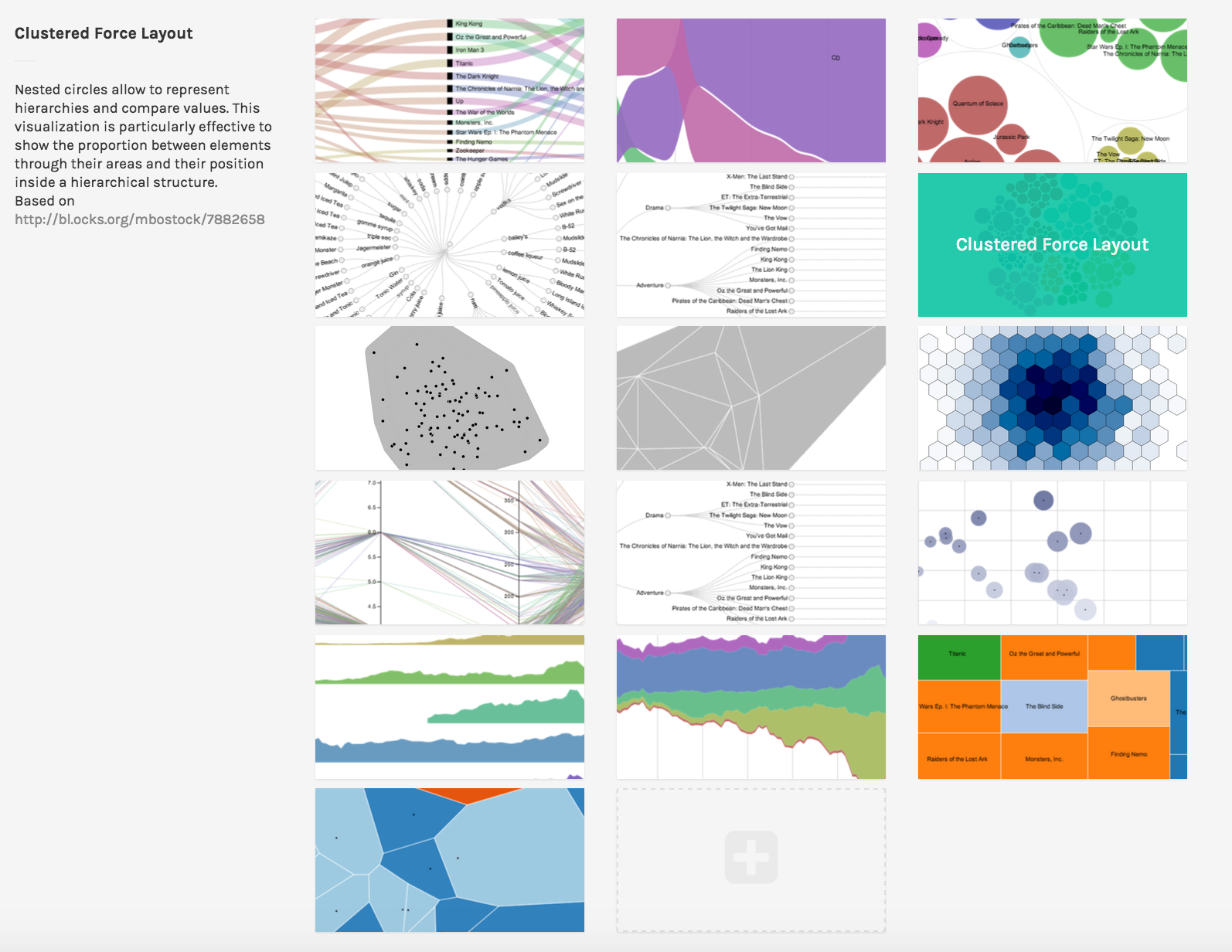
Next, we chose the ‘Clustered Force Layout’ chart. Notice how many other awesome visualizations you can make.
Map the data to your chart
In the next step, you map your data to the dimension used in the chart. In this case, the bubbles will be clustered by pathogen type, the size of the bubbles will be determined by the yearly fatalities, the label will be the pathogen’s name, and the color will be the pathogen type.
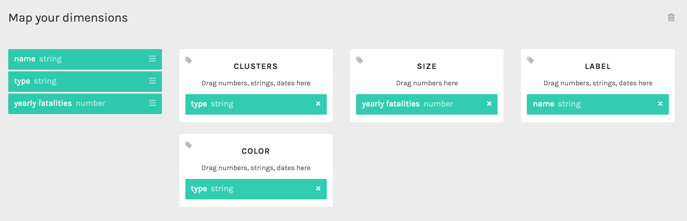
Once you’ve mapped your dimensions, your visualization will appear. Change the colors as you see fit.
Download or embed
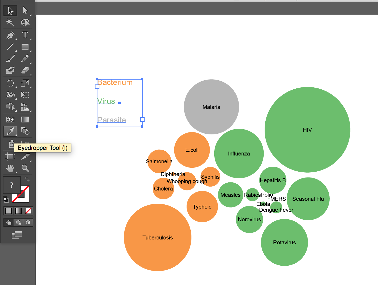
We downloaded our clustered bubble graph as an SVG, or scaleable vector graphic. To add a legend, we opened the SVG in Adobe Illustrator, wrote the legend, highlighted each pathogen name, and then color-coded the words by selecting the Eyedropper tool and clicking the corresponding bubble. We also moved around the labels for Polio, MERS and Ebola so they weren’t overlapping.
Drawbacks
- We couldn’t get the embed code to work on RAW.
- RAW visualizations don’t include legends. We had to add ours separately.
Considerations
Bubble charts only go so far in communicating information. They’re visually appealing and they make it easy to compare relative size of values. Yet we have no grasp of the numbers of annual fatalities resulting from these pathogens. The following bar graph communicates that. We built it with the same data using Datawrapper.


It’s indeed not within everybody’s reach to develop a d3 dataviz. Opening up d3 use to designers and journalists that don’t have programming skills thus make a lot of sense.
Datylon focuses on this workflow and gives designers access to d3 right within Illustrator. Journalists and business users on the other hand can access templates, charts and maps from their browsers.
Here’s an example of an infographic with d3 charts made in Illustrator by a designer using @datylon without any programming http://browse-dev.datylon.com:80/#/guestedit?url=http://story.datylon.com/kim.gressens%40datylon.com/20bf9cd9-7c53-4463-99ff-63570262ebe4
Or a very simple circular bar chart builder: http://browse.datylon.com:80/#/guestedit?url=http://story.datylon.com/erik.laurijssen%40datylon.com/32184a29-c8b6-4408-9bc1-fdf57fd5f9c8
We’ll be opening up for you to add your own d3 dataviz (like RAWs bubble chart) soon.