How to make a multilayered Google My Map using news articles on invasive species
Wildfires, hurricanes, extreme heat waves, invasive species. These are the climate change news that I read most every morning I visit The Weather Channel’s homepage for the day’s weather forecast.
Based on those Weather Channel stories, I wanted to see if I could map the locations of invasive species. Invasive species are invasive for a reason: they are often widespread and span multiple locations, which makes them particularly interesting to map.
The following tutorial walks you through collecting data from the articles in Google Sheets and uploading and visualizing the data in Google’s interactive My Maps platform.
Collecting and organizing the data
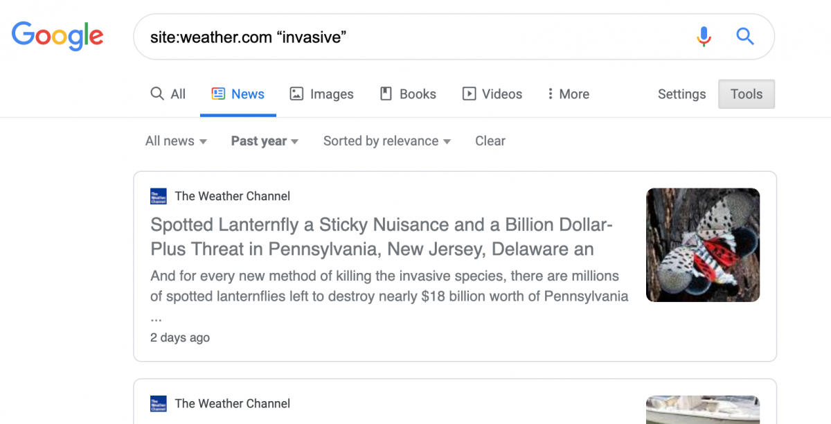
First, I did a Google search for the articles I wanted. Google has ways to refine a search, and I limited my search to TWC’s website, the keyword “invasive,” only “News,” and only articles published within the past year – as of September 28, 2019.
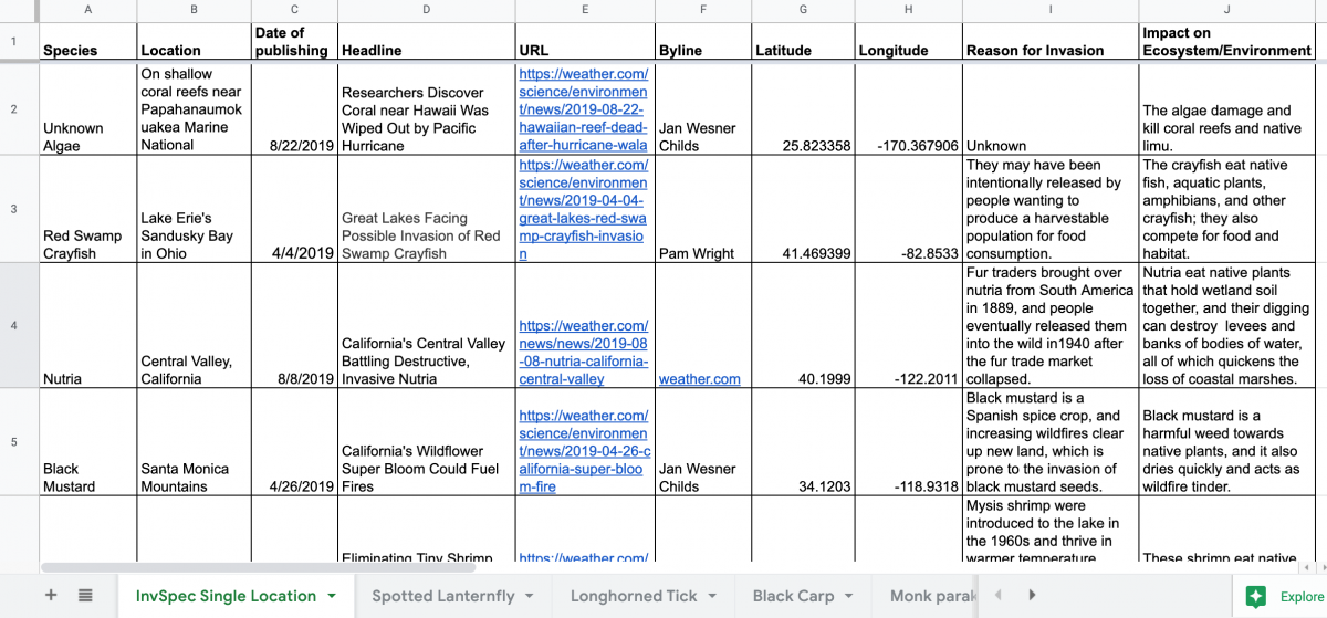
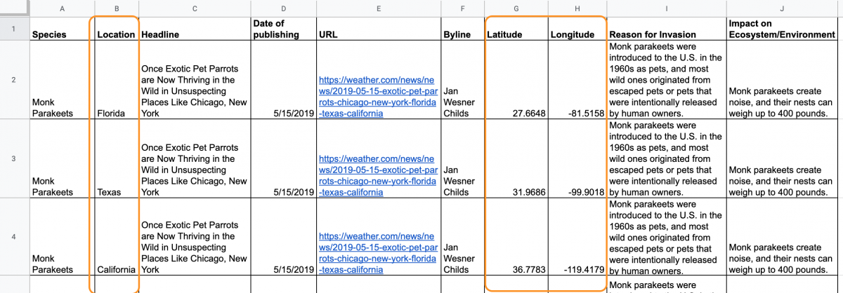
I combed through the articles from the search and filled a Google Sheet with the pertinent information to summarize each article. The latitudes and longitudes for the different locations were found using Google search or Google Maps’ “What’s here?” function.
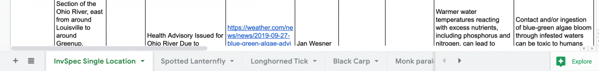
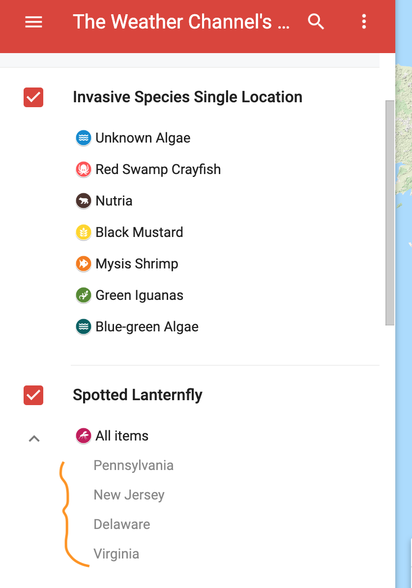
To better organize my dataset, I decided to make a sheet for all invasive species with single locations, and a separate sheet for each invasive species with multiple locations and the corresponding latitudes and longitudes. Link to the full Google Sheet.
I chose to use Google My Maps because I had multiple sheets, and I would be able to upload up to 10 layers of datasets for a single map.
I knew I would be plotting a different layer for each invasive species with multiple locations. Google My Maps reads each location’s details as specific to that location. But I wanted each location to have the same TWC article information for one type of invasive species.
Since I was unable to log one set of details for multiple locations, I opted for a redundant sheet for each invasive species with multiple locations. For example, the Monk Parakeets sheet shows different locations, latitudes and longitudes. The rest of the information I copied down the columns. This way, I organized my data to fit the capabilities of my mapping application.
Making the map
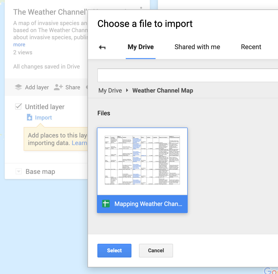
Google My Maps will only read the leftmost sheet from the imported file. For a Google Sheet with multiple sheets like mine, I would first move the sheet I wanted to the left end, wait for the changes to save in Google Sheets, and then import the file into my map. In the case below, Google My Maps will only import the “InvSpec Single Location” sheet. When uploading subsequent layers, I would repeat the process and make sure the sheet I want to upload is on the leftmost end, prior to importing.
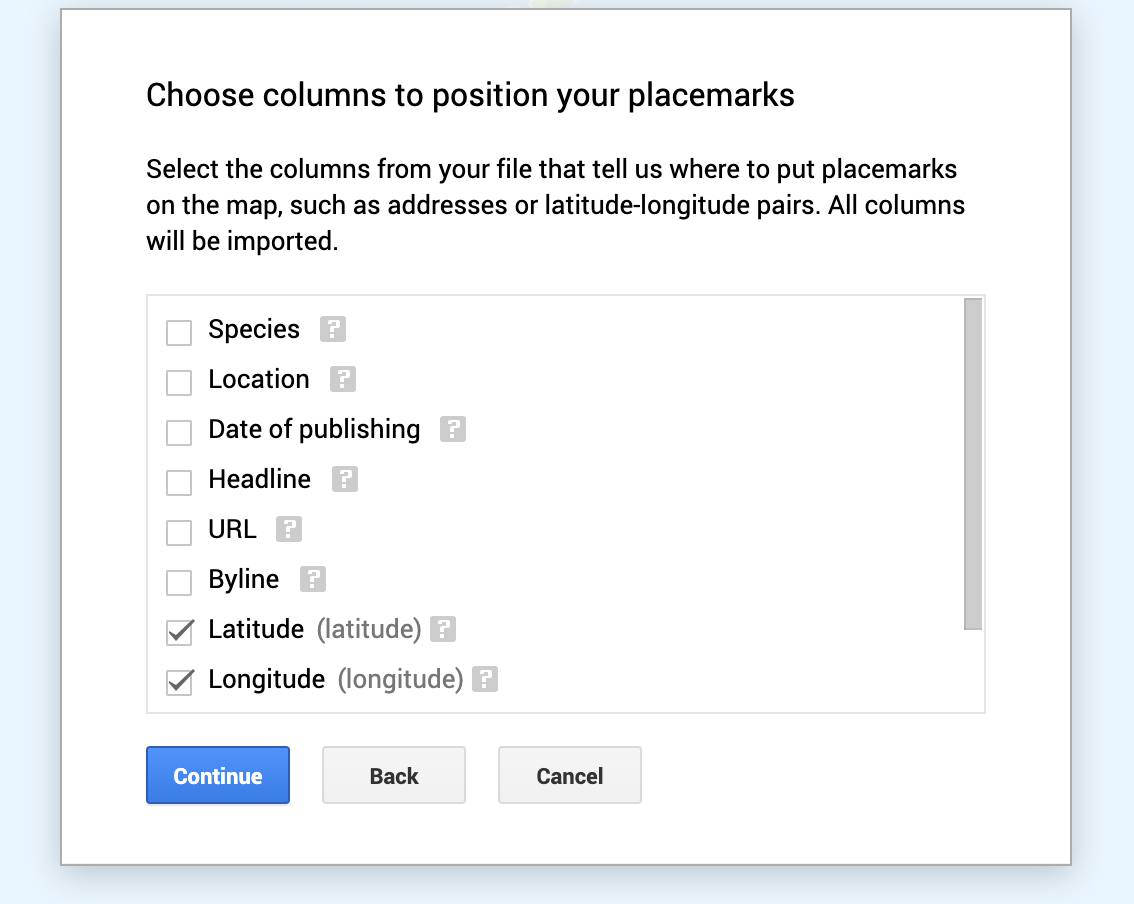
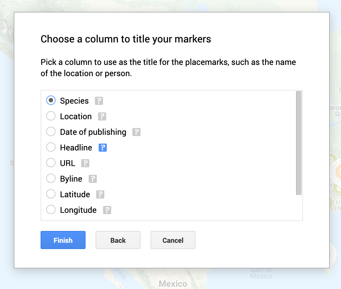
When uploading the data, I selected latitude and longitude for the placemarks and species for the title markers. I then renamed each layer to the appropriate species name.
A fun part about Google My Maps is selecting the icons and colors to differentiate types of placemarks. For layers with a single invasive species with multiple locations, like Silver Carp, I first grouped the placemarks by a “Uniform Style” to easily make changes across all Silver Carp placemarks.
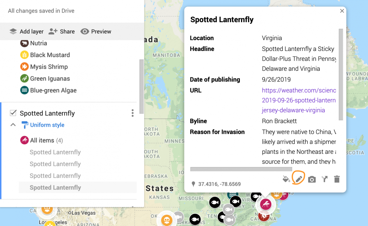
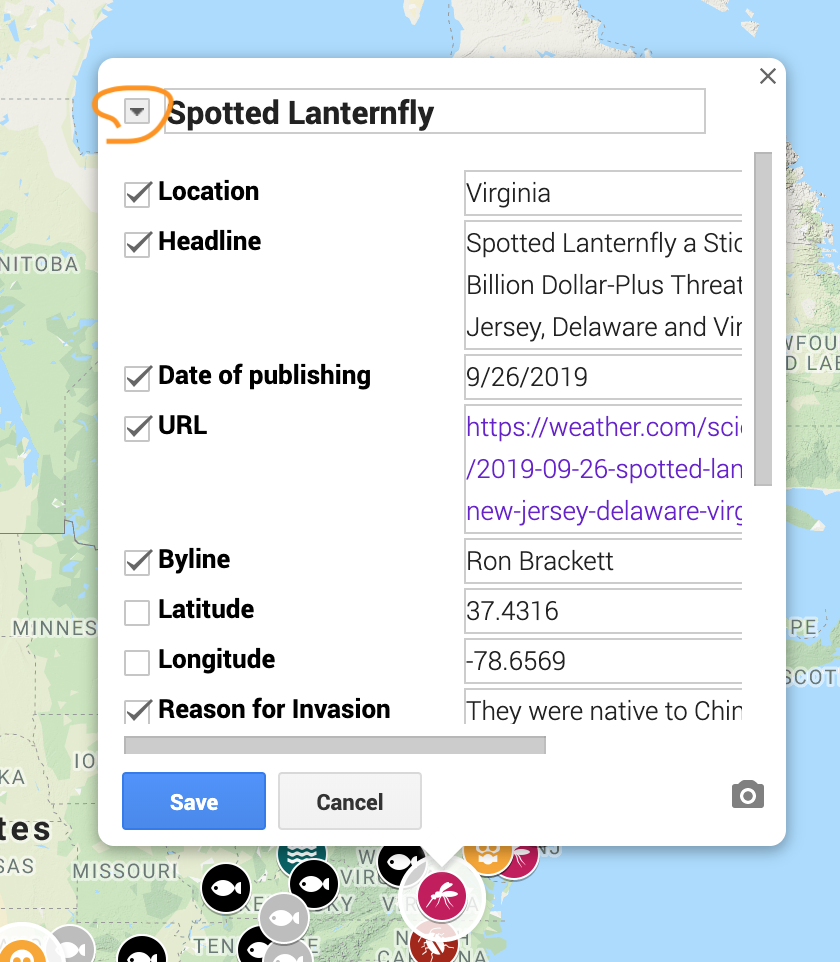
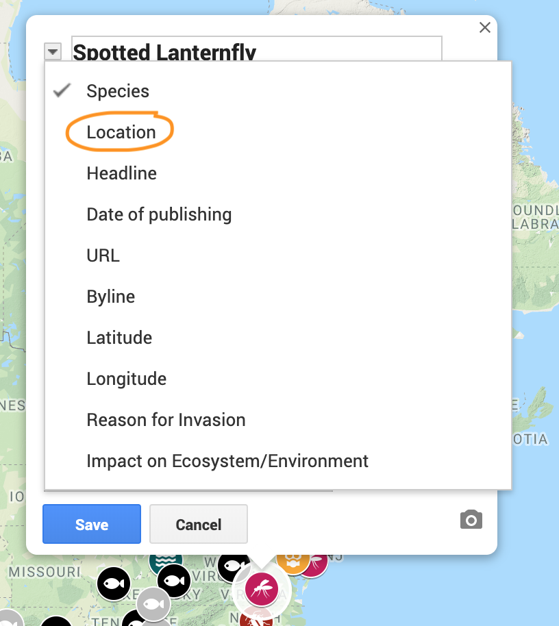
For uniform-styled layers, editing the display columns of a single placemark will make the change for all placemarks under that layer. For example, my layer for Spotted Lanternfly is already named after the species, so I decided to set the placemark title to “Location,” instead of “Species.” I can also deselect certain columns: for locations with state names, knowing the latitude and longitude may not be that useful for someone viewing the map, so I deselected them in the edit menu. These changes were made across all Spotted Lanternfly placemarks.
Improvements and Reflection
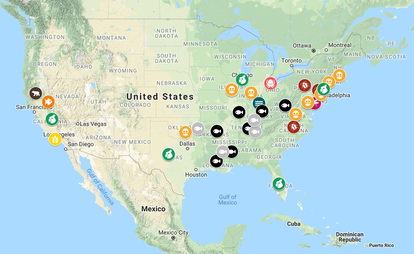
I discovered that for multiple placemarks on the same location, only one placemark could be seen when viewing the map with all layers selected. The state latitudes and longitudes that I used were the same across different invasive species. If you were to deselect “Japanese Knotweed,” which is widespread across many states, you would be able to see the placemarks for other species that were previously covered. If I hadn’t pointed out the overlapping placemarks, someone could miss the underlying data points entirely.
I did have the option to enter a variant latitude and longitude for a single state, since a state spans a region and not a specific point; the placemarks for duplicate locations would then be spread out, and I could deselect the “Latitude” and “Longitude” columns in the edit menu to avoid confusion for the viewer. As the map is now, selecting fewer layers at a time will let you see the individual placemarks more clearly.
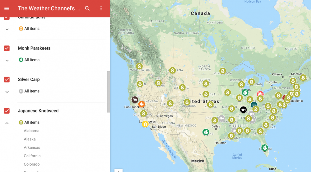
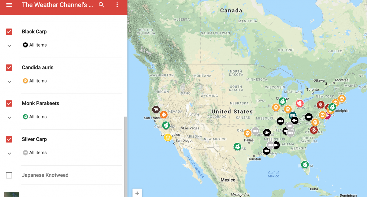
Interestingly enough, after Japanese knotweed is removed from the map, I can see that the locations of other invasive species are concentrated in California and the eastern part of the U.S – namely, in the places with bodies of water or a greener terrain.
To be sure, this map is limited to TWC news articles on invasive species, published within the past year. But the locations of these invasive species make sense. Many reasons for these invasions of nonnative species began with human activity. And when the surrounding environment and warming climate help an invasive species survive, it’s likely that they’ll ultimately thrive.
- Behind the scenes at ‘How to Save a Planet,’ a climate solutions podcast - January 29, 2021
- How the podcast ‘Science Vs’ investigated a 1971 virus conspiracy - January 11, 2021
- How The New York Times visualized racist historical redlining and urban heat - September 17, 2020