How to map natural gas ruptures using Tableau
The U.S. Department of Transportation’s Pipeline and Hazardous Materials Safety Administration (PHMSA) keeps a thorough track record of “significant pipeline incidents,” ranging from mechanical failures to gas leaks and financial damages, across a variety of petroleum products including crude oil and natural gas. The incident reports include the exact site where the incident occurred, with longitude and latitude coordinates, “incident result[s],” and the amount of commodity released.
Our goal in visualizing the data was to plot the recorded incidents on a map and communicate the relative size of each spill over the last seven years through differences in diameter. We began by plotting the information in CARTO, but soon found that the free version of the software could not display complex data sets with multiple layers. We decided to switch tools and settled on Tableau.
Tableau plots data onto a chart or map, displaying multiple dimensions and measurements with a simple drag-and-drop method of input. Input marked ‘dimension’ is how the map is accessible; input marked ‘measurement’ is the actual numerical data. The software also allows the user to have a live connection with the data, matching changes to the data in the spreadsheet to the visualization on the map.
Visualizing with Tableau
Streamline relevant data in Excel: The original PHMSA dataset contains hundreds of columns irrelevant to our purpose, so we created a new Excel spreadsheet with the following data columns: report number, company name, local date and time, year, street address, city name, state abbreviation, postal code, latitude, longitude, incident resulted, commodity released, and amount of gas released (measured in thousand cubic feet, Mcf).
We narrowed down our data further, eliminating any incident with a recorded 0 Mcf released; the data used to plot and visualize in Tableau included a range of .001 to 47,249.7 Mcf. This allowed us to work with a much smaller dataset while still retaining information that we might find useful later on in our analysis. Before uploading to Tableau, we used an Excel pivot table to be sure that there were no duplicates at each longitude and latitude pair.
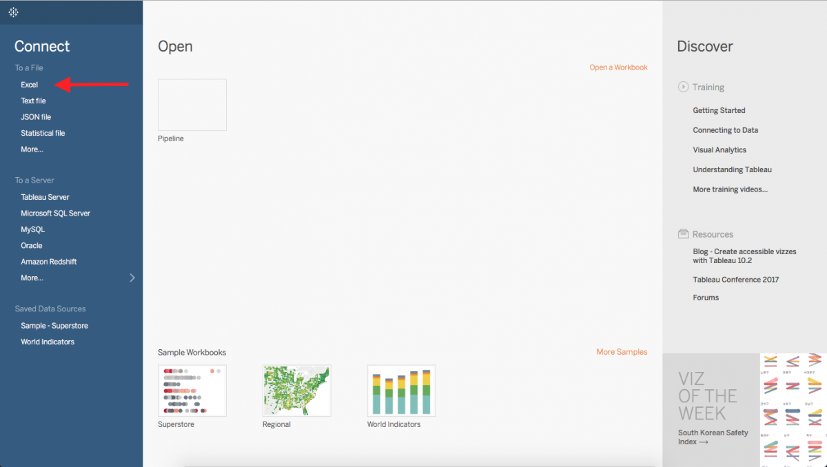
Getting started: To start in Tableau, connect the software to your data source. Because we used an Excel file, we selected Excel and chose the streamlined file we created for this purpose.
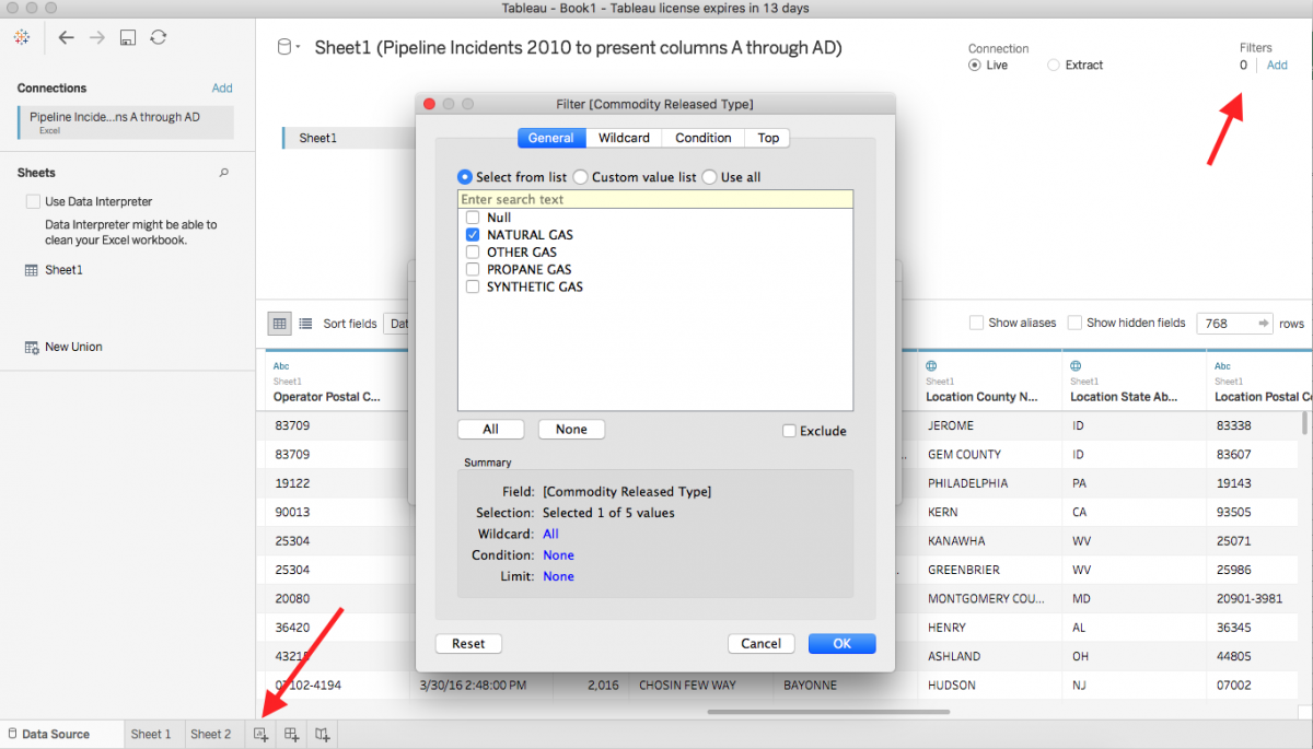
From here, you can also filter out unwanted data. We decided to include incidents of released natural gas, so we selected that field as a filter. Once you’ve selected the filter, select the Graph Icon with plus symbol in the lower right-hand corner of the window.
Plotting the data
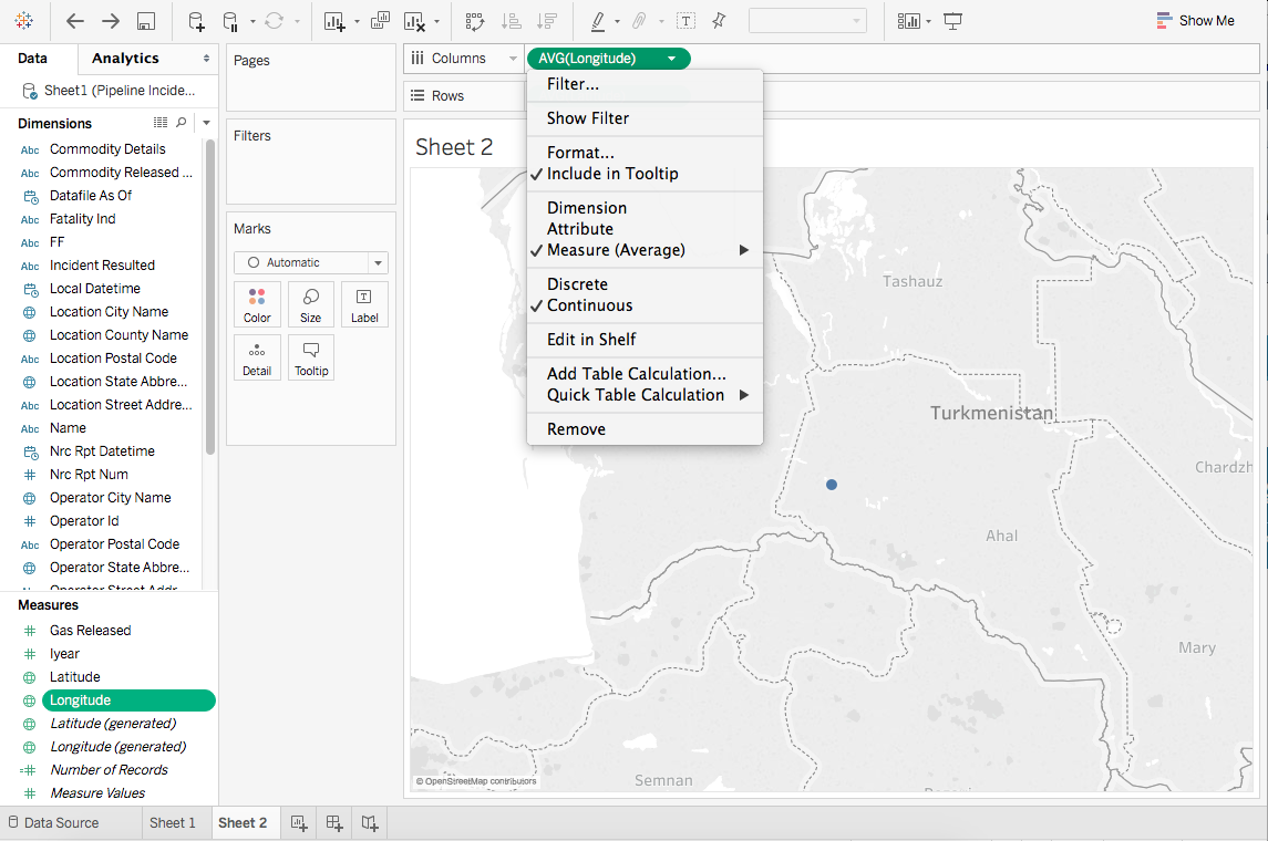
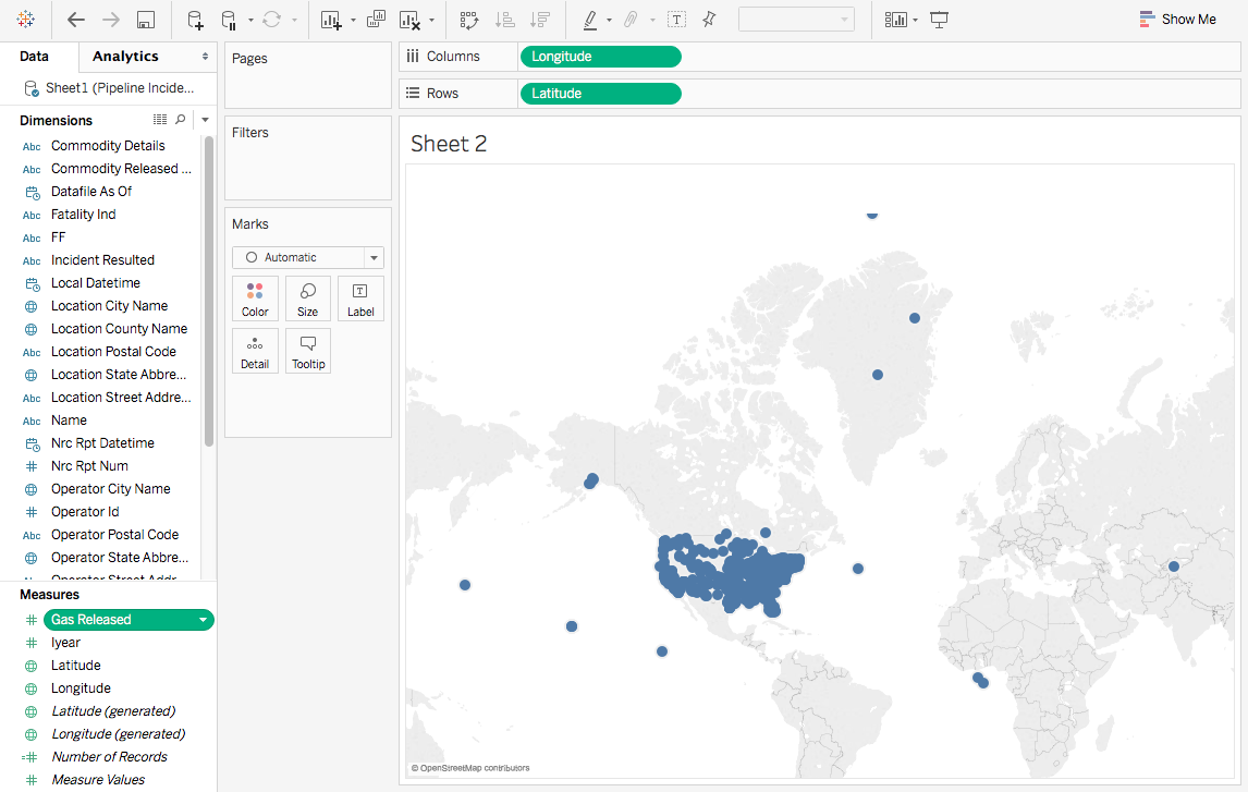
Now you should see the dimensions of data on the left hand side separated by columns, and an interactive map on the right. Tableau can be used for many kinds of visualizations, but we’re here to make a map. From the Measures menu in the lower right-hand corner, double click on the “Latitude” and “Longitude” options; they will then populate the “Columns” and “Rows” fields. In order to make sure that Tableau is treating the data correctly, select the drop-down menu for each and select “Dimension.”
Adjusting size with filters
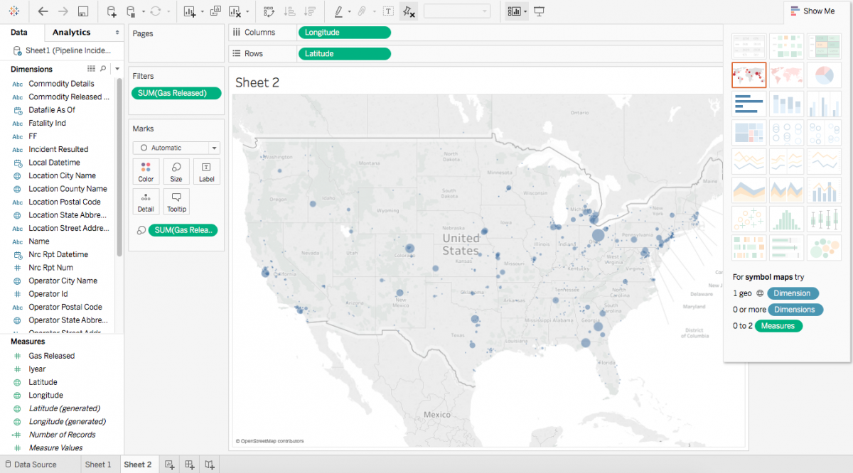
The location where each incident occurred is now displayed, but is not clear how much natural gas escaped at each location relative to other incidents. Drag the “Gas Released” measure on top of the map. In the “Marks” toolbar, make sure the map is set to “Automatic,” that way Tableau can determine how the data should be shown. This can easily can be changed to a different chart based on how you want the data to be displayed.
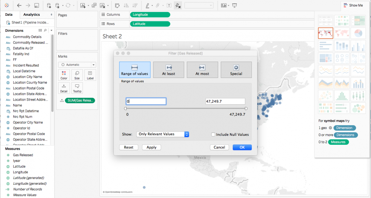
From here, you can select “Filter” in the dropdown menu for “Gas Released” and tell Tableau if you have a threshold for values you want shown. The program has already eliminated “Null” values, or instances where there was no datum in the Excel spreadsheet. We don’t want to show spills where there was nothing spilled, so we set the lower end of the range to “1.”
Fine-tuning the map
Under “Marks,” select “Color,” adjust “Opacity,” and add “Border” to outline the gas spills.
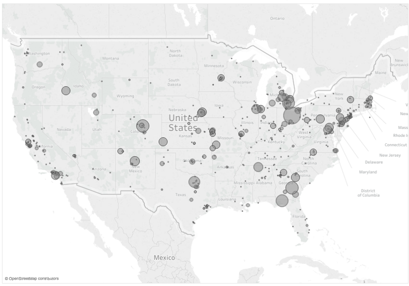
The final visualization plots dots that signify the exact coordinates of the incident reported along natural gas pipelines in the continental United States, with the radius of each circle reflecting the size of the spill relative to others in the dataset. The largest concentrations of natural gas ruptures are found along coastal regions like California, Florida, and states bordering the Gulf of Mexico, as well as urban centers.
- How to map natural gas ruptures using Tableau - April 13, 2017