How an Italian information designer visualized Bob Dylan lyrics and Pulitzer Prizes
How many different worlds do Bob Dylan’s lyrics paint? How many societal changes and events can one infer by exploring Pulitzer prizewinning stories and photographs?
Those are the kinds of questions Milan-based information designer Federica Fragapane tries to answer in her Visual Data column for la Lettura, the cultural supplement to Italy’s Corriere della Sera newspaper. Earlier this year, Fragapane was awarded a silver medal by the European Design awards for her portfolio of data visualizations for la Lettura.
Storybench sat down with her to chat about three of her awarded projects, the tools she uses, and her approach to information design. (We also spoke with Fragapane in 2015 to highlight her work mapping organized crime.)
How did your partnership with Corriere della Sera begin? How often do you produce visualizations for the Visual Data column?
I’ve been collaborating with Corriere della Sera as a freelancer for two years now, but my very first visualization for Visual Data goes back to 2012 during my work with Accurat, where I worked on data visualization projects for three years. Actually I recall it very well also because it was my first project there! I remember how at the time it looked like a great opportunity to experiment and work on something that is different and potentially interesting every time and years later nothing has changed for me. I usually design one visualization for Visual Data per month, originally they are only in Italian and then I translate them for my online portfolio.
Sometimes you allow readers to explore the data you’ve amassed and organized. Other times you choose specific insights and highlight only those. What’s your philosophy about the role your visualizations play?
In this case my personal approach is strictly related to the medium I’m working on. la Lettura is a cultural supplement that comes out on the weekend, I see it as a calm and relaxing reading moment and I feel the same about my visualizations for Visual Data. I like to provide the readers with different elements, stories and sub-stories to be explored and discovered. There are some shapes or colors emerging, and then different layers of information that can be read.
 I love writing and I think that this different way of communicating stories and topics has an influence on my approach to data visualization for Visual Data, or at least on the way I look at it. For me it is like writing a short story with data. Working for la Lettura allows me to do it for readers that have the time to read it calmly and this is one of the reasons why I think that Visual Data is a very unique platform to work on. This approach gives me the possibility to extend the topic and release its complexity through the data: the readers can choose if they are interested to spend time on it, as for an article or a story.
What’s your approach to data cleaning? What tools do you like to use?
Data cleaning is one of the phases in which I deeply think about the concept of responsibility. Considering that la Lettura is printed, there are more physical and spatial constraints than in a digital project and I always have to make choices, deciding which data to keep and which to eliminate. For la Lettura and for me, it is very important to have a criterion as objective as possible for selecting information from a dataset – ranking the top or worst countries, for instance – keeping in mind that space is limited.
I mostly use Microsoft Excel to analyze and clean the data. I often use Density Design’s Raw to explore them before the actual visualization phase, it’s a powerful and helpful tool. And then I visualize them with Adobe Illustrator.
Your visualization of the best and worst countries ranked by personal freedom and tolerance is quite intriguing. How did you think about its design?
For this visualization my purpose was to allow a comparison among the different variables for every nation. For me it was important to give each factor its own relevance, visualizing it as a single element. Some of these variables are related to extremely serious topics such as violence against minorities, tolerance and freedom.
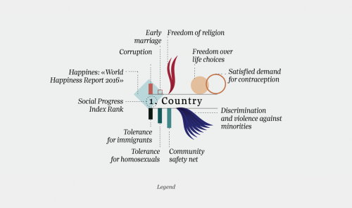
Because of their importance and specificity I wanted to give each its own specific color and shape, maintaining a visual consistency according to the different categories of data.
I think that this approach can facilitate the analysis and comparison among the different factors by country, giving them visual emphasis. In my opinion one limit is related to the spatial aspect: I would have liked to map the countries according to their geographic position or in a scatterplot, in order to compare the analyzed factors to external ones, but there was not enough space on the page for it. So I decided to instead focus on the single variables for each country and highlight them.
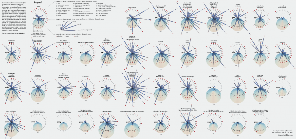
Your visualization of Bob Dylan’s lyrics is very interesting. Tell us about your collaboration with the Institute of computational linguistics Antonio Zampolli and the ItaliaNLP Lab.
My collaboration with the Institute Antonio Zampolli and ItaliaNLP Lab started a few years ago, during my Master’s thesis project, a visual analysis of organized crime in Northern Italy. In that case, I was looking for text mining tools to extract information from Italian official reports and ItaliaNLP helped me with their T2K (Text-To-Knowledge) tool. Since that collaboration, I’ve kept in contact with them – I’m very interested in the intersection between text mining and data visualization – and we collaborated for some visualizations for Visual Data. More specifically, I proposed they help visualize Bob Dylan’s lyrics after the Nobel Prize announcement.
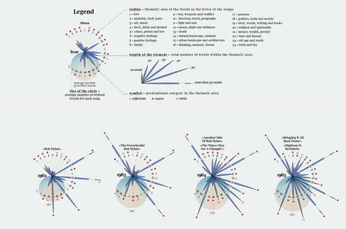
We decided to visualize the different thematic areas contained in his lyrics divided by year, to show the patterns that emerge in the different worlds created by Dylan’s songs. In order to do that, I copied and pasted lyrics from bobdylan.com. Then I prepared single TXT files grouped by year and sent them to the ItaliaNLP Lab. They sent me back a CSV file per year with all the extracted terms and for each one the frequency and the category indicated (adjective, noun, verb).
After analyzing all the files, I defined 24 thematic areas – such as family, war, architecture, nature, religion and freedom – to group the terms into and calculated the total frequency for each area by year. Then I visualized every year focusing on the weight of every topic.
More than providing one specific insight, this visualization allowed me to appreciate the wide range of worlds described in Dylan’s lyrics and the choice of the words used to narrate them. I decided to use a relatively high number of thematic areas to show them as specifically as possible. What I found particularly interesting was discovering the changes in the description of landscapes (urban or rural), feelings (positive or negative), and topics (politics, religion, money).
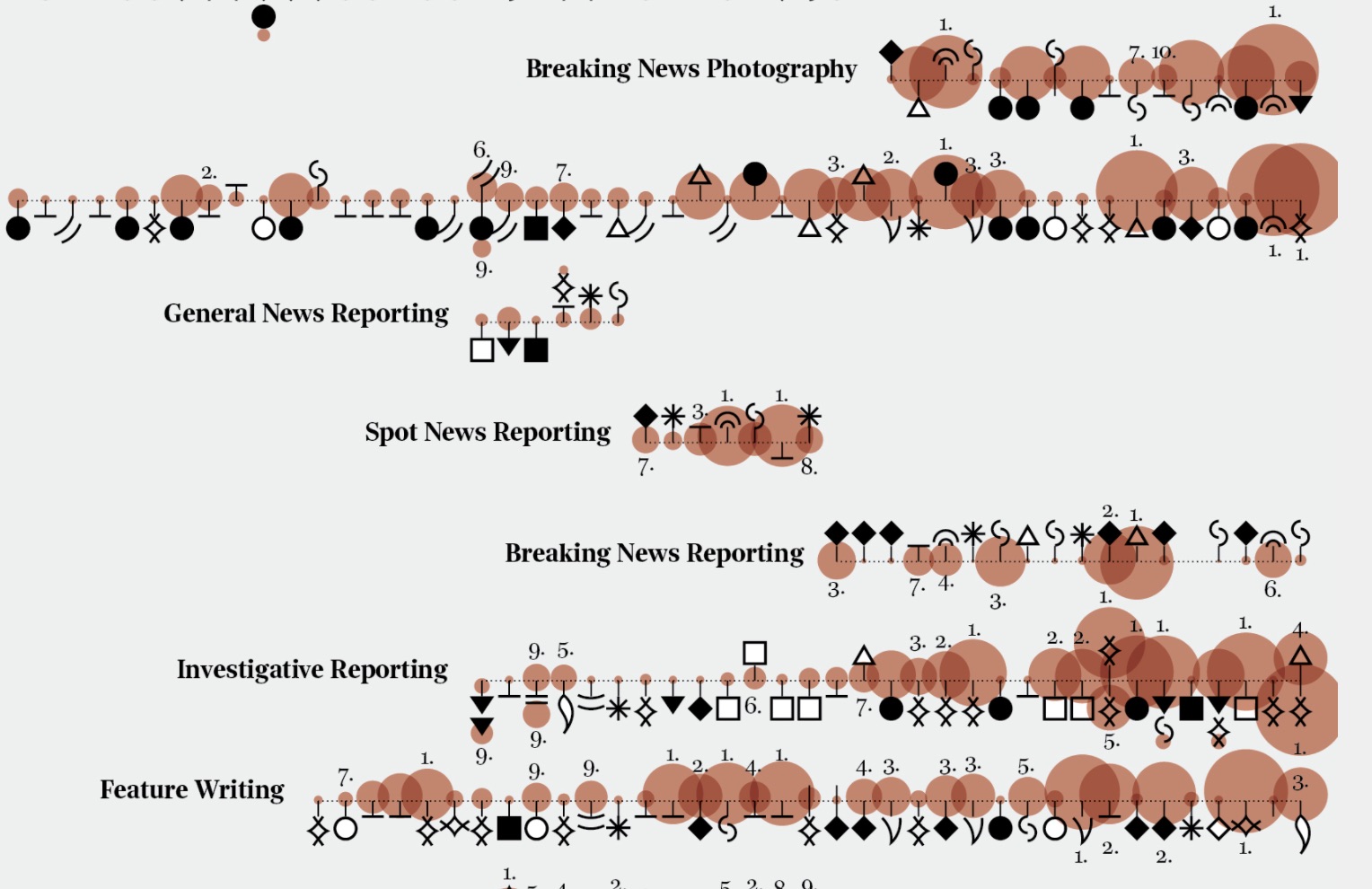
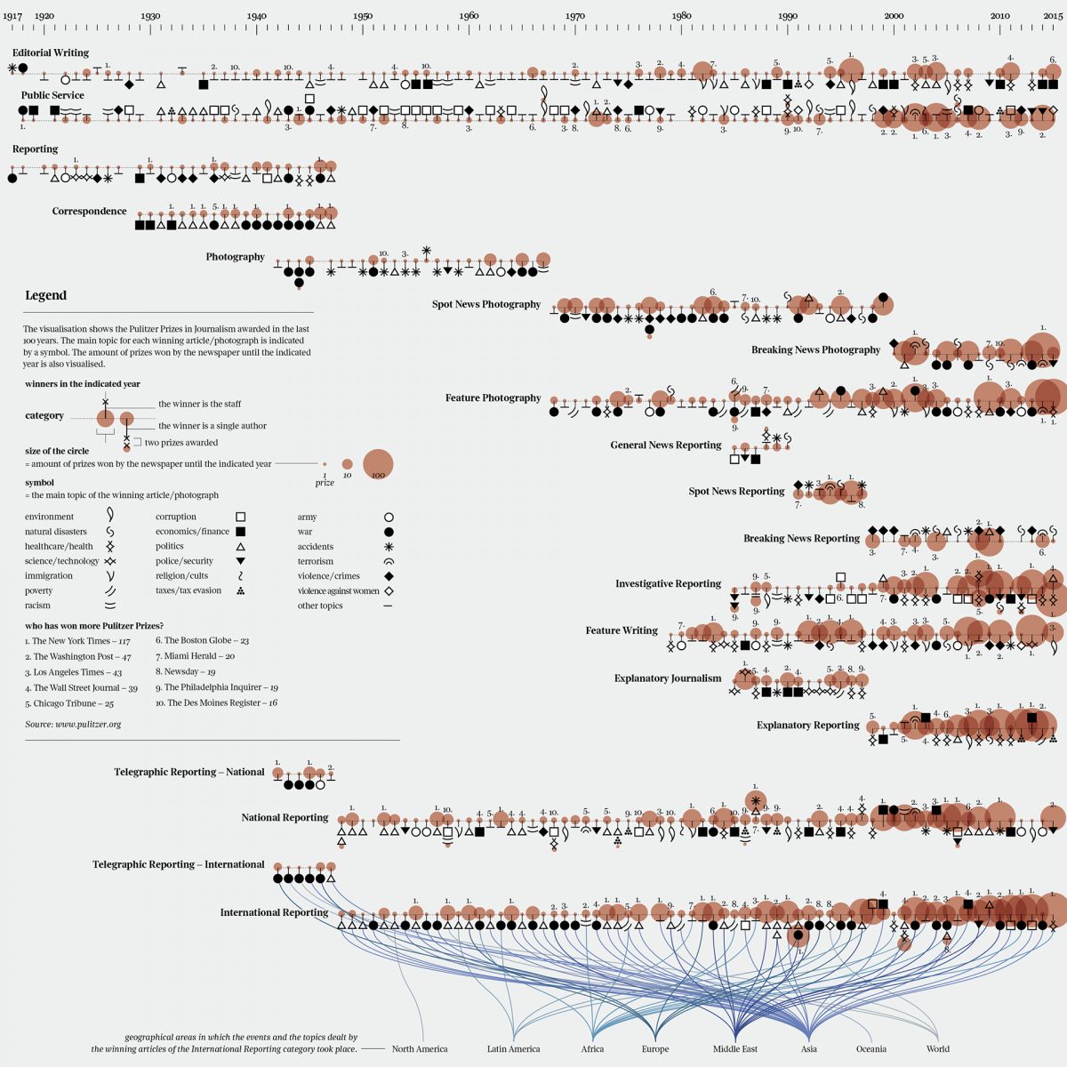
Your visualization of the Pulitzer Prizes is equally striking. You’ve encoded every prize by year, category, genre, publication. How long did it take you and what were the largest obstacles?
I worked on the Pulitzer Prize visualization for some weeks. In this case, the main obstacle was the data mining phase: I didn’t have a ready dataset to start from. I extracted all the information from pulitzer.org, manually copying and pasting all the information from the website into Excel. This process was particularly time-consuming, but I’m happy with the result.
This is another visualization that requires time to be read completely. I wanted to focus on the topics of the winning articles and photographs, reflecting on how historical events and changes in society had an impact on the prize throughout the years. In order to do that I created an alphabet made of 20 symbols, one for each topic. As with Dylan’s visualization, I preferred not to over-simplify the complexity and variety of the data, but to show it in a multi-layered visualization, to create a story that’s (hopefully) interesting to read.
Information design is a very visual methodology but these all require concise annotations that introduce the visualization and perhaps explain its meaning and insights. What’s your approach to the written component?
Providing a clear key is essential in these projects. I use a simple writing style, in order to provide an easily understandable explanation. In the Visual Data column there is always space for explanatory text: it is very important, but I also focus my efforts on the legend, keeping in mind that it’s often one of the first elements the readers look for. I think it’s also important to test the efficiency of the annotations and the legend. I always ask for opinions and most of the time the most valuable advice and comments come from the people who are not data visualization experts but rather curious and interested readers. My purpose is to communicate clearly to the highest number of people possible: In my opinion it’s a constant work in progress, but this is another aspect that keeps me interested and enthusiastic about this job.
You seem to gravitate towards projects about nature, music, literature and the arts. What advice do you have for designers and journalists looking for data to visualize?
Yes, I do indeed. One of the aspects that for me is extremely interesting is the possibility to propose to la Lettura the topics to be visualized and I like to look for data that can be engaging and meaningful for the readers (and also for me). That means that I usually look for both data and topics in a non-linear process. That depends on the availability of the sources of information.
What I can give as advice is what I usually do: thinking about what I would like to tell, what story is going to be told with a specific dataset, and why it could be interesting to read. When I look for data I think about the people that are going to read my visualizations, keeping an eye on what interests myself and why, in a people–driven approach.
Two concepts are relevant for me during the research process (and then in the visualization phase): responsibility and empathy. [inlinetweet prefix=”” tweeter=”” suffix=”@fedfragapane tells @storybench”]Selecting data to be visualized means taking the responsibility to communicate them[/inlinetweet], so thinking about the story I want to tell and why I want to tell it is really important to me. I like to talk about literature, music, and art, but also about science and urgent issues. I usually divide the topics I’m interested in into two areas: the topics I would be curious about as reader and the complex and serious ones, that I – as a communication and information designer – feel the urge to communicate.