How the Marshall Project visualized racial inequities in New York City subway policing
Last month, The Marshall Project published a piece about arrests for subway turnstile jumping in New York City by interactive reporter Anna Flagg and former reporting intern Ashley Nerbovig. They found that, while the number of arrests for turnstile jumping has fallen since 2014, the racial makeup of those arrested has remained steady. This year, 89 percent of people arrested for turnstile jumping in NYC have been black or Hispanic.
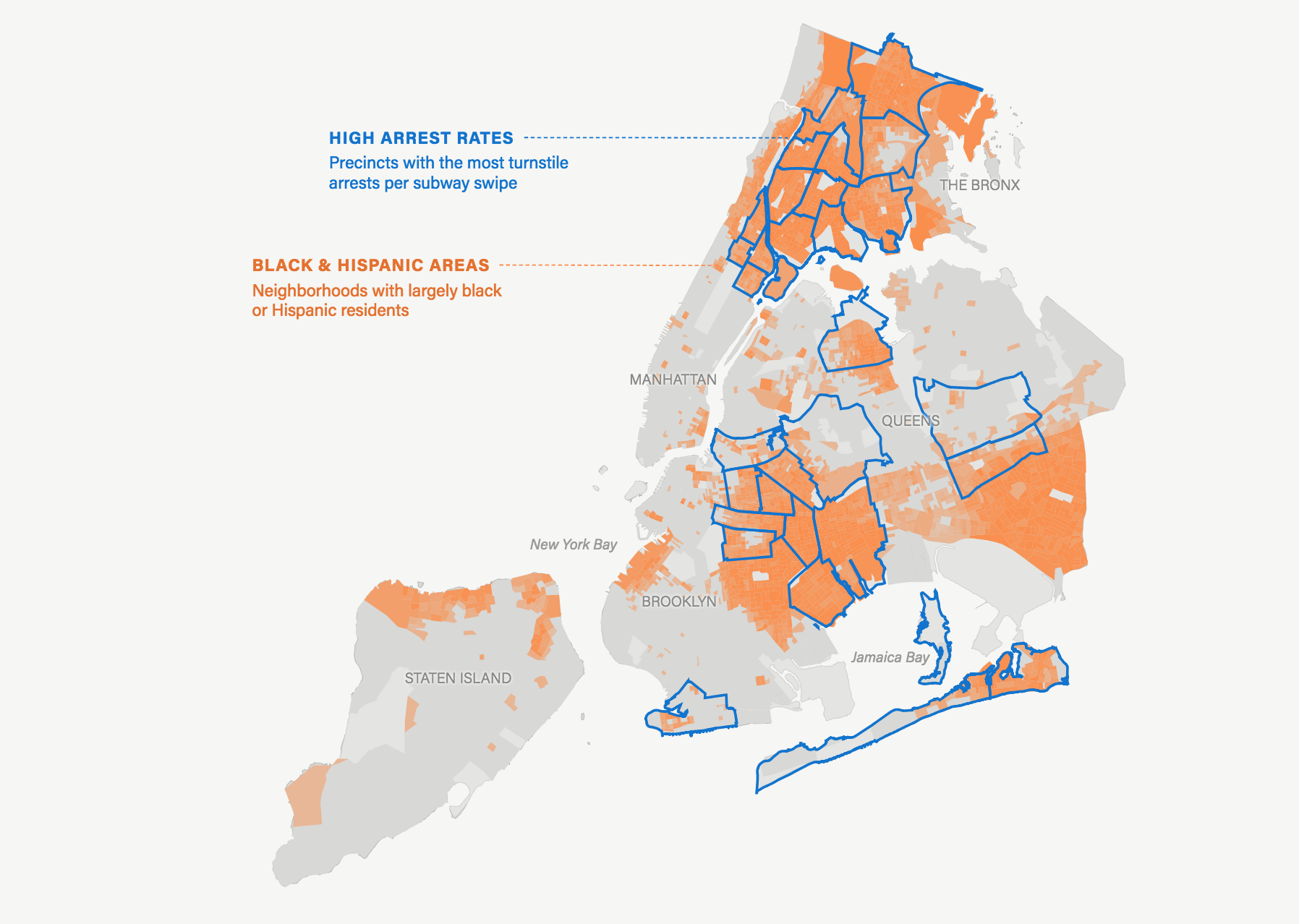
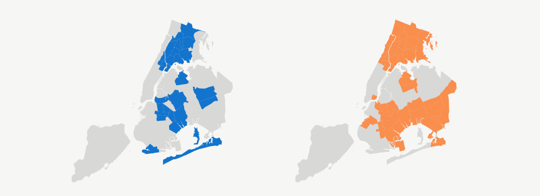
The piece opens with two adjacent maps, one showing the NYC precincts with the highest rates of arrests for turnstile jumping per subway card swipe and the other showing the city’s neighborhoods with largely black and Hispanic residents. Lower down in the story, a single map overlays those two data sets, highlighting how the majority of these arrests occur in the city’s neighborhoods of color. The visualization drives home the close tie between a neighborhood’s racial makeup and how strictly the subways are policed.
Storybench spoke with Flagg about how she assembled the maps and her thoughts on data visualization.
How did you settle on this topic?
So, we had collected data actually for a different story that was looking at outcomes for lots of different New York City based cases. And we were just doing some analysis on different charges and how arrests for different charges had been trending over time and how outcomes for those had been changing with regards to prosecutorial outcomes. And then we kind of noticed that, while arrests for a lot of different minor crimes and misdemeanors appeared to be going down quite significantly, arrests for theft of services, which includes turnstile jumping, seemed to be staying pretty level.
How did you settle on the metric of arrests per metro card swipe?
We looked at it at first as arrests per capita, just dividing by the number of people who live in that area. But those results when we got them seemed like they were not necessarily the best metric because a lot of places in New York, especially that have a ton of subway traffic, actually not that many people really live there. Like if you think of a neighborhood like Times Square, it has an insane amount of travel that goes through every day, but not that many people live in that area. We’re really looking at policing of the subway system, so we’re really interested in the subway population more than the above-ground population.
And also, there was another study done by the Community Service Society of Brooklyn turnstile arrests, and they had also put it in this form of arrest rate per subway swipe.
How did you decide on using maps to show the relationship between a neighborhood’s racial makeup and arrest for turnstile hopping?
Well, it just seemed to be easier to understand and more viscerally clear. Obviously, we also did things like scatter plots, and they kind of had a similar message, but you didn’t get the context of how closely these neighborhoods match up to each other, neighborhoods that have high arrest rates and the neighborhoods where black and Hispanic residents live. So, I feel like a map showed that a little more viscerally to the reader. And also, I think it’s a bit easier to understand than asking them to parse a scatter plot or something like that.
How does the final piece differ from what you originally envisioned?
I did make a map pretty early on, and I think it ended up being fairly similar to what we ended up going with, which is not always the case. What I was initially trying to do was compare the neighborhoods of color with the precincts that have the higher arrests rates. So, we have the arrest data by precinct so that’s the most granular level that we have it. So, we know that that’s probably what we’re going to do to show the arrest rates. For showing the neighborhoods, that data for that exists at several different levels. The census publishes, you can have a block, or you could have a census tract. We used the data that was at the most granular geographic level in both cases. So, at precincts, the smallest geographic area that we had arrest rates for was precincts. And then for the neighborhoods, we had that at a much more granular level, so we used that. And the connection seemed to pretty clear, even though we’re not comparing precincts to precincts. And I think it gives it a bit more of a nuance.
What tools did you use to make the maps?
“I got the data, I analyzed it using R, then I used Illustrator… and then I used D3.”
I used D3 to code the maps. So, the pipeline for me was, I got the data, and I analyzed it using R, and then I used Illustrator to do some design, and then for development I used D3 to build these maps, which is a JavaScript library. D3 is just a JavaScript library that’s specifically catered toward data visualization. That pipeline is one I’ve been using pretty consistently, and D3 had been a really important part of my process for a long time now.
How did you go about collecting your data?
So, the census data had the demographics, and then we got the data on the arrest from the Division of Criminal Justice Services. We worked with them over a period of months to get the turnstile arrests with precincts. They have a certain set of information that they generally release. And we requested that they also add precinct to it, so we could make it geographic.
Were there any of trends you identified in the data that you ended up not pursuing this time around?
I guess the thing that jumped out at me the most with this specific data was just how closely the match is between the precincts that have the high arrest rates and the neighborhoods of color in the city. I mean, basically, the precincts with these high arrests, it’s basically a map of the city’s neighborhoods of color. So, that’s what stood out to me.
And then, I think that we could have done some more work looking into the outcomes of these cases and how that’s changed over time. We talked a little bit about how it seems like one of the reasons the number of arrests has decreased is because of the Manhattan DA’s decision to stop prosecution in some cases. So, I think we could have looked more into that and been like ‘O.K, what are the percent that’s being declined to prosecute, what are the percent where people spend any time in jail, what are the percent that’s being dismissed,’ and just look at those outcomes.
As an interactive reporter, can you describe what sort of work you do?
An interactive reporter tells stories visually and using interaction to help the reader understand and engage with data whatever the subject matter of the story is. And that frequently involves things like web design, and mobile design, and thinking of different types of ways that a story can be in addition to a long, written piece, or maybe in a form that is mostly visual. For me, the most interesting part of that is just thinking about ways that information can be communicated more clearly through visual means. So, obviously, telling stories in a written form is an incredibly effective way, and a lot of information is really well communicated through a written piece. But there are certain pieces of information or types of information that are actually easier, cognitively speaking, for the viewer, to understand if it’s visual. So, that’s what I consider a visual journalist or an interactive journalist to be interested in, these other types of storytelling that can help someone either understand it better or more deeply using means that are in addition to written stories. A lot of what I do is just basic data reporting, just trying to get the basic reporting itself that’s available from data sets.
What advice do you have for journalists with mostly print experience who are interested in visual reporting?
I don’t really think that there’s a super big difference between a journalist who focuses on writing and a data journalist. To me, they’re both people who are interested in information, and data is just information. I think that journalists are completely capable of understanding data and using it in their stories and it’s not that different from what they already do. They’re already really smart at doing this very difficult investigative reporting work, and data’s just another tool, another form of information that they can use to help understand their stories and tell their stories.