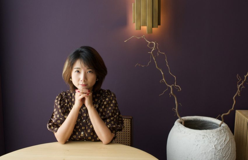
Matteo Moretti on bringing design to journalism
Matteo Moretti is a designer and researcher of visual journalism at the Free University of Bozen in Bolzano, Italy. He recently crafted “The People’s Republic of Bolzano,” an interactive project that explores the issues facing the small, vibrant Chinese community in the northern Italian city of Bolzano. Moretti led a team that included design students, a journalist, and a programmer through the design and execution of the project. He spoke to Storybench about chopsticks as a visual metaphor, his passion for code, and bringing design to journalism.
Where is Bolzano and what is “The People’s Republic of Bolzano”?
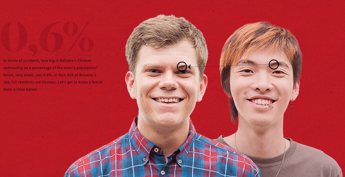
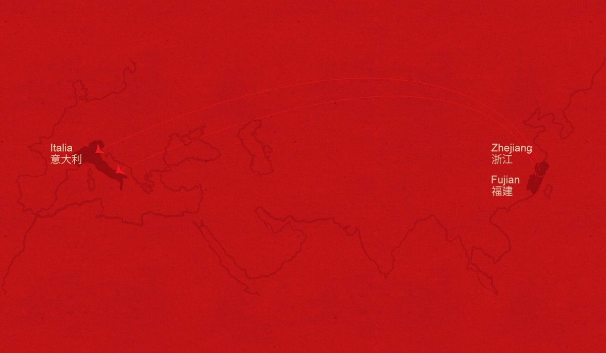
Bolzano is an Italian city close to the border with Austria where some people dress in lederhosen on Sundays. Few people realize that it also has a Chinese immigrant population. We wanted to describe that community. I worked with a newspaper journalist to tell the story of the community because we felt that it was important for people in Bolzano to understand the Chinese community. We did it online and printed it in the paper. On paper it was a long article with a nice picture and some infographics.
How did you want to tell the story of the Chinese community?
We knew we had to structure the narrative into different parts on the page. It was a question of how to structure long-form narration. Every news unit should make sense even if you read it out of order. We wanted to publish in English, too, so the story could be more geared towards an international audience.
Can you describe some of the design elements you brought to the story?
Pictures can create a strong experience with data. A designer that is aware of visual language is important for a project like this. But you must use visuals in an intentional way otherwise you risk adding distortion.
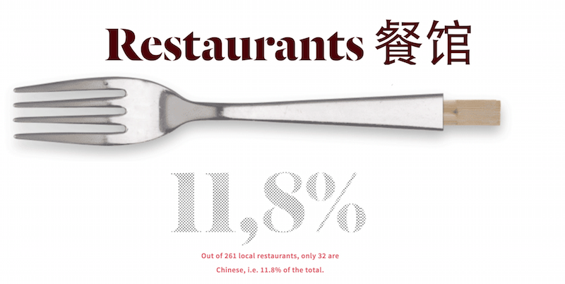
For example, for the restaurants, I could have made a chart with just two bars, one showing 10 percent one showing 90 percent. But I decided to not use bars and use a visual metaphor of the fork and the chopsticks. Using this metaphor makes the chart a little more self-explanatory. You get an idea from skimming over it.
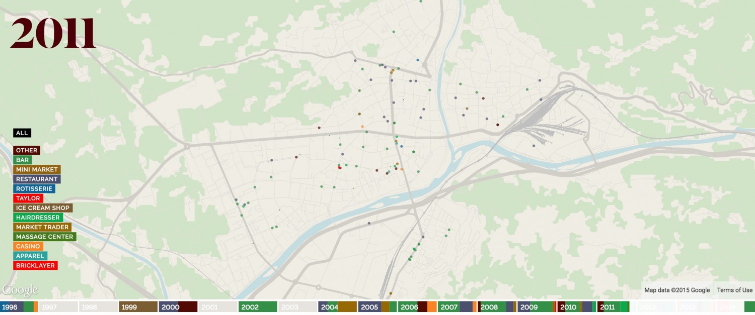
For the interactive map showing the growth of Chinese businesses across time, we tried to go beyond the classic progress bar and had a visualization embedded within it. I collaborated Daniel Graziotin to build these elements with [the Javascript library] D3.
Can you describe this project’s workflow and challenges?
Instead of having the journalist write the article, the designer make a nice infographic, and an anthropologist provide some data, we went for more organic organization. While the journalist is finding the data, the designer is involved in fact-checking and telling the story. The project is not linear. If you change a variable, that means everything has to change in order to keep the story coherent. Everybody has to be conscious of the dynamics.
In terms of challenges, the interview subjects were hard to get stories out of. We needed an anthropologist to help us get the interviews and make the sources comfortable. We decided to film them in a dark room that gives the readers a very intimate space where the subjects reveal topics from Chinese culture.
How do you approach code and what technical challenges have you run into?
I have a passion for code. I’m a super fan of D3 [the Javascript library]. I studied informatics before I moved to design. I was teaching web and motion graphics and now I’m using those things to research visual journalism. One problem with D3 is the [mobile] responsive side of it. I spent a lot of time making this work on iPad, but it’s still a problem for the iPhone. The labels are messed up and the map was scaling too small. Optimizing for the iPhone meant sacrificing some of the project’s interactivity.
What kind of impact did the story have?
A journalist from Der Spiegel published an article on this project and this Chinese community. It wasn’t until Germany paid attention to the project that I got calls from local newspapers in Italy. The Italian newspapers republished the story but many times were plagiarizing directly from it. But, in the end, it opened up a debate in the local community about the Chinese population.
What kind of tools to do you use?
Facebook and Twitter are my tools for discovery. I use Nodebox for generative design and RAW for Sankey diagrams. For most of my designs, I make the sketch in Adobe Illustrator and then we develop everything in D3. Then, with CSS classes on the SVGs [scalable vector graphics] we play to make it look as close as possible to the initial idea.
What’s next?
I’m working on project about refugees now because Libyan and Syrian refugees travel through Italy on their way to Germany. And since Bolzano is on the border with Austria, we want to try to tell the story of the border. For Italians, we can travel across borders like they’re nothing but for refugees the border definitely exists. On the border, there’s this small town of 500 people that currently has 5,000 refugees. It’s a European law that has contributed to this situation. There’s a lot of misinformation out there and we want to provide good information.


Hey, I just wanted to point out that the translation of “Where it all started” in People’s Republic of Bolzano” should be “一切皆有起源“。 It’s missing a “一(yi)”. I didn’t find the author’s email, so I thought posted it here might work 🙂
Thanks Yingchi, I passed along your comment to their translator!