Modeling networked media: Diagrams and graphics in John Wihbey’s The Social Fact
The conceptual black-and-white diagram, or idea-oriented infographic, goes back a long time in publishing design and storytelling. Many an academic or explanatory work has some kind of visual tucked away, illustrating a key concept or general idea. But in our era of multicolored, web-based interactive data visualizations, the art of the austere conceptual diagram is at something of a crossroads.
In April 2019, John Wihbey, who teaches journalism and media innovation in Northeastern’s School of Journalism, published The Social Fact: News and Knowledge in a Networked World (MIT Press), which explores a number of ideas relating to new conceptions of knowledge; misinformation and how people come to know things (particularly through news); and how news and the public interact dynamically to enrich knowledge. It also theorizes how journalism and reporting might be reimagined and practiced in this more networked and connected media environment.
To help understand these complex ideas, the book employs some conceptual diagrams and graphics, working within the constraints of the printed medium to convey networked flows of information. We spoke with Wihbey about his book, his collaborative process for producing graphics, and their meaning. The following is an edited interview:
Let’s start with the network diagram of the priest abuse investigation by the Spotlight team at the Boston Globe. What did you want to get across?
It’s as much a kind of highly stylized flow chart as anything, and it has a recursive dimension. I wanted to provide a vivid example of what I call in the book “networks of recognition,” which I define as dynamic patterns of social connectivity that generate engagement and, ultimately, increase shared public knowledge. The book explores how journalist-public interaction works iteratively – particularly as digital technologies create more dynamic forms of engagement – and can be understood as a networked phenomenon. The priest abuse scandal, as a story, unfolded in ways that help highlight the networked nature of news, with the story expanding and creating a kind of “compound interest” as public knowledge grew.
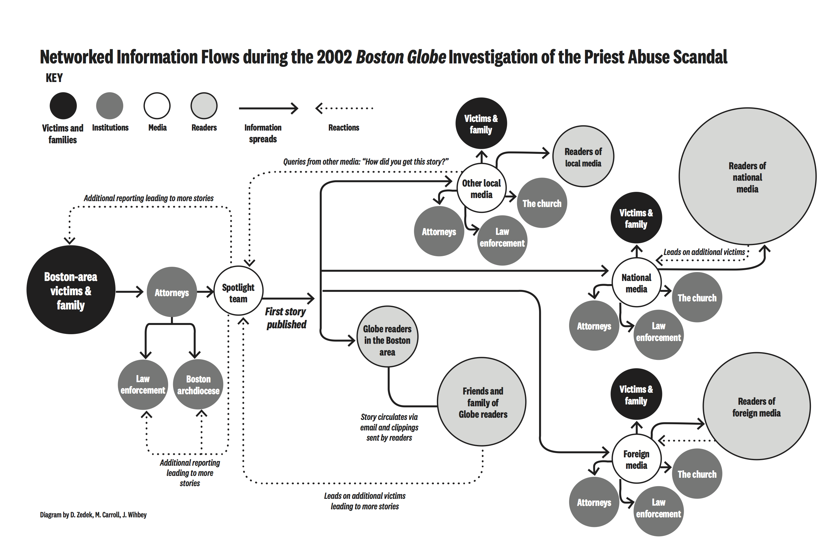
The rise of the web and the wide adoption of email by that time (2001-2002) were key to that story really getting off the ground, as many of the reporters and editors involved attest. It’s an early example of a story benefitting from viral effects enabled by networked technology. Nearly two decades later after publication, this story is still reverberating across the globe in these networked ways, accelerated now by social media and other technologies.
What went into designing that diagram?
I was extraordinarily lucky, as both Matt Carroll and Walter “Robby” Robinson, who were part of that Globe investigative team, are my colleagues at Northeastern, and they helped me design and review concepts. And Dan Zedek, who was running graphics and design for the Globe, is also my colleague on the Northeastern faculty. Dan was instrumental in designing the diagram in the book. He’s an amazing designer. We whiteboarded the concept together. It was a collaborative effort to document the networked public information dynamics around this historically important story. After all, it won the Pulitzer Prize, opened up new cultural space globally for discussions about abuse and power, and ultimately was memorialized in the Oscar-winning film, “Spotlight.” I thought it was worth trying to get a bit more scientific about the information flows that help explain the story’s viral lift and cultural power and resonance.
What did you want to illustrate with the four stages of network graphs relating to the splintering of knowledge in an online environment?
There has been a lot of conversation about how the web or Internet are fueling changes in the way people come to understand the world. I wanted to provide a visual model for what was changing, and how. This graphic anchors a central chapter in the book about online misinformation and how to understand the phenomenon. It’s influenced a lot by the research coming out of Northeastern’s Network Science Institute, where my colleagues David Lazer and Albert-László Barabási really helped me to understand these emerging dynamics.
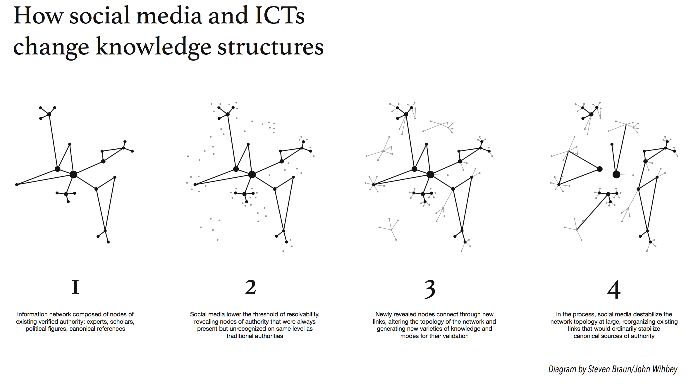
Another Northeastern colleague and friend Steven Braun (who just finished teaching a course at the School of Journalism on coding for digital storytelling) offered to help me work through the idea. Steven and I debated ideas in this area at length and prototyped some different designs and diagrams. This led to the final product, which best captured the phenomenon I was trying to point to. Steven is not only a great visualization expert but someone who himself has been trying to think through how our information environment is changing. So I’m very much in his debt, both for the design and the articulation of the ideas.
What suggestions do you have for journalists or media companies that want to expand the sources and publics they reach?
I think the way that decentralized information networks change knowledge means two things for journalists. First, we need to do more careful listening within these pulsating online networks, which often contain under-recognized voices, conveying experiences and observations that we need to pick up on. Think of how in recent years the water quality crisis in Flint, the effects of police-involved shootings, which spilled into view after Ferguson, or the #metoo movement all were missed by news media. Many stories live in the shadows until networks of recognition bring them into view. Journalists can help accelerate this recognition. Think of all the potential stories that are right now available to journalists, if they will just listen.
Many stories live in the shadows until networks of recognition bring them into view.
Second, however, we need to be very intentional about how we operate within the sea of noise in digital networks, which are full of misinformation and false or manufactured claims and trends. We need to draw on deeper, reliable knowledge, whether through research, science and social science, or systematic data. Here I’d refer to the concept of “knowledge-based journalism” developed by one of my mentors, Tom Patterson, at Harvard’s Shorenstein Center. We need to ground our networked journalism practice in solid evidence. The biggest issue we have now in a world of information abundance is selection; the choices for voices and topics to include, to place in public view, is almost infinite. But what’s really important? What’s a real trend? We have to ground our practice in knowledge to justify our selections.
We found your “guiding principles for journalism in an age of networks” graphic to be a valuable roadmap for journalists today. How did you put that together?
It’s worth stating that no such pattern or model of work is going to apply to all journalists, in all situations. So it’s a deep challenge to come up with a static model, with all of those limitations. The arrows that demonstrate flow are meant to compensate for that. In any case, the graphic is meant to be just a starting point for discussion. For anyone who has done journalism, you know the whole process is frequently messy and fluid, with new information sending you backward sometimes to uncover new ground. There are dead ends all of the time. Rarely is the same method used in stories of any depth. Still, I wanted to model some of the key aspects of reporting practice in an age of digital networks, and I hope it provides some basis for critical reflection. For some of the ideas, I owe a debt here to Nick Lemann, my old teacher at Columbia Journalism School.

That was another graphic that I worked together with my colleague Steven Braun to produce. For me at least, I think it really helps to work collaboratively and prototype on visuals. We went through many iterations on that one, and I’m still thinking it could be improved in many respects.
What do you hope journalists take away from your book and the graphics?
We often talk about the new dynamics of our networked media environment in quite vague and general terms. I think it’s useful to try to pinpoint the new dynamics with some specificity, put language and images to them, and try to generate new models that can help guide both thinking and practice. In a diagram or graphic, we inevitably have to abstract from actual media practice, but such an exercise forces us to think about fundamental principles and their relations.
Note on graphics: From The Social Fact: News and Knowledge in a Networked World by John P. Wihbey, © 2019 by John P. Wihbey. Reprinted by arrangement with the MIT Press, Cambridge, MA. www.mitpress.com.