Some not-so-obvious ways to represent voter turnout data
With voter registration deadlines fast approaching – and some already past – social media has been filled with reminders urging those who are eligible to register and to make sure they vote on November 6. But will Americans turn out?
Voter turnout, of course, is more than just an average for each state. It can be interpreted by demographic, geography and political climate, for example.
Storybench rounded up various visualizations of how voter turnout can be analyzed and visualized, and what this means for the upcoming midterms.
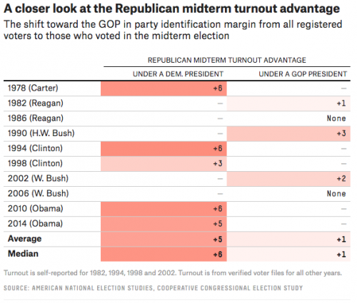
“The Republican midterm turnout advantage”
FiveThirtyEight draws a correlation between voter turnout and the political party of the current president of that time. By looking at the data, we can see that Republicans experience a greater voter turnout when the sitting president is a Democrat. With our current political climate, and intense opposition of President Trump from the Democratic party, we will see in the upcoming midterms whether Democrats behave the same way under a Republican president, and what that means in shaping the 116th United States Congress.
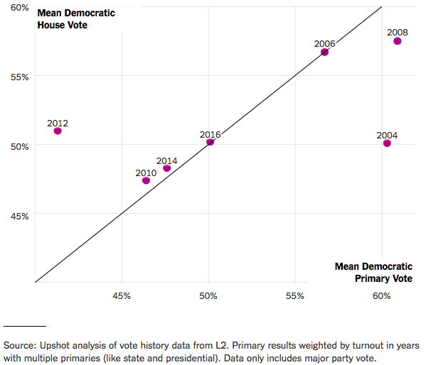
“National Primary Vote Generally Correlates With National House Vote”
The New York Times took another approach. The line graph above illustrates the correlation between the primaries and the general election. Measuring each year by the mean democratic house (y) and primary (x) vote, a correlation line can be drawn at y = x, showing that in some years, the primaries can predict the general election, with 2012 and 2004 as outliers.
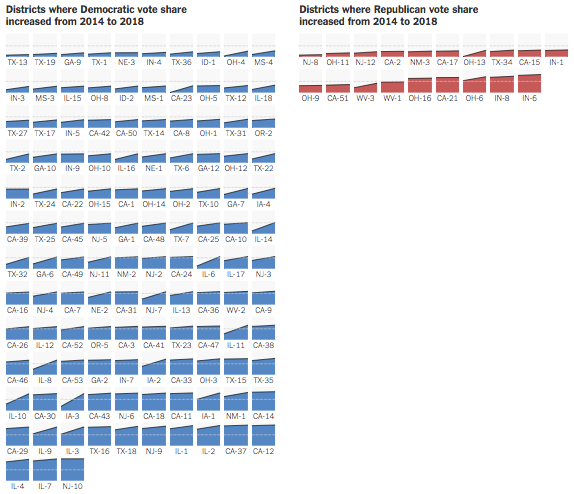
The New York Times also represented voter turnout by looking at it from the district level. These visuals use data of partisan voter turnout within several districts that have shown growth. The difference in the number of districts that showed voter growth between the two parties is very clear. With both the executive and legislative branches of government being controlled by the Republican party, there is more enthusiasm for Democrats to vote in the upcoming midterms.
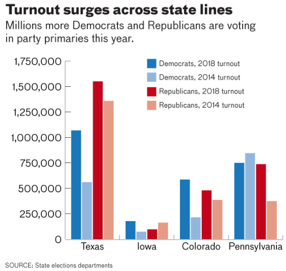
“Turnout surges across state lines”
The Hill decided to look at the data for voter turnout in states that experienced surges in voter turnout from 2014 compared to the 2018 primaries. The data is represented through a bar graph, where we can see voter turnout nearly doubling amongst either Democrats or Republicans. Three of the four states shown are known as swing states, and have shown dramatic increase for Democrats in Iowa and Colorado, and a surge for Republicans in Pennsylvania.
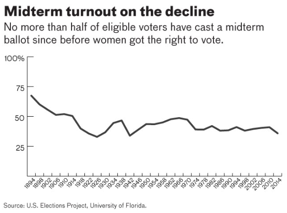
However, though all of these images have illustrated surges in voter turnout fluctuating between the two parties, overall national voter turnout for the midterms has been declining. In the line graph above, we can see that voter turnout for the midterms has been below 50 percent since the ‘70s.
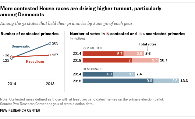
“More contested House races are driving higher turnout”
Pew Research Center decided to look at voter turnout amongst contested and uncontested primaries in 2014 and 2018 by using a line and stacked bar graph. We can see that for uncontested primaries, the figures stay relatively the same between 2014 and 2018 across both parties. For contested primaries, however, the number of votes (in millions) increased from 5.7 to 7.0 for Republicans, and 4.3 to 9.9 (over twice the amount) for Democrats.
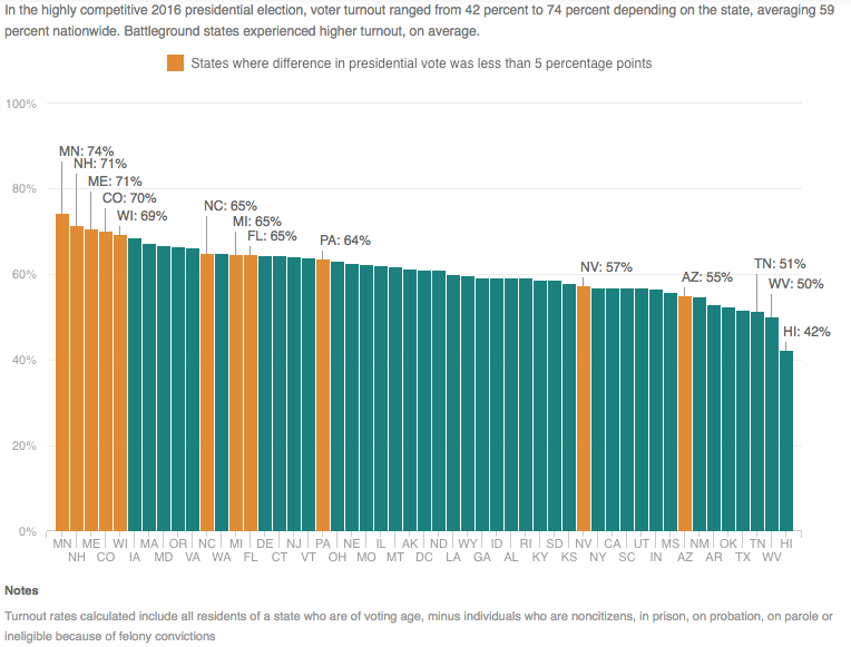
“Election Turnout Varies Significantly State To State”
National Public Radio analyzed the overall averages of voter turnout by state, as well as voter turnout across different demographics and geographical areas. In the bar graph below, the data being represented is voter turnout by state from the 2016 presidential election. The states with the most turnout are swing states, displaying a correlation between the strength of a partisan majority within a state and voter turnout.
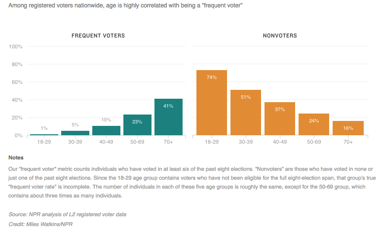
“Older Americans Are Much More Likely To Vote Frequently”
This bar graph illustrates the age distribution among voters and non-voters. Among the frequent voters, people who are 70-plus make up the largest part of the distribution, representing nearly half of it. Among the non-voters, people aged 18-29 are 74 percent of the distribution. Although there appears to be a correlation between age and voter turnout, the 18-29 group have not been able to participate in the other past elections, so their results may not be as accurate. With a new wave and generation of voters for the upcoming midterms, and our current political climate, one might wonder if these statistics will remain as true as they are. Undoubtedly there is a correlation, but perhaps the percentages will begin to level out.
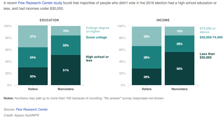
“Education, Economics Defined 2016 Voters And Non-voters”
This representation of voter vs non-voter draws a correlation between education and voter turnout, and income and voter turnout. Although the voter distribution under education and income appear to be evenly distributed, it is important to note that the distribution for non-voters is heavily skewed.
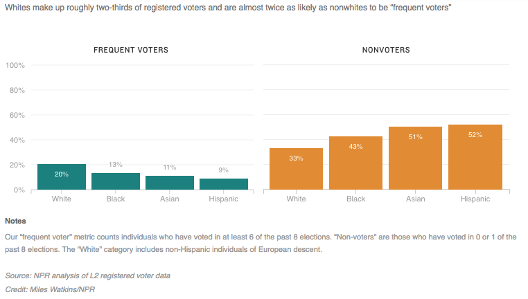
“White Americans Are More Likely Than Minorities To Be ‘Frequent’ Voters”
This bar graph evaluates the distribution between frequent voters and non-voters across racial demographics. In either case, it is clear that white Americans make up more of the voter distribution.
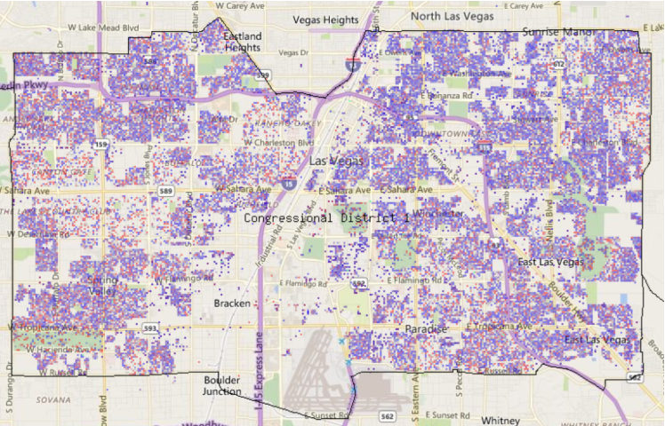
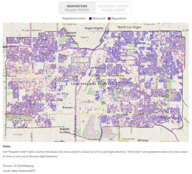
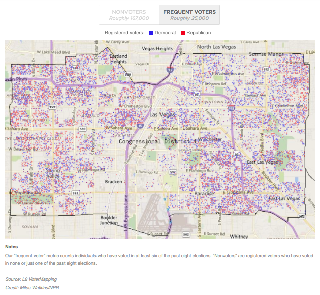
“Las Vegas Is Home To Many Non-voting Democrats”
National Public Radio also represented voter vs. non-voter data geographically. This visual is a map representing the density and spread of partisan non-voters and frequent voters in Las Vegas, Nevada. The non-voters map shows areas of concentration of non-voting democrats. Whereas the frequent voters map illustrates how the voter distribution is more equal and that democrats are more concentrated, while republicans are more spread out.
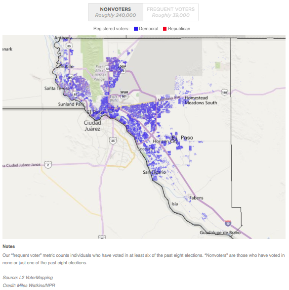
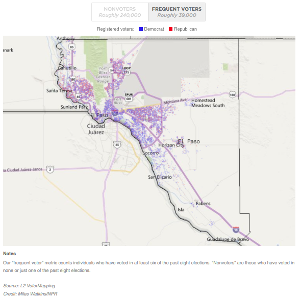
“Over 60 Percent Of El Paso County Voters Sit Out Elections”
This visual map is similar to the previous one. Again, we see high concentrations of democratic non-voters and less concentrated areas of democratic voters. It is important to note that El Paso County, though it is similar to Las Vegas, has an even more drastic distribution of non-voters in its county.
In this political climate, it seems like there’s no excuse not to vote on Nov. 6. We could see surges of Democrats, young people, minorities and those of lower income households coming out to cast their vote. Perhaps this upcoming midterm could begin to change the trends amongst non-voters and drive the rate of voter turnout upwards.
- A roundup of visualizations of discrimination in the tech industry - December 18, 2018
- Some not-so-obvious ways to represent voter turnout data - October 19, 2018