Winter is here: How Vox mapped snow accumulation in the U.S.
The first big snowstorms have hit the East Coast and their effects have fascinated Vox’s developer Soo Oh, who recently built a map to track snow accumulation across the U.S.
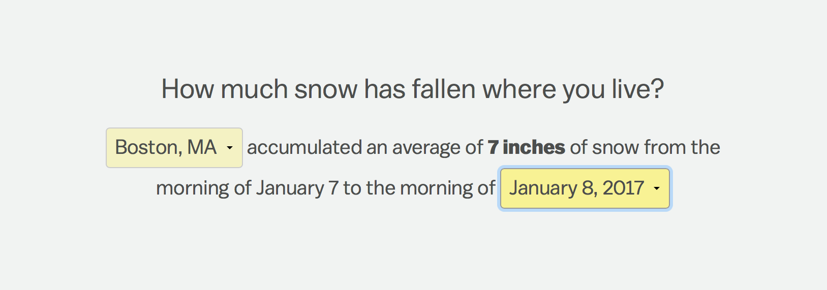
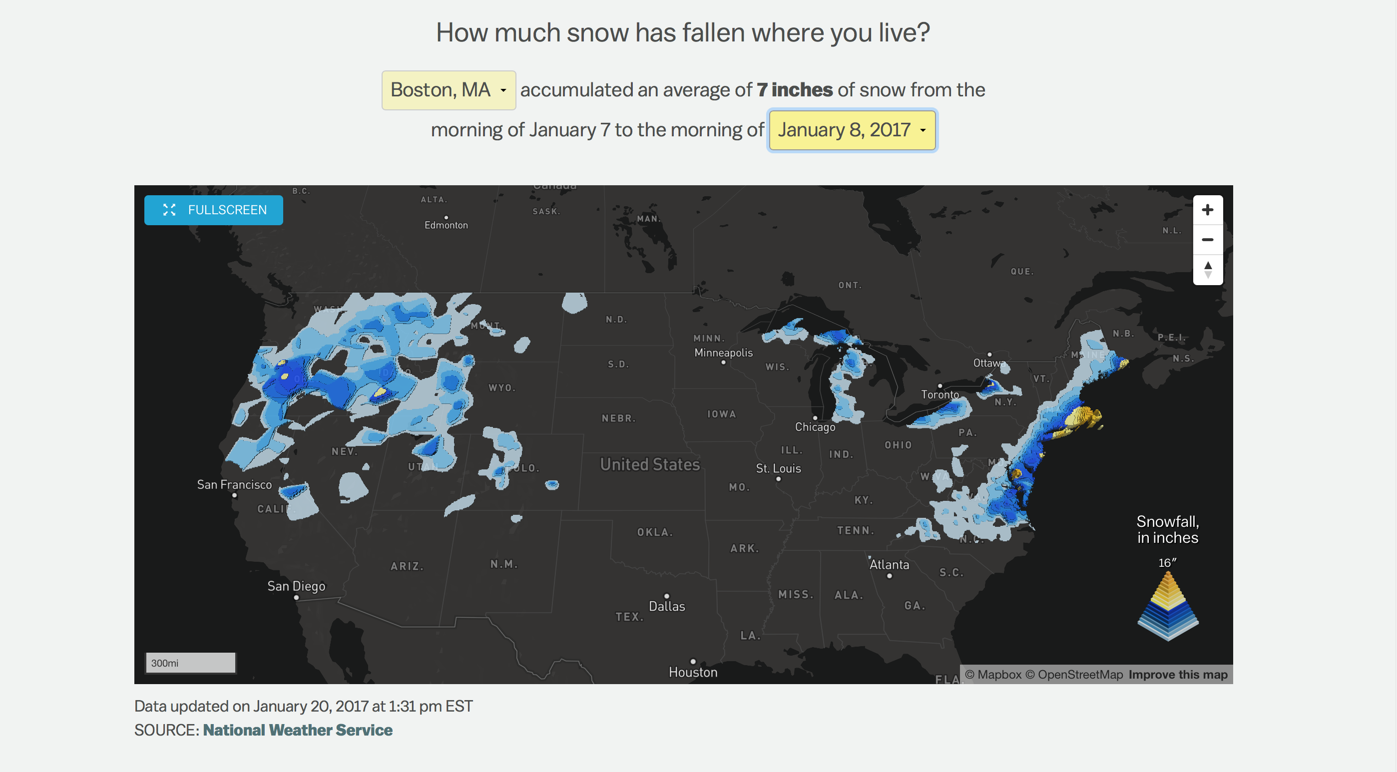
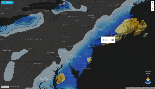
The project relies on data provided by the National Weather Service’s Snowfall Analysis project. Oh developed a Python-based scraper to download the images provided by the NWS and convert them into shapefiles, which can then be superimposed on a map. She then turned to Mapbox to create a 3D visualization showing the amount of snow accumulated over 24 hours in specific locations. The project was first published on the morning of January 8, the Sunday after the biggest Northeast snowstorm so far this winter.
“I’m fascinated by snow,” says Oh, who was raised in Los Angeles and is now based in D.C. as a Vox journalist and programmer. Oh says she had been thinking of building a map like this for over a year. “Mapbox announced the extrusion layer last Fall and when I saw it I knew it was the way I would build this project.”
Storybench spoke to Oh about how the snowfall map was built, the many libraries and resources she used during the process, and her take on how developers are warming up to journalism.
How was the map conceived?
I have been wanting to do this for more than year. In December 2014, we had quite a bit of snow and then again in January 2015. These were big snowstorms. Since then, I have been wanting to build it, but I wasn’t sure how it could be displayed.
How long did it take for you to hack together the whole project and why did it take so long?
I was working on a few other projects too, so it took me about three weeks. I also interviewed someone at the National Weather Service, so that took a little bit of time as well. [What took longer than expected] was the part of the work that wasn’t necessarily writing or coding as much as trying to figure out when the files were being updated, what these files were really telling us, and what the map would exactly show. I wanted to get those details first so I could more competently tell users what they were looking at.
Can you explain how your script works?
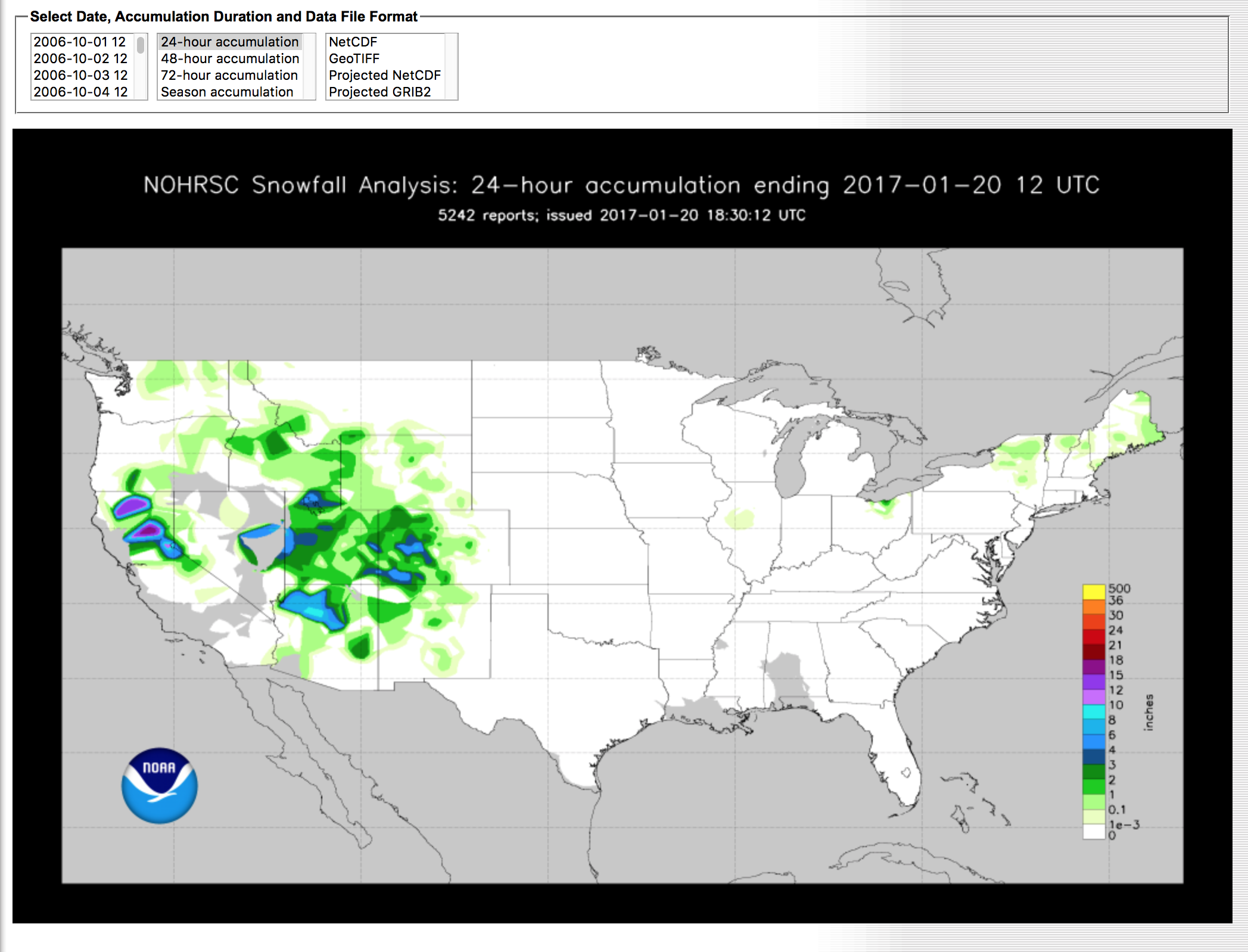
Essentially, I download a geoTIFF from the National Snowfall Analysis page. There is a consistent URL that they use, which is formatted by the date and updated around 7AM ET. It runs twice that hour and checks what time it is, then it scrapes the data for that day. The URL was really easy to figure out: if you go to the source and try downloading the geoTIFF, you can actually see the URL right there. It comes with the year and the month. And as long as you change that day, it will pull up the image file that you want.
I use [the visual library] GDAL to convert the [geoTIFF] image into vector shapes that I can use on a map. The key thing here to know is that the geoTIFF is a raster image, so it is composed of pixels. What I needed for this map was to extrude all these shapes in a Mapbox presentation as vector polygons. Every day it updates for the past 24 hours of snow, so it shows [data] from the morning of the current day to the morning of the previous day.
What is GDAL and its applications on visual projects?
It is a library that comes up often when you are talking about mapping data. I used GDAL quite extensively on a project I did last year, where, by your address, we would tell if that district was ever represented on Congress by a woman. GDAL is a visual library. I’ve heard of GDAL before, but I have never used it in the context of a library. I ended up using a library in Python called pyGDAL, which is a Python-friendly version of GDAL itself. I used the operations often to merge vectors into geoJSON and then convert it to topoJSON. I had to learn pyGDAL a little bit, but luckily there’s a popular cookbook that was super helpful. [The New York Times’] Derek Watkins also has this GDAL cheat sheet.
Tell us about the challenges you ran into while working with this data.
When you first go to the page, it geolocates where you are. Vox Media has a geolocation service, so when you log on with your browser it will get your IP [address] and stipulate what it thinks your coordinates are. One thing that was difficult is that there are lots of holes in the data.
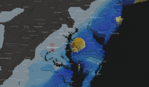
One of my friends lives in Astoria, which is in Queens, N.Y. If you zoom in all the way to New York, you can see that there are these weird holes because this came from an image that is pixelated. The Hudson River surrounds it, so the image thinks that this section is water. My friend was trying this out and it kept saying that there was no snow. What I did to solve this was querying 2.5 miles north, east, south and west and searching if any of those five points landed on any polygons. I had to make sure that everybody would get data because I can’t just ignore everybody who lives in Astoria.
The model is estimated into a 2.5 square miles grid in the US, but they don’t have stations everywhere, so it is not a perfect grid. It is and estimated average, so I felt comfortable using that as my parameter. If you look in D.C., there’s also this area where the image think it is water, the Potomac. It renders weird because this pixel wasn’t filled out in the geoTIFF. When I talked to my source at the NWS, he mentioned that he might provide polygons in the future, which will be great so that way I won’t have to go through the process of converting these into shapes.
Another issue was that I did have to simplify a little bit, because the file was a very large geoJSON object. So I converted it into topoJSON, but with really minimal simplifications. By converting from geoJSON to topoJSON, I cut the file size by a half or two-thirds. I had to make that decision because of the libraries. The Mapbox geo-library to use the extrusions were quite large, so I really wanted to make the file size as small as I could.
How did you set up the server for this map?
We had previously been using [the cloud-based web application server] Heroku and some other ways so that we didn’t need to bother our ops team. Ryan Mark, editorial engineering director at Vox Media, has the keys and permissions to ask our ops teams for servers and other things. He ended up helping with us setting up a server because it would be really hard to work on this as a Heroku project. We needed something that had GDAL installed in the whole system and it was such a particular setup that couldn’t be installed virtually. He also helped moving the scraper that I wrote onto the server, and showed me the right ways to do it.
I did this map a while back, called Where is the Midwest? He is the one who helped set up the database for that one so we could give back instant results, and in that situation, he wrote code for this API reroute to receive the results, collect them in the database and spit back results.
Why did you decide to use Mapbox for this project and not another resource?
Mapbox has this extrusion layer that was announced last Fall. It was just so cool and just stunning. They debuted these two projects in the same newsletter: on altitude variation for this marathon on an island, and on restaurant complaints on New York City. When I looked at them I knew that this was exactly how I was going to make the snow map.
I had other ideas for a 3D snow map, but they all involved me having to learn new libraries, which I think could have been done, but this saved me time. I didn’t have to learn Three.js to make this happen.
When and how did you start coding?
I started coding about four years ago, when I took my first programming class at a local community college. I was working at the L.A. Times as a web producer and I was getting bored at that or a needed a bigger challenge. I started taking this programming class for C++.
I wasn’t even sure if I liked it and it wasn’t a game-changer. This was something that I realized I could come every day into work and do. I just enjoyed it more sitting down at my desk and working on this stuff. It still took a while for my company to put me in a position where I could do it more, and it just kinda kept going organically. I came to D.C. when I got hired for a position where I could be able to program and design full-time.
I feel very lucky to be doing what I am doing. What I think was important for me to discover was that every day I could sit down and not get bored with what I was doing. I knew I liked the coding part. Discovering that was really helpful because it meant it was my choice to be in journalism and be working in service of the people and truth. When I was a web producer, I didn’t enjoy it as much and it made me wonder if I might even not be cut out for journalism.
What advice can you offer aspiring digital journalists?
In terms of what I see happening in our field, I think we are going to see a lot more people who are going to report more. I think there was a time when a developer could just design and develop, and I think that will change a little bit more. I think that the industry is going to want more people who are also able to report and call sources. News organizations have always wanted those kinds of skill sets. Every reporter and journalist should have writing and reporting skill sets, too.
One really big piece of advice is: Don’t be afraid to ask questions about stuff.
This is an issue with programming, but I feel this is very true in every field: if you don’t have that kind of help, you need to move into positions where you can get it. If you are in a job where management cannot support you, then you need to start looking at other places. Or if you are the most technically competent person in your very small town newspaper, and you just can’t grow—you are going to have to find someone outside the newsroom or you are going to have to change newsrooms. It is not a bad thing to start looking around. It doesn’t even have to be a change of jobs. You can try to find a local hacker group.
- SXSW: ‘Excel is okay’ and other tweet-size insights for data journalists and news nerds - March 17, 2018
- NICAR: Data stories from last year that you could be doing in your newsroom - March 13, 2018
- How to scrape Reddit with Python - March 12, 2018