November 19, 2015April 12, 2016 by John Wihbey How journalism students warmed up to data visualization tools Plot.ly and CartoDB Recently
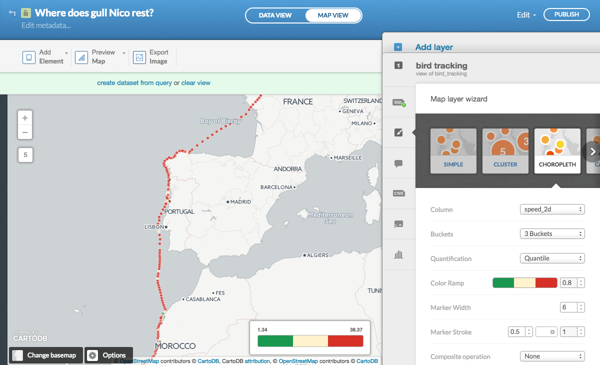
January 12, 2015August 10, 2015 by Aleszu Bajak How to use CartoDB instead of Adobe Illustrator for rapid mapping
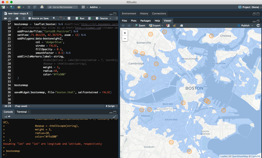
December 20, 2018December 20, 2018 by Aleszu Bajak How to map point data and polygon shapefiles in R I
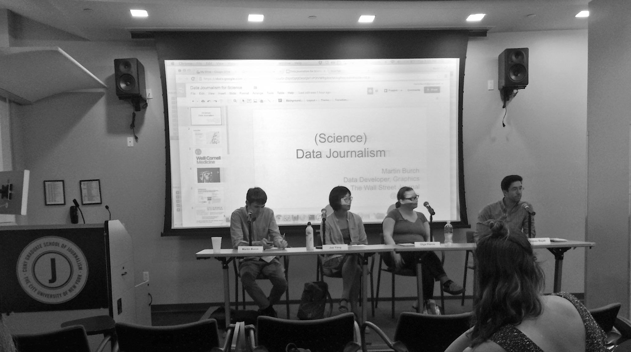
Credit: Jesenia De Moya Correa. August 16, 2016August 17, 2016 by Andreas von Bubnoff How to get started in data journalism: Takeaways from a panel at CUNY Want
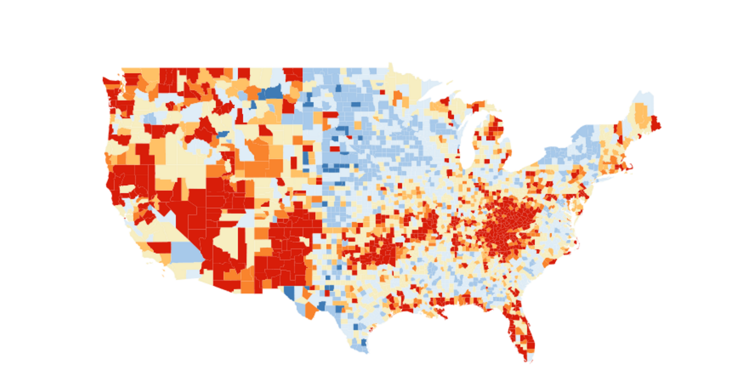
May 12, 2016May 15, 2016 by Aleszu Bajak How to build an interactive county level map like the New York Times The
April 26, 2016May 15, 2016 by Maria Crosas Panama Papers insights and more: Five data journalism workshops you missed in Helsinki News
The Build the News hackathon in London last weekend. Photo: Maria Crosas March 25, 2016April 12, 2016 by Alli Shultes and Maria Crosas Nine digital storytelling projects from last weekend’s Build the News hackathon Journalists Alli
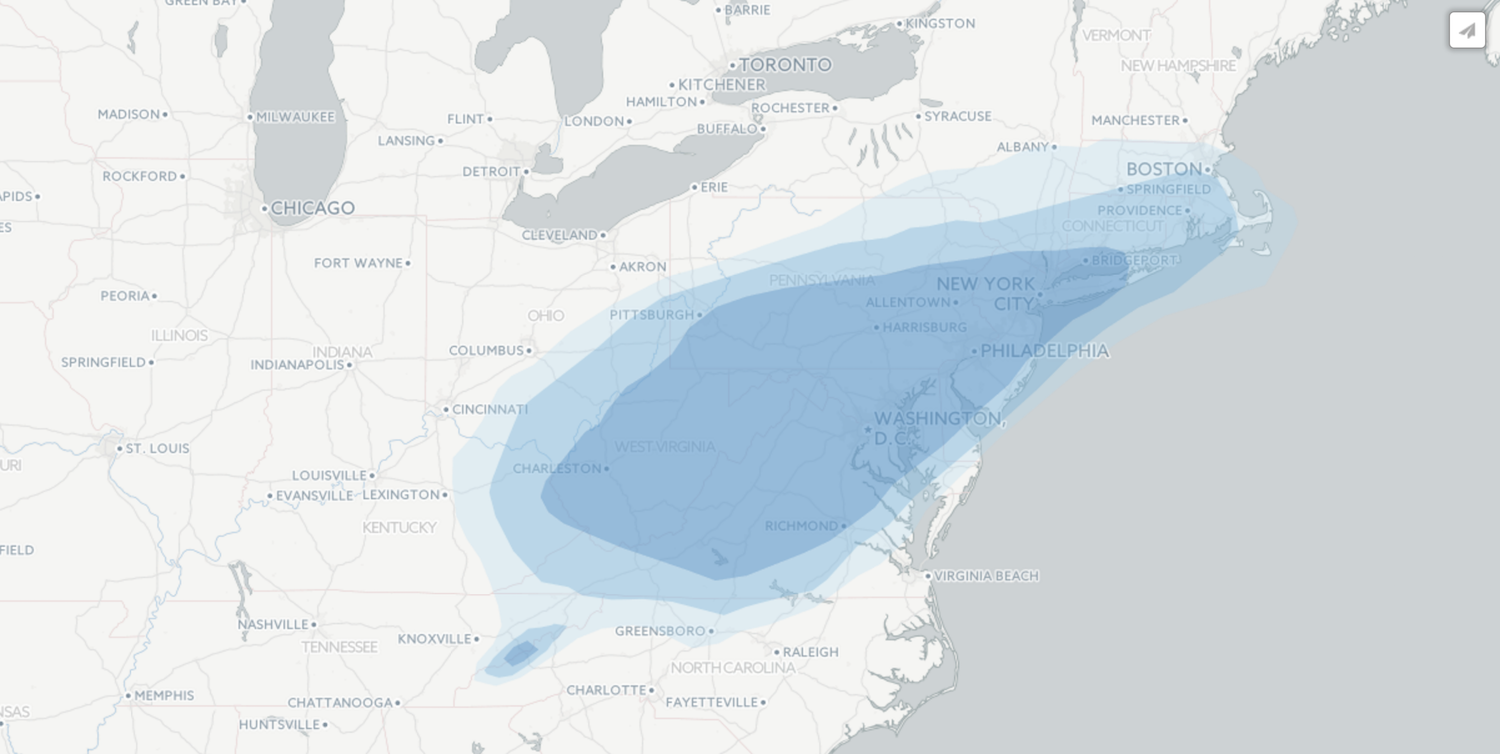
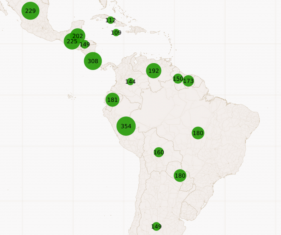
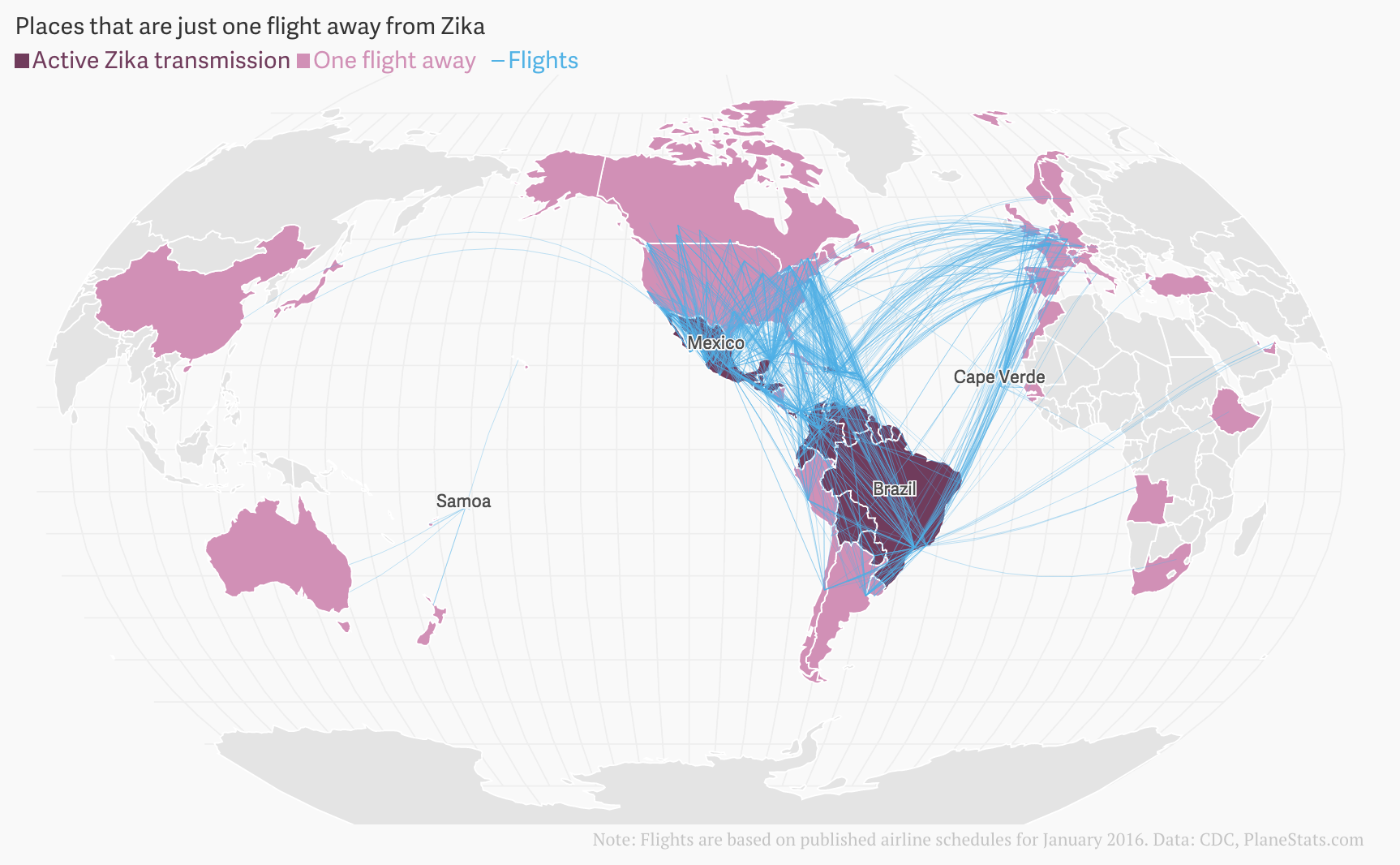
February 21, 2016April 26, 2017 by Margaux Phares The spread of Zika virus: A roundup of visualizations News
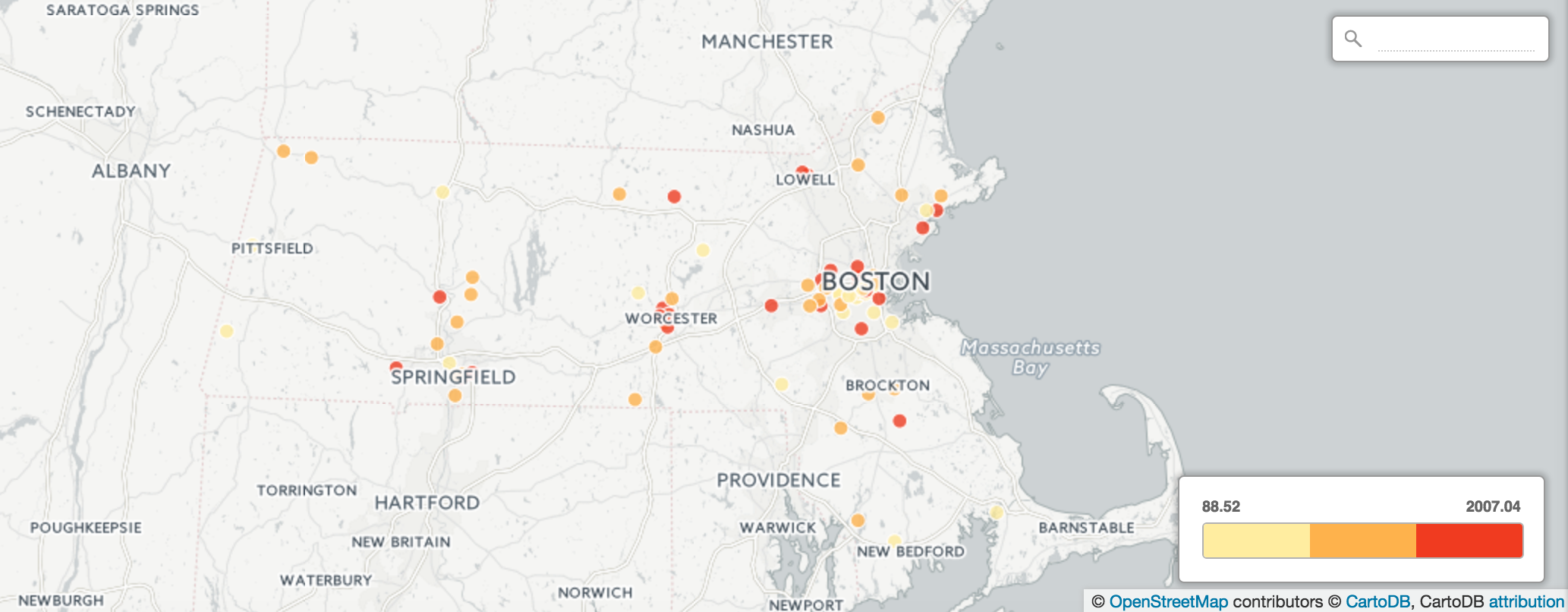
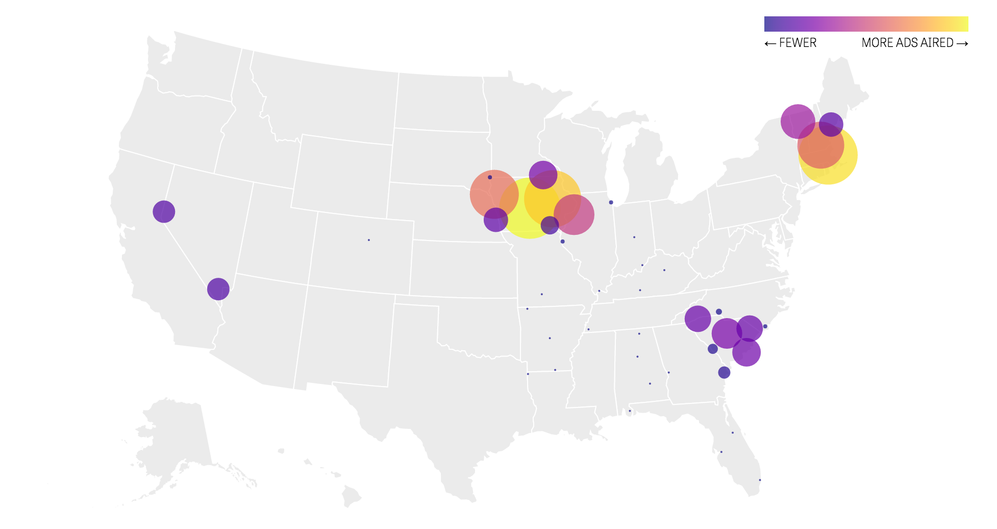
February 15, 2016April 12, 2016 by Margaux Phares How the Center for Public Integrity is tracking TV ads in the 2016 presidential race Last
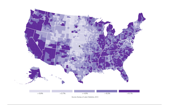
August 20, 2015August 20, 2015 by Sarah Frostenson One Way to Give a National Map Geographical Detail With
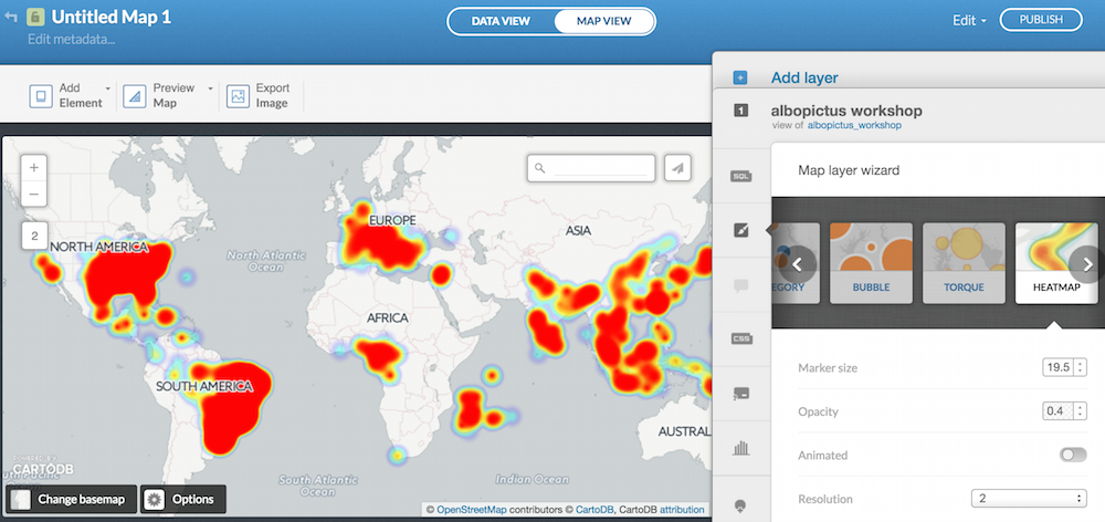
August 7, 2015August 7, 2015 by Aleszu Bajak Using BuzzFeed’s listicle format to tell stories with maps and charts “I