
How to learn responsive web design by coding your own story
Say you have a great story with text, pullquotes and photos ready to go and now you want to throw it up on its own website. All you need is some basic HTML and CSS knowledge. By the end of the following tutorial, you will know how to build a standalone website that can hold an article, a photo essay, a story packed with multimedia, or your own personal website.
You will leave knowing how to build a fully responsive website, meaning it will work well on most any desktop, tablet and mobile device. Why standalone? Free from the bounds of a CMS like WordPress or Méthode, a standalone page can host fancy dynamic content like parallax images, auto-playing videos and funky rollover effects. Some examples of news organizations building standalone pages for articles or projects: Mashable’s Eyewitness to Hell, The New York Times’s Norway the Slow Way, and The Baltimore Sun’s Undue Force.
Selecting a framework
To layout an article, it helps to have a grid and a system to organize all your interconnected elements. In web design, this is called a framework. These frameworks are packages that structure your HTML, your CSS and other related elements like Javascript documents. Some frameworks you may have heard of: Bootstrap, Foundation, Groundwork, Gumby, and Skeleton.
All of these frameworks are responsive (mobile-friendly) and include similar basic elements like a grid (so you can create columns, for example), typography (font and heading sizes), and user interface elements like buttons, tabs, lists and tables. Scroll through the documentation on these frameworks to see the elements they include.
Skeleton is one of the most bare bones responsive frameworks out there. It’s one of the easiest to use because it doesn’t include fancy add-ons. We’ll use Skeleton for this tutorial. Read through the Skeleton documentation to understand the features it includes: a 12-column grid, simple typography with the Raleway font, and nicely styled tables, buttons and forms.
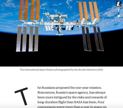
Here’s an example of a landing page built with Skeleton. I used Skeleton to build a standalone webpage for the Esquire story Away by Chris Jones about an astronaut’s year aboard the International Space Station.
Codepen: A coder’s sandbox
Throughout this tutorial, you can check your work against mine using this Codepen. Codepen bills itself as “a playground for the front end side of the web,” and you can troubleshoot bugs and look at how HTML, CSS and Javascript all work together live on the Internet without a server. Need to host an image somewhere? Try uploading one to imgur and then copying it into your code.
See the Pen doBwPq by Al Baj (@aleszu) on CodePen.
Opening up your framework in a text editor
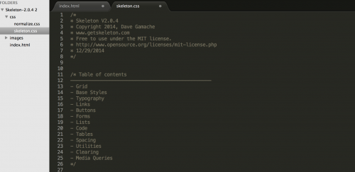
Download Skeleton (all 23KB of it; 8KB zipped), unzip it and open up the entire folder in a text editor like Sublime Text 2. This is what the index.html page looks like:
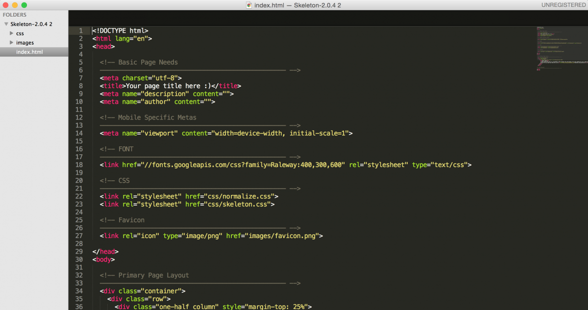
Adding title and metadata to your <head>
Notice that Skeleton has scaffolded your HTML for you. Take a look around and try to understand what all is being laid out in the <head> of your index.html page. Start by adding your title, description and author. You can add a favicon, too, which is that little logo that shows up in your browser tab.
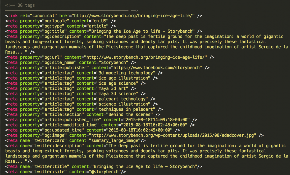
For social media optimization, it’s important to add metadata in the form of Open Graph tags. Read the Storybench tutorial here to understand how and why to add them. Notice I’ve added the OG tags comment by starting with <!– and ending with –>. More on “commenting out” below.
Adding content to the <body>
Now for your story. Scroll down to the <body> tag and notice the head section has been closed using the </head> tag. Below <body> you’ll notice that Skeleton has already set up an <h4> header and some text within <p>. This text currently sits within a <div> with classes one-half and column and a margin of 25% on the top (defined in style). That <div> resides within the row <div> which itself resides within the container <div>.
I am going to start adding my title between the <h4> and </h4> tag and my text to the inner-most <div>. Because I want it to centered on the grid, I will remove the one-half class. Notice, I have reduced the margin to 5%.
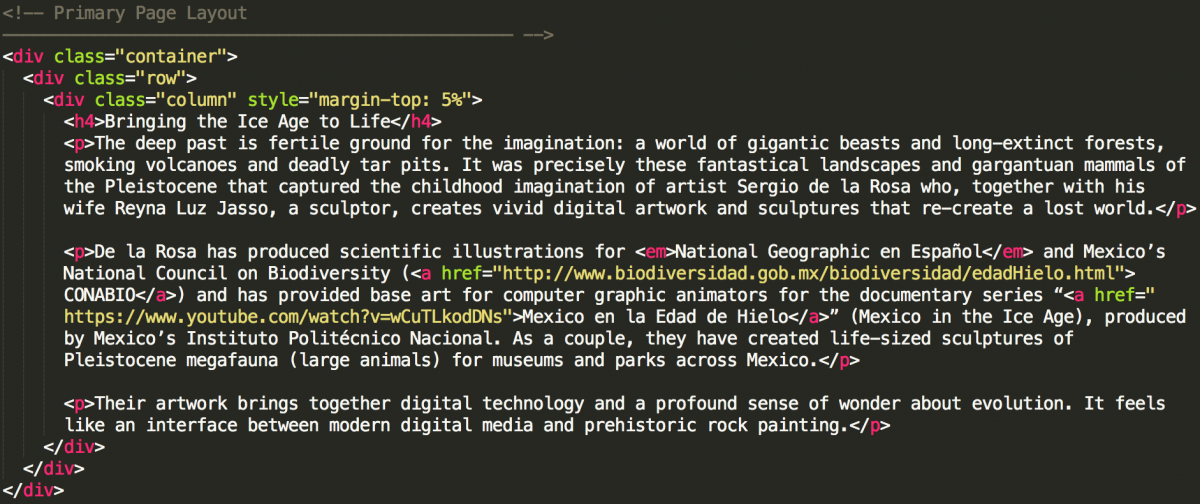
Add the rest of your text (make sure each graf starts with <p> and ends with </p>), hyperlinks (<a href=”mylinkhere”>), italics (<em>italicized text here</em>), and headings (h1, h2, h3, h4, h5 or h6).
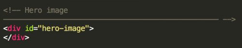
Adding a hero image <div>
You’ll probably want a full-bleed image that takes up the whole viewport to introduce the story. These days, they’re all the rage and they’re called hero images. Do that by adding a <div> above your article text. Add the id tag hero-image to your new <div>. Notice the difference between id tags and class tags.
Adding custom CSS
To tell this <div> where to find the image it will display, you’ll have to navigate over to the skeleton.css file. You’ll see that Skeleton has a nicely organized list at the top of its css file.
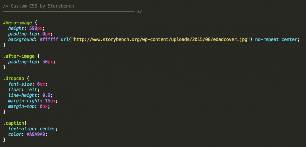
Start a new entry at the top of this list and name it Custom CSS by Storybench or something truly descriptive. [inlinetweet prefix=”” tweeter=”” suffix=”says @storybench”]Coding can get confusing later on if you haven’t documented your steps well.[/inlinetweet]
Next, scroll down, and add a new heading above /* Grid. The reason your heading begins with /* and ends with */ is so that it won’t be read by the browser when it’s crawling through the CSS trying to find elements to display on your page. [inlinetweet prefix=”” tweeter=”” suffix=”says @storybench”]This is called “commenting out” and you can do it to organize a long script[/inlinetweet] or to silence pieces of code when trying things out.
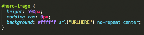
Since you attached a unique id to your hero image <div>, you can reference the id in the CSS by calling it with #hero-image. (Notice class tags are referenced with periods and id tags are referenced with hashtags). It’s important to designate the height of your hero image and its URL. See my HTML here and CSS here. See the full working website here.
Notice I’ve designed my hero image with mobile in mind. By laying out my Ice Age animal in a grid, the center column will show on mobile. There are other workarounds for this issue. One workaround is changing the image that the #hero-image points to when the site is opened on a mobile screen. See “media queries” below.
While I’m at it, I am going to add some other custom CSS to style my dropcaps, my image captions, and to add some spacing after my images. I’ve named these .after-image, .dropcap, and .caption. Feel free to play around with the styling on these.
Adding pullquotes
Scroll down to the place within the text where you want to add a pullquote. Add a new <div> with three classes: one-half, column, and u-pull-right. These will make sure the width of the pullquote is half of the grid and that it is floated to the right of the text. Next, paste in your pullquote between the <h3> tags. Repeat for all pullquotes.
Adding photos and captions
To add a single, centered photo in Skeleton, make sure it lies within a <div> with class row and give your image <img> the class column. To add a caption, I created a <div> with class caption. Recall that in my custom CSS I added some caption styling that centered the caption and changed its color to grey.
To add two images side-by-side, make sure they reside within a <div> with class row. Then, place each image inside a <div> with classes one-half and column. Call your image with <img> and make sure you add a u-max-full-width class. Add your caption in its own <div> with class caption.
Adding a dropcap and cleaning up your image spacing
After adding the title, author name and date, I realized I wanted a little more spacing before the first graf. So I added a class after-image that I could also reuse for similar spacing problems that occurred further down after images. In the custom CSS I simply add a padding-top of 50px to create 50 pixels worth of spacing.
To add a dropcap, I simply add the class dropcap to a <span> tag that surrounds the first letter of my first graf. I’ve already styled the dropcap in my custom CSS.
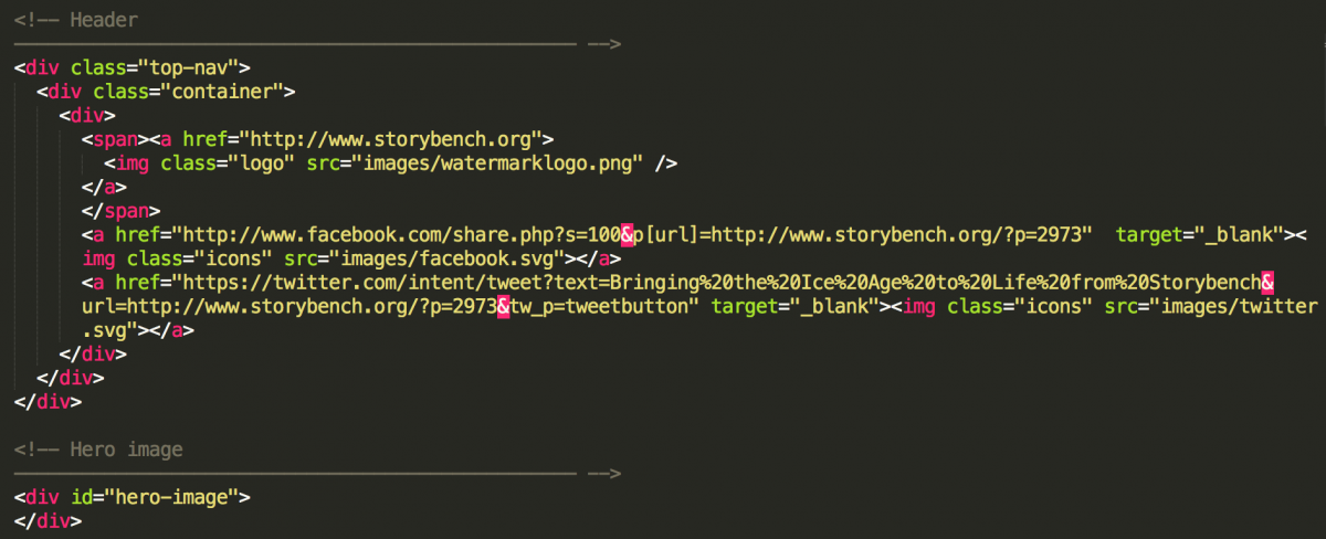
Adding a top navigation bar and share buttons
To add a top nav, it’s best to think of which elements you want to have and how they will be floated. In this case, I have a Storybench logo (watermarklogo.png) with a class logo and a Facebook button (facebook.svg) and a Twitter button (twitter.svg), each with the class icons. Notice how the social media button links are styled so that they communicate at the very least the URL of the story I’m sharing.
Notice that within the top-nav <div> is my container <div>. I’ve done this because Skeleton’s container <div> is 80% wide. I want my top-nav to reside outside of the 80% container <div> because I want my top navigation bar to take up the entire width of the viewport. It will have a nice white background.
To style my top navigation bar, I call my top-nav, logo and icons classes in the custom CSS. I want my top-nav to be 50 pixels tall, 100% wide (so as to be full-bleed), and have a white background. So that it floats above every other element on the page, I add a z-index of 100 (anything above 1 would do). So that it’s fixed as I scroll down the page, I add position: fixed;.
To style my logo, I designate its height as 45px and the padding on the top as 3px. (Notice that padding has four numbers that can be changed. These are the top, right, bottom and left padding, in that order.)
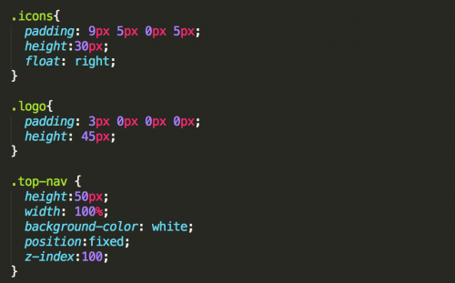
To style and center my social media icons, I add padding and height to my icons class. Finally, I float them to the right of the navigation bar.
Saving your HTML and CSS files and uploading via FTP
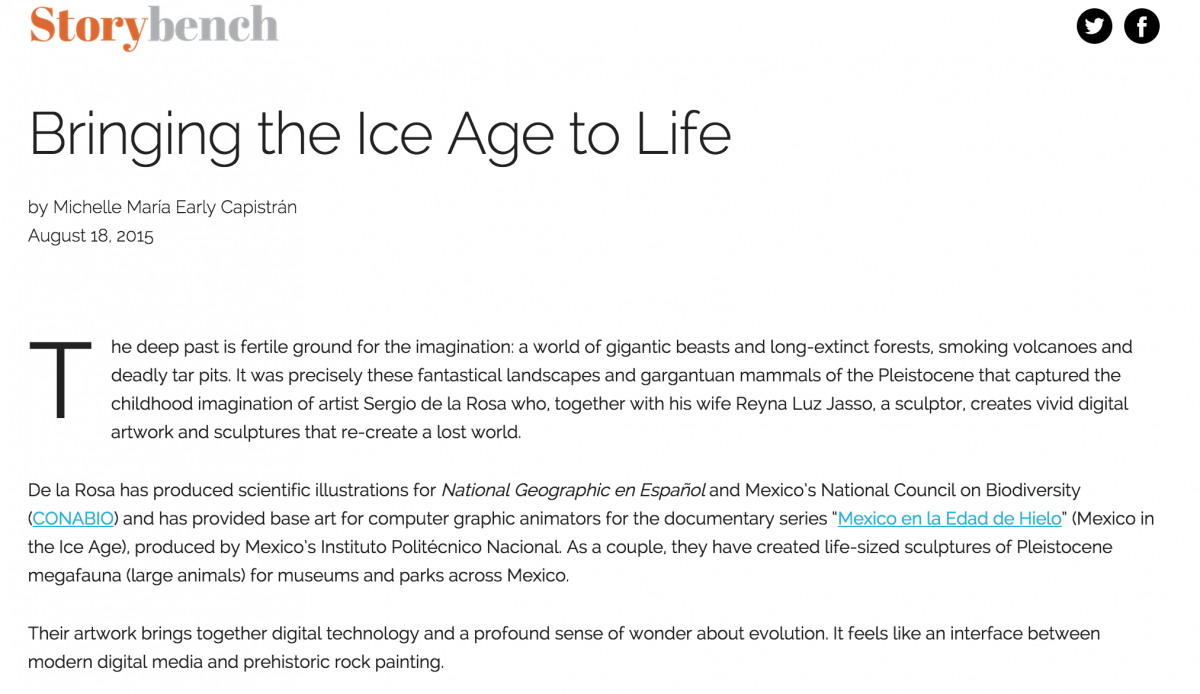
As you’re developing your Skeleton webpage, you can check on your progress by opening the index.html in your browser. Once everything looks ready to go, upload it to your server via FTP (I recommend FileZilla) and then go see it live. Make sure to maintain folder structure and file names. This “Bringing the Ice Age to Life” story, written by Michelle María Early Capistrán for Storybench, is now live here.
Using media queries for mobile
All the Skeleton code we’ve used is mobile-friendly, so you shouldn’t have any issues when opening this site on a mobile device or tablet. But if you do want to alter an element’s style or behavior for mobile, there are things called media queries in the CSS that can be altered for specific scenarios.
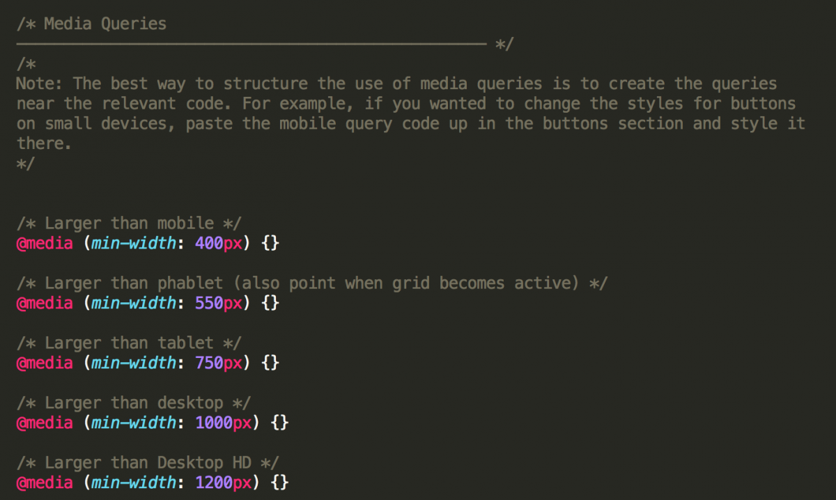
For example, say I want my pullquote font to appear smaller and to align right on a mobile device. I could add the following a media query in my custom CSS:
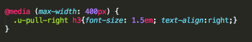
Because my pullquotes reside within <h3> tags which themselves reside within a <div> with class u-pull-right, this styling will apply to my pullquotes on devices with a viewport with a maximum width of 400 pixels. Fun, right? Media queries can get very confusing very quickly, so take notes.
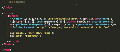
Adding your Google Analytics or other tracking codes
You’ll probably want to track the traffic coming to your article or webpage, so be sure to include an analytics code in the footer. Services like Google Analytics, Parse.ly, Chartbeat, and others have simple instructions for pasting in the Javascript that handles the tracking.
Testing your webpage on mobile, tablets and across browsers
It’s incredibly important to test your site across all major browsers, tablet screens and mobile devices. I’ve been seconds away from deploying when I’ve noticed a Firefox bug and had to rework the code.
While designing and styling new elements, I usually test for mobile by collapsing the size of my browser to mimic a tablet or mobile device viewport. The developer tools in Chrome and Firefox are highly recommended, too.
If you run into any problems, try StackOverflow or contact me on Twitter at @storybench or @aleszubajak.
Let us know what you build! Happy coding!


very informative articles or reviews at this time.
It is in reality a nice and helpful piece of info.
I’m glad that you simply shared this useful info with us.
Please stay us informed like this. Thanks for sharing.