Exploring climate data using the Python libraries Matplotlib and Pandas
If you’ve just grabbed a new dataset and you want to look for interesting trends, making some exploratory graphs in Jupyter Notebook is a good way to start. I usually explore data in R Studio, but I wanted to become more familiar with the analysis and graphing capabilities of two Python libraries: Matplotlib and Pandas. This tutorial describes three simple graphs that I learned how to make: line graphs, histograms, and scatter plots.
Downloading the data
First I needed some data to play with, so I downloaded the average annual temperatures for each state in the lower 48 from 1895 to 2019. The Washington Post used these data for their Pulitzer Prize-winning series, “2°C: Beyond the Limit,” and they’ve made their raw files available through github. I grabbed the file called /data/processed/climdiv_state_year.csv.
Importing data and getting started
I started by loading the following Python libraries in Jupyter Notebook. If you’re not set up with Jupyter Notebook, or haven’t installed these libraries, I recommend using the Anaconda distribution to do so.
import pandas as pd
import matplotlib.pyplot as plt
import numpy as np
%matplotlib inline
Then I imported the temperature data into a Pandas dataframe and called it “temps.”
temps = pd.read_csv("/path/to/climate_graphs/temp_by_state.csv")
Line graphs
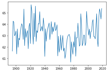
Next, I used the state with ‘fips’ code number 1 (Alabama) as a test case and made a line graph of the average temperature in this state from 1895 to 2019 (the years represented in the data set). I used the plot function from Matplotlib for this.
plt.plot(temps.loc[temps['fips'] == 1]['year'],
         temps.loc[temps['fips'] == 1]['temp'])
This produced a clean, legible graph, so I tried scaling up! Next, I plotted the average annual temperatures for each state, with each represented by its own line. Using a for loop to iterate through each fips code let me put all these graphs on one set of axes. (Note that the fips codes range from 0 to 78, even though there are only 48 states.)
for x in range(0, 78):
    plt.plot(temps.loc[temps['fips'] == x]['year'],
             temps.loc[temps['fips'] == x]['temp'])
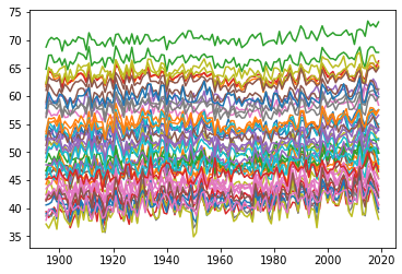
This would make a lovely pattern to knit into a blanket, but it’s too cluttered to be informative.
Instead, I imported the Washington Post’s calculation of average national temperature, and plotted it in blue, with the trends for each state behind in light gray.
## import national average temperatures
nat_av = pd.read_csv("/path/to/national_average.csv")
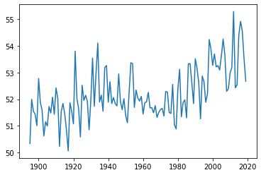
I quickly took a look at these data with a line graph, just like the ones we’ve been making.
plt.plot(nat_av['year'], nat_av['temp'])
Then I combined the national average with the state-level line graphs. I used a for loop to iterate through all the states, then I used a separate plot command outside the loop to add the national average.
for x in range(0, 78):
    plt.plot(temps.loc[temps['fips'] == x]['year'],
             temps.loc[temps['fips'] == x]['temp'], color = '0.8')
plt.plot(nat_av['year'], nat_av['temp'])
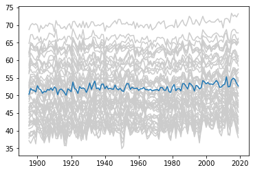
While the national-level data alone shows a pretty clear uptick in temperature from 2000 onwards, extending the range of the y-axis to accommodate the state-level data makes this trend hard to see.
Histograms
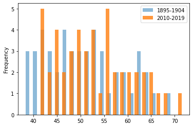
As an alternative to line graphs, I calculated the average temperature for each state over the first ten years and last ten years represented in the data, then drew histograms of these two temperature sets.
## select the first 10 years of temperatures and put them in a
## dataframe called ‘early.’
early = temps[temps['year'].between(1894, 1905, inclusive=False)]
The groupby function from Pandas is a convenient way to find the mean temperature for the first 10 years.
early_av = early.groupby('fips')['temp'].mean()

## do the same for the last 10 years and call this dataframe ‘late’.
late = temps[temps['year'].between(2009, 2020, inclusive=False)]
late_av = late.groupby('fips')['temp'].mean()
Now for some graphs! I used the plot.hist command from Pandas.
## first plot the averages for the first 10 years in blue
early_av.plot.hist(bins = 20, histtype = 'bar', alpha = 0.5,
                   rwidth = 0.5, label = "1895-1904")

## then plot the averages for the last 10 years in orange
late_av.plot.hist(bins = 20, histtype = 'bar', alpha = 0.8,
                  rwidth = 0.5, label = "2010-2019")

## then add a legend
plt.legend()
Scatter plots
My histograms suggested that temperatures are shifting upwards in general, but they didn’t allow me to compare how temperatures have changed for individual states. I decided to plot the early and late average temperatures for each state on a scatter plot instead.
First, I combined the early and late average temperatures into one dataframe called early_late using the concat command from Pandas.
early_late = pd.concat([early_av.rename('early_temp'),
                        late_av.rename('late_temp')], axis = 1)
Then I used the plot.scatter command from Pandas to plot early versus late temperature.
sc = early_late.plot.scatter(x="early_temp", y="late_temp")
Finally, I added a green y = x trendline running from (30 , 30) to (75, 75).
sc.plot((30, 75), (30, 75), linestyle='-', color='green', lw=3,
   scalex=False, scaley=False)
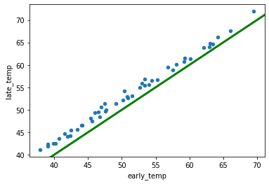
If the blue dots fell on the green line, that would mean that each state’s temperature had stayed the same. Instead, the blue dots are all slightly above the green line, indicating that every state’s average annual temperature has risen slightly over the last century.
Although R Studio will always have a special place in my heart, Python gave me an easy way to make attractive graphs, and I can definitely see myself returning to it in the future. I think the graphs produced by Matplotlib look cleaner than those produced by base-R, and the syntax of Matplotlib isn’t as obtuse as the syntax of the R graphing package ggplot.


It is good, but I have one questions. How to downloading Climate data both fifth and sixth assessments?
hi, Mrs. Saima Sidik:
It is a very good tutorial. Thank you very much for your posting!
I tested your python codes and encountered one “ValueError”(see the message below). As the result the “Histogram” was not generated.
————————————–
ValueError Traceback (most recent call last)
Cell In[57], line 36
31 plt.plot(nat_av[‘year’], nat_av[‘temp’])
34 ## select the first 10 years of temperatures and put them in a
35 ## dataframe called ‘early.’
—> 36 early = temps[temps[‘year’].between(1894,1905,inclusive=False)]
38 early_av = early.groupby(‘fips’)[‘temp’].mean()
41 late = temps[temps[‘year’].between(2009, 2020, inclusive=False)]
—————————————————————————————————–
I am new to python thus not able to figure out the way to fix the problem. If possible, could you please help me find the solution? Your help will be greatly appreciated!
Best!
Mr. Yang