How Reuters visualized the influence of K-pop on social justice issues
For the past several years, racial injustice in the United States has been trending on social media and in the news. Movements such as Black Lives Matter have increased awareness of racial injustice across the country. Many artists and celebrities, as well as ordinary people, have been spreading awareness for these causes, too.
The Mobilizing Power of the BTS Army written by Aditi Bhandari, a data visualization developer at Reuters Thomson on the editorial team, highlights the power of global celebrities and their fans. Korean boyband BTS has a long history of philanthropic work, partnering with the United Nations for their Love Yourself campaign. This past June, Black Lives Matters confirmed BTS had donated $1 million and soon BTS’ fans created the #MatchaMillion campaign on Twitter, a campaign to match the $1 million donation.
Bhandari, a graduate from Northwestern with a degree in Journalism, worked in various news organizations such as the Boston Globe and the Texas Tribune. This sparked her interest in coding, data, and interactive design, which helped lead her to a job at Reuters.
K-pop fans have been known for their work with social justice on social media, such as taking over white supremacist hashtags on Twitter and Instagram with fan cam videos, which are short videos of artists. Many of these fandoms are younger fans that collaborate with each other on social media, and many participate in collective action, allowing these fandoms to raise money and break social media records.
This interview has been edited and condensed.
What was the inspiration behind this project, and how did you pitch it?
So I have been listening to BTS for a couple of years and I follow a lot of people on Twitter, both friends and journalists, who are very active BTS fans. So the day when the Match a Million Campaign happened I woke up and saw that #2MforBLM was trending and I was very curious because it was associated with the K-pop and BTS hashtags. So I dug into it and found out that over those 24 hours, BTS fans had raised over $1 million for Black Lives Matter. When I originally pitched this to my editor I pitched it thinking it would be a simple line chart just showing the progression of how much money was raised over those 24 hours because I never heard of any online fundraising event surrounding a musical community that happened so quickly at a large scale.
As I started looking into the data and telling my editor about the story – and he’s not a BTS fan so he had a lot of questions as well – I also had questions on how the fans were able to pull it off because in my head I only know individual BTS fans I was not as aware of the entire community and how structured it is, especially on Twitter. As I was pitching the story, my editor and I had a lot of questions about how these fans were able to pull it off and why they did it, and it became clear that people would be interested in reading about this. We decided to take an investigative approach and dedicated time and effort to get more information on the story.
With the current political climate in the US with racial injustice, how do you think bands like BTS and their fans can help spread awareness and support movements for racial equality?
In terms of BTS, just judging by their lyrics and the fact they tweeted in support of Black Lives Matter, I think it was very clear to me and other fans what BTS’s stance was. They also donated $1 million and in terms of the fan’s response, it was surprising because during that time period there were other fundraising campaigns happening. I know some fans individually had been donating but I didn’t know that there was larger coordination with the fanbase to donate.
Can you discuss the tweet that went viral about the article and the general response you have gotten online?
The response was pretty overwhelming, to be honest. I never worked on a story that had much online traction such as likes and retweets. Social media appreciation is the last thing I think of when I’m writing a story, the focus is always on how I can make the information clear, easy to understand, and useful for our readers. It was nice to receive the appreciation and I didn’t receive any negative harassment online. Overall it was a positive experience and I enjoyed it the most when people who were not fans were also saying the information was interesting or useful for them to understand the fan community. I think that the goal of journalists is to make information easy to understand and hope people can come away from a project or a story learning something new.
How did you approach visualizing the data?
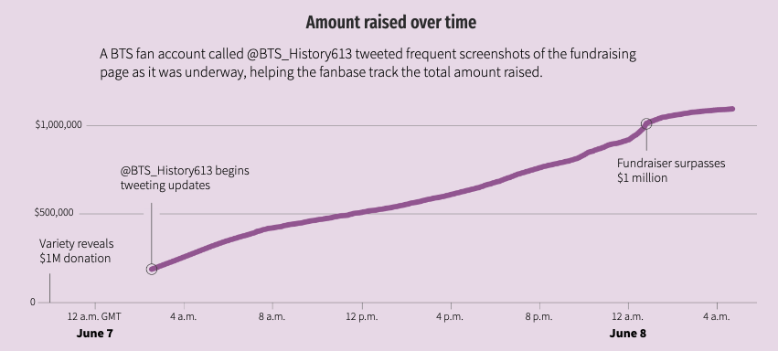
The first chart, which is the amount of money that was raised overtime, was the chart I originally pitched, thinking that I would just publish this chart. At Reuters, we publish both page long projects and individual charts and maps for other stories. I originally thought that I was just pitching that one chart for the piece.
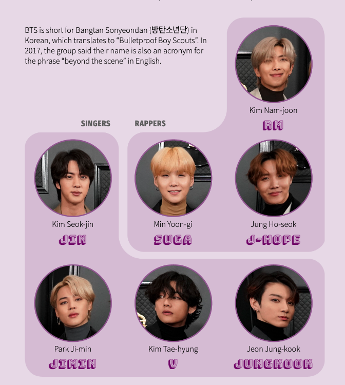
The second graphic was the members of BTS, that’s something I knew as a fan but I wanted to give an introduction to people who were not as familiar with BTS, I didn’t want to make any assumptions about the reader and I wanted everyone to be able to read the piece. For this graphic, I insisted that the order of the names was in the order of the BTS fan chant, and I wanted to give some information about each of the members such as roles, names, and artist names included. I wanted all this information to be included so it took some redesigning for all the information to be represented in one graphic. These graphics were built in AI2HTML, which is a tool by the New York Times … for creating graphics that can move between screen sizes easily.
The third chart was just a simple bar chart of the campaigns that One in an Army has done. One in an Army is the BTS-themed charity project that helped popularize the fundraising campaign — they didn’t originate it, but they helped popularize it. All the data for their monthly campaigns was already posted on their website, so I put all those numbers into a spreadsheet and then reached out to the individual organizations to confirm the amount that had been raised in that time period. The next graphic is just a small chart comparing the monthly campaigns to the #MatchAMillion campaign.
The next chart is more interesting, it is the demographics of the online fandom and its breakdowns. Like other online fandoms, there are no concrete demographics who’s in the fandom because being a fan is a very amorphous state and people can choose when someone is a fan and to what degree a fan someone is. There’s no one definition of a “fan” and there’s no one definition of a BTS fan. And there’s no clear data on the demographics of BTS fans. When I was speaking with one of the researchers on BTS Army, she pointed me to a data set that a ticket company had on who was searching and buying BTS tickets.
However, there’s some missing information such as Google Analytics doesn’t track any information for people under 18. Since the data was being tracked over years, it was helpful to see the information change over time. There is a stereotype that of the fandom skewing young and skewing female, it was interesting to see the data to see the diversity of the fandom. I wanted to remind people that there are real people in the fandom, and I used icons of dancing people to remind readers of this.
I conducted so many interviews with fans, such as regular fans, fans who ran fan accounts on Twitter, fans who create content on YouTube, professors, and researchers all over the world. I pulled some quotes from the interviews and from Twitter to help bring home the human aspect in terms for me to see who is in the fandom.
How did you collect the data, especially the Twitter data? What type of research went into creating the story?
For the Twitter Ecosystem, I knew some of the official accounts such as @BTS_twt and @BTS_bighit and I knew some of the mobilization accounts and statistics accounts. I follow some fans on Twitter so their retweets will appear on my Twitter feed. When I was learning about One In An Army and I started researching other charity accounts, I found out there is no breakdown of who belongs to certain categories so I created my own categories. As I interviewed fans and asked which accounts they follow I would add the names of the accounts to the buckets I made based on certain similarities. I then started drawing it out on paper and listed names under these buckets, then I went to each account and started scraping for names of accounts they were following.
I used the library called Twint and pulled all the lists of the names of accounts they were following with the names I had. That was helpful for example with the fan accounts of certain geographic locations, I found they were following other accounts from different countries or cities. This helps for collecting data on who was talking and promoting BTS. I then start thinking about data visualization and what type of data visualization could be created.
One idea was to make a map on Twitter users and followers on a map, but that was difficult because it was data based on a 24-hour snapshot and I started working on the project after that period so some of the data may not be 100% accurate.
Another idea was to create a data visualization on the follower size of each account, but some of the accounts had millions of followers and some of the smaller accounts did not show up so I scrapped that idea. I realized that the easiest way to understand the accounts was to just list the accounts under categories, which is helpful for people who may not be familiar with BTS. For followers, I used foller.me and I updated the numbers on the morning we published the piece to help give an idea of the size of the accounts. Some of these accounts actually blew up after the piece was published, which was interesting to see.
As I continued to make my lists of accounts, I would go back to the professors and researchers to see if these accounts were correct or if I missed anything. It took a couple of rounds of data cleaning and interviews to get down to the current lists. These labels are not exclusive – one account may fall under multiple labels, and most of them are based on their main function. I used data scraping, interviews, and research to collect the data since there’s no one data set for fan accounts.
The last chart was mostly just reporting. I found the project with the last hashtag I used, which was #2MforBLM, that was the one I saw trending first. I backtracked by speaking with One in an Army, who had credited on their website the two users who had come up with the #MatchAMillion campaign hashtag. I also looked through some Twitter trend data to see which K-pop and BTS hashtags were trending at the time. So it was #matchthemillion, which is on the second day, and #ArmyMatch1M, and I just used Twitter’s advanced search function and scrolled through some tweets. This is how I found out John Cena was a fan of BTS! After this, I created a table of who has been tweeting about them, and I used the search function to find out the first tweets using the hashtags and which tweets had the highest number of engagement. This allowed me to see who were the most influential users in the first place.
Were there any challenges that you faced when working on this project?
One of the main challenges was that I was trying to cover a 24-hour period but I didn’t collect any data from that time, so I really had to rely on what people had collected. For example, for the tweets I was looking at I had to do some research to see which ones were the most popular at the time and speak with fans and researchers to see if there were any tweets that were deleted or removed. I didn’t hear about any cases like that but that is an issue with Twitter data and social media data, in general, is that if you look at previous dates there’s always that concern. I think the best way to work around that is to do as much reporting you can and as much research, you can.
The demographics data was something I wished I had more data on. I never thought a ticketing company would have that information. That just goes back to manual reporting and reaching out. It was one of the researchers that told me to reach out to the company. I think sometimes your own research and data collection can fall short, but manual reporting and interviewing can help bridge the gap with missing data and research.
If you went back to the beginning of this process, is there anything you would do differently?
I would wake up a day earlier to catch the campaign when it was actually trending, but that’s a good question. This is something we always think about or what could be a good sequel to the project. I think there are more possibilities to collect the data on Twitter activity, some of the professors and researchers had been more active on Twitter compared to other social media sites. I do think there are researchers who work on these kinds of topics and analyze the trends and how these fans use Twitter. I think it will be interesting to see if there are any parallels with other online communities since online communities have been around for the past two decades. As well as how BTS Army uses Twitter compared to other online communities.
Do you have any advice for people who might be interested in data visualization and digital storytelling?
I think what I personally learned from doing this story is that there’s no topic too small to look at a data prescriptive even though you don’t think the data is there. I say that because this story was originally pitched as a simple line chart, not knowing that this project would take me a month. With the researching and interviewing, I was able to go beyond the scenes of the campaign. This is definitely a factor of being more of a media and music article. Unlike educational and healthcare-related stories, there was not a lot of data on the subject that was accessible or available,.I think datasets are usually industry-based and many datasets are behind paywalls.
The main thing I learned from this was to be more creative in my approach to finding data and not stopping when I approached the first hurdle to find datasets, as well as using skills we learn as journalism students such as interviewing and reaching out to researchers to help work together on collecting data. It’s important to “interview” a dataset and to ask yourself what the data is saying and how you can interpret it. It is also important to see what’s missing from the data and to understand what the data is not telling you, those skills are important to have.
- Analyzing gender differences in music themes and lyrics - January 31, 2022
- How Reuters visualized the influence of K-pop on social justice issues - January 26, 2021
- Four tips from the Wall Street Journal’s Yan Wu on visualizing police data - November 10, 2020