How The Pudding discovered swing states will suffer most from job automation
Will robots take your job one day? Probably. But how should that affect your choices in the voting booth? Ilia Blinderman, a data journalist at The Pudding, recently published an interactive explainer that tries to answer that very question. Blinderman combined census data with academic research to determine not only where automation will hit the hardest, but what it might mean for this country’s political future.
Storybench spoke with Blinderman about how he answered the question “Why the Republican Party wins if robots take your job?” and how simple tools can create great data visualizations.
This story takes it a bit farther than the typical “will robots take your job” story. How did you get the idea for this story?
Really the impetus was discussion of mass automation just with friends in a very social, relaxed setting and starting to consider what the implications would be over and above you know the media “oh unemployment, oh this percentage of people will no longer be employable whatsoever.” I think part of what I try and do is take a maybe a little more of academic approach, or at least I hope to, that includes pairing ideas and data sets that may not be found combined all that often. So in this case I was just thinking of the social consequences of this and I thought, “well let’s try and go to the data” in order to avoid another hot take and another piece that sort of rehashes the same thing.
Where did you start with this piece? What was the process of looking for this data and finding the right data to answer the question?
I think there’s a lot of journalists that specialize in working with census data and with knowing the stuff that’s available there inside and out and that’s really not me. So I came across a paper I think that was published about a year ago in late 2016 that discussed the implications of jarring economic circumstances, unexpected kind of sizeable economic shocks to the U.S. When I started working on this impact of job automation piece, I immediately thought back to this and thought “well, wait a second, if the way that people shift their political allegiances is impacted by the economic circumstances that they’re in, there’s going to be a clear effect on future voting patterns when automation kicks in.”
So really I think the reason I took the approach that I did was that I came across this peer-reviewed article. It seemed really interesting and unusual in its conclusions in the subject matter at least for me and afterwards simply looking at census data at the employment figures on a county by county level and on a state by state level, which are generally pretty accessible and are known to exist out there and I combined those to kind of reach the conclusions that I did.
When you were building the visualizations what was your guiding principle? What were you thinking about when you were trying to turn the data into a visual?
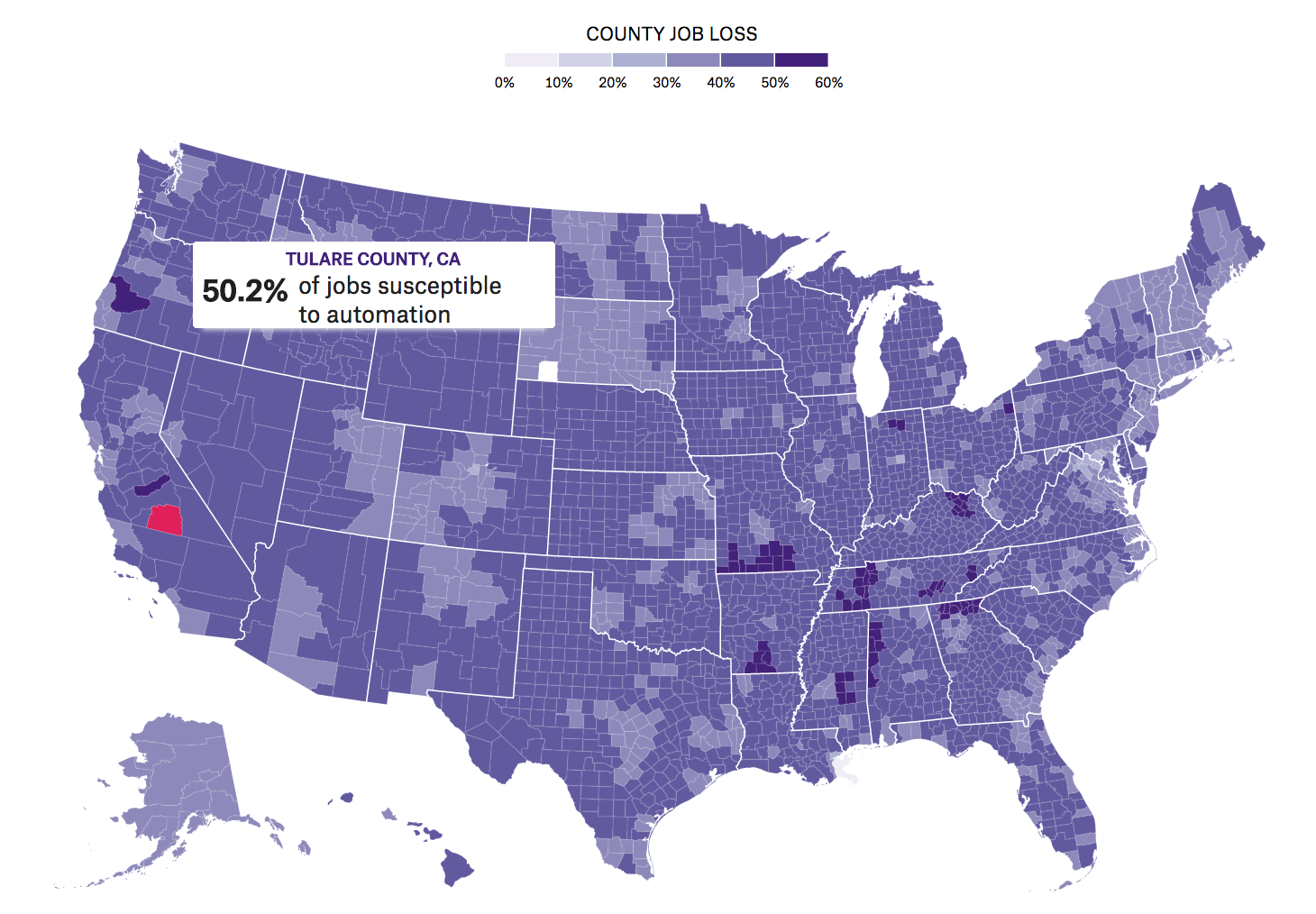
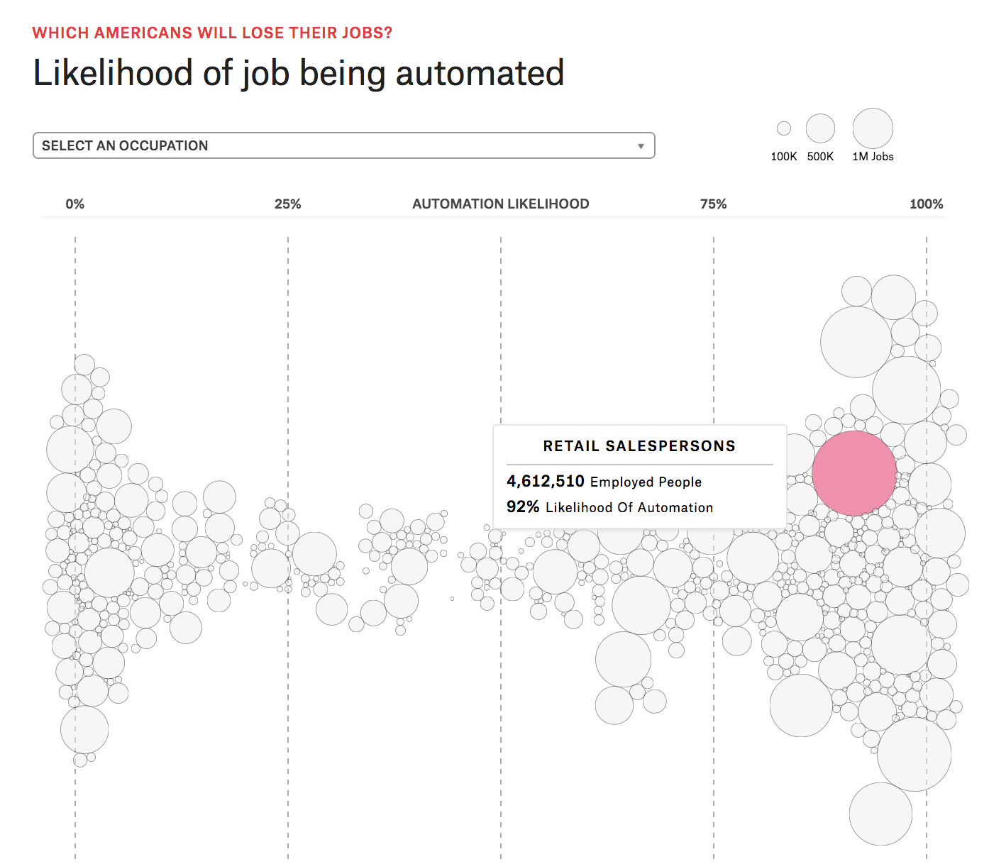
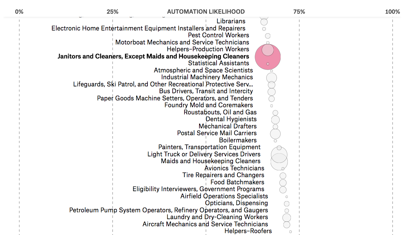
So you know how a lot of the time when you’re writing a standard story in prose you start off taking your readers through point A point B point C in increasing degrees of complexity? For example if you’re trying to tell a story about some particular mechanism in Congress and why it’s so important right now, you would say “okay, so we’ve got Congress and then we’ve got these voting rules and then we have these special exceptions to these voting rules and that’s actually the crux of your story.” I tried to take a similar approach. I first attempted to show that, look there’s a whole bunch of jobs out there that are likely to become automated that was the first chart that I put together. For the next chart, I tried to show that automation, when it comes to the number of people that are employed in highly automatable jobs, is really likely to happen everywhere. And, finally, trying to communicate the fact that the people that are going to be affected by this are kind of located in this niche that’s going to mean that there are going to be electoral consequences. So it’s the swing states that are going to be disproportionately affected, all things being equal by automation. So it’s kind of like this you know establish some form of understanding and then go a little deeper and then a little deeper after that.
What did you use to build this project?
I imagine for this particular one it probably was as simple as having some sort of SQL database or maybe just orchestrating Google Sheets and putting together the presentation the front-end of it in Javascript. The reason I say simple, obviously SQL isn’t a tool that everyone knows, but a lot of time people say “oh you have to learn R or it’s ideal to learn pandas,” but really the equivalent of something like Google Sheets can take you very, very far. So on the data end, I think it was probably largely working with something like Google Sheets and on the front-end Javascript, specifically the D3 library which is kind of the standard in a lot of data journalism pieces.
What was the most challenging part of creating this piece?
Honestly, I would probably say dealing with the census data itself. Because I wanted very specific cuts of the data and using the online interface can be a relatively painful experience so there was a lot of time spent manually copying and pasting and kind of dealing with the online portal.
Do you have any advice for students that are trying to get their feet wet with data visualization?
If I had to encapsulate it in one idea I’d probably say pick a passion project. Take something that you’re really interested in, you know, one of these things you discuss with your friends over beers or something that gets you really excited and fired up that you could spend five minutes just giving an extemporaneous speech on to someone and answer question that pertains to that.
“Pick a passion project… and it’s going to make it all that much easier to get past those stumbling blocks.”
Look into something, dig into something, and it’s going to make it all that much easier to get past those stumbling blocks that invariably arise when working with data and working with new technology and tools that can be really frustrating to grasp. So much of what aspiring data journalists and visual journalists come up against is “why doesn’t this Javascript work? Why is my Python script crashing? Or why am I getting this weird error? This is stupid, I hate this, computers suck.” I’ve totally been there, everyone I know has been there, and the one piece of advice is to take a personal project to work on where the passion that you have for the topic helps you overcome these kind of technical hurdles.
- How The Pudding discovered swing states will suffer most from job automation - February 20, 2018


Ndea Yancey-Bragg, thank you for this post. Its very inspiring.