How to build an interactive choropleth map with barely any code
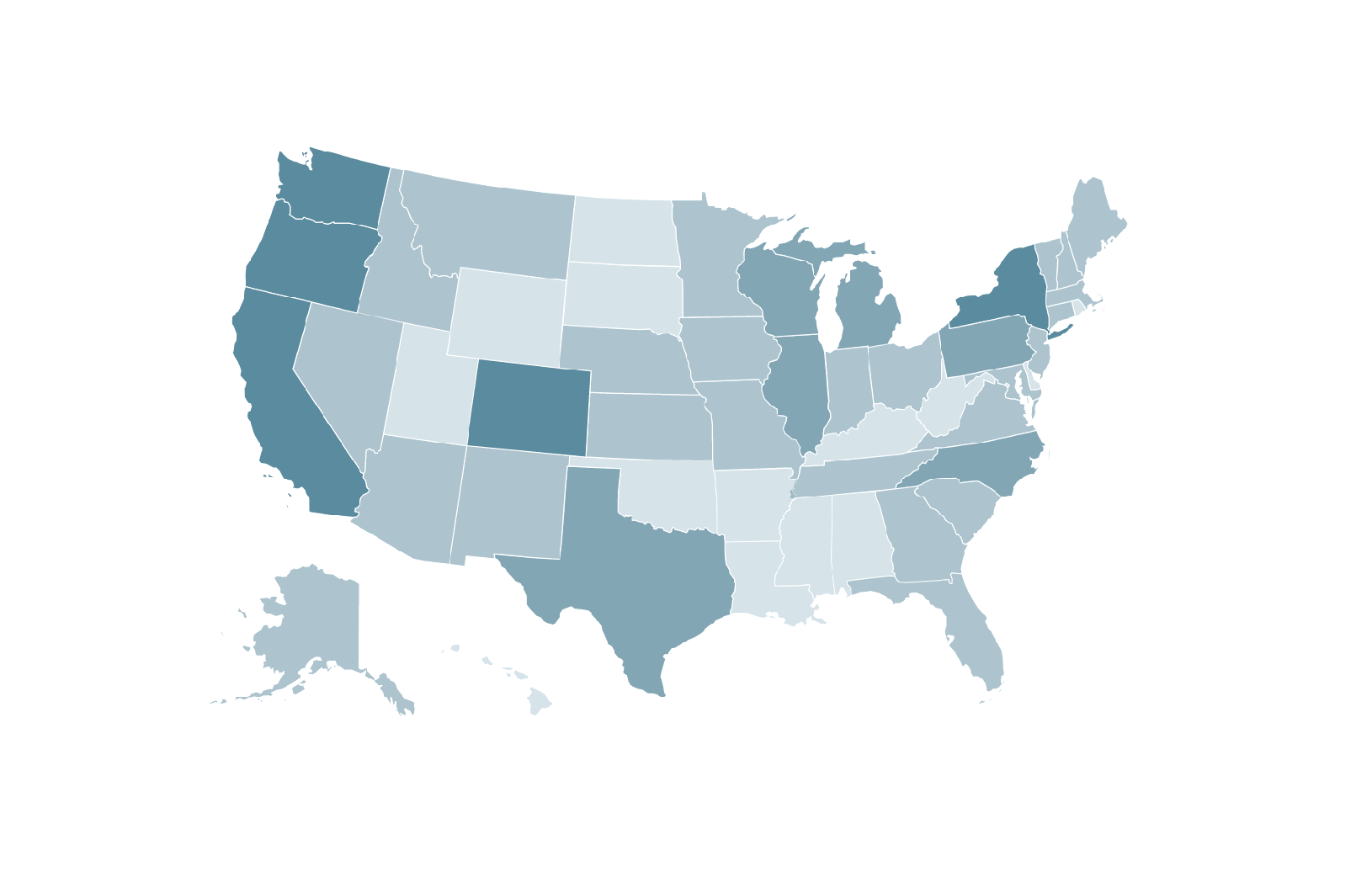
Patrick Garvin, a designer and graphic artist with The Boston Globe, has built a handy web application called Mr. Map Generator to build interactive maps of the United States. You supply the data you want to visualize and Garvin allows you to customize how the states are shaded and how many shades you want to use. You can preview your map and then copy and paste the simple Javascript into a set of files he provides. Upload to your website and voilá: an interactive choropleth map of the United States:
What you’ll need
- Data organized by U.S. state
- A spreadsheet program (like Excel, Pages or Google Sheets)
- A text editing program (like TextEdit, Sublime Text or TextWrangler)
- FTP access to your website
Here’s a live example of a map Garvin made for the Globe. Garvin wrote up a tutorial and recently added another tutorial for adding your own SVG map. We figured we’d give it a spin.
Getting your data into a spreadsheet
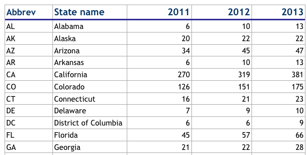
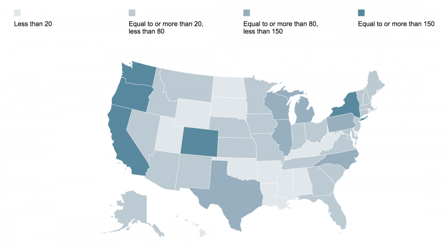
We chose to visualize the number of craft breweries by state using 2013 data from the Brewers Association.
We pasted our data into a spreadsheet Garvin provided.
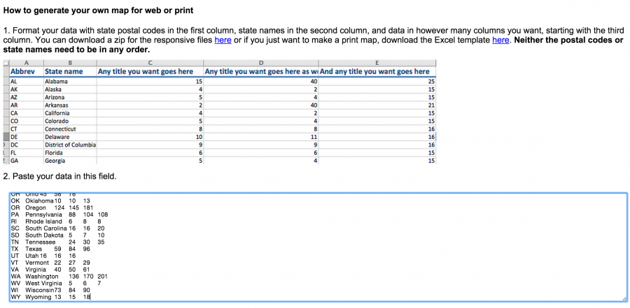
Adding data to Mr. Map Generator
We then copied our whole spreadsheet and pasted it into Mr. Map Generator.
Next, we selected the column we want to visualize. We chose the most recent year of data: 2013.

Then, we selected the color, the number of shades, and the size of the “buckets” we want those shades to represent. The size of these buckets (or breaks) will depend on the story you want to tell. (This becomes a question of ethics in many cases because you don’t want to skew your distribution unequally. Here’s a short discussion about that. Here’s another that weighs the different ways to classify data breaks.) We chose completely arbitrary breaks that are not equally intervals.

Next, we previewed our map. Disregard the legend because it won’t show up when you download the data files. Garvin’s tutorial includes some steps to print this image to a PDF and extract the map and legend in Adobe Illustrator.
Garvin allows you to generate the Javascript to make this map interactive on your own webpage. Note: you’ll need FTP access to your webpage’s server so you can upload the data files and generate your map.

Downloading the data files
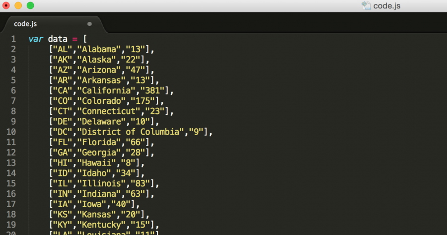
To make this map interactive on your own website, download Garvin’s zip package of files. Unzip the folder and open the file code.js in a simple text editor (like TextEdit) or something more heavy duty (like Sublime Text).
This is the extent of the code you will see or work with. In fact, you’re not even working with it but rather copying and pasting it. Just so you know what’s going on, you are defining the variable “data” with your state abbreviations, state names, and brewery data. Looks like a spreadsheet, right?
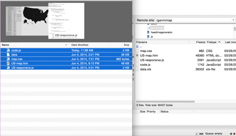
Finally, you save your code.js file and then upload the contents of that unzipped folder to your own folder on your server. We use the FTP software FileZilla.
We hosted the map here and called it with an iframe to display it in a WordPress post. We use an iframe plugin to display the map:
To add a title, I including the following line of HTML above the map on US-map.html: <p style=”font-family:Open Sans, sans-serif; text-align: center; font-size: 1.5em;”>The number of craft breweries by state in 2013</p>.
Improvements to be made
Garvin has open-sourced part of his workflow and for that we’re immensely grateful. Some suggestions for improvement would be (1) to include a customizable legend for the shading; (2) to allow users to input HTML hexcodes for the colors of their choice; (3) to make the map responsive (scale down for mobile); (4) to allow users to set up a time series (with several years of data, for example). Still, we thank Garvin for the initiative. Add your own comments below.


Garvin’s map is responsive indeed, but you may not notice if you move the window. If you reload after moving the window, or load the page at any size, you will see it adapted. He made this working for the Globe, which is 100% responsive, so that’s covered.
How to build an interactive choropleth map with barely any code this information is very excellent, thank you so much for sharing this. And if anyone have color blindness problem then visit here and solve your problem with fast recovery.