How to make a simple virtual reality data visualization
The following tutorial was written by Roger Kenny, an interactive designer at the Wall Street Journal. After Storybench covered his 3D virtual reality tour of the Nasdaq, Kenny offered to guide us through building a simple virtual reality data visualization. Find Kenny on Twitter here.
We now live in a magical time of virtual worlds full of unicorns and rainbows. Pixelcats ride neon toaster pastry across clear virtual reality skies, and with a few lines of code you can turn a dataset into a 3D virtual reality visualization.
The actual subject of 3D graphics unicorns is at once wide and deep. There’s no way I could give you a righteous and appropriate accounting in this brief format. Luckily there are numerous resources for those topics available. I will provide some links at the end of this tutorial for your happy consumption.
Today I will focus on how to create a 3D column chart, utilizing the Javascript libraries Three.js and D3js. If you’ve seen my 3D Nasdaq virtual reality roller coaster on WSJ.com, these are the exact same tools used to create that experience. Our project will also be natively VR, so have your cardboard VR case nearby as we work our way through the dimensions, from one dimensional code, to two dimensional drawings on screen, and then into the three dimensions of our very own Chart World.
Prepare your data
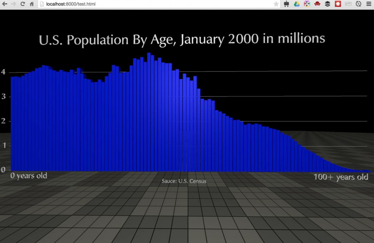
Let’s grab the U.S. population by age data from census.gov. Copy the data for January 2000.
Prepare your project
Download my modified Google chrome VR template from this link.
Open the project in your favorite editor.
Host it on a web server or locally with something like MAMP, or use this simple php server that comes with php 5.4.0 and higher like so:
Navigate to your project root folder in terminal.
Type:
php -S localhost:8000
Open that address in your browser.
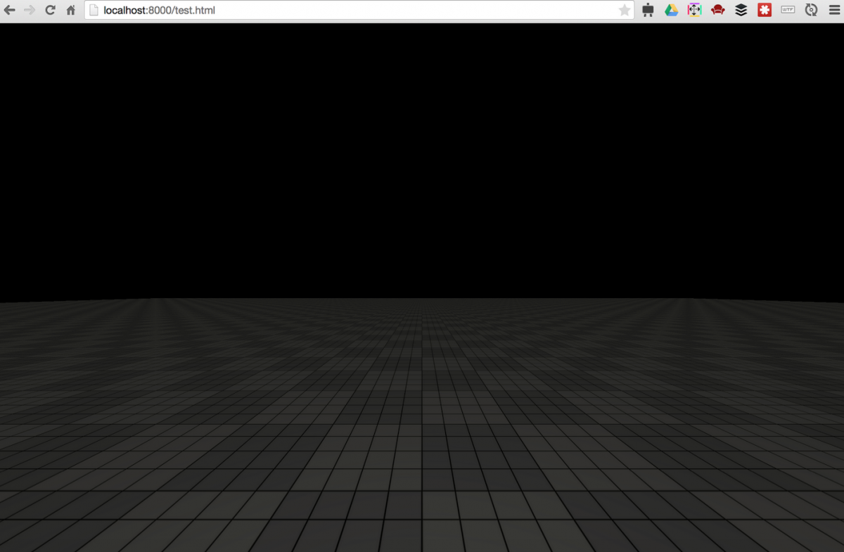
You should see an empty 3D environment.
Click and drag around your browser window to rotate the camera around.
Create a new file in the root of the project called data.csv. Paste the census data into it. Remove the “All ages” row for simplicity sake. Add column headers to the first line: date,age,all,male,female.
Load data with d3
Add d3 to your project by adding this:
<script src=”http://d3js.org/d3.v3.min.js” charset=”utf-8″></script>
about line 30
Add to init() around line 120
d3.csv('data.csv', population, function(data){ /*drawing code*/ });
The function population is the data transformation function we’ll write in a minute. All of our drawing code will go in that empty callback function at the end. After this line add the population function:
Set your scales
Add some global variables to the top of your script around line 36
Now we can set the scales’ domain once the data is loaded. Within our csv callback function add this:
Add new cube for each datapoint
Within the csv callback, after we set the domains, first set a variable to control the column width:
Then create a phong material which will be shared by all columns, and initialize it with a blue color:
Now we’ll iterate over our data and create a new 3D box for each point. We’ll use the scales we set up earlier to set the height of each and its x position and y position.
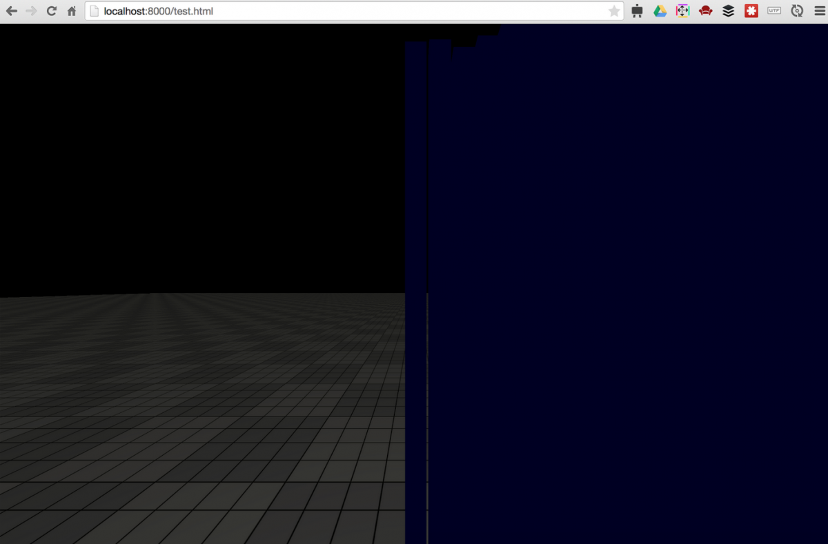
Refresh your page and you should see some bars, but there are definitely some issues.
Adjust Camera and Lights
First, the bars appear very dark. Let’s add a point light to the scene to brighten it up. Add this code around line 87, underneath the code for the hemisphere light. It doesn’t have to go there, but we might as well keep things organized.
The next issue is that the chart appears too close to the camera. Let’s move the camera away a little. Change the third value in the camera position setup code near the top of init() function to 30. That’s the z value which in this case will move the camera back away from the chart. Positions, scales, and other vectors in three.js are generally in the format [x, y, z].
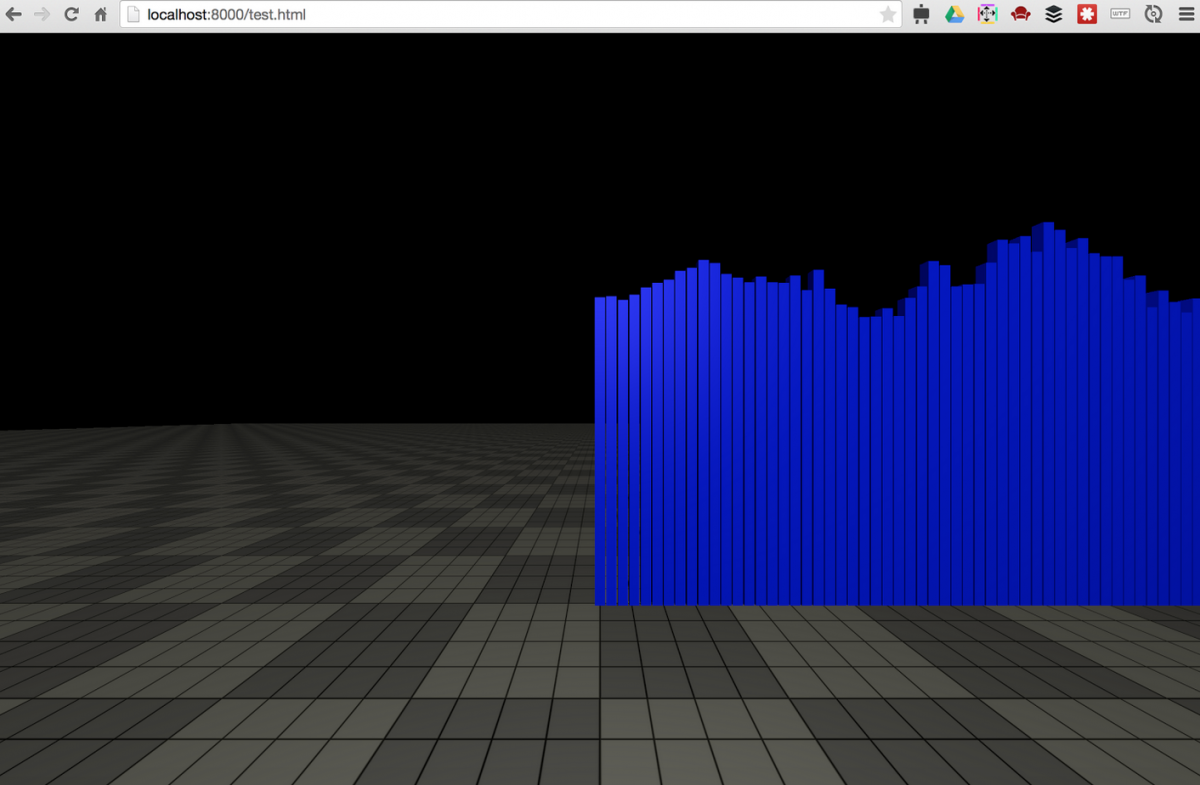
Next let’s change the placement of the chart so that we’re at the center of the chart, rather than the edge of the chart.
Change the xscale range to read:
.range([-chartwidth/2, chartwidth/2])
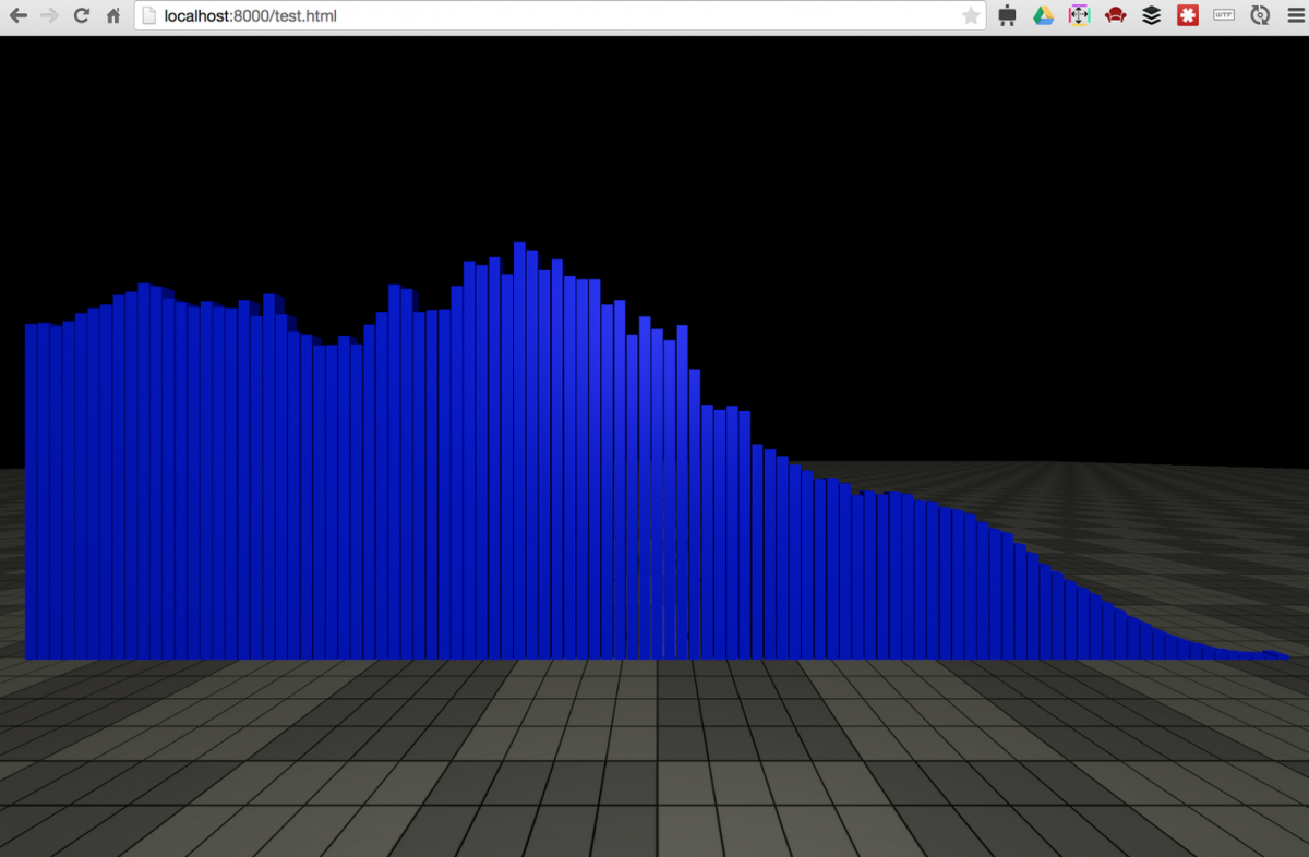
Excellent. That certainly fulfills the requirements set out by the title of this tutorial, and now I’m off to grab a fine IPA at my local– what? It’s not done you say? A visualization is not complete without clear labels and scales you say? Fine, fine. Let’s go a little further.
Draw labels and axis
I’ve included a handy function called createType which takes a text string and returns a mesh. Add this to the bottom of your init function, around line 149:
Next lets add some text along the x axis. Move chart up to make room. Change the marginbottom variable near the top to read:
marginbottom = 4
Add this under the title code we added just before:
To add the y axis, we need to do this after we set the range. So after the data has been loaded. So within the d3.csv callback function, after the data.forEach loop, add this code:
Refresh the page and you should see a complete bar chart with title, source, labels and axis.
Making it VR
I’d mentioned earlier this project is already set up for virtual reality, and enabling it is very easy. First, uncomment the two script tags at the top of the file, which will load the Three.js StereoEffect and DeviceOrientationControl libraries.
Uncomment line 52 which creates a new StereoEffect.
Comment out line 208 and uncomment line 209 within the resize function, which switches the default renderer for the effect renderer. Do the same thing for lines 221 and 222 within the render function. The resulting lines will be like this:
Refresh the page and you’ll see a split screen display with separate views for the right eye and left eye. Load this page up on your mobile device and view it in a VR case such as Dodo Case VR or Google Cardboard, and you’ll be placed in the scene in 3D. You can look left, right, up, and down and view our Chart World as though you were really there.
If you have hosted this on a public web server, just visit the URL on your mobile device. If you’re working locally you can make your development server accessible from your local IP address, then make sure your phone is on the same wifi network as your development computer, and connect to the ip and port of your dev server. I’ll let you google that part based on your particular setup.
Going further
The purpose of this tutorial was to show the fundamentals of how to bring together Three.js and D3 in the browser and VR. While we’ve done that, there are plenty of ways our simple project could be improved.
For one, it’s not very easy to read the middle data points. Some form of dynamic highlight either with the user’s pointer or based on the viewer’s gaze would be a nice addition. You could apply a glow to the bar in question and display the data as a floating label, for instance.
Also, there’s no way to move around the 3D scene. Implementing keyboard controls would be fairly easy, or a gaze based UI for inputless VR.
Finally, although the chart is rendered in 3D, it’s not very, well, 3D. This exact chart could be reproduced very effectively in 2D. The real exciting possibilities lie in visualizing data in ways not possible previously (or possible, but really difficult). Area charts intersecting to create volume charts. Width x height x depth bars. Scatterplots becoming twisting snakes with thin or fat bellies. Surfaces and terrains of data. Maps with data overlaid. The possibilities are as numerous as they are exciting, and really a new unexplored continent of visualizations has just become accessible.
I’ll leave that up to you to follow though, and I’d love to see what you do with it.
Links
Three.js
http://stemkoski.github.io/Three.js/
Excellent Udacity course on Three.js and 3D graphics
https://www.udacity.com/course/viewer#!/c-cs291/l-68866048/m-96403551
D3
https://github.com/mbostock/d3/wiki/API-Reference
Original Google Chrome vr template
http://vr.chromeexperiments.com/
Get Google Cardboard compatible VR case
https://www.google.com/get/cardboard/get-cardboard/
- How to make a simple virtual reality data visualization - May 20, 2015





Since you asked about cool work-in-progress 3D visualizations – have you seen the Vizicities 3D data visualization project? — https://github.com/vizicities/vizicities
Anyway speech services can be included?