How to plot state-by-state data on a map of the U.S. in R
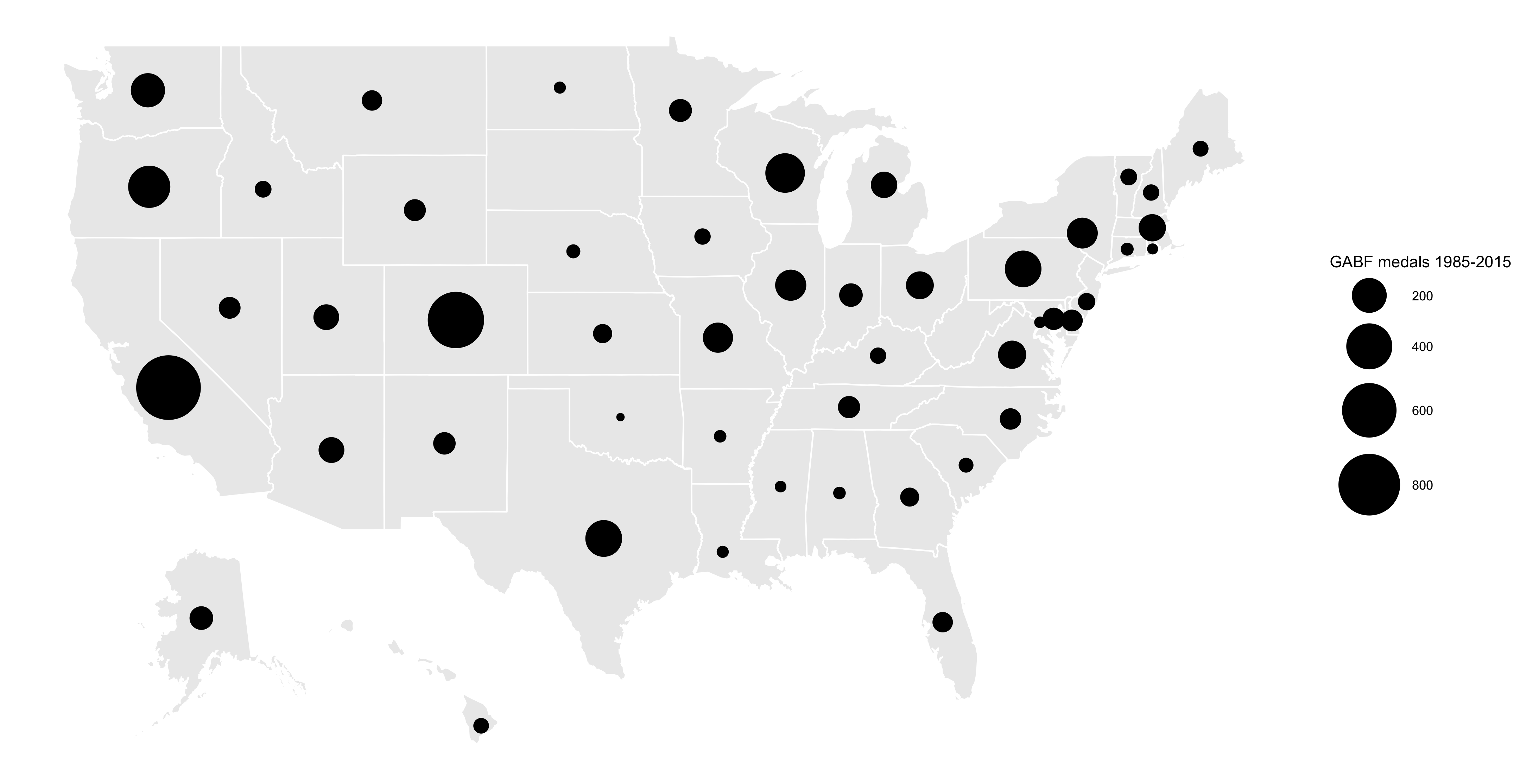
While I usually turn to Carto.com or Datawrapper.de for my mapping needs, I decided to give R a whirl. The following tutorial will take craft beer awards data from Great American Beer Festival and map medal counts by state. This data spans 1987 to 2015. Cheers!
A quick look at the code
Geocoding the “state” column
If you’re dealing with state-by-state data – or collecting it yourself – chances are you won’t have latitude and longitude coordinates for states. In this case, we start with a pivot table that only includes state and medals columns.
Using LocalFocus’s “Batch geocoder for journalists,” select “United States” under 1. Indicate Country and then copy and paste in your states column into 2. Copy and paste a list of locations. When checking results, see how many are in Doubt and be sure to click through and verify each.
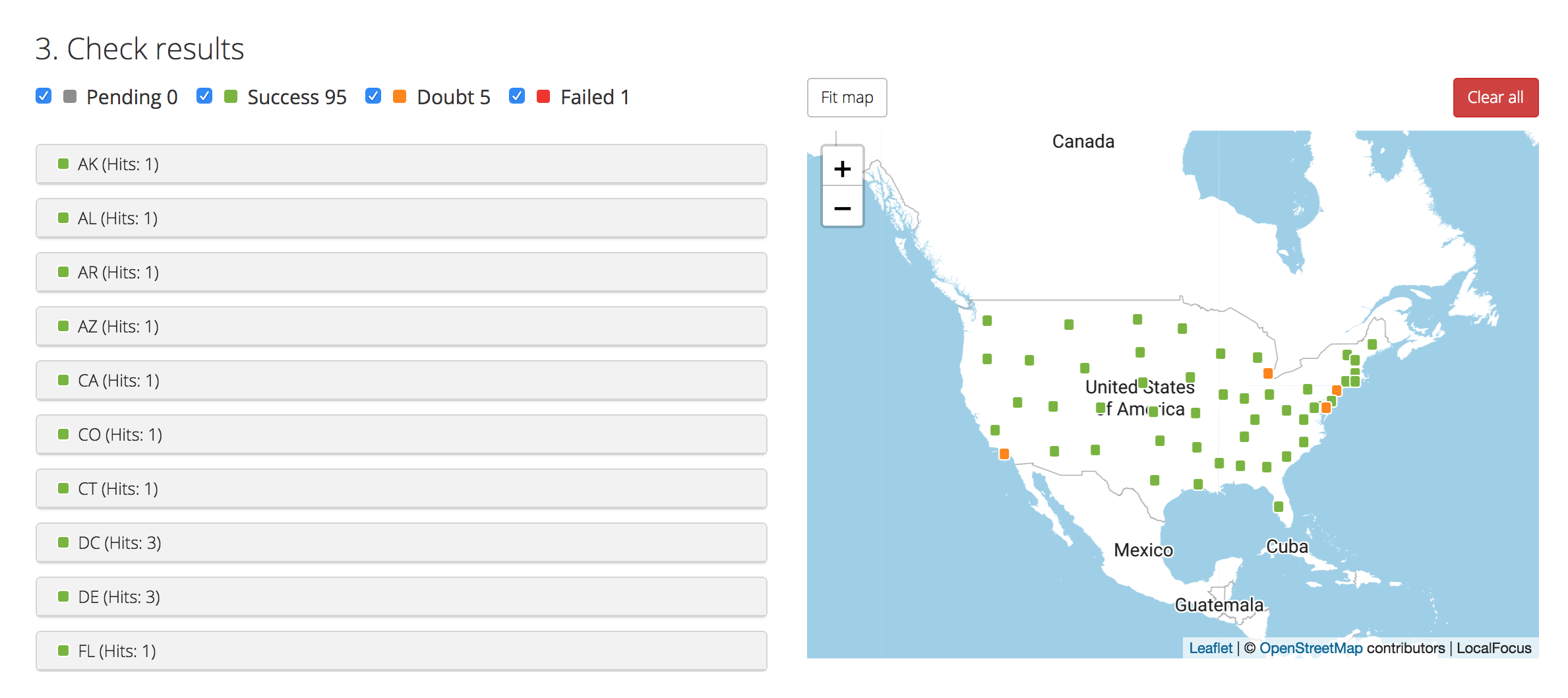
Then, select “Decimals with dots” from 4. Copy and paste coordinates to spreadsheet and do exactly that, copy and paste the list into your spreadsheet. (I’ve added the column heads). You can download the CSV here.
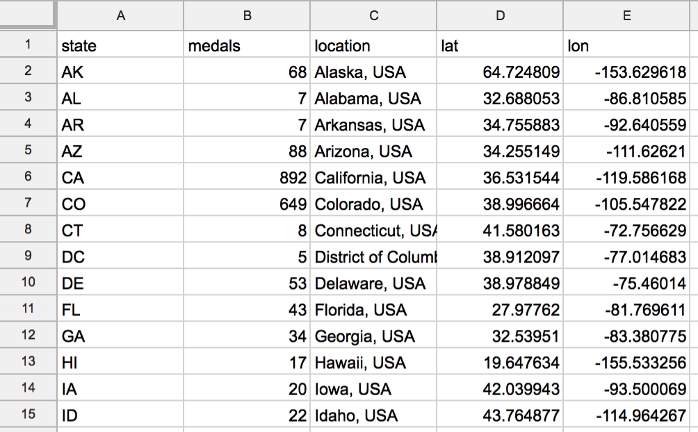
*IMPORTANT: I’ve manually changed Hawaii and Alaska’s coordinates so that they’ll correctly map to the ggplot2 map I have below. Alaska is now 28.12768 -117.981766 and Hawaii is 24.200987 -104.313994. You will soon see why.
Load csv into R
Boot up R Studio and load the packages tidyverse, ggplot2 and fiftystater. For Storybench tutorials on tidyverse head here and for ggplot2 head here.
Next, ingest the csv using the line: mapdata <- read.csv(“state-medal-count.csv”, header=TRUE, stringsAsFactors=FALSE). You can use the glimpse() function to check it out the dataframe containing the csv data.
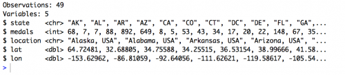
With 49 observations (or rows) it’s clear the data is missing two states. But any beer snob will know that South Dakota and West Virginia aren’t exactly epicenters of craft beer.
Set up your map in ggplot
Next, we call up the state boundaries data using data(“fifty_states”). We then plot that using ggplot2 with the following line:
ggplot() + geom_polygon( data=fifty_states, aes(x=long, y=lat, group = group),color="white", fill="grey10" )
You should see the following in the Plots pane of R Studio:
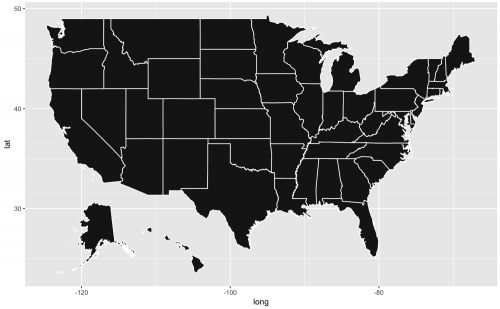
Fine, if a bit ugly. Don’t worry – we’ll clean it up.
Plot your points using geom_point
Next, using ggplot2’s geom_point function, we’ll map the columns lat and lon to plot each row to each of their corresponding states. the size = medals call makes sure I am mapping the number of medals to the size of the bubble. You can mess around with those sizes by tweaking the numbers on the scale_size(name=””, range = c(2, 20)) line. Finally, theme_void() removes the axes and background color and grid.
If you’re happy with the plot, save it to your working directory using ggsave. Notice I’ve included width=14.4 and height=7.43 in inches so that I have a consistently sized, high-resolution image. In pixels that’s 4320 by 2229. Nice!
While you can continue to play with the design in R, I prefer saving as a PDF and dropping the file into Adobe Illustrator.
Mapping multiple data points in each state
Using the school shootings data set amassed by the Washington Post here, we visualized the lat and long coordinates and mapped bubble size the number of people killed. Code and map below.
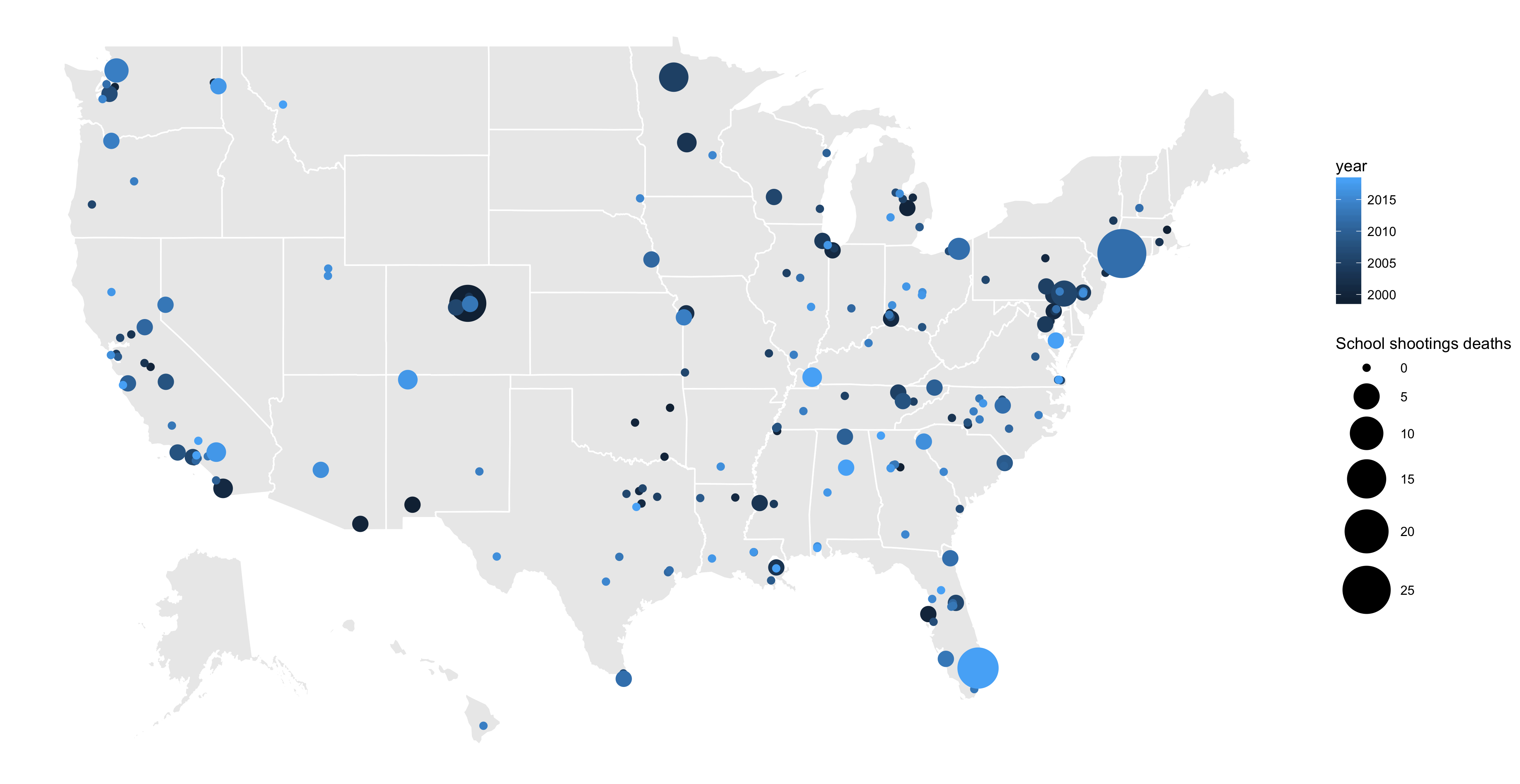
ggplot() + geom_polygon(data=fifty_states, aes(x=long, y=lat, group = group),color="white", fill="grey92" ) +

geom_point(data=mapdata, aes(x=long, y=lat, size = killed, color=year)) +

scale_size(name="", range = c(2, 15)) +

guides(size=guide_legend("deaths")) +

theme_void()


Is this csv file available to demo this? I don’t see if linked and searching “medal” in your github repos did not find any results.
Just added it to the post. You can get it here, too.
How did you get the lat/long points for Alaska and Hawaii to map to the the shifted position of those states? Currently, when I plot the data I get the Alaska and Hawaii points in their true location.
Thanks.
good map. how do i color the circles red in the second map?