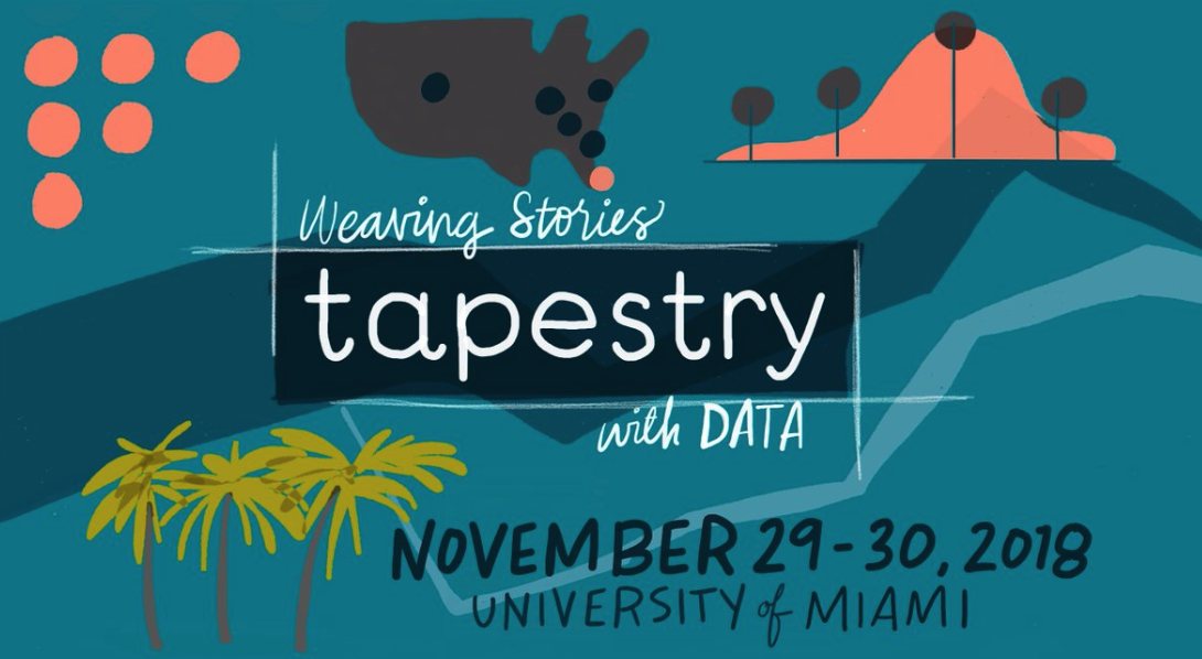
Takeaways on data storytelling from the 2018 Tapestry Conference
The Tapestry Conference, an interactive online data storytelling event, was held last week for the 6th time at the University of Miami in Florida. Sponsored by Miami’s School of Communication and Tableau, Tapestry featured talks by experts in journalism, academia, design, industry, and more.
This year’s conference focused on many topics ranging from how to represent uncertainty to the relationship between words and visuals in crafting data-driven narratives. Here are some practical takeaways from the conference you can use to improve your storytelling with data.
“Sequence — sequence — surprise”
Mona Chalabi, data editor at The Guardian, described how she responds to 3 common challenges we encounter when communicating data: showing uncertainty, showing complexity, and showing without seeing. For one of these — showing complexity — Chalabi recommended capturing and maintaining readers’ attention through a simple technique of “sequence — sequence — surprise”: guide the reader through complex data in a tightly defined sequence and then subsequently hook their attention by revealing a surprising factoid or connection within the data set. By playing with the rhythm of that sequence, Chalabi suggested, it is easy to construct a compelling narrative that captures the imagination of your reader.
Three problems facing #dataviz today from @MonaChalabi:
1. Visualizing uncertainty.
2. Showing complexity (without creating fatigue among readers).
3. Showing without seeing (how we make viz accessible to the 1 in 25 people who are blind/visually impaired).#tapestryconf pic.twitter.com/cxl7x9dvKN— Amanda Makulec MPH (@abmakulec) November 29, 2018
Conveying uncertainty is a critical part of communicating data, but we aren’t very good at it
Matthew Kay, Assistant Professor at the University of Michigan at Ann Arbor, offered a “biased tour of the uncertainty visualization zoo,” illustrating the range of conventions different disciplines and visualization types employ to communicate uncertainty in data. (Download the presentation here.)
Kay argued that although challenging, representing uncertainty should be a moral imperative — we should present well-calibrated measures of uncertainty in ways people can understand. At the same time, more research needs to be done to assess what kinds of representations are best at communicating that uncertainty accurately, whether that be through animation, the use of blurred edges, non-solid lines, or otherwise. Kay encouraged representations that avoid what he calls “deterministic construal errors,” or representations of uncertainty that are misunderstood as representing certain and precise values — such as a dotted fluid boundary around a geographic region that is misconstrued as a concrete border. Choosing reliable representations of uncertainty in our visuals means minimizing these deterministic construal errors.
Slides from my @tapestryconf talk: A biased tour through the uncertainty visualization zoo. Includes work with @JessicaHullman and the MU Collective. https://t.co/fuSjQ5MAZU #tapestryconf pic.twitter.com/xcTboup3Ut
— Matthew Kay (@mjskay) November 30, 2018
Your words are more important than your visuals
Bill Shander, Founder of Beehive Media, delivered a strong message about the relationship between the visuals we design and the words we use to describe them: never underestimate the power your words hold in defining the narrative of your visuals. Though we often lean heavily on our visuals themselves to communicate our narrative, the words we choose to support those visuals should lead the user directly to the visuals — we can describe any visual using different words, but those different words lead to different understandings of what is being communicated. Shander offered a practical tip for honoring this principle in designing infographics and other kinds of visuals: write a long sentence about what the infographic should say, find the breaks in that sentence, and turn those breaks into sections of the infographic. That way, the words you choose feed directly into the design of the visual itself.
https://twitter.com/billshander/status/1068970831651450880
Personalize narratives in time and space
Sometimes we must work with complex data sets that feel distantly removed from the individual human experience. This is true of working with data about climate change, a task that Nadja Popovich has grappled with as graphics editor at The New York Times. Popovich suggests several strategies for personalizing the experience of data that can feel abstract in their effects: localize the data geographically, personalize the time scale, make abstract changes or trends in the data more tangible and rooted in daily lived experience, and integrate both near and far views of the data across space and time.
These maps @PopovichN is showing at #tapestryconf: many more people believe that climate change will harm others (left map) than it'll harm them (right map) #dataviz pic.twitter.com/Z2yRc0sJeJ
— Alberto Cairo (@AlbertoCairo) November 30, 2018
- Takeaways on data storytelling from the 2018 Tapestry Conference - December 7, 2018
- Visualizing tumbling tumbleweeds – and storylines – in ‘The Big Lebowski’ - October 12, 2018


WOW just what I was searching for. Came here by searching for meta_keyword|