Exploring Human Connection: Alvin Chang on “30 Minutes with a Stranger”
Alvin Chang is no stranger to visual storytelling. He has built his career on turning data sets into captivating, compelling tales for The Pudding, The Guardian, Vox and others. Chang’s past work often explores themes of community and human behavior, and his newest piece continues that trajectory. In “30 Minutes with a Stranger,” for The Pudding Chang explores the conversation of people who do not know each other, but by the end of a 30-minute interaction, form a platonic bond.
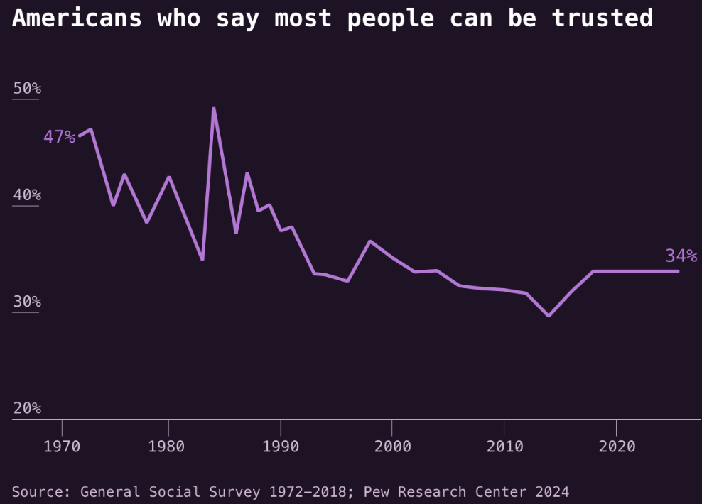
Using data from the CANDOR Corpus, a public dataset of over 1,600 conversations, he animated conversations and deduced findings from a subset of 1,700 participants. The findings, which he relates back to himself at the end, offer an optimistic view of humanity – especially in a time viewed as overly polarized.
Storybench sat down with Chang to learn more about his creative process, human curiosities, and hopes for a less polarized society.
The following interview has been edited for length and clarity.
The story starts with Kate and Dawn introducing themselves to each other and then we check in with them a few times throughout the piece. How did you decide to make them a throughline?
I was looking for an example that seemed to be an accurate portrayal of the overarching data set. So, in this data set, it’s basically like people feel better after talking to strangers. I was looking for a conversation that gets that across in a way that’s pretty succinct that you don’t have to watch a video to understand. I was looking for one that I found compelling where the people in the conversation feel it. I stumbled on this one and thought, “Okay, this one’s really touching.” It also worked with the storytelling structure, where they had a nice intro and then they made fun of the fact that it’s a survey by the end.
How did you go about identifying the most captivating parts of these conversations?
I just read through so many transcripts. I narrowed down the conversations to what I was looking for, since I wanted to show generally positive interactions.
Did you experiment with highlighting some of the negative interactions?
Until I looked at the data, I didn’t know what I was going to focus on. Once I looked at the data, I was like, “Okay, I should probably focus on the positive interactions.” But inevitably, I’m a curious person. I’m like, “I wonder what these negative interactions look like.” When I looked at them, I realized there was nothing to write about. It’s not like people arguing in a way that they might at a family Thanksgiving, it’s just kind of awkward.
Were there any results that surprised you?
The overarching story. If you think about it, if someone were to ask me, “Do you want to talk to a stranger right now?” my answer would be “no.” I think I was surprised that just a huge majority of people were like, “Yeah, I guess I’m feeling better after this.” It was shocking. I didn’t expect to find that.
This story relies on animation and word bubbles to signify conversation. Did you consider using audio or video?
I was thinking about it. There were privacy concerns, but also it just takes so much time to figure out what’s happening in conversations. Like, do you really want to listen to two strangers talk about what they had for dinner for three minutes? Because it takes a while to get into it. So every time I considered it, I thought, “No one’s going to want to listen to this.”
How did you balance showing overarching data trends while preserving the individual stories, such as Kate and Dawn, that are driving the narrative?
The first thing is figuring out what the structure is going to look like. The narrative helps ramp up to the big reveal that people are happier over time. Once you figure out what the story looks like, you start looking around for examples that carry the piece throughout or bookend it. So, like the Kate and Dawn conversation, that worked nicely because it kind of tracked the narrative arc. And so you could come back to it. I wanted you to feel like you were in a room full of people who are just talking to strangers, like a Zoom executive, maybe. I wanted to make sure it was also engaging.
What was your design process?
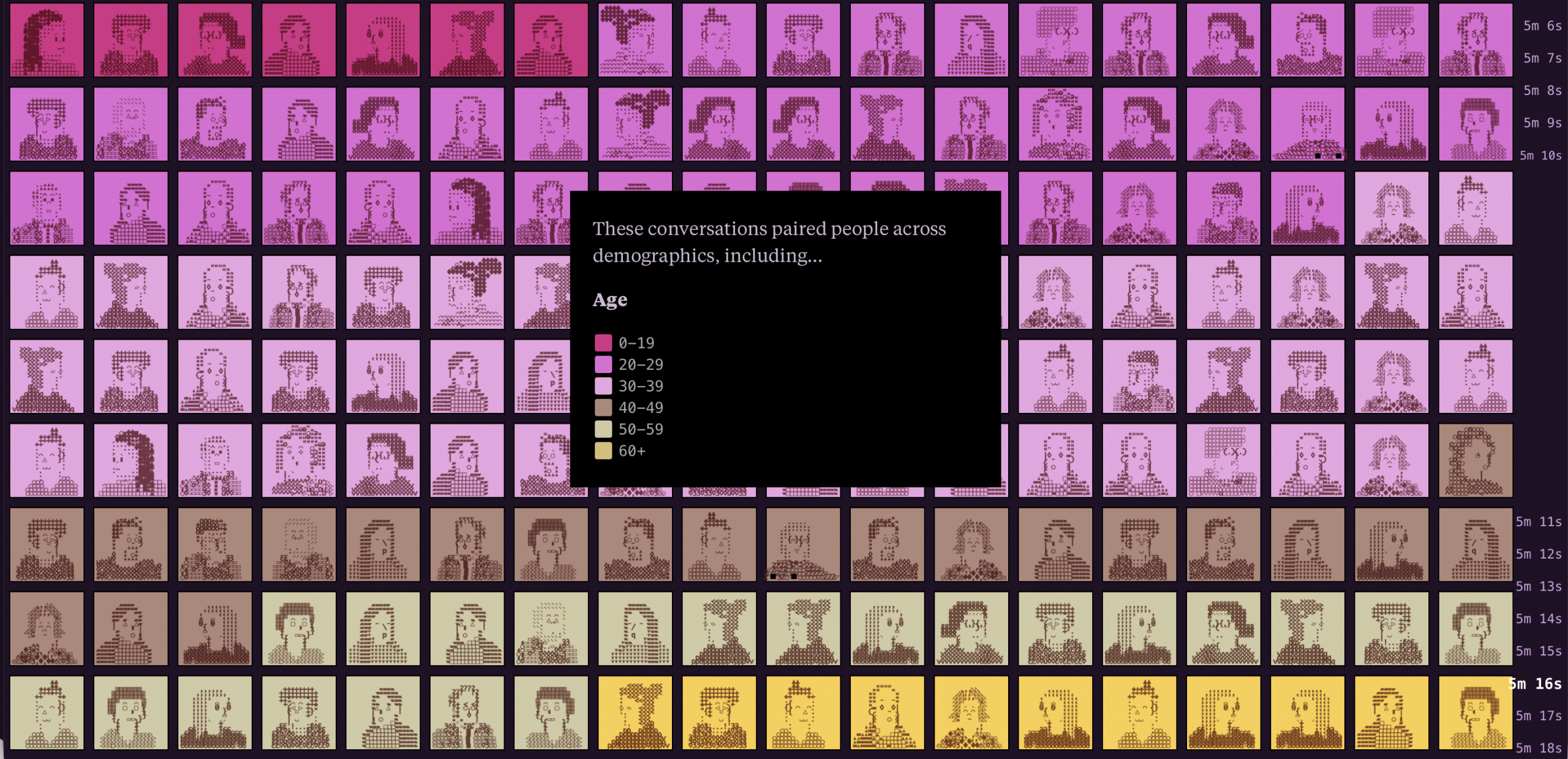
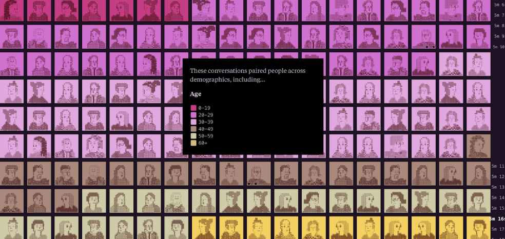
I knew that I wanted to show individual people having conversations. However, the other thing I wanted to show was some of the preconceived notions I had going in which was, this is a diverse group of people who normally you wouldn’t think get along. Essentially, I had this idea of: “What if you could see people across the age spectrum, race spectrum, political ideology spectrum? What if you could just see that first?” That gets you revved up. The hope was to build up the tension and then show the animation of matching them up so it’s leading the reader into thinking that something is about to go down. I like to build up a little tension and give you a release in the middle of the story.
Something I particularly liked while going through this piece was the 30-minute timer on the side to help keep pace. How did this come to be?
I’m always looking for ways to structure stories, especially interactive stories, because readers want to know where they are going. You don’t want to feel like you’re being thrown around. It allows the reader to offload expectations so they can just focus on the story. It also just happened to work really well because it’s fun to see how the conversations evolve as you see the story laid on top of the timer.
If you were to redo this piece, what would you change?
I think I would consider more audio or video options. I like to make videos to go along with [stories,] but it’s easier when I have more time. This one could have worked really well with video, but toward the end I started to realize I need to focus entirely on the interactive portion to get it perfect rather than taking time away to do the video. It’s always a bit of a compromise.
What did you ultimately want to convey with this piece?
Right now it feels like there’s a lot of polarization happening, and we are told that we are a polarized society. But, when you interact with people in real life it doesn’t happen the way it does on the internet. You interact with people who have very different politics from you, who you would just argue with on the internet or people who you would think have really despicable opinions, and imagine those would go horribly. But in reality, it turns out people are able to exchange ideas and have disagreements in ways that are positive and in ways that create more empathy and openness. My goal for this piece was to trigger all of these feelings of being threatened in the beginning when you see all the demographics and then to make it about humans interacting with each other. We tend to actually be way kinder and empathetic and listen to each other far more than what is portrayed of us.
- Exploring Human Connection: Alvin Chang on “30 Minutes with a Stranger” - February 19, 2026