How I used ICE detention data to visualize the movement within the deportation system
In late January, the Minnesota Star Tribune, where I’m a graphics producer, published “How immigration detainees are moved around Minnesota and the nation,” giving a detailed picture of ICE detentions during the first year of Trump’s second term.
I started this project back in November last year. When I came back to it in early 2026, things had changed. In January, there was a surge in immigration enforcement in the Twin Cities and two citizens were killed in encounters with federal agents. It made the story feel more immediate and tied closely to what was happening in our area every day.
I started with a few questions:
- What happens after an ICE arrest in Minnesota?
- Where are people sent next?
- How many times are they transferred before deportation and how does Minnesota fit into the broader national detention system?
I was initially inspired by reporting from other outlets that looked into deportation flights and the business behind them. Some of these stories stood out not just for their reporting, but for how they used visuals to explain complex systems:
- Financial Times: “The booming business of Trump’s deportation flights”
- The New York Times: “How Louisiana Built Trump’s Busiest Deportation Hub”
- Bloomberg: “The Rising Cost of ICE Flying Immigrants to Far-Flung Detention Centers”
- The New York Times: “Local Sheriffs Are Turning Their Jails Into ICE Detention Centers”
These helped me understand deportations at a high level, but I also wanted to understand how Minnesota fits into the national detention system.
Getting started
I started with data from the Deportation Data Project, which provides individual-level detention records. Each person is assigned an anonymized ID, which makes it possible to trace their movement across facilities over time.
To begin, I focused on nine months of data in 2025 (Jan. 20 to Oct. 15), which included nearly 750,000 records. Since individuals can be transferred multiple times, a single person can appear many times in the dataset.
Several date fields in the spreadsheet made it possible to reconstruct detention timelines:
- Stay_Book_In_Date_Time: When overall detention started
- Stay_Book_Out_Date_Time: When overall detention ended
- Book_In_Date_Time: When booked into that facility
- Detention_Book_Out_Date_Time: When left that facility
To map locations, I combined this dataset with facility data from the Vera Institute of Justice, which provides coordinates, cities, and state information for each facility.
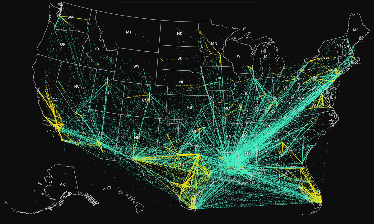
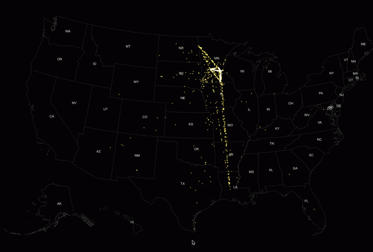
At a national level, the system looks like a network of constant movement. By connecting each individual’s first and last detention records, we could see where people ultimately ended up before deportation. Most were transferred out of state, often across long distances.
In the visualization, each dot represents a person who was moved between facilities, denser paths indicate higher volumes of transfers. The result is a map that shows not just destinations, but the flow of people through the system.
Digging deeper
But the national view alone misses something important.
Many detainees are transferred multiple times, moved between jails and detention centers across the country. These repeated transfers can make it harder to access legal support, stay connected to family, or even know where they are in the process.
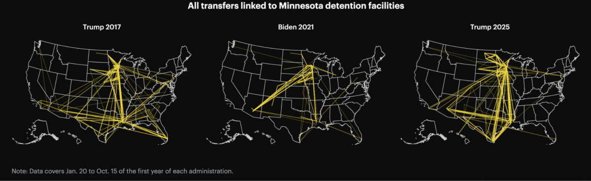
To understand Minnesota’s scope, I filtered for individuals who had at least one detention record in Minnesota (excluding hospitals). Then I pulled all detention records for those individuals, even if they were later transferred elsewhere.
This allowed me to track how often people were transferred and where they were sent. It also made it possible to compare patterns across different administrations within the same time window.
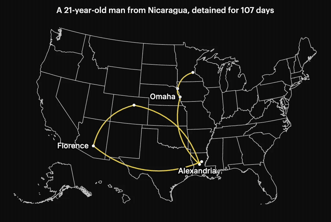
Susan Du helped find and interview people who were being affected by these detentions. We also identified individuals whose stories could be traced through the data. Some had no criminal record, yet were still moved across multiple states before deportation.
Building the project
In terms of how I built the visuals, the main challenge was scale. The dataset was too large for D3 alone to handle smoothly, especially with animated flows. To address this, I used a combination of Three.js for WebGL-based rendering, D3 for data processing and the scrolly map, Svelte for building the interactive components.
First, I set up the core Three.js environment: a scene to hold everything, a camera to define the viewpoint, and a renderer to draw visuals.
const scene = new THREE.Scene();
const camera = new THREE.OrthographicCamera(0, width, 0, height, -10, 10);
const renderer = new THREE.WebGLRenderer({ antialias: true, alpha: false });
Then I converted the data into buffer attributes such as position, color, and size, allowing all particles to be processed in parallel.
geometry.setAttribute( "position", new THREE.BufferAttribute(positions, 3), ); geometry.setAttribute("color", new THREE.BufferAttribute(colors, 3)); geometry.setAttribute("size", new THREE.BufferAttribute(sizes, 1));
Each data point is rendered using THREE.Points. To control how the particles are drawn, I use a custom ShaderMaterial to define their position, size, and texture.
Rendering the map on canvas allowed for smoother animation and better performance across screen sizes. I started the experiment with a much smaller data sample on Minnesota-related people, this helped test the visual concept before applying full data.
From there, we structured the story to move from the distant to the personal: a national view of detention flows, regional patterns, Minnesota-specific transfers and eventually individual journeys. That structure wasn’t planned from the beginning. It came out of the way I understood the data: from something large and hard to grasp, into something more specific, more human.