
Quickly Transform Your DataWrapper Locator Maps from Meh to Magnificent
For those looking to get started with data storytelling, DataWrapper may be just the free, easy-to-learn tool you’ve been looking for.
The locator map option certainly gets the job done, letting you display dots on a map to pinpoint locations. But what if those dots could tell a story? What if your map could make viewers stop scrolling and engage with your data?
With a few strategic tweaks, you can elevate your average locator map from functional to interactive, complete with custom styling, contextual details, and visual hierarchy to serve as a roadmap for audience attention. Let’s take a look.
First step: get connected
If you’re new to DataWrapper, sign up for a free account. Chances are, the free account will give you all the functionality you need. A paid account covers 10 users and allows you to use custom fonts, export to SVG, PNG and other formats, and delete the “Made with DataWrapper” text that appears at the bottom of visualizations.
Onwards…
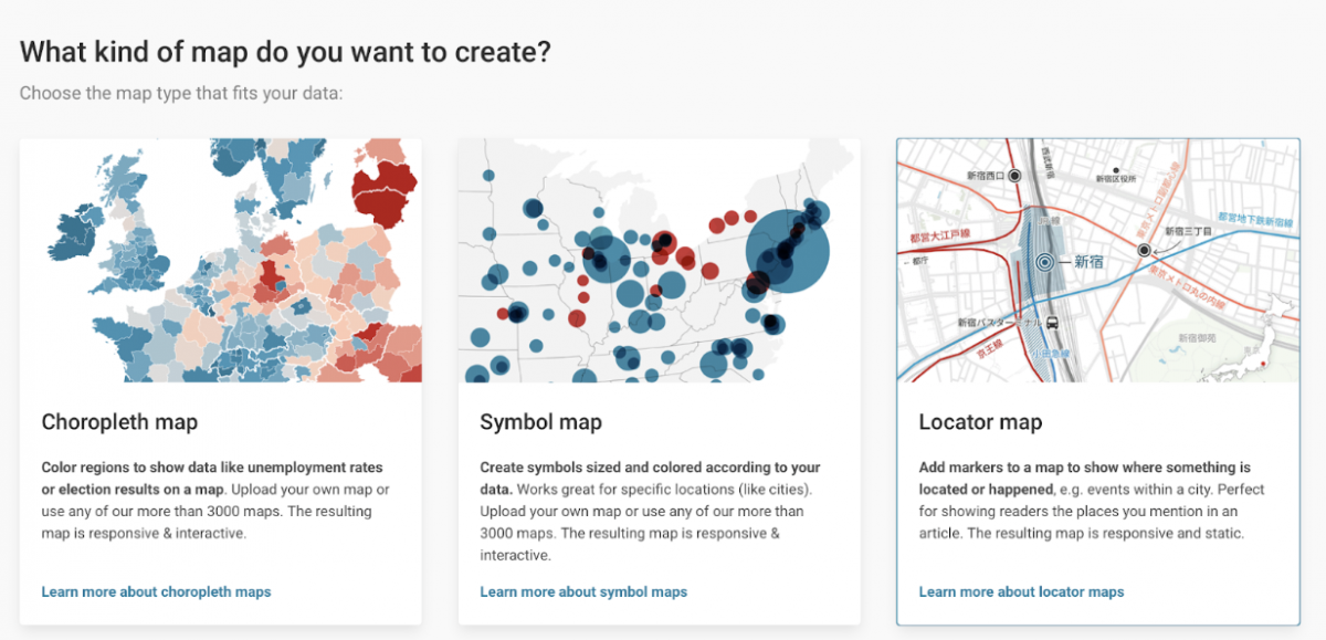
Create a locator map
From the dashboard, select “Create new…” and “Map” from the dropdown menu. This will take you to a page where you can specify the kind of map you want to build. Click on the “Locator map” option.
Time to start making our map
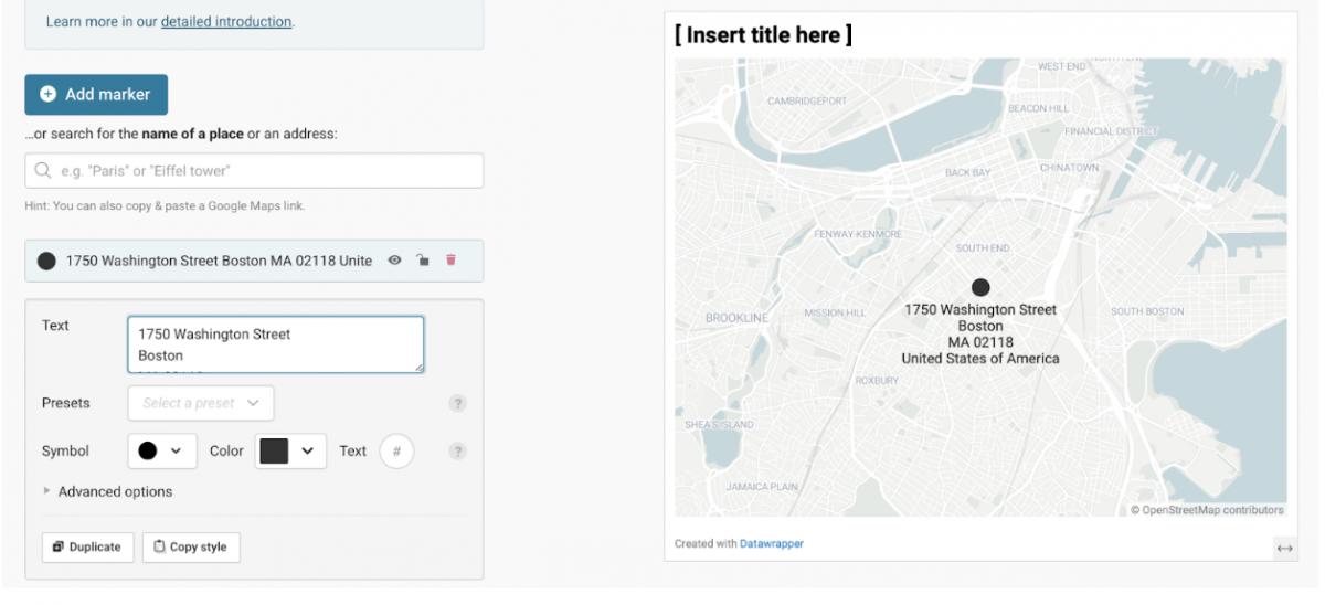
Clicking “Locator map” will take you to the “Add marker” page. This is where we’ll be doing most of the work. By default, the map will show the whole world. Fear not, it’ll zoom in as you add locations.
Click on the blue “+ Add Marker” button and enter the address of your first location. For instance, if I’m creating a map of the top 10 restaurants in Boston that serve soup dumplings, and my top-ranked restaurant is Nan Xiang Express – South End, I should enter the address of “1750 Washington St.” into the text field.
As you do that, you’ll notice that the map zooms in to Boston and the location appears as a black dot. A text entry box also appears that lets us modify the default options. It’ll look something like this:
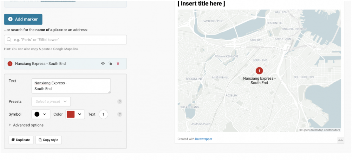
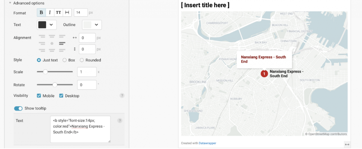
Next, replace the address in the “Text” box with the name of the restaurant. I use a return to force “South End” to the next line.
I also want to change the color of the locator dot and give it a number that reflects its ranking. These numbered locations are also useful if your map contains timeline elements (“first this happened here, then this happened there”).
Under the “Presets” pulldown, select “Numbered” and pick a color and enter a number in the “Text” field to the right of “Symbol.” The map should now look like this:
Styling the locator text a bit more
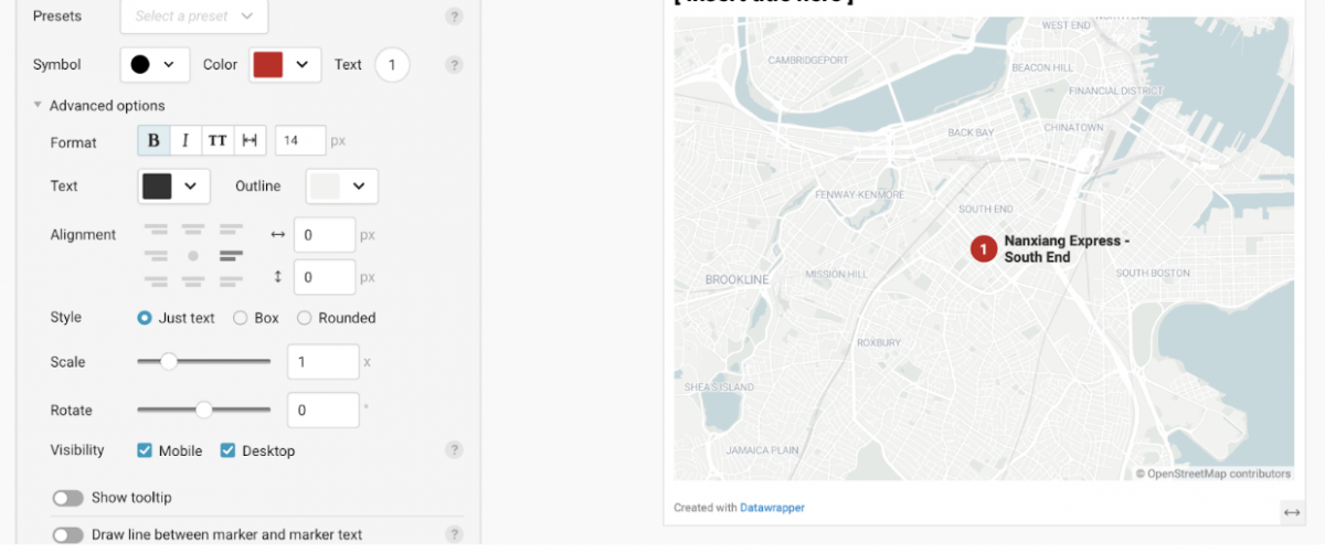
To see more styling options and add a pop up box when users hover over the dot, click “⏵ Advanced options” to reveal more choices.
Before you get to the pop up, you’ll want to change the location of the text besides the marker and make it bold. Next to “Format” I click the B bold button. Under alignment, choose a spot to the right of the dot. It now looks like this:
Adding a pop-up with more information
This is pretty basic so far, but I want to add a lot more information to this location to make it useful to users.
Since this is a restaurant recommendation map, I want to add a photo of a featured dish, location, hours and a clickable link to order. To enable that kind of pop-up, click the “Show tooltip” toggle so it’s on. By default, it adds the label text to the pop up in small grey type, but I want to make it bigger and bolder… and red. We’ll add some simple HTML and CSS code to do this. Adding a <b> before and a </b> after will make the type bold:
<b>Nanking Express – South End </b>
To make it larger, I need to add a little more styling information inside the <b>
<b style=”font-size: 14px; color: red”>Nanking Express – South End </b>
Want to add more type with the location and hours? Use the <b> tag to make some of the information bold. This should do the trick:
<b>Location</b> 1750 Washington St.
<b>Hours</b> 9 a.m. – 10 p.m.
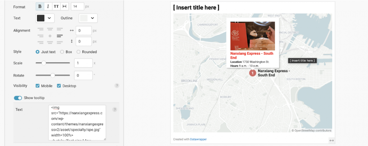
Adding a photo to your tooltip pop-up
We all know we eat with our eyes. To add some visuals, locate a photo you want to use. Control-click or Right-click and choose “Copy image address.” The one I want has a URL of https://nanxiangexpress.com/wp-content/themes/nanxiangexpressv2/asset/specialty/spe.jpg
And I want to put the photo at the top of the pop-up, so above the restaurant name. To accomplish that, I’ll add this code:
<img src=”PUT-URL-HERE” width=100%> The width code is important — it forces the photo to fit inside the pop-up.
Here it is, pretty slick!
Adding a link to your tooltip pop-up
One last thing, let’s add a button that lets users order from the restaurant. I grabbed the URL for the order page on the restaurant’s web site. It’s https://www.onlineorder.abcpos.com/nanxiangexpress/b28acd450c7f40b39b6e99e42bb10f85
I’ll next want to add that to the bottom of the “text” window. Note that the word “Order” appears in the code after > and before </a>. That creates the text for the link.
<a href=”https://www.onlineorder.abcpos.com/nanxiangexpress/b28acd450c7f40b39b6e99e42bb10f85“>Order</a>
That looks a bit squished, so I add a bit of space above by putting <br> before that line of code.
Here’s what it looks like:

Finishing up
You’ve now created a pop up with a photo, styled text, and a link for a locator map.
There are a few last steps left before the map is done: choosing map colors on the “Design Map” page, adding a headline and explanatory text on the “Annotate & Layout” page and publishing it from the “Publish & Embed” page. DataWrapper’s excellent resources section has an easy-to-follow tutorial. Happy plotting!

- Satellite companies restrict journalists’ access to images from the Iran War - March 13, 2026
- Layoffs at The Washington Post gut an innovative newsroom - February 6, 2026
- How an open-source investigation by the Wall Street Journal unmasked the official narrative of the killing of Alex Pretti - January 29, 2026

