Meet the Media Innovation student who builds Boston Globe data stories
Growing up in an “underdeveloped suburb” in China’s Hebei Province, Yan Wu pored over every page of the newspapers that her father took home from work. Wu’s family couldn’t afford to travel, she said, so her favorite pastime became reading about far-flung places. By the time Wu was 14, she knew she’d become a journalist.

Today, Wu is a Media Innovation graduate student at Northeastern University’s School of Journalism. She also holds a Master’s in communications and media studies from Sun Yat-Sen University in China and worked for two years as a journalist and editor for the Shenzen Evening News, assisting with layout design, fact-checking, and overseeing local news, especially data-driven stories. In the summer of 2016, she left her job and headed to Boston. At Northeastern, Wu has excelled at data visualization, merging her interests in layout and data reporting with web design.
Now Wu is on co-op as an editorial designer at the Boston Globe, expanding her talent and shaping compelling stories with more than words. She took some time away from her busy schedule to share some of her experiences with us.
What are some of your day-to-day responsibilities as a Boston Globe editorial designer?
My role at the Boston Globe is as an interactive journalist. Most of the time, I am assigned to create daily graphics for both the website and the newspaper, usually within a couple of hours. We have a few graphic templates for interactive online bar charts, fever charts, maps, et cetera; we just need to make some adjustments in the Javascript files. With the print graphic, we use Illustrator.
Other times, I work on long-term projects by collaborating with a few reporters. We usually have a few meetings to talk about story ideas and schedules, and then I do some quick experiments to show my colleagues what it’ll look like. If they’re OK with it, I’ll proceed.
Do you have a favorite part of the job?
I love every part of the job. But my favorite is I get to learn new stuff every time I work on a new project—a new Javascript library, a complicated function, or a new storytelling angle.
We were really impressed with your series on racism and Trump Twitter data visualization projects for the Boston Globe. What was it like working on these?
Thank you. My supervisor, Tonia Cowan, asked me to attend a meeting with the Spotlight team the first month I worked at the Globe. I was impressed by the ambition of the project and I really wanted to contribute to it. My suggestions were not taken, but I learned what they wanted from us.
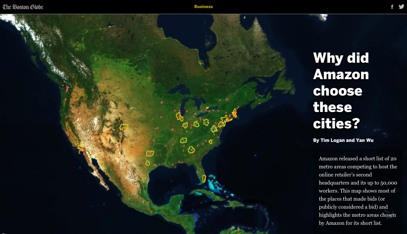
The enclaves map in the first [piece on racism in Boston] story paved my way to being a part of the project. It took the most time to finish— I wrote a tool to join the data from different sources, process the data and store them. My team gave me a lot of instant feedback. I listened to what they said, made adjustments or fought for what I believed in.
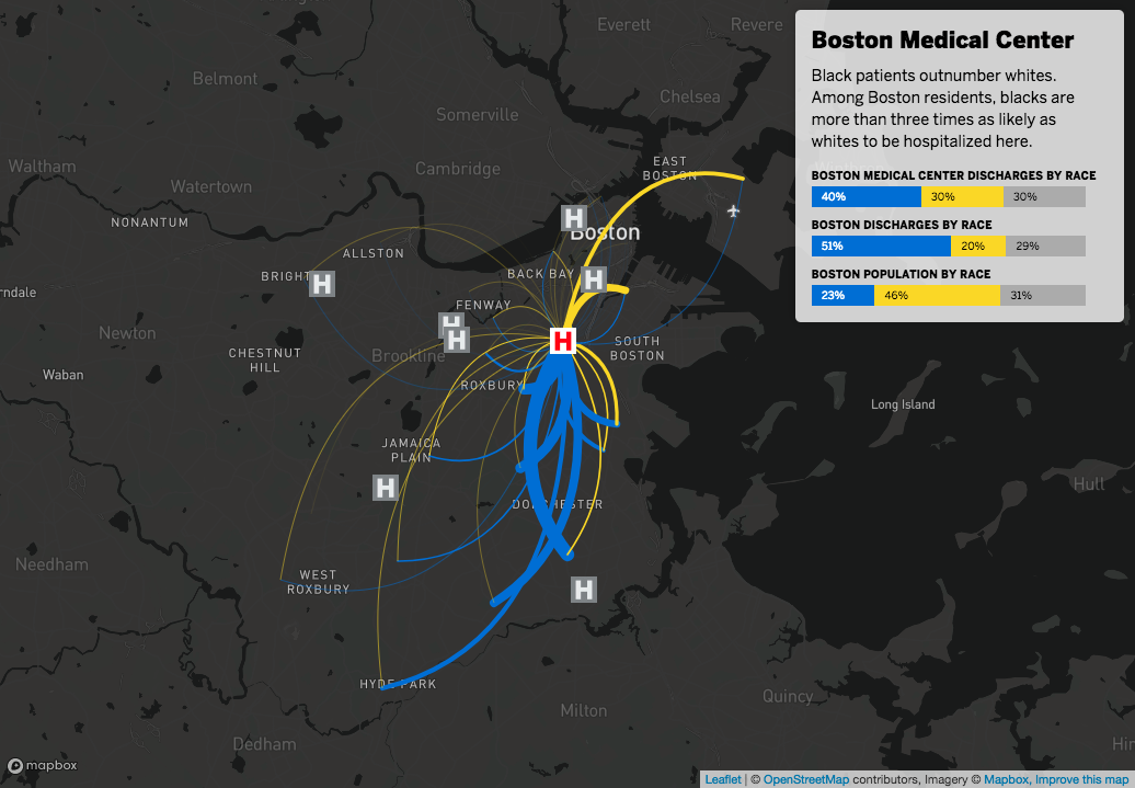
I advocated for the hospital map in the hospital story. There was a time when someone loved the flow and someone else thought it was confusing. So, I made another version –hiding the lines after the animation stopped and using circles to show the discharges. Some people loved it and some, including myself, did not. The reporters stood by my original version and we persuaded the others.
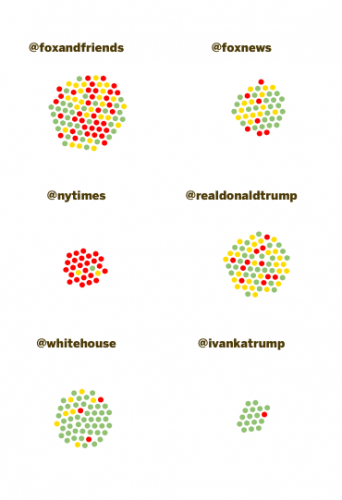 The Trump tweet story is the first project I jointly wrote with another reporter and developed independently with our new Globe app template. When I got the assignment five days before Christmas, I had just wrapped up the interactive graphics for the race project and was developing an interactive graphic for Words of 2017. I was so intrigued by the Twitter dataset that I couldn’t waste the opportunity to make it interactive. After it was published, Larry Edelman, the deputy managing editor, sent us an email saying, “This interactive graphic is simply splendid. One of the best I’ve seen the Globe do.” I know I’m bragging, but it required me to try my best to make it work.
You have a Master’s degree from Sun Yat-Sen University in China, so what propelled you to come to the States and work toward another Master’s degree?
When I was working at Shenzhen Evening News, I felt some mysterious energy to explore a bigger world… Bazinga!
The truth is, I’m always a fan of innovative ways of storytelling. I saw a 360 video project about prison life which blew my mind. Writing can be powerful, but I also wanted to create cool stuff like that.
What was moving to the other side of the world, to attend Northeastern, like for you?
It was like, wow, everyone can speak English so well! Their accent is so beautiful!
I think for some, if not most, Chinese journalism students, English speaking can be a big challenge. I still felt I behaved weirdly or I should use “this” phrase instead of “that” sometimes. I felt coding was my weapon to fight against other things that might stop me from being a good storyteller. But I slowly learned to embrace the differences, thanks to my lovely colleagues.
What sparked your interest in data visualization?
I was hired as a writer for Storybench and I did a lot of research on digital storytelling. I am really intrigued by how innovative it can be and that is the kind of experience I want to bring to readers.
Do you think data visualization is a big part of journalism’s future?
I think data visualization is already a big part now, but I am not an expert!
As a Master’s student, you were involved with The Scope, a student-run publication on “justice, hope and resilience” in Boston. What was the process of creating your Boston crime map for The Scope?
“Get your hands dirty on data and coding! It is a life-changing experience.”
The Boston crime map was my first data viz project. I audited a data visualization technology course and I wanted to do a map as the final project. Aleszu [Bajak] told me Leaflet is a cool library to play with, so I did. Though Leaflet.js provides detailed tutorials and it’s much easier than D3 to draw a beautiful map, I had a terrible time making everything work. Looking back, the code is really nasty.
Do you think this project helped you land your current position as editorial designer at the Boston Globe?
The crime map boosted my confident of developing interactive storytelling skills—it was a good start. Then I kept creating small projects whenever I could. It was through those small projects that I started to understand Javascript and D3 documentation.
What would you recommend to current journalism students, or those considering journalism?
Get your hands dirty on data and coding! It is a life-changing experience. For me, as I learned more skills, my way of thinking about storytelling changed. Today, I think more visually and interactively. But of course, the content is more important than the presentation.
- Meet the Media Innovation student who builds Boston Globe data stories - February 5, 2018