How a New York Times graphics editor designed “Greenland is Melting Away”
At the end of 2015, New York Times reporters visited Greenland with a group of scientists for an up-close look at the effects of climate change. The resulting article, “Greenland is Melting Away,” features interactive graphics that detail the scientific quest of a team of researchers collecting samples from the network of rivers that cut through Greenland’s ice sheets in an effort to correlate rising sea levels with global warming and, hopefully, better understand climate change.
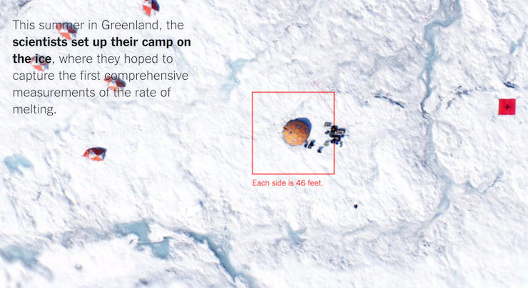
Storybench spoke with Derek Watkins, a graphics editor with The Times, to ask him how he went about creating the data visualizations for the article. The first visual allows users to zoom in from a satellite image of Greenland to a close-up of the scientists’ tents and research facility as well as the vein-like network of rivers. The second visual “pulls back,” as Watkins describes it, to show the areas where flow rates were measured.
There were a few people working on this project, what parts specifically did you work on?
The four bylines that are on the project are me, Larry [Buchanan], Josh [Haner] and Coral [Davenport]. Coral and Josh had gone to Greenland and done their reporting, but then when they came back, we were all kind of involved from the beginning of the writing process of actually like putting the article together. So part of what I did and my colleague Larry, who was also in the graphics department at The Times — part of what we did was help the story planning and work with Coral, the writer/reporter, to try to figure out what the best way to put the story together was so that the visual elements, like the drone footage that Josh captured on the ice sheet and the graphics that we were gonna be producing, would fit in with the writing and kind of one would flow into the other. And then beyond that, just like once we actually started creating the article, Larry and I worked on the portions that kind of zoom into the ice sheet. That was the main focus, but then we also handled the design of the article, like making font choices and just actually coding that design in HTML and CSS. So we handled that also, but the grunt of the work was on the interactive zooming parts of the article.
Early on in the brainstorming process, what did you want this project to achieve?
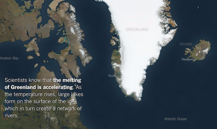
So one kind of central part of this story was this idea that we are bringing you down to meet the people that are on the ice sheets, that are actually spending time and their lives investigating this one aspect of climate change. So it was kind of taking this huge, multifaceted issue and boiling it down to this handful of scientists that are actually living in tents on the ice sheet, and so that was kind of the overarching goal, to use the visuals to make that point, and we ended up doing it explicitly. Like starting really big at the ice sheet and zooming in and in and in until you land on their little camp next to this little temporary lake.
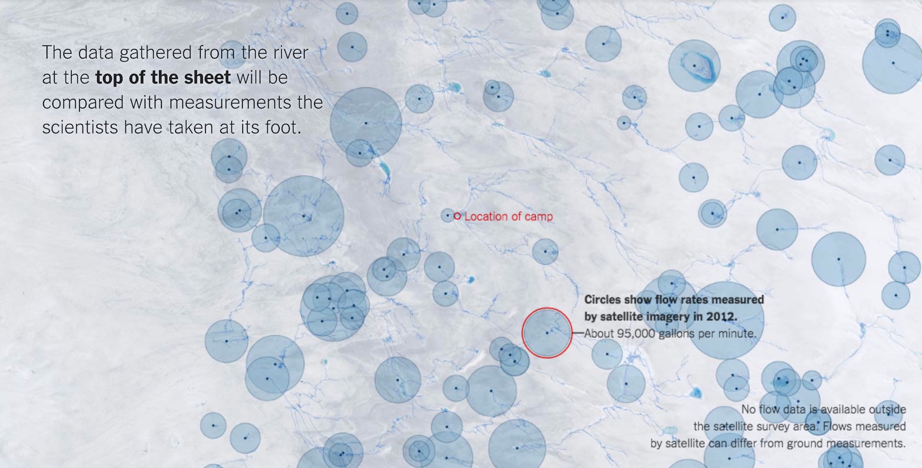
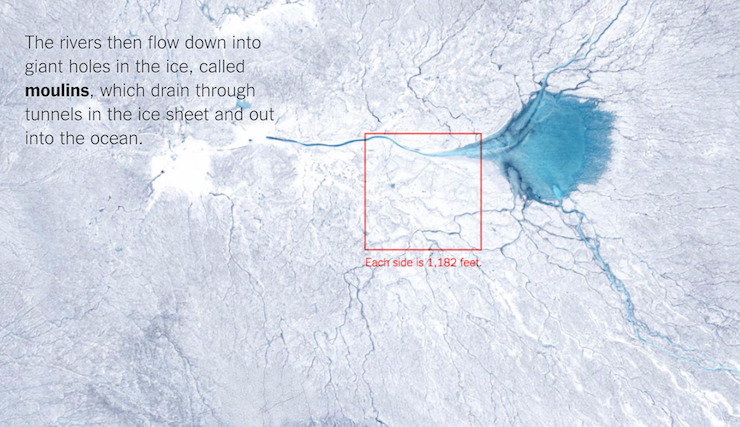
That was kind of the initial motivation: to do the zoom from way out thing, but then we also, farther down into the story, we used that same mechanism to pull back out and actually lay some data over the satellite imagery to kind of contextualize what we’ve been talking about elsewhere in the story to say like we’ve been focusing on this one moulin, [giant holes in the ice], that the scientists are researching. But then when you pull back there’s actually hundreds of them all over the ice sheets so this isn’t just the problem that you’re seeing in the photos and in the writing; it’s actually a much bigger thing.
How did your team attain the data and then organize it? What specific parts of the data did you want to visualize? Did you get the data from Coral who was doing the research in Greenland?
In this case, none of the data came from Coral, sometimes that’s the case. It kind of just depends. In this case, Coral put Larry and me in touch with Laurence Smith who was one of the characters in the story. She put us in touch with him and then we were emailing back and forth with him as we were kind of thinking about the visuals that we might do and we had like several conversations with him.
At one point we spent an hour having him explain to us the mechanisms by which these moulins burrow down into the ice because we thought at one point that maybe we would have a diagram of how these kinds of rivers burrow through the ice and then come out underneath the ice sheet. We ended up not even doing that diagram, right, but that’s kind of the process. You just kind of speak with, in this case, the researchers to get the characters of the story and just try to slowly brainstorm and think about what visuals might be best to support the points we’re trying to make in the story. And over the course of those conversations, you’re asking them “What data do you have?” and “Do you know other researchers that might have the data?”
I think it ended up that Laurence Smith knew some other researchers that he had worked with that had the satellite data that we ended up overlaying, and so he put us in touch with them and they had written an academic paper basically about the same data that we show in our piece. They were gracious enough to give the data to us that they used in that paper and so we were able to visualize it. That’s kind of how that one came together. But in general, it’s always kind of a very fluid process where you have an idea. If you’re not sure if that data exists, you get in touch with the people that know whether or not it exists and then depending on what data is out there, you might have to change your idea or take a different approach.
How did you code both of the interactive satellite graphics? What tools or techniques were employed to create them?
To begin with, we collected satellite imagery at several different scales. [And we] have this snapshot of the camp which is actually drone footage that the scientists actually shared with us. And then when you get a bit farther back, you’re using high-resolution satellite imagery and then farther back still you’re using publicly available medium-resolution satellite imagery and then when you’re looking at all of Greenland that’s actually just kind of a map that I made using satellite imagery and data on the shapes of the land masses and things like that, right, so that’s why when you get kind of all the way back, it has this kind of very clean look because it’s not actually a satellite image, it’s more a map.
We used, when we were preparing the satellite imagery, an open-source GIS program called “QGIS” to collect the satellite imagery and line it up and stuff like that. After that we used Photoshop to kind of color-correct the satellite imagery and to make the map of the very well-zoomed out level. And then I used Adobe Illustrator to crop out those images and export them and these big squares that make up the flags that you’re zooming in to.
On the page itself, we wrote a lot of custom Javascript. I think we used a Javascript library that’s called D3, which is very popular for data visualization. It’s got some good mapping tools included in it that makes it kind of easier to do things like this. So I used Javascript and then used what’s called a canvas element on the web page. Basically a canvas is just an image that lives on the webpage like any other image except that you can draw to it with your computer code. So you basically have this image that you can draw anything you want: circles or squares or lines. And so basically we used Javascript to, every time somebody scrolls, figure out how far zoomed in they should be, how big we should make the images that you will see at this point, and based on how zoomed in you are, how we should save the images between one another. The computer code is basically just doing that like 60 times a second as somebody scrolls down the page, and it writes it to the canvas element which then shows up as this image that is animating on your screen.
What were the biggest challenges in creating the graphics?
I think, just from a technical point of view, it was pretty difficult to get everything to line up the way that we wanted it to. That was probably I guess the most difficult part, just making sure that the transitions were very smooth and that you couldn’t see the points that were fading between one image and another so that it felt like this very smooth animation.
What does this project not show that you wish you could have fit in?
I don’t know. There were definitely other aspects of the story, like the thing I was talking about before where we were considering doing the diagram of how these things dig into the ice sheets. There’s always things like that — there’s always more information that you could throw into a story. But I don’t know if I would say that the story would be improved if we had put that in there. You know, we made the conscious decision not to put it in because we wanted to keep the story focused on the most important things that we wanted to communicate, so I feel pretty happy with how the story turned out.
Typically, we’ll end up with more regrets about what we could have done with a story if we’re on a very short time frame. But with a story like this, we had enough time to really plan it out and be specific about what we wanted to include and where we wanted to include it. So with this story, I think we had enough time to make it the form that we wanted it to be in and to make specific choices and were able to execute on those. So in this case, I feel pretty good about what we ended up including and I don’t have any large regrets.
From data gathering to digital design, what advice do you have for journalists trying to build similar visualizations?
I think even if you don’t have much of a background in design, just reading a bit about very basic design rules, the very basic understanding of how to approach visual communication, can go a long way. So I think that’s a valuable thing to have, even if you’re not going to be making graphics full time, to kind of understand the principles of visual communication.
Beyond that, if somebody wants to jump in deeper, I would definitely urge them to learn HTML and CSS and Javascript just because that’s kind of like the bread and butter of so much of the stuff we do. And also Adobe Illustrator: still kind of the de facto main software program that people use to make stuff like this. So that’s kind of from a training and learning and software point of view.
It’s important to keep in mind that when you’re doing something like this — making a graphic to support a story or to be the story — you’re still doing journalism, right, and all the same rules and same ways you would be careful about getting things correct in a written story still apply when you’re doing visual journalism. In some cases, even more so because it can be much easier if you’re doing a visual to introduce error, introduce detail that you didn’t necessarily report out without even realizing it. So I guess that’s kind of a broader piece of advice I have: If you’re doing graphics or visuals for a story you should approach it as you would another medium through which you’re reporting the journalism and things that you sound out. In that way it’s really no different from writing a story and making sure you get all the facts right.
- How a New York Times graphics editor designed “Greenland is Melting Away” - February 28, 2017


