
How the Urban Institute democratizes access to education data
Debates about education have taken center stage everywhere from local school board meetings to debates between presidential hopefuls. Yet, beyond the rhetoric, getting the hard data to answer questions like, “How have student demographics at the school down the street changed over time?” and “How have student outcomes changed over the course of the pandemic?” has been surprisingly difficult. The information is spread across multiple government agencies, and getting meaningful insights can require laboriously cross-referencing and combining data from multiple places.
In 2018, the Urban Institute, where I’m a senior data engineer, launched the Education Data Portal. It’s a free one-stop shop for nearly all major national datasets on schools, districts and colleges in the United States. The goal of the portal is to make the large amounts of education data published each year more accessible by centralizing and standardizing this information over time and across sources. As a result, users can spend less time finding and wrangling data and more time leveraging data to answer the questions that matter to them.
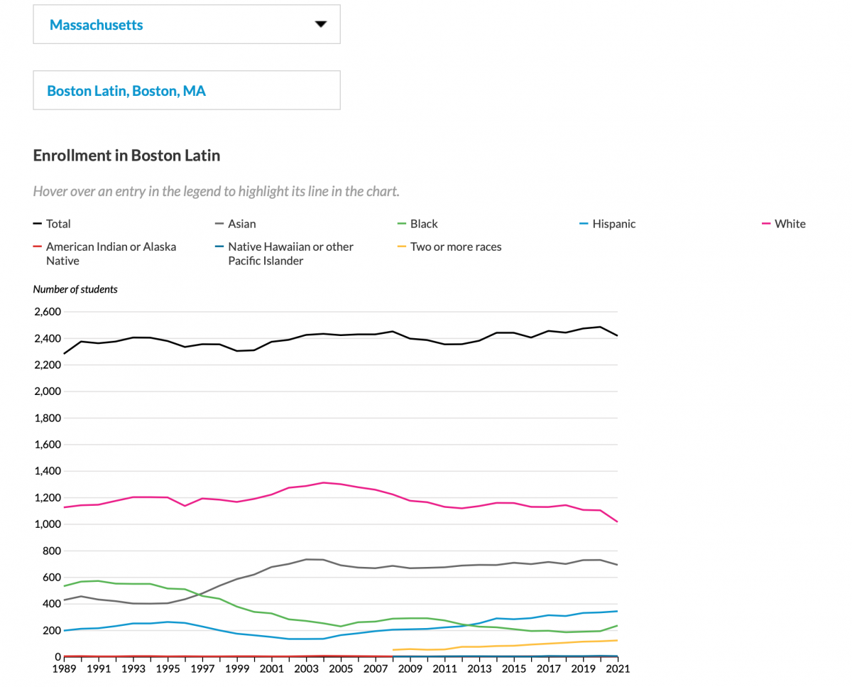
At its core, the Education Data Portal includes an API and a documentation site. Our developers have also built tools to help technical and non-technical users interact with the portal more easily. This includes packages to let R and Stata programmers pull data with just a few lines of code and a point-and-click Data Explorer tool to let non-programmers download custom data extracts with just a few clicks. We’ve also built summary endpoints to let users quickly compute aggregated statistics, and we’ve developed dashboards and Tableau data connectors to help visualize this information. In this example, the demographics for a high school over time can be quickly charted and downloaded in multiple formats.
The portal has been highly effective at bridging the gap between data availability and data accessibility (i.e., putting the data that agencies already make freely available at the fingertips of more people). Here, we wanted to highlight two features that have been key to making this data more accessible: focusing on the underlying API and treating data documentation as a first-order priority.
Focusing on the underlying API has been key to the portal’s utility and sustainability.
When we launched, we wrote about how and why we built an API rather than publish Excel, CSV or other flat files like the agencies reporting this data typically do. At the time, we noted that APIs are valuable for large and complex datasets because they let users specify a subset of rows and columns to return. Since then, as we’ve added dozens of new datasets each year that often include millions of rows and hundreds of variables, this has proven especially useful. Through the API, users can specify that they only need data for a particular school or from a particular year, for example, which allows them to load, browse and filter these records much more efficiently than if they had to first download dozens of gigabytes of flat files.
The API also makes it easier for users to access and combine data from different sources. The portal brings together more than one hundred datasets published by different agencies in various formats. Because the API returns data in a consistent format across all of these endpoints, users don’t have to spend time learning the ins and outs of each dataset’s structure –– file formats, entity identifiers, variable names, layouts, etc. Instead, they can access all of these datasets using similar syntax and receive records in a consistent format with harmonized variable names and data structures.
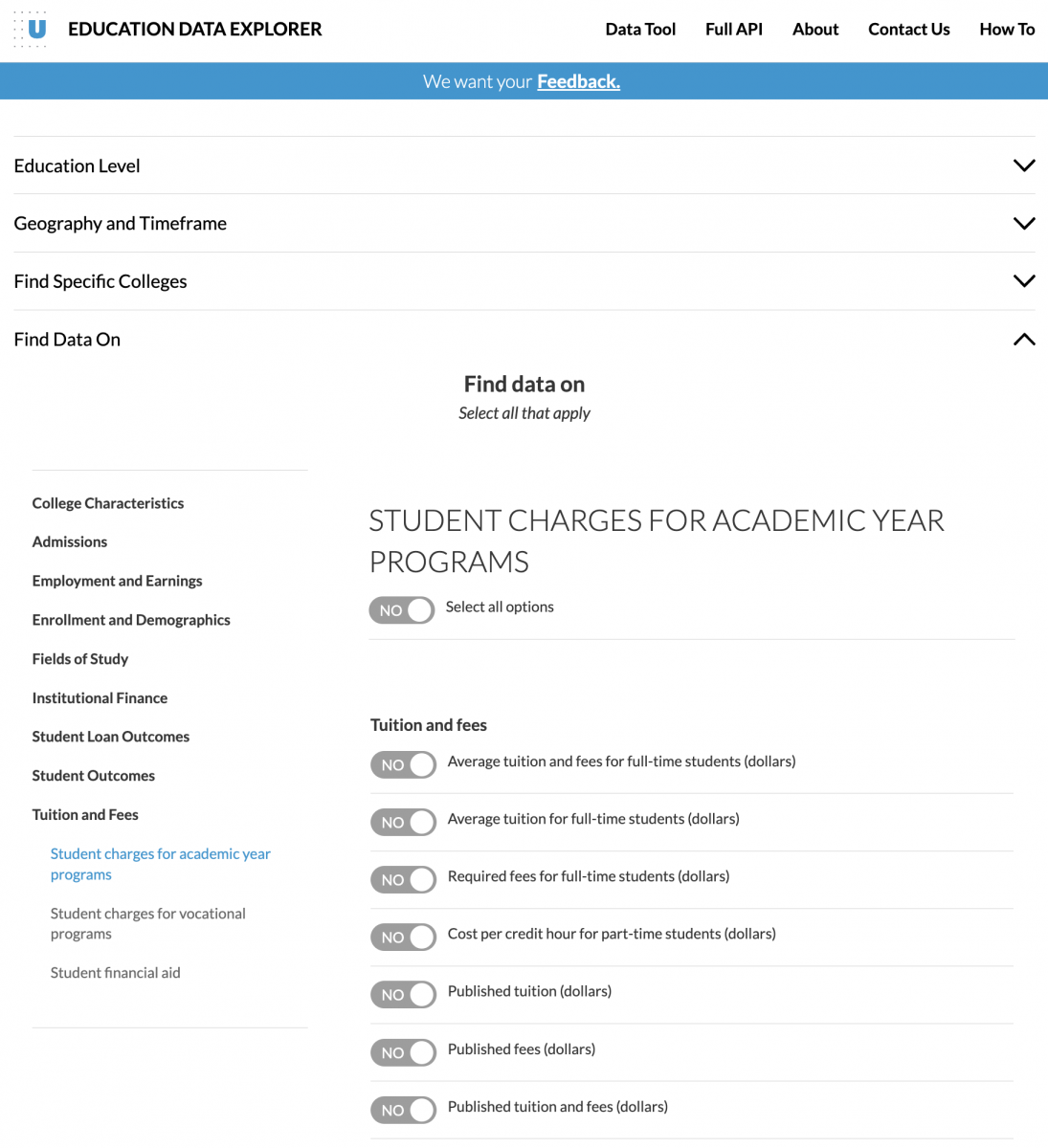
For example, suppose you were interested in exploring the relationship between college endowments, tuition and student loan outcomes across colleges. Without the Education Data Portal, you would have to navigate three different websites to download the data and then spend hours wrangling the different datasets to combine this information. With the portal, you could instead make a single trip to the Data Explorer tool (shown below) or write a few lines of code to get all of this information in a standardized format within seconds.
Over the years, all of the tools that we’ve built around the portal have directly leveraged the API through a combination of data endpoints (with the data) and metadata endpoints (about the data). This has grown to include applications built using R, Python, Stata, D3.js, React, Tableau, various AWS services and more. We’ve been able to sustain this growth by leveraging the API as a single source of truth. Our developers are able to focus on ensuring that the underlying API is fast, reliable and accurate –– and all of these other tools (along with tools that users develop from the API) can stay up-to-date with virtually no additional effort. As staff have transitioned off and onto the project over the years, limiting the scope of responsibilities for the portal’s developers has helped ensure the project’s continued success.
Treating data documentation as a first-order priority provides tremendous value to users.
The portal also makes education data more accessible through harmonizing and improving data documentation. This is especially valuable given the lack of standardization and challenges that government agencies often face in making their own documentation more accessible.
As with the API, a core feature of the portal’s data documentation is simply that it is centralized in a single place and reported in a consistent way across endpoints. As a result, users don’t have to navigate dozens of websites and parse through Excel, PDF and text files (how agencies often report data dictionaries) that are formatted in different ways and include different pieces of information. Instead, they can access complete and detailed documentation for all of these datasets through a single, harmonized interface.
Another key feature of the portal’s documentation is that it is designed to be both human- and machine-readable. The screenshot below shows how the interface displays detailed information about each endpoint: which years of data are available, which variables are included, what these variables represent and their data types, what categories or special values exist (and how this may have changed over time), how the endpoint can be accessed using different programming languages and more.
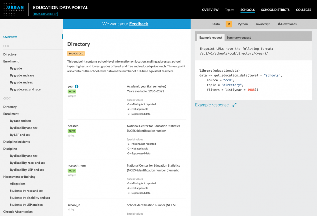
By displaying this information through an user-friendly, interactive web interface, the portal makes this dense content digestible, leveraging design principles like providing details-on-demand through tooltips and organizing parallel information through tabsets. A set of metadata endpoints also makes this information machine-readable, or able to be accessed programmatically to automate otherwise tedious and manual steps such as labeling charts, dashboards and other interfaces. This has been particularly useful in recent years as users have developed increasingly complex applications and tools from the portal.
Over the last several years, we’ve heard from countless users who have used the Education Data Portal to answer a range of questions. They include researchers using this data to inform policy decisions, developers building complex web applications to support university administrators, parents and teachers exploring trends in their own communities and more. We believe that data can have the most impact when it is accessible to everyone, and we’re excited to see how the portal continues to put education data at the fingertips of more people for years to come.

- How the Urban Institute democratizes access to education data - February 20, 2024


