Berliner Morgenpost’s interactive bus ride through Berlin
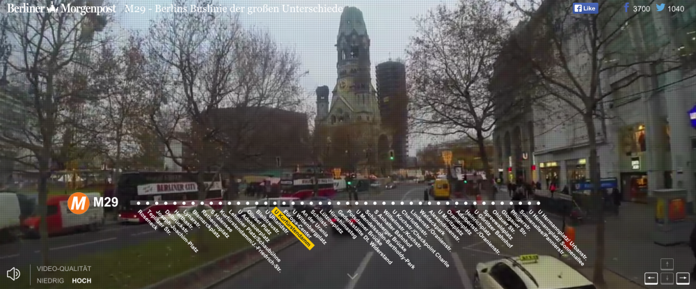
Last week, the German newspaper Berliner Morgenpost published an interactive following one bus route that winds its way “through the social universe” of Berlin. The newspaper visualizes statistics from each neighborhood visited by the M29 bus, including migrant makeup, rent increase, income and burglaries, among other data.
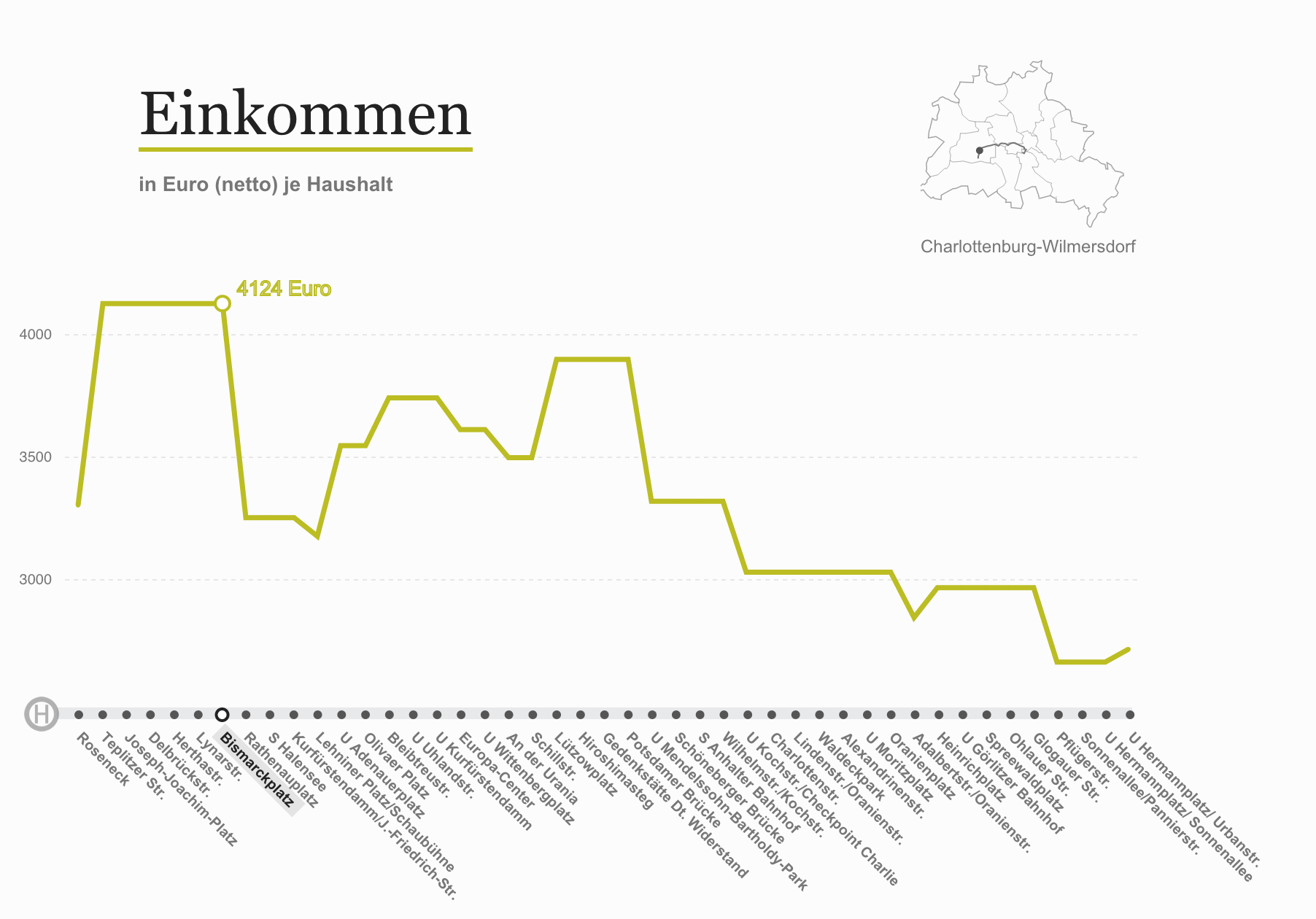
Income
Bismarckplatz, near Berlin’s Grunewald forest, has some of the highest net income levels per household.
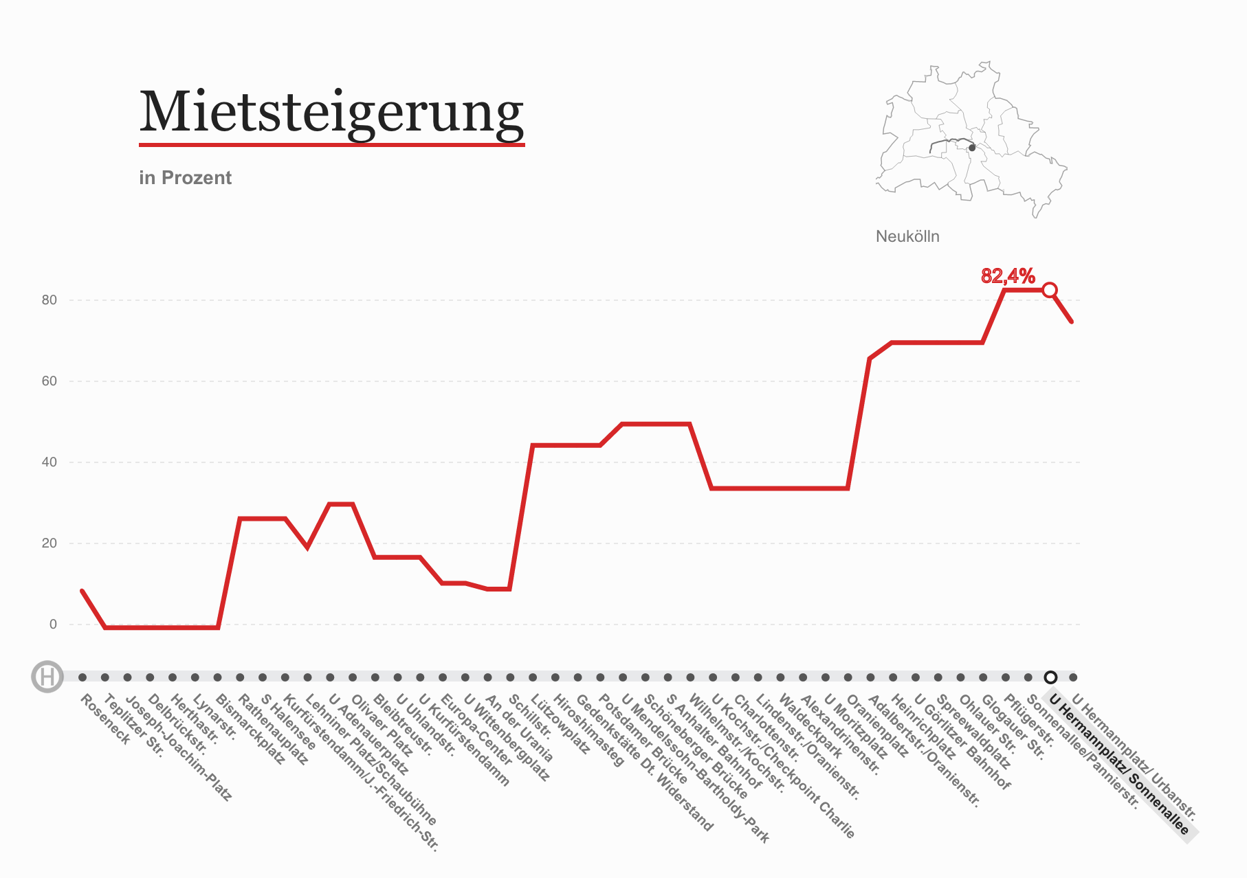
Rent increase
Sonnenallee has seen some of the highest increases in rent in the city. Must be the Döner kebabs.
Data ethics
We asked one of the visualization’s designers, Julius Tröger, about the choice not to superimpose the charts.
@storybench Thanks! We thought about that. But we use different data granularity (post code areas, electoral districts, neighborhoods,…)
— Julius Tröger (@juliustroeger) January 16, 2015
What were the charts built with?
The charts were built with C3.js, a D3 Javascript-based reusable chart library. Tröger designed the feature along with Theresa Rentsch, Moritz Klack, Max Boenke, David Wendler and André Pätzold.
One nice touch: they admitted in the visualization’s credits to being inspired by The New Yorker‘s Inequality and New York Subway Map.
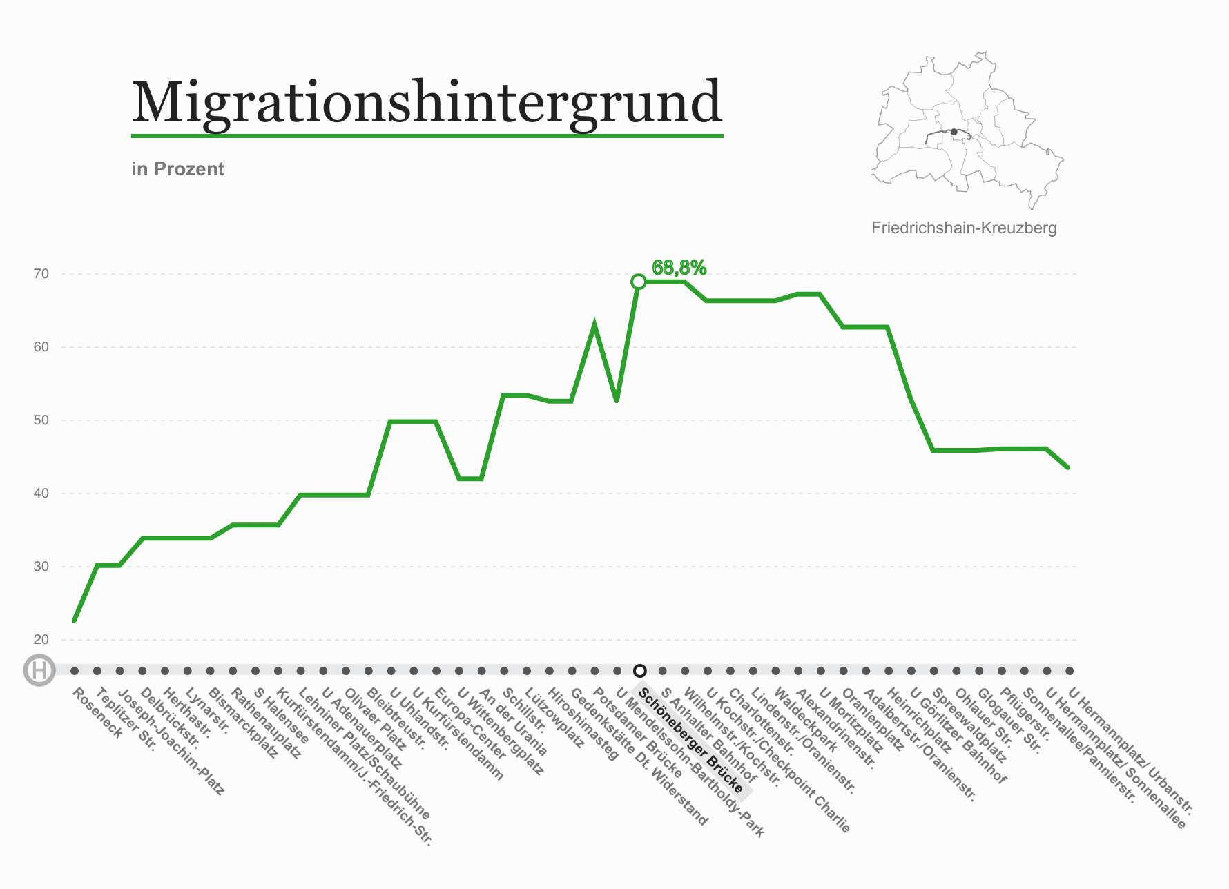
Immigrant makeup
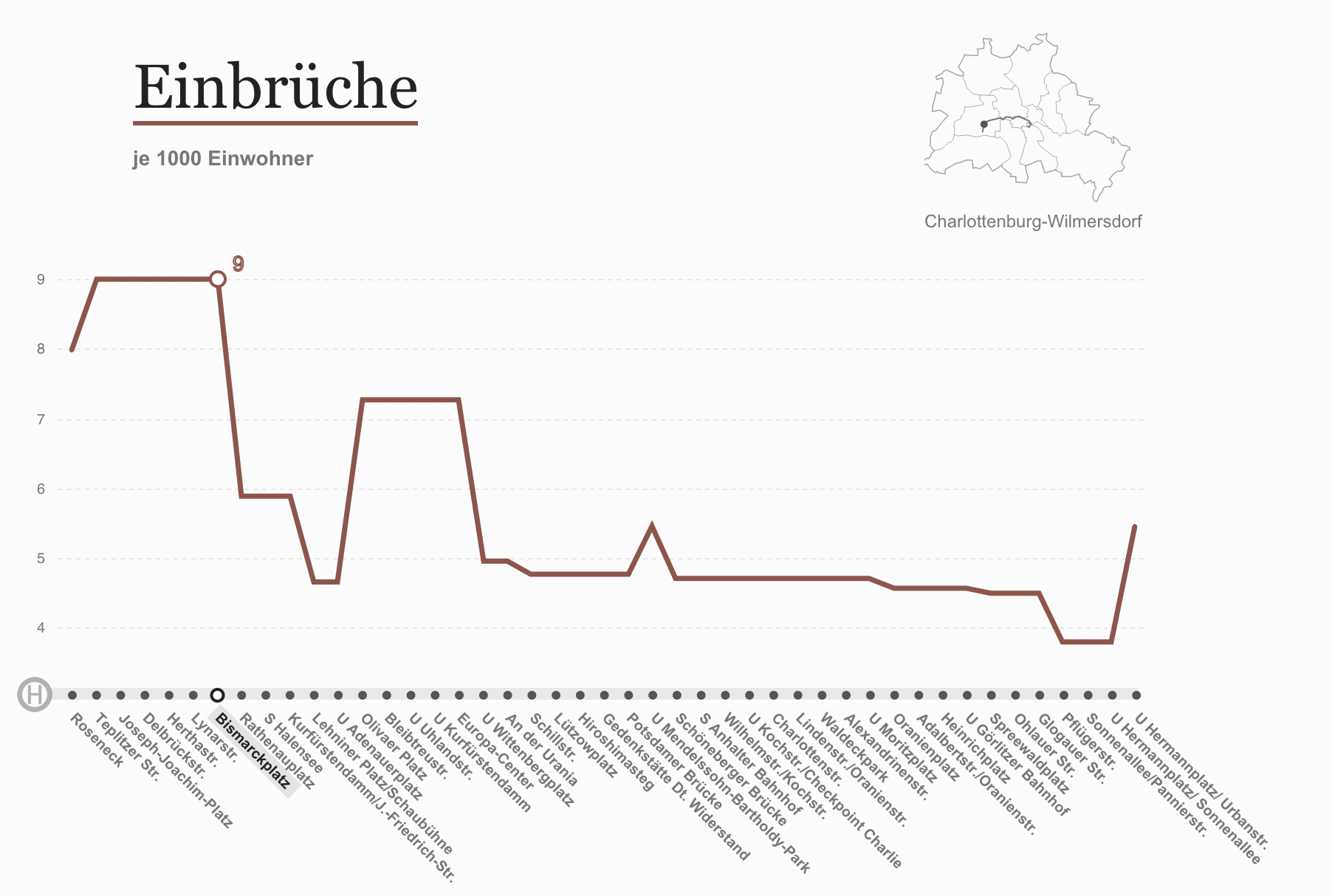
Burglaries