How a dataset on lighting strikes taught me to not take data at face value
Being struck by lightning is often used as an example of heavenly retribution because it is so unlikely. The occurrence is simply so rare that it might as well be due to divine intervention – only 49 deaths per year on average are reported by the National Weather Service. But these fatalities are statistical outliers since most people struck by lightning survive. So what is the best way to avoid becoming one of these outliers? The following is a step-by-step set of instructions for unpacking a dataset – and being careful about the conclusions we draw.
While correlation certainly does not mean causation, here are a few interesting trends that jump out. If you are male, you might do well to stay indoors during thunderstorms, as men accounted for 79 percent of lightning fatalities between 2006 to 2017.
While this gender breakdown is easy to graph, not all categories – such as activities being performed as individuals were struck – are simple to visualize. Turns out, the activity linked to the most lightning strike fatalities was also the most ubiquitous – walking. Fishing was second!

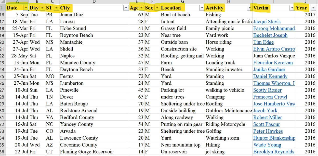
To understand how I reached that conclusion, let’s examine the raw data and how it was organized. Taken from the National Oceanic and Atmospheric Association’s website and fed into a spreadsheet, the categories I found were Date, Day, State, City, Age, Sex, Location, Activity, Victim and Year. As an aspiring environmental journalist, this was a treasure trove of weather-related data (of a very specific nature) I could poke around.

After creating a pivot table of the data, I noticed several discrepancies in the “Activity” category. Descriptions were entered inconsistently, with even minor differences in word choice creating new data points, i.e. “roofing” and “working on the roof,” while clearly the same, were listed as different activities.
When these seemingly minor inconsistencies added up, they could badly skew the results. Any trend or conclusion drawn from this data would be wrong. Treasure trove it may be, but also an object lesson in the perils of large datasets and not to ever take data at face value.

Before it could be of any use, the data had to be heavily cleaned. Duplicate data points in the “location” and “activity” categories needed to be collapsed, or consolidated. The following graph was created using the unrefined data, and the results are quite different from those graphed above, giving the impression that the most dangerous activity during a lightning storm is fishing, rather than walking.

It would have been easy to assume this was correct, since I was already predisposed to assume that a water-related activity would take the top spot.
However, the filter option on Excel’s pivot table function allowed me to search out all similar activities, regardless of precise wording, and either edit the label or manually factor it into the data visualization. Whether walking your dog or walking to your car, for example, it should still be counted as walking for the purposes of this graph. As shown here, there were several variations on the activity “walking” and I collapsed most of those into the single heading. Left as it was, each of these would have been calculated as an individual activity.

With the adjusted data, the new graph showed that walking was actually, by and large, the most dangerous, up from 24 to 36 fatalities.
With data processing tools such as Excel, Google Sheets, Python or R at our fingertips, it’s easy to think that finding this information would be a relatively simple matter of feeding the raw data into a program and publishing the resulting graph. But it’s no surprise that most datasets require a lot of “data wrangling” before conclusions can be derived. In fact, a 2016 survey by Forbes found that data scientists spend about 80 percent of their time on data preparation alone. Data journalists presenting at the 2019 NICAR conference have been warning about the same thing.
- How the Wall Street Journal reported on “The Price of Climate” - April 11, 2019
- How a dataset on lighting strikes taught me to not take data at face value - March 8, 2019