5 ways news organizations are visualizing election data
Believe it or not, the first presidential primary is only three months away.
Let us take a look at five smart ways that news organizations are presenting election data, such as candidates’ profiles, voting demographics and districting, so you can make your data visualizations more powerful and better inform readers.
Let users try out different scenarios for all the ways to win.
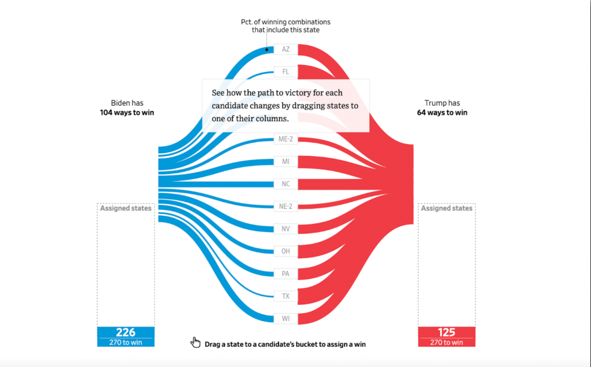
In the 2020 election race between Donald Trump and Joe Biden, The Wall Street Journal visualized their possible routes to the White House through electoral votes. This interactive allows users to assign remaining electoral wins by state to each candidate and illustrates the percentage of winning combinations based on that state’s electoral votes.
Before election results are available, visualizations like this one are valuable for the public to see the chances that each candidate has to win.
See where voters are coming from.
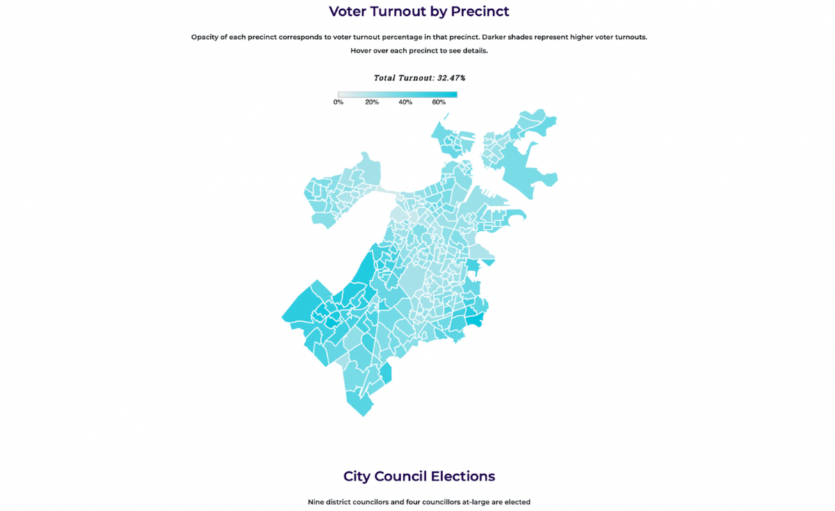
Voter turnout is a key factor in understanding the results of an election on a local level.
The Scope created this map of voter turnout from the 2021 Boston mayoral election, with darker shades representing greater voter turnouts. This visualization gives the reader an insight into where the most votes are coming from.
While maps like this gives readers a better insight into where voting citizens live, a deeper dive into the demographics of each precinct would give readers a chance to explore which demographics are more likely to vote, and for whom.
Compare election results by precinct and candidate.
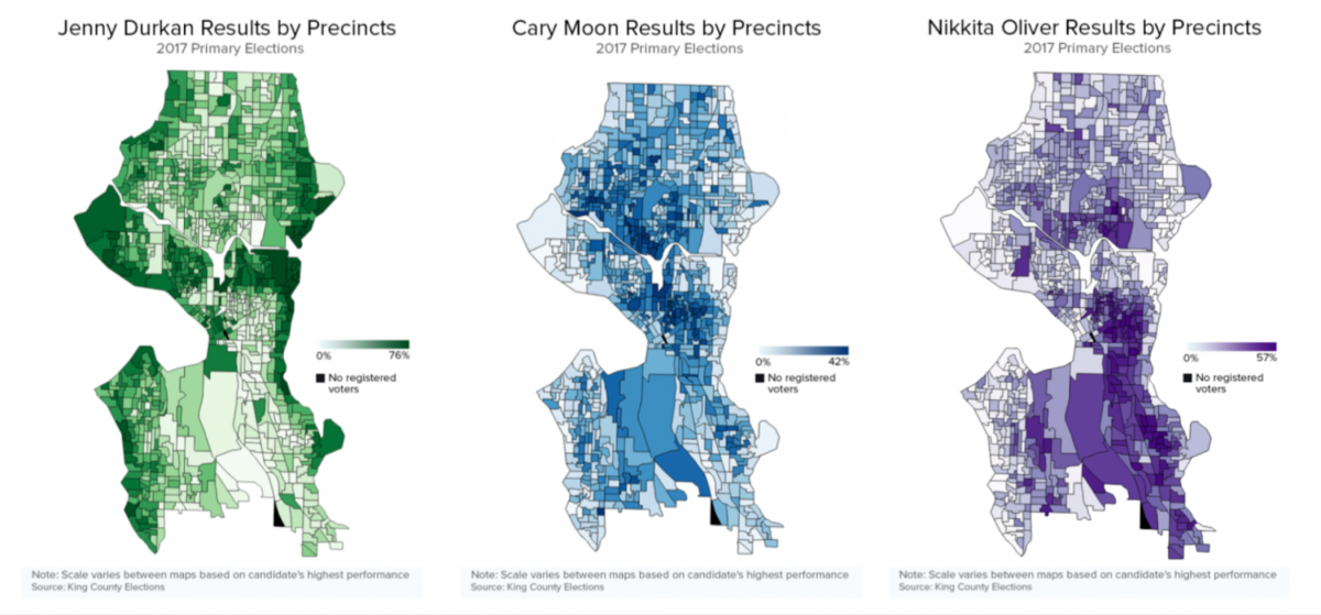
In 2017, Crosscut deeply reported Seattle’s voter demographics, comparing primary election results by precincts and representing them as percentages of voter turnout.
Unlike The Scope, this visualization gives local readers — like me, a Seattle native — more comprehensive insights into which neighborhoods, and therefore which demographics, are driving each candidate’s success. As someone who lives in the city, visualized data like this can enhance locals’ understanding of voter demographics, helping them better election results and how candidate support is distributed throughout Seattle.
Find out who the average voter for each candidate looks like.
On a national scale, breaking down states’ votes into more distinctive demographic categories is often more insightful than just where voters live.
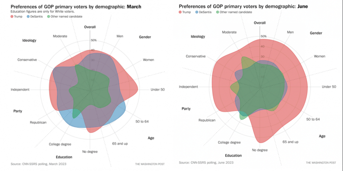
Earlier this year, The Washington Post analyzed the demographics of GOP primary voters, comparing Trump and DeSantis supporters’ backgrounds, including education, age, gender, ideology and party.
It reveals both which groups that candidates targeted and where they fell short. It also shows how the election campaign is swaying voters through different months’ comparison. The March and June visualizations, for example, reveal where support fell away and provide an insight into the future of that candidate’s presidential campaign.
Let users become the campaign manager.
Finally, Politico’s recent article “You Be the Campaign Manager,” allows readers to take Election Day and presidential campaign data to a personal level. This interactive allows readers to explore the campaigning side of elections and reveals the leading factors that campaign managers use to swing the vote into their favor. This breakdown illustrates clearly where campaigns and candidates target and why.
In 2024, election data visualization is vital in educating the public on voter demographics, hypothetical results, and most importantly, why and how our votes matter.

- 5 ways news organizations are visualizing election data - November 2, 2023