How Nature magazine visualized 150 years of scientific discovery
In honor of the 150th anniversary of the seminal scientific journal Nature, the publication spent months producing a special “cover” for the 21st century. Through a colorful interactive tool, a set of exclusive analyses, and a “data movie,” users can explore the entire network of multidisciplinary research published throughout the journal’s history.
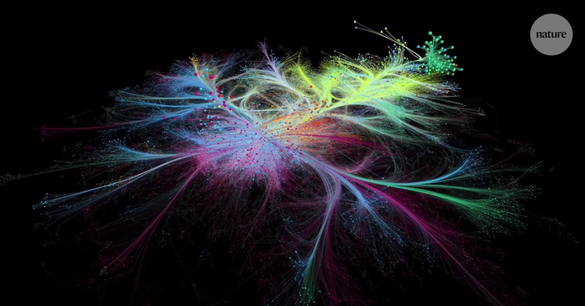
“150 Years of Nature” explores what’s known as a “co-citation network” –– a 3D visual object where points represent individual scientific papers, and linear connections between them symbolize citations that reference the work.
Storybench sat down with Mauro Martino, founder of the Visual AI Lab at IBM Research and a former Northeastern professor, to discuss his role in the project, what it means to be a “data director,” and how effective data storytelling can elicit a tear-jerking response from scientists and the public alike. The following conversation has been edited for length and clarity.
This project was a massive collaboration to produce multiple components––an article, an interactive user experience, several images, and your directorial debut: a “data movie.” Who was involved, and what did you focus on in particular?
With Nature, we have a long story of collaboration. For months, we talked and we shared ideas and opinions.
The Barabási Lab was responsible for the collection of the data and possession of the data. The type of data, and the type of analysis, and the way to plot this data was [determined] in collaboration with the communication team at Nature.
I chose my contribution, and decided to focus on what I considered the most complicated thing in that data visualization system. For this type of project, I tried to take the more artistic part––the part where I can essentially act as a “data director.” My job was visualization of the story and the data. Usually, the story is very rich. So my job is to simplify the story and to find the insight that can be more interesting for the audience.
You’ve done an impressive amount of work with networks and visualization. How did this project compare to others you’ve done in the past?
You don’t see “data movies” very frequently, because they take [so much] time. An interactive tool, in the end, is easy to [make], because you make the visualization, you make it interactive, and then [the product is] the user story. You interact, and you find what you want to find.
A five-minute movie is almost 20,000 frames. 20,000 pictures that have to work together and flow. When you have the responsibility to deliver a story, you need to consider any possible aspects that come from the data, any possible insight that comes from the scientists, and then strengthen the story, identify just a few things, and work a lot with the journalists and the scientists to really familiarize the flow of information so that it can be easy to understand for almost everybody, and be engaging both for scientists and for people who are not from the field.
For five minutes you have to make it exciting for the audience. And you have to create some emotion.
What were some challenges you faced in putting together the story?
The big problem was, for me, in the end, this network was very small. Now, I’m working with very big data––I have a terabyte of data to visualize in some way––but you can really fit all this information on the screen. For my parameters, it’s very small. And how [could I] make what’s so small look so big, and have people feel like they’re losing themselves in a galaxy of papers?
So, to identify the type of information I created for my camera, the type of movement that I was building, [I wanted] to make people feel that that universe was huge, with different regions, with different aspects, and a lot of complexity. So if you see the video there are just two or three spots where you [see the] big picture of the whole network. Otherwise, the camera is always inside some part of the network. And this gives you the sense of immersion in something big; you feel like you’re inside a universe of information, a constellation of papers.
And that was, in some way, the spirit that we tried to insert visually, to share the state of Nature. We tried to glorify, to honor a certain journal by presenting visually the sense that there is a universal knowledge that this journal was able to build in a 150-year history.
As you put together the visuals, did you find yourself making any arbitrary distinctions or compromises? Is there anything you’re concerned about being misleading or misrepresentative of the data itself, based on the visual choices you had to make?
Well, there are a lot of stories that are missing. I mean, there are so many stories in the dataset, so many. And I spent a month reading everything I could about the Nature story, multiple books to understand the evolution of this journal. I think the whole team was really conscious about the history, the number of incredible discoveries that were in some way published in the Nature journal. And were we absolutely able to tell all these incredible stories? No. Absolutely not.
Probably, you’d need to play more with the interactive tool to find the stories you will be looking for. But when it was time to really simplify and just deliver a five-minute story, the oversimplification is so strong that we can easily say that we misdefined, in some ways, the full content of the papers. By watching the movie, you understand the spirit, but you cannot really understand all the complexity, and interesting and beautiful stories that are in that dataset.
The video mentions a few stories from the network: for example, Watson and Crick’s paper on the structure of DNA, and the high-temperature superconductors, which gave rise to an entirely new field of study. Were those papers that the team already intended to highlight, or did the story beats pop out as you were visualizing the data?
That’s a very interesting question. We had a feeling about what ought to be on the storyboard. But [although] the storyline refers to trusting the data, when you start to collect the data, you realize that that method doesn’t always come out very clearly from the video visually.
Of course, I tried to do my best to really highlight what we wanted to highlight, but sometimes it was impossible because it didn’t emerge from the data viz technique that we used for that specific piece of the movie. So [you can] either change that data viz technique, or try to move the story around a little bit, highlight other things. So this process is really a combination between the idea that the Nature people had, the analysis that came from the Barabási Lab, and what I was really able to highlight for my video. It’s a compromise between these three forces.
What software programs or tools did you use to create the shots for the video?
It’s very hard to use software because software always has simplifications; it simplifies for user experience everything that you can do with the code. So everything is based in Java and OpenGL. It’s just a thousand lines of code.
Sometimes you can introduce code in a sophisticated tool like Maya. You can write in Python or other types of code, and you can really achieve something sophisticated. But in data visualization you have a lot of constraints in terms of the quantity of points that you want to visualize in the data stream.
My suggestion for everybody that is looking for professional delivery of data visualization is to learn OpenGL very well. Because it gives you access to a lot of features to create interesting visual effects. And then whatever you want, Python, Java, Javascript, whatever you want to write for yourself to make something that is unique or rare to see.
To what extent is artificial intelligence and unsupervised learning involved in your work with data visualization?
AI is changing everything. We cannot avoid the fact that, really, this technology is changing the way that we do science. And not just the way we do science, but the way that we do the visualization of science too. And it [seems] trivial, but connecting papers because they are made by the same author is a limited simulation––and we can discover something from these connections. What’s more sophisticated is appreciating the facts that emerge when a paper cites two other papers. But what about when we start to connect papers because they have similar types of pictures, data, and analysis? What happens when we connect papers because they talk about the same topics, they talk about the same protein?
So the level of insight, and the level of knowledge that we can build by looking at this new type of connection is unbelievable. Visually, always we have in some way, a graph. All points plotted in the space and whether looks mean something in terms of similarities. So the bigger innovation is not really in a way that we plot the data, but the type of relation that the AI is able to find.
In your TED talk, you reveal that you’re an avid reader and book collector. Any book recommendations on this topic of data storytelling?
I love all the books from Lev Manovich. He’s a professor at the City University of New York. And he just came out with a new book two weeks ago, it’s funny that you say that because I just ordered it. Cultural Analytics. I can’t wait to read the book, because he was sharing bits and chapters throughout the process. I really love his way of contextualizing in history, in the history of art, and visual art, the analysis of data he’s doing in his lab.
He’s one of the few people I know who is so focused on writing books just on theory, and at the same time, delivering data visualization. It’s an inspiration for me.
What has the result of the Nature project been for you? How was it received?
I think I was able to deliver a movie that, in some ways, makes people feel how important science is in our society.
I thought, “oh, l’ll just show you some flow of data.” But apparently, if you’re from the field, if you are a scientist, you understand how complicated it is to produce all this knowledge, in the case of 150 years of Nature. And so, probably, there’s a connection with the data. I’ve received multiple emails, sometimes every week, from people saying, “oh, I cried in front of your movie, it’s so dramatic and beautiful.”
And now, I do consider myself a “data director.” They call me the “Kubrick of data.”

- Northeastern University’s Reinventing Local TV News Project kicks off a year of experimentation - February 22, 2024
- How Nature magazine visualized 150 years of scientific discovery - November 9, 2020


