
Four tips from the Wall Street Journal’s Yan Wu on visualizing police data
News organizations interested in exploring different ways to cover policing can draw inspiration from a piece by Yan Wu, a graphics reporter at the Wall Street Journal and alumna of the Media Innovation graduate program at Northeastern’s School of Journalism, on New Jersey police officers that use excessive force.
After graduating, Wu worked with NJ.com as a web developer, a job she landed after working at the Boston Globe as a Google fellow. The staff at NJ.com had started its investigation into police officers’ use of force before Wu joined the team in 2018, and their work quickly evolved into a larger project.
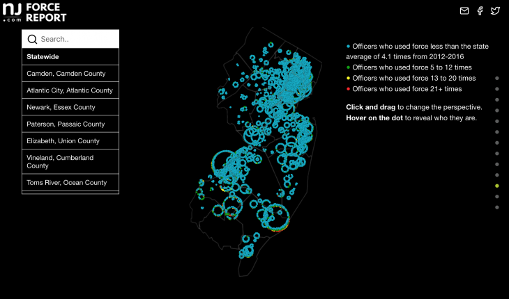
Wu’s data visualization, “Explore all 17,369 officers who used force in N.J.” is an interactive visualization that highlights the number of officers who use excessive force, which is determined by NJ State Guidelines, and how many times they used it, as well as where these officers were stationed at. The data visualization also allows readers to double click on the dots, each of which represents one officer, and go into a detailed view of the officer’s name, town and country, and how many times the officer used force.
Storybench spoke to Wu earlier this fall to hear her tips on using data visualizations to better understand police brutality. Here are four things she suggests:
Tip #1: Don’t be dissuaded by missing or dirty data.
In New Jersey, there was no central database that had all the information on officers and excessive force, even though the States Attorney Office had required the police departments to report each of the incidents. It had taken a Supreme Court ruling for the records to be released to the public, but it still took the team about seven months to gather all the information. Many of the documents were in poor condition and they were ineligible or had grammar and spelling errors. There was also an issue with inconsistencies in how the forms were filled out, such as inconsistent spelling of street names and officer’s names. This, unfortunately, created an issue and the team had to repeatedly clean the data until they were able to have all the information sorted into a spreadsheet. After the cleaning of the data, the team was able to use the information and they created a database with detailed information on the officers.
With the topics of “defunding the police” and “abolishing the police” the responsibilities of police had changed over the years. Many of the responsibilities include being first responders for mental health crises and social work calls. With the increasing number of responsibilities for the police officers, it causes a strain of resources and time used up for these calls. Rather many of these calls can be better handled by other trained professionals rather than the police, yet the system does not allow these calls to be divided equally between the police and other professionals.
Tip #2: Teamwork is key.
The report was already being worked on before Wu had joined NJ.com, after she had joined the organization she was assigned to these teams to help work with data visualization. There was a previous interest from the team to work on the excessive force used by the police officers, which led to the creation of the Police Force Report.
For Wu’s part of the report, there were no interviews done, it was mostly data-focused and getting the data from the various offices. Most of the research that was done for this report was to contract various police departments and the Attorney General’s office and request the data. However, many offices did not give the information and the team had to go through a long legal process to retrieve the data. After that, it took the team some time to clean the data and sort it into a database, which allowed them to create the Police Report.
While other people on the team interviewed the police departments, many of the interviews focused on the issues of racial disparities and victims of the police force. There was one person on the team that had interviewed different parties, such as officers, victims, and the Attorney General office, to gain a better understanding of the issues each of them faces.
Tip#3: Don’t worry, data visualization takes time to create.
After collecting all the data and cleaning it up, it was time for Wu and the team to create ways to visualize the data. Since the data was rather large, it posed the question: how can the data be visualized and presented? Wu had different types of models tested out for this piece before she was able to find the best one. One of the first drafts of the data visualization was a design similar to the Milky Way, in which each of the officers was a dot, the outer ring symbolizes the least amount of reports of force and the innermost had the most number of reports. However, with this concept, the team had run into the issue where the data was too large to properly show on some browsers and it was lagging on mobile devices. After creating various test data visualizations, Wu was able to create the current data visualization that is used, which uses various elements from previous other drafts.
The data visualization was created with different tools such as D3.js, which is a Javascript library, Django, and Jupiter notebook, which was used during data cleaning.
With the data visualization, there was the issue with the dots expanding with the Milky Way design, the data set was too large, causing too many dots on the screen and it hindered loading times. However, design-wise the dots and colors were easy to understand, the dots were grouped by department and by the town on the map.
Another initial idea for data visualization was to create a line graph with each of the different reported incidents. Each of the lines represented one officer, each of them was coded with a different color that represented how many reports they had. The X-axis was labeled with the years from 2012 to 2016, while the Y-axis was labeled with the number of reports. However, this design was difficult to read and it was too complex to be understood by readers.
After these two drafts, Wu and the team were able to create the current design, which took elements from previous attempts and applied it to the published work. Such as the expanding dots and the color coordination for the number of reports of force.
Tip #4: Be proud and reflect on past work.
Wu stated that she tried her best on the piece and she was proud of the piece, with the amount of data and work that went into the piece the end product turned out what Wu had expected. She is now a better coder so one of the things she’d improve on is to make the piece more effective and make it faster on mobile. As well she still wants to work on her interviewing skills that she did not get to use on this project. Yet, Wu is overall proud of this piece and being able to create a data visualization with the large amount of data that was given to her.
- Analyzing gender differences in music themes and lyrics - January 31, 2022
- How Reuters visualized the influence of K-pop on social justice issues - January 26, 2021
- Four tips from the Wall Street Journal’s Yan Wu on visualizing police data - November 10, 2020


Great article by Samuel Chuan! Data driven and facts are the key and future.