How interactive, visual storytelling helps readers better retain information
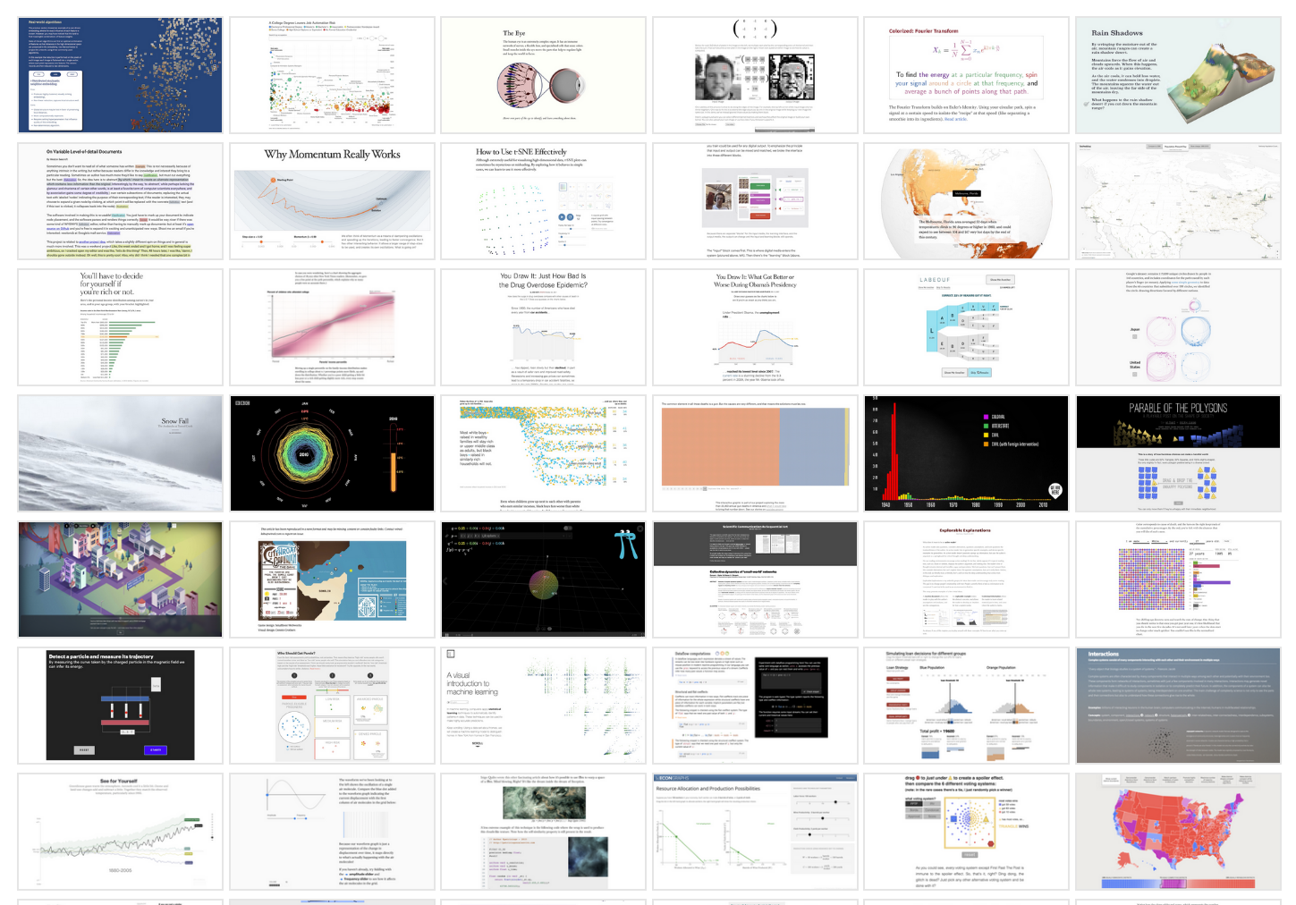
Earlier this year, you may have seen the Washington Post’s wildly popular coronavirus simulator explaining how pandemics spread exponentially. But have you played the Financial Times’ Uber Game? What about the New York Times’ “You Draw It?”
The quantity and quality of interactive, visual storytelling has grown tremendously over recent years, boosting learning and engagement and informing the public. Many impactful stories, like Covid-19 or the gig economy, require a deep understanding of various perspectives and contexts – interactive storytelling formats can help provide those windows into complex stories.
The techniques used in interactive digital journalism “helps people retain the information better than just reading and show a moderate boost in information retention,” explains Fred Hohman, a PhD candidate in the College of Computing at Georgia Tech and one of the authors of “Communicating with Interactive Articles,” a study published in September 2020 by researchers at Georgia Tech and the University of Washington that draws connections between popular interactive articles, like those seen in the New York Times, and the techniques and theories from the academic literature across education, information visualization and human-computer interaction. (So enchanted has Hohman become with the medium that he launched the digital magazine Parametric Press in 2018.)
Storybench spoke with Hohman and co-author Matthew Conlen about the benefits of interactive articles over traditional, static ones, the potential of visual communication and interactive video games, and the use of animation in journalism.
What does your research suggest on the advantages of interactive articles over traditional ones?
Hohman: This is not an exhaustive survey. There’s hundreds and hundreds of these articles. We chose from ones that we think are most representative and we likely missed a few citations, but we think we got the important ones. With that being said, towards the beginning of the article, there are five sorts of affordances that we highlight, and we have them in colored boxes, and we use that sort of throughout the rest of the article. These five sort of colored boxed affordances that we call them that we really think are why interactive articles can be better. Position to explain and help people than their static alternatives.
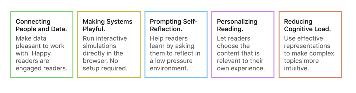
You have a computer behind the thing you’re reading on, and that allows you to do a lot of things that a newspaper just simply cannot do, so you can hide a bunch of information you don’t really need always, but if you’re really interested in some piece, you can just summon that up immediately, whether that’s one particular data point or another source, or something else extra that adds context to your story that you have to flip through a bunch of pages.
One example is prompting self reflection. It’s the third one. It’s in the blue box here, so we have this graphic in the article where it’s a line chart, but it’s only halfway filled in. What you do is you read what the chart is and you say and guess how the chart ends. This technique is used in New York Times. It’s called “You Draw It.” This is one of the rare examples where you have this really cool interactive technique that’s been used in the wild. This technique helps people retain the information better than just reading. Actually, show a moderate like boost in information retention, just general education that static alternatives can’t do, so that’s just one of these more deeper examples. It’s really having this computational representation. Having a computer behind the thing you’re reading on.
In your article, you describe the potential of visualization for communication. Do you think a given visualization can achieve the goals of the journalist? What is your take on that?
Hohman: Interactive articles in general are like a new way to communicate and I think there’s some growing pains because they’re really hard to build. You not only have to be a storyteller, you have to be a designer to lay things out in order to have people take away what you want them to take away. Like you were saying.
Then you also have to be a programmer because you have to implement these stuff. You have to write it in code so it’s a lot of skills you need to have and you have to be good at them. I don’t think there really isn’t not a lot of research directly on them. There’s not a lot of guidelines on what’s the best way in an interactive setting to have people learn it? It’s really just these point wise examples that we found and then this other desperate research area. I mean, another way you can look at these five affordances.
It’s almost trying to be like guidelines to try to help people understand the things you really should be using because they’ve been shown, at least in the limited capacity to actually help people.
I think over time it’ll be a lot more clear what types of interactions people actually do and really find useful to [help readers] take away particular messages.
You make the example of the use of animation in articles and our society is increasingly reliant on video as a medium (think of TikTok). Is there some evidence on how embedding videos affects attention and recall in articles? Do readers get “distracted” and lose the main message?
Hohman: You want to take away the message. You can either present it in a video or text form. When it comes to animation there’s been a lot of work that has been shown.
There’s one animation that can be used to improve engagement which is coming from a visualization like interface, research space, and they’re really good for communicating state transitions, uncertainty and causality.
You want to make sure it’s sort of aesthetically pleasing, it’s been shown that if you make things better looking than people are more interested and more self driven to actually go and like to read through the thing. Maybe if you go too much in that direction and like you said you get distracted and you sort of lose the message. I think there’s an interesting thing there of like making sure the animation isn’t overwhelming. Making sure it’s just driving the story forward, making sure it’s really integrated with.
There have been interactive video games like the Uber Game or Waiting Room. How do these interactive media types relate to the journalist’s aims in writing the article?
Hohman: The sort of human computer interaction researcher inside of me wants to go and talk to a bunch of game designers and then also talk to a bunch of journalists and see where all that lines up. So that’s probably how I would tackle it because I think that’s basically a research question of what you just or what you just asked.
I think gamifying any sort of thing in journalism is really useful to share in some scopes down or limited capacity, like the experience of something. The Uber game is a great example. I have taken uber rides which is why I have one sort of perspective on how that works but I don’t really know the other side. The Uber Game is really saying that we are going to put you basically behind the driver seat of someone driving Uber, but you don’t have to actually do it and you can get this full sort of complex problem within 10 minutes or so. Not only are you just going to read about it, you’re actually going to do it. It’s like your experience. We’re putting your investment. You have fake currency. You have deadlines. It’s basically a model for this big system.
This system being like ride sharing, you know just in general, so I think when it comes to games that’s one thing that interactive our goals can do really well is take some sort of super complex system. In the system here I mean the ridesharing politics. You know big things like that and try to scope it down. Make some assumptions you know, cut off some of the more complexities that are a bit more detailed or nuanced, but get down to sort of like the core pieces and slowly build up and have people like.
Experience how those systems actually are without all the technical burden and overcoming a bunch of like pre-existing knowledge. You have to sort of ramp up to get there, so it’s really just lowering the barrier to entry like these complex things and I think games are just a great way to have someone experienced that first hand as opposed to just reading. It’s a bit more visceral or something.
The other game was mentioned in the article too. WIRED did a Cutthroat Capitalism game. It’s actually one of our oldest examples we cite. It’s from 2009 and it’s about the rise of piracy off the coast of Somalia where you can go and read about that and you can show some numbers, a couple of charts. You can make a visual, you can get some first hand stories of what it’s like. It’s like you get this rise of emotion that you just don’t get when you’re just reading things.
If the trend towards more visualization and interactivity continues, how do you think this might affect the gap between different types of readers? In other words, won’t people who are unfamiliar with graphs or quantitative methods be left out?
Conlen: First, I don’t see interactivity and visualization as only useful for people who are “numerate”, rather I see the ability to present things using more direct and engaging representations as a way to expand the number of people who are able to understand a particular topic. Take, for example, the wildly popular coronavirus simulator from Harry Stevens. By presenting the concept of exponential growth through visual simulations rather than equations, the topic became much more widely accessible. I also don’t see this as replacing traditional coverage, but supplementing it. I don’t think traditional text-based reporting is going anywhere.
There are some other concerns designers need to think deeply about as well. These include things like making interactives accessible to audiences who may be visually impaired and can’t see the embedded visualizations, or making sure pages don’t transfer such a large amount of data that its prohibitive to load on a slow cellular network. Hopefully tools and infrastructure will continue to make this better over time, but there is a lot of work to do.
What do you think is “the future of detail”, i.e., would an excessive emphasis on visualization come at the expense of nuances and detailed explanation?
Hohman: I think this depends on what the story is. So there are breaking news stories and you want to get something out fast. You probably just want to report like the big number or the big headline, especially if it’s if it’s more sort of a headline story. You may not need some big interactive charts. I think that’s one point we highlight towards the end is.
There are a lot of people who spent a lot of time and a lot of effort to make sure like this is the right chart to do everything, and you don’t need to interact with them like you can just get everything away from this chart. So not everything needs to be interactive. I think things really benefit from being interactive in certain situations. It’s not a requirement always. I think it just depends on what you’re trying to do. If you’re trying to report one particular number, one particular’s new story, something that’s a little bit tied to a cycle of a couple of weeks or even a month or something. I think you put that headline chart right at the front and you highlight the number.
She is passionate aboutcreating interactive media, focusing on issues like class struggle, education and healthcare inequality. A lifelong cinéphile, she also loves to write essays on avant-garde cinema and has published journals on Point of View Magazine and Deep Focus Review.
- How stuff.co.nz tells the tale of two pandemics in Auckland with an interactive timeline. - October 20, 2021
- How the Parametric Press explains the environmental cost of digital consumption - March 1, 2021
- How the Center for Collaborative Investigative Journalism is reporting on water access around the world - November 12, 2020