Best No-Code Tools for Data Visualizations
Do you want to visualize data but don’t know how to code?
As data becomes central to storytelling, journalists increasingly need to be able to turn numbers into something readers can understand. Not everyone in the newsroom may know how to code, but nowadays a solution exists. Platforms like Flourish Studio, Datawrapper, Tableau, and Google My Maps and let reporters, students, and editors build professional visualizations in minutes.
In this guide, we’ll introduce four of the most useful tools and explain when each one works best.
Flourish Studio
What it is for & How it works
Interactive explainers that guide a reader through a sequence. Trends, rankings, small multiples, and annotated moments benefit from its story tools.Flourish provides templates for lines, bars, scatterplots, packed circles, cards, maps, and step by step slides. Titles, subtitles, footnotes, and annotations sit directly on the visual, which means copy edits can happen without a separate graphics desk. A typical workflow often begins by choosing a template that matches the reporting goal. For example a line chart can be used to show trends, a bar chart to display rankings, and an annotation to mark pivotal points such as where a law changed or a budget collapsed. To get started, upload data from a CSV or paste from a spreadsheet, set clear axis units, and keep labels short so no one needs to guess whether a value represents dollars, percent, or people.
Strengths and limits
Overall, Flourish is good when you want to walk a reader through several beats in a deliberate order. The story mode does this quietly, one slide at a time, without losing the thread. The story mode helps to build that sequence step by step. Each slide can show a different part of the data, highlight an important moment, or reveal a change in the trend. It turns a static chart into a short narrative that feels like a guided explanation. However large datasets can make the program load very slowly. so a quick test on a weak connection can help catch that early. Although default color palettes are sensible always check for contrast and color blind accessibility before publishing.
Flourish user community
If you’ve ever opened Flourish and wondered where to start, the platform’s own community is a good place to begin. On the website, you’ll find a blog filled with quick tips, case studies, and updates on new features. Besides the blog, the resources section offers training sessions, webinars, and an expert network where designers and journalists share advice and talk through visualization challenges.
Flourish is also active on social media. Their X feed is a steady stream of real projects, quick tips, and small product notes. Seeing how reporters use Flourish in the wild makes it easier to move past a template and learn how to tell a story with a chart.
Datawrapper
What it is for & How it works
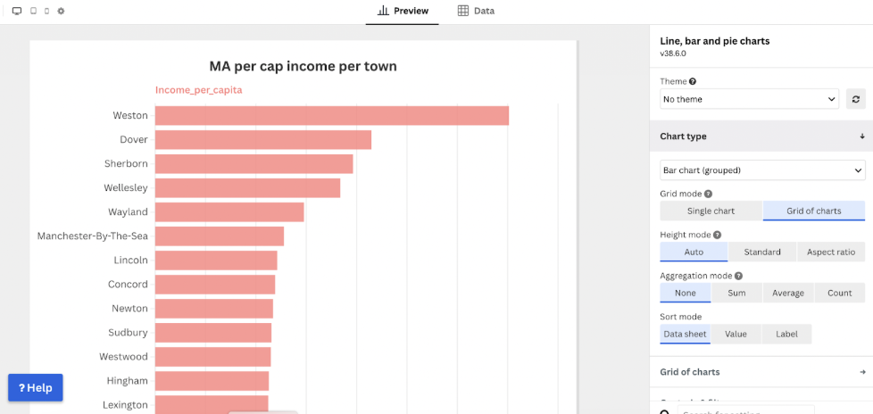
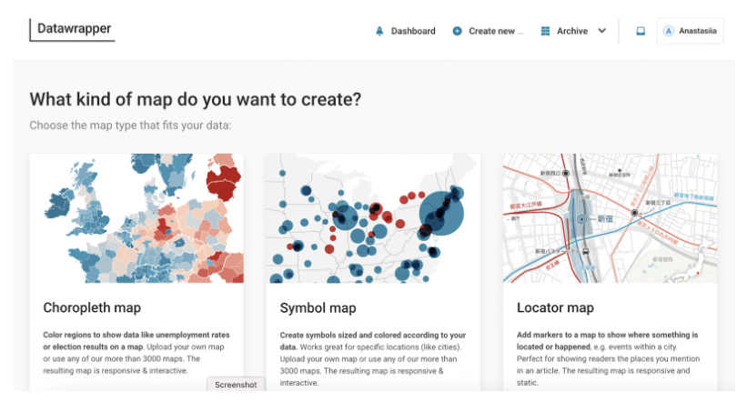
By design, Datawrapper excels at clean editorial charts and straightforward maps that sit comfortably inside . Users can paste their data into the tool, select a chart type that fits the structure of the numbers, and write a clear title.. Remember to always add a source line that credits whoever compiled the data. The built in check and describe panel points out long category labels, missing units, and other small problems that can harm readability. For maps, it covers common needs such as choropleths and symbol maps. You can also create bar charts, line charts, area charts, scatter plots, pie charts, and tables.
Strengths and limits
Datawrapper is ideal when a chart needs to publish quickly and look professional. It is not the best choice for highly customized layouts or multi chapter narratives. When projects outgrow a single chart, many newsrooms pair one Datawrapper chart with a short text explainer and a second small chart below it.
Datawrapper user community
Datawrapper’s community makes getting started easy. The Datawrapper Academy offers step by step lessons, from bar and line basics to maps and tables,written for hands on learning with your own data.. The blog runs Weekly Charts, where the team builds one real chart a week and explains choices you can copy for your next story.
There is also a public gallery called River which is a feed of charts, maps, and tables made by other users. You can open any item and hit Reuse to start from their setup, which is a fast way to learn by doing. Datawrapper also runs live free webinars available by registration.
Finally, the team is active on X and posts quick tips, webinar invites, and small product notes. Following that stream helps you spot new features and see how working journalists use the tool in the wild.
Tableau
What it is for & How it works
Tableau is built for rich interactive charts and dashboards that let readers explore data. It works with Excel files, CSVs, Google Sheets, and databases. You connect a dataset, choose fields, and drag them to rows and columns to create a view. The Show Me panel suggests chart types that fit your selection. The Marks card controls color, size, labels, and tooltips, while filters and parameters let readers focus on a year, region, or group. Simple table calculations such as running total, percent of total, and moving average are available without code, and custom metrics can be made in calculated fields. Several charts can be combined on a dashboard, where actions link them so a click in one chart filters the others. Publishing can go to Tableau Public for a shareable embed or to an organization account, and images can be exported.
Strengths and limits
Tableau is strong when a story needs multiple views on one page, interactive filters, and tooltips, or when the data is large and combines information from several sources. The platform can join datasets that share a common field, like matching unemployment rates with census data or survey results, which helps build richer dashboards. It handles complex visualizations well and is widely used in newsrooms and data teams, which helps with examples and learning. The tradeoff is there’s a bigger learning curve than Datawrapper or Flourish, and embeds can feel heavy on slow connections. Very precise page layout and pixel perfect typography take time, and some features require a desktop app or an organization account rather than a quick browser session.
Tableau user community
If your goal is to start fast and learn from real work, the Tableau community is a strong helper. The Tableau Community Forums collect quick answers and walkthroughs from experienced users practitioners. The Tableau Public blog highlights new dashboards and explains design choices. Weekly challenges such as Makeover Monday provide a fresh dataset and invite remakes that show many ways to tell the same story. There is also a section for Events & Conferences, where users can join live sessions or watch recordings of past talks to hear from Tableau experts and see how professionals use the tool in real projects.
There’s also a public Slack workspace, where data fans chat, share tips, and post screenshots of their work.
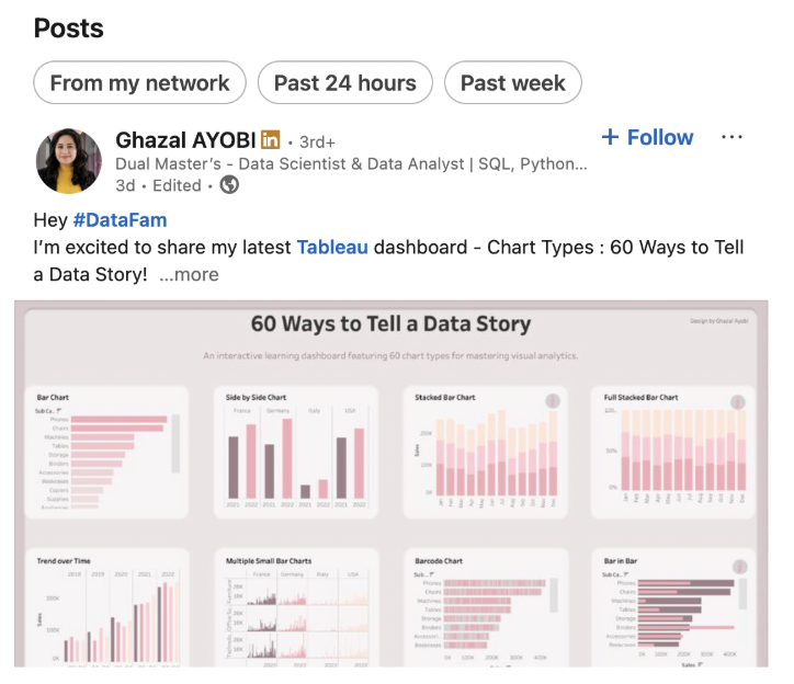
On social media, the hashtag #DataFam on X and LinkedIn shares tips, job leads, and examples from journalists and analysts. These spaces lower the learning curve and help turn a basic chart into a clear multi-view dashboard.
Google My Maps
What it is for & How it works
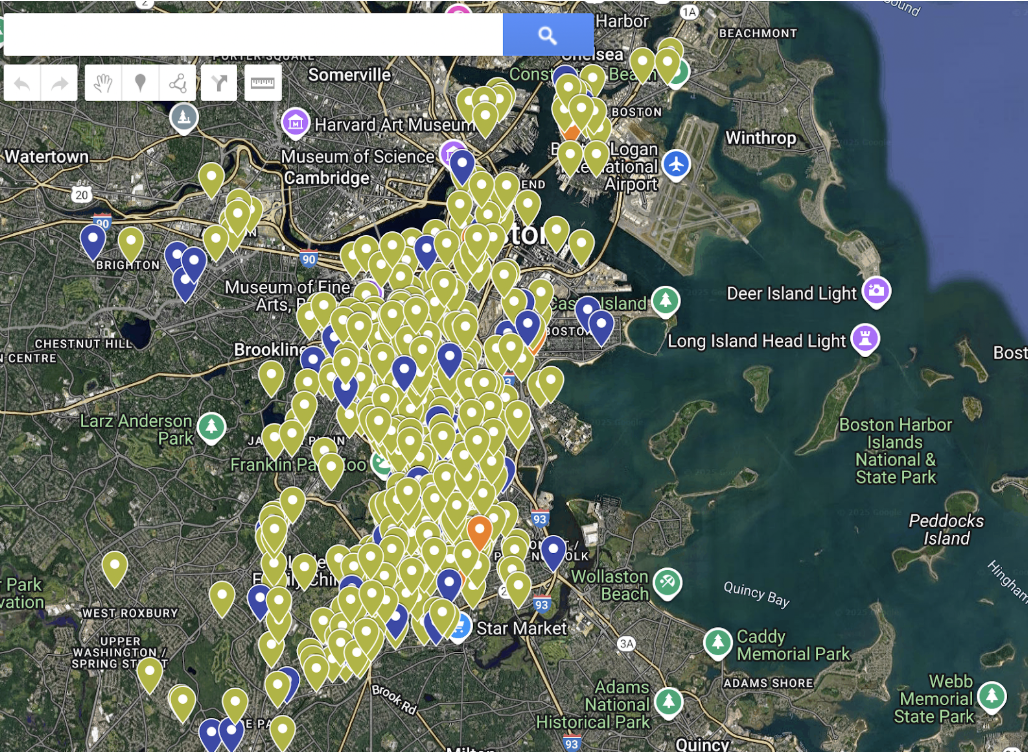
Google My Maps suits stories that live on a map first such as crime incidents by neighborhood, a transit rider’s day, a tour of historic sites, a cluster of building permits around a school etc….
The tool reads a Google Sheet or CSV and turns rows into points, lines, or areas. Layers can separate categories such as years, beats, or agencies. Inside My Maps you can create a new map, import your datasheet, and assign the location columns. If the addresses are messy, the geocoder flags problem rows so they can be corrected in the original sheet and reimported. As a result, categories become colors in a legend that makes the pins legible at a glance.
Strengths and limits
My Maps are strongest when a place is the main character. By contrast, it becomes less helpful when a story needs numbers to move over time or requires heavy annotation. So, if you need complex filtering, custom legends, or many notes on the graphic, consider Flourish or Datawrapper.
Google My Maps user community
Unlike Flourish, Datawrapper, or Tableau, Google My Maps doesn’t have a dedicated user community. Instead, its guides and videos together form an informal learning network that helps new users get started.
One of the best places to begin is Google’s own tutorial called “Visualize your data on a custom map using Google My Maps.” It explains how to import spreadsheets, customize layers, and publish interactive maps. The guide is written clearly and includes short examples that make the process easy to follow.
Beyond the official resources, there are plenty of tutorials on YouTube. For instance, the channels Technology for Teachers and Students and Steve Builds Websites both walk through real examples of creating maps, from marking locations to designing stories for presentations or news reports.
Why data visualization matters
These days data shows up in almost every story. In many newsrooms the task is not only to collect numbers but to make them clear for readers. With simple no code tools even a small spreadsheet can turn into a map, a chart or a compact dashboard. In short, data visualizations help a story land faster. This is less a passing trend and more a core skill for modern journalism and communication.
How to choose the right tool
As a rule, different tools match different goals. If the story is rooted in place, Google My Maps helps reveal patterns on a map. If the plan is to guide readers through key moments and changes, Flourish Studio works well for interactive explainers with annotations. If the need is a quick clean chart inside an article, Datawrapper is a practical choice. And for larger projects that need dashboards, filters, or multiple views Tableau offers more flexibility to build.
All four tools run in the browser, connect easily to spreadsheets, and export visuals that adjust to different screens. Ultimately, the right choice depends on what the story needs to show and how the audience should see the evidence.
Making data visualizations without coding is easier than it looks. You just need a good story and the right tool to tell it.
- Where Should Data Journalists Be This Spring and Summer? - May 6, 2026
- Redefining “Healthy”: Who Gets to Decide? - March 31, 2026
- How Media Frame Climate Change - February 3, 2026


Great roundup! I’d also suggest adding LivingCharts.com for readers who need animated data visualizations rather than static charts or dashboards.
LivingCharts is a no-code tool for creating Bar Chart Races and other animated charts from spreadsheet data, with customization and direct video export. It can be especially useful for journalists, educators, and content creators who want to turn data into visual stories for YouTube or social media.
Full disclosure: I’m the creator of LivingCharts, so I’d be happy to provide more details or examples if helpful.