How the Australian Broadcasting Corporation used a reporter’s cell phone data to track and tell the story of his every move
This article originally appeared on Back Story, a blog dedicated to telling the stories behind the stories told by the Australian Broadcasting Corporation’s News division. The author, Simon Elvery, is a developer practising journalism and telling stories with data.
Since the NSA spying scandal, governments across the world have been grappling with issues around telecommunications data retention and the implications it has for law enforcement and citizen privacy. This issue has been well covered in the media but is often discussed in abstract and confusingly technical ways, making it difficult for individuals to understand the impact it may have on their own lives. As the political debate around telecommunications data-retention was really heating up in Australia, Will Ockenden, a reporter with the Australian Broadcasting Corporation (ABC), requested his own mobile phone metadata from Telstra, an Australian telecommunications and media company.
Will received his metadata from Telstra around April this year, and looking to do something interesting with it he came to ABC’s Interactive Digital Storytelling (IDS) team to talk about how we might use interactive storytelling techniques to bring a metadata story to life. The resulting story, “How your phone tracks your every move,” was published last month.
How we brought Will’s cellphone data to life
A plan was hatched where the IDS team would spend some time independently analyzing Will’s data (which he had already anonymized to protect the identity of his contacts) to see what we could find out about his life and initial responsibility for that fell to Colin Gourlay, one of the developers on the team. From there, Colin got to work, first cleaning the data of errors and omissions and then creating a few test interactive components to help the whole team understand the data.
This story was a bit of a slow-burn for us. Even though we knew other Australian media outlets were likely to be working on on similar stories, we deliberately took our time because we really wanted to get it right.
After having a play with the test interactives the whole team got together to come up with more detailed coverage plan. We asked: How can we best to present this complex issue to the audience in an engaging and informative way?
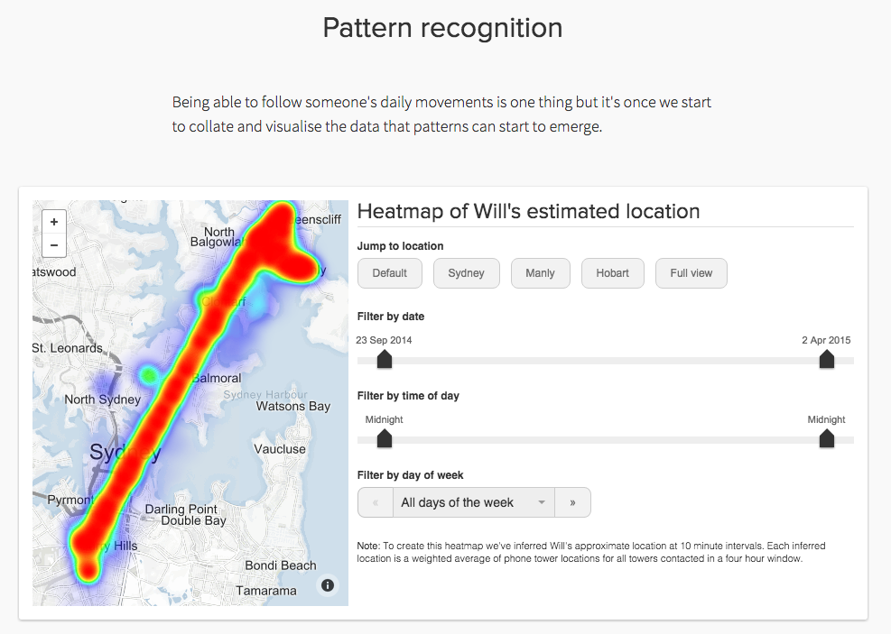
One thing we discovered was how easy it is to paint a detailed portrait of a person’s life from this data—“the envelope” in government parlance—which can seem rather innocuous. All Australian telcos and ISPs will now be required, by law, to keep detailed records on every one of their customers for two years and the government has been keen to allay concerns about the privacy implications of these new laws.
We felt that one way to illustrate the possible privacy implications was to give the audience the opportunity to play investigator themselves. So we began working on a set of interactive elements which would provide the audience some in-roads for starting to interrogate the data and form a picture of Will’s life. As well, we would provide the raw data for anyone who wanted to take the analysis further.
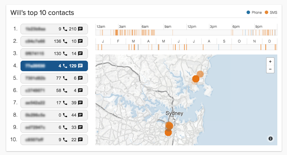
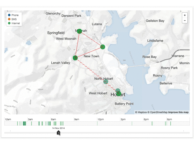
We created several map-based interactive elements people could use to explore where, when and how Will used his phone for communicating, including anonymized details for his top ten contacts.
Challenges
There were some technical challenges involved in creating the interactives. One of the first steps on any story involving data is to ensure you fully understand the dataset and verify the data, including cross-checking from other sources where possible. For example, the original data was missing some details, including the locations of some phone towers, and had some unexpected inconsistencies.
We verified any details we could and as the interactives came together, continued to spot check the visual output to ensure it was consistent with the data.
One of the many little ‘gotchas’ that often crop up when working with data is dates and times recorded without reference to a timezone. In this case we were lucky that Will had only visited areas of the country within the eastern timezone, but we had to verify whether the period of time where daylight savings was in force had been accurately accounted for in the data analysis.
There were also many smaller challenges to overcome related to the technologies of the web. For example, the whole dataset was more than 1.3MB which would have made loading the story slower than we would like, so Colin developed a method of reducing the size of the data file required to display the interactives.
Aside from the technical challenges, this story also proved to be challenging from a storytelling point of view. The breadth of the topic and the significant implications these changes to law and technology could have for society meant that there were so many different approaches we could have taken for this story.
As we discussed and examined potential angles, each one we looked at seemed to be leaving out some important aspect. We spent a lot of time agonizing over framing and trying to keep the scope in check, while not leaving out too many important parts of the story. Indeed there are many we ultimately couldn’t fit and as a result, there are several more potential follow-up stories we’re continuing to discuss.
Audience reaction
During production of the story we kept Will well informed about our plans, to ensure he was comfortable with everything we were doing, since asking the audience to explore his life in such detail potentially had some problematic outcomes.
The story was launched on a Sunday night, which is typically one of the lower traffic periods for the ABC News website, but it was immediately popular, shooting to the number one spot. It also sustained the audience’s interest, remaining one of the top stories well into Tuesday. As well as finding a large audience, people engaged with the story strongly, spending much more time interacting and reading than is typical.
We received an impressive response from audience members doing their own analysis of Will’s life, with mixed success at gleaning accurate insights. More than 300 audience members submitted their own analysis, many of whom had downloaded the full dataset and spent considerable time analyzing it using their own tools and techniques.
Several academic organizations and data analysts have also begun their own analysis of the data and have promised to provide us with that analysis in the near future.
In the end, we’ve been really happy with the outcome. We felt it told the story of what metadata is and shone light on some of the implications in an innovative, engaging and digital-first, way. It earned a strong reaction from the audience and rolled out across all ABC platforms, including nationally on the 7 P.M. television news bulletins, ABC News Breakfast, The World Today and local radio stations across the country.