Why the WSJ used a virtual roller coaster ride to bring stock prices to life
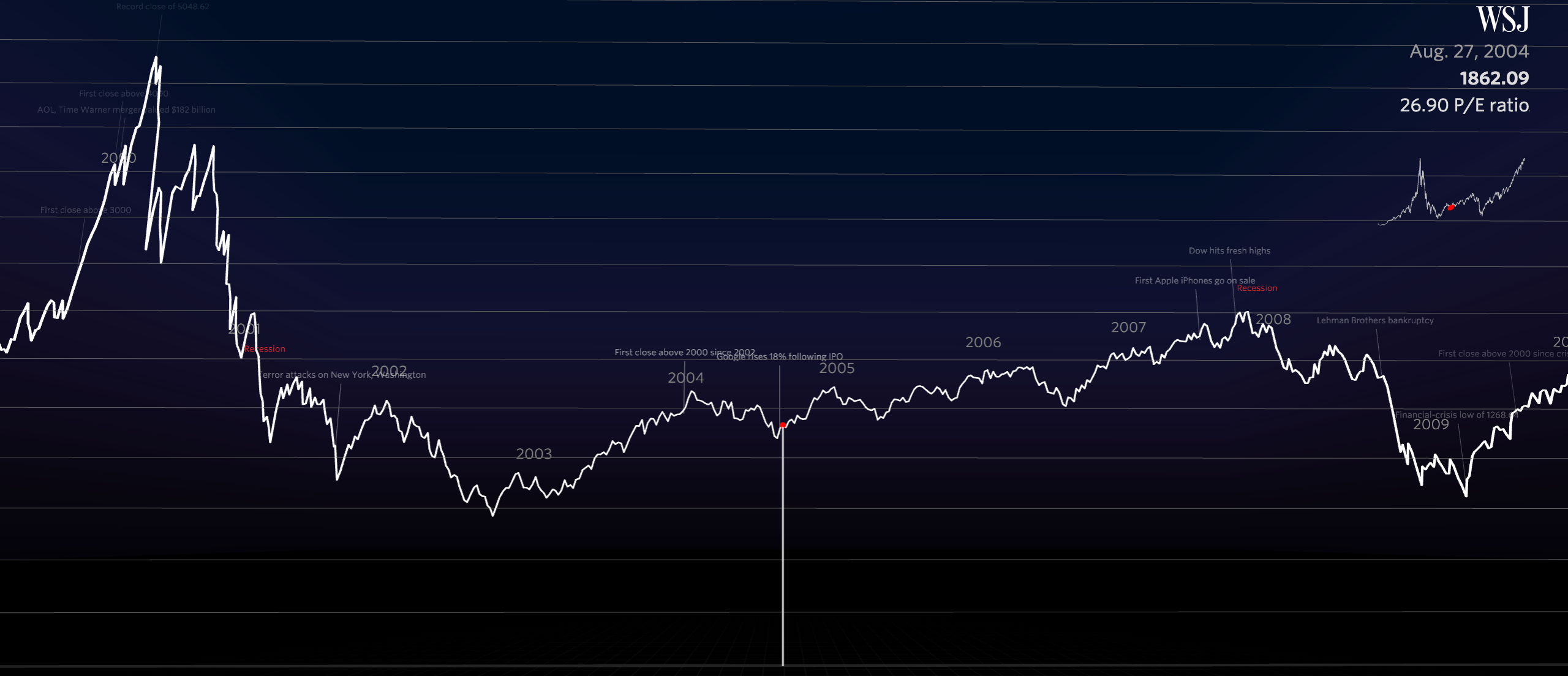
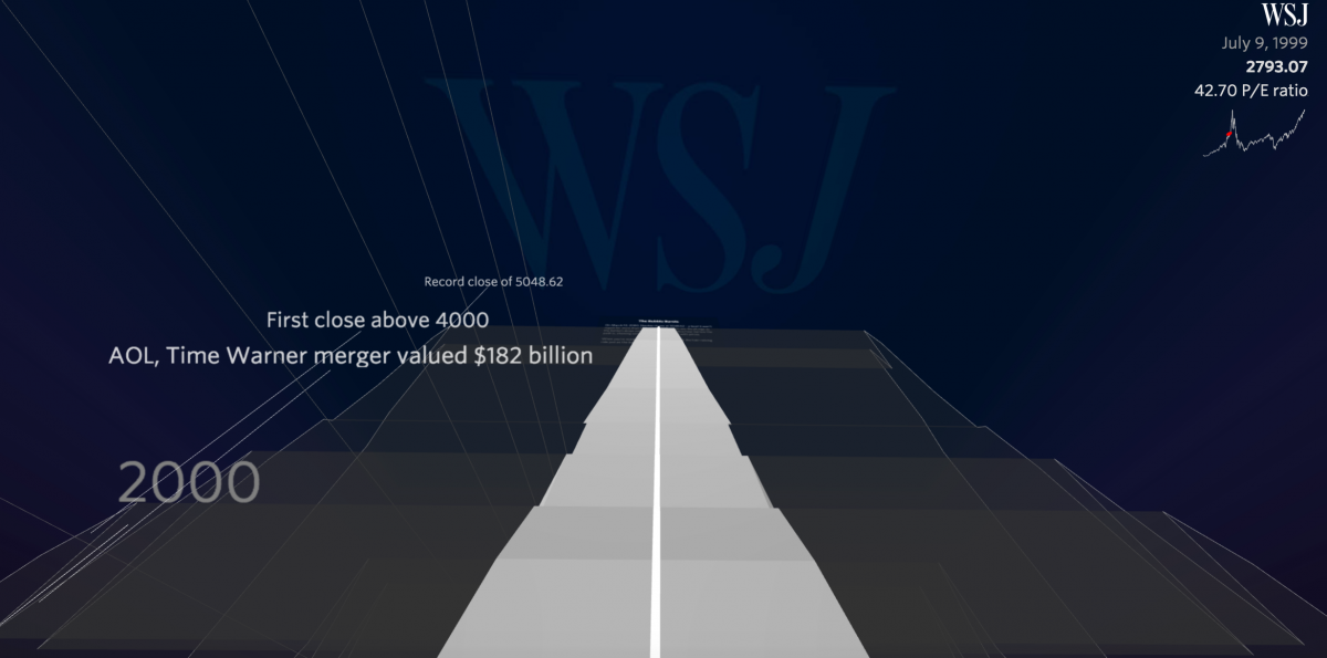
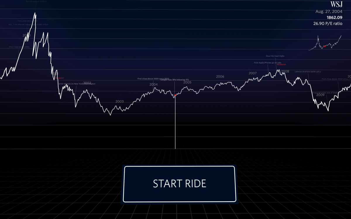
Hold on for the ride. You bump along through the 1990s with the rise of Yahoo and eBay and then start a steep climb in 1999. As the dot-com bubble bursts in 2000, you fall with stomach-dropping speed into a valley of stunted economic growth. In 2008, you fall once again into an historic recession. By 2015, you’re back at the precipice. Will we keep ascending? Or is another bubble around the bend?
The Wall Street Journal recently released a three-dimensional virtual reality tour of the Nasdaq, the U.S.’s second-largest stock exchange which lists thousands of companies and is a general barometer of the strength of U.S. markets. The newspaper released the virtual reality experience to coincide with the historic high that the Nasdaq hit on April 23. Built for desktop, mobile and Google Cardboard—the poor man’s virtual reality viewer—the Wall Street Journal‘s Nasdaq roller coaster brings financial reporting to life. While most newsrooms are just now experimenting with interactive visualizations built with D3, the Javascript library, this Nasdaq roller coaster takes D3 and adds three-dimensional Javascript to an existing visualization. Stay tuned for a Storybench tutorial on building 3D graphics.
“You’re high up on this mountainous curve looking down and standing on something that’s extremely narrow and fragile,” says Roger Kenny, an interactive designer at the Wall Street Journal, describing the VR experience he built. “Can we make that real? Can we make you feel that it is such a precarious scenario that you’re in?”
The journal’s interactive graphics team wanted to illustrate 21 years of economic ups-and-downs traced by the Nasdaq and decided on a three-dimensional exploration of the market’s oscillations in roller coaster form would be a fun way for readers to engage with data. The precipitous drops of the tech crash of 2000 and the recession of 2008 hit the viewer with a three-dimensional ride along the peaks and drops.
Take a wild #virtualreality ride through 21 years of @Nasdaq on desktop, mobile, and #3D #VR http://t.co/gZD3qQnshB pic.twitter.com/KsQKDe2uLL
— The Wall Street Journal (@WSJ) April 24, 2015
Kenny is no stranger to working in 3D. Last June, when the Wall Street Journal ran a review of the MakerBot printer, Kenny designed and released the blueprints for a three-dimensional bar chart showing the growth of 3D printer sales.
Before the Nasdaq roller coaster project, Kenny had been playing around with D3js and Threejs, a 3D Javascript library, to visualize the Dow Jones industrial average. He was essentially taking a D3 visualization of a chart and making it three-dimensional with more Javascript.
It didn’t take on its current form until Ana Becker, an interactive graphics editor at the Wall Street Journal, said to Kenny, half jokingly, “Let’s make it a roller coaster.” And this month, when the Nasdaq looked like it was approaching a historic high that it hadn’t hit since 2000, Kenny swapped out the Dow for Nasdaq data. Becker and Kenny admit it was a scramble to publish on time. “If [the historic high] had happened a couple days earlier we wouldn’t have had it ready,” says Kenny.
When it was released last week, the visualization had the effect the team intended. The response from Wall Street Journal readers was great, says Jessica Yu, global head of visuals for the Journal. “We were getting tweets like ‘I would never read an annotated timeline of the Nasdaq but this brings it to life for me’,” Yu tells Storybench.
Yu, Becker and Kenny say the project did not end up costing any more than a standard visualization would, besides a few long nights, cab rides home, and some pizza. The visualization took just a few weeks to develop and could have always fallen back on being an interactive graph. But the late nights paid off and what the WSJ has gained is another “storytelling tool in our tool belt,” says Yu. Which isn’t to say they’ll use the virtual reality experience every time they want to illustrate market volatility. “We’re trying to figure out the best tool for each story,” she says.
But to illustrate something that feels as dry as the Nasdaq average, the Wall Street Journal has hit on an engaging new visualization.
Similarly to NPR’s Planet Money which seeks to bring human stories to financial reporting, the Wall Street Journal’s virtual reality tour of the Nasdaq is also making financial journalism more accessible and even fun. It’s also part of a bigger trend of gamifying the news.


