How Brian Romer approaches data visualizations
With the endless information in the media every day, creativity almost seems like a necessity. That includes crafting data visualizations to tell stories that are easy-to-read and impactful.
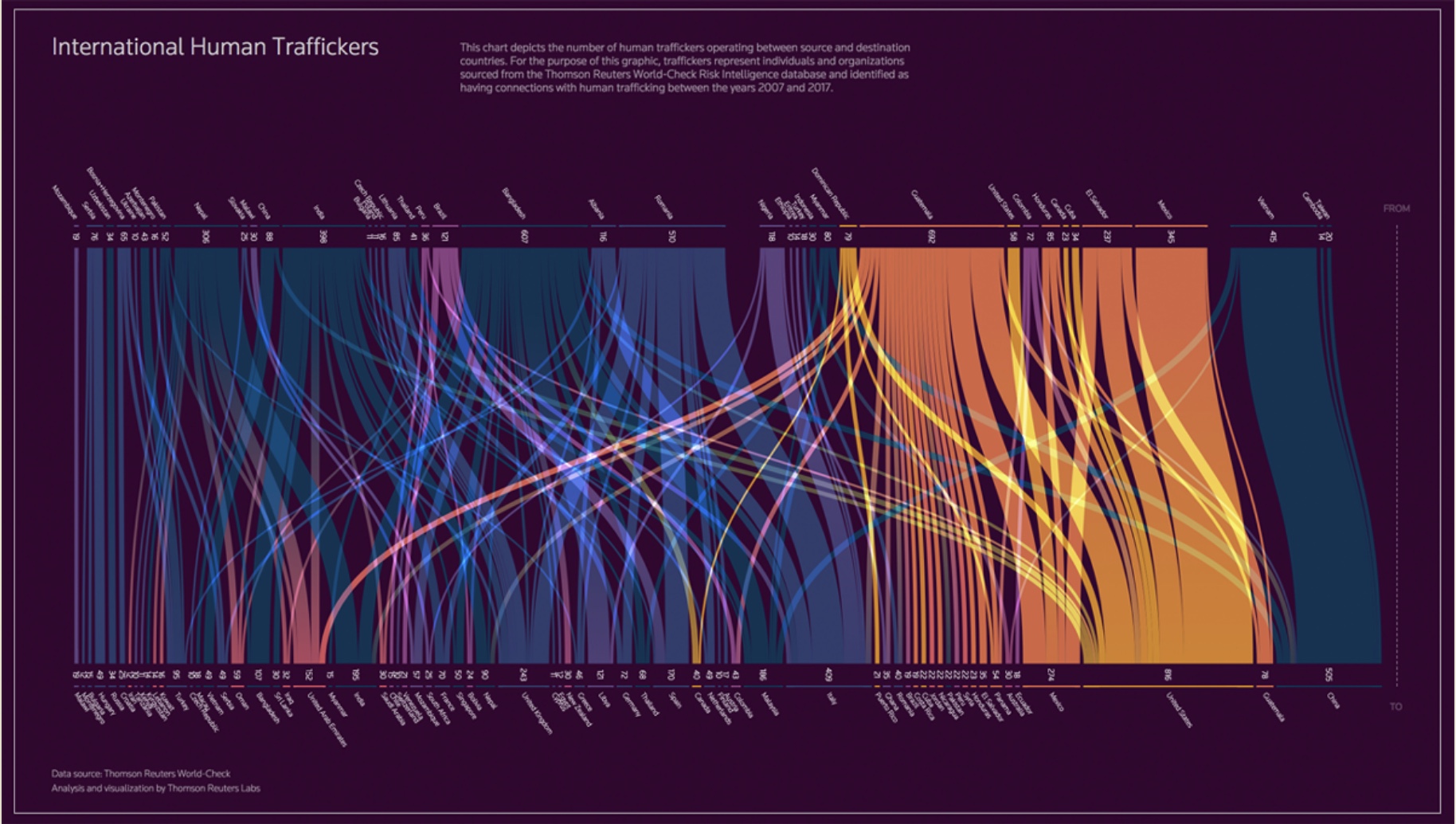
Brian Romer, who previously worked on data and design projects at Reuters, is accustomed to producing meaningful insights from complex data sets. Now as a freelancer, some of his projects include exploring how design works with AI, making infographics and visualizing money laundering, mass shootings and global cyber attacks.
Storybench spoke with Romer about how data visualizations can be used to heighten storytelling.
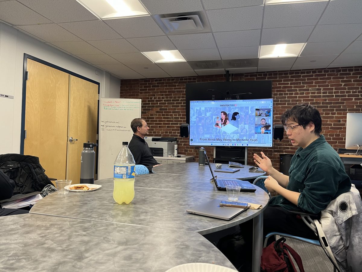
Romer visited Northeastern University’s School of Journalism on Jan. 18, 2024. The questions and answers below are also taken from the event.
The following interview has been edited for length and clarity.
Can you walk us through one of your best projects and what that process looked like?
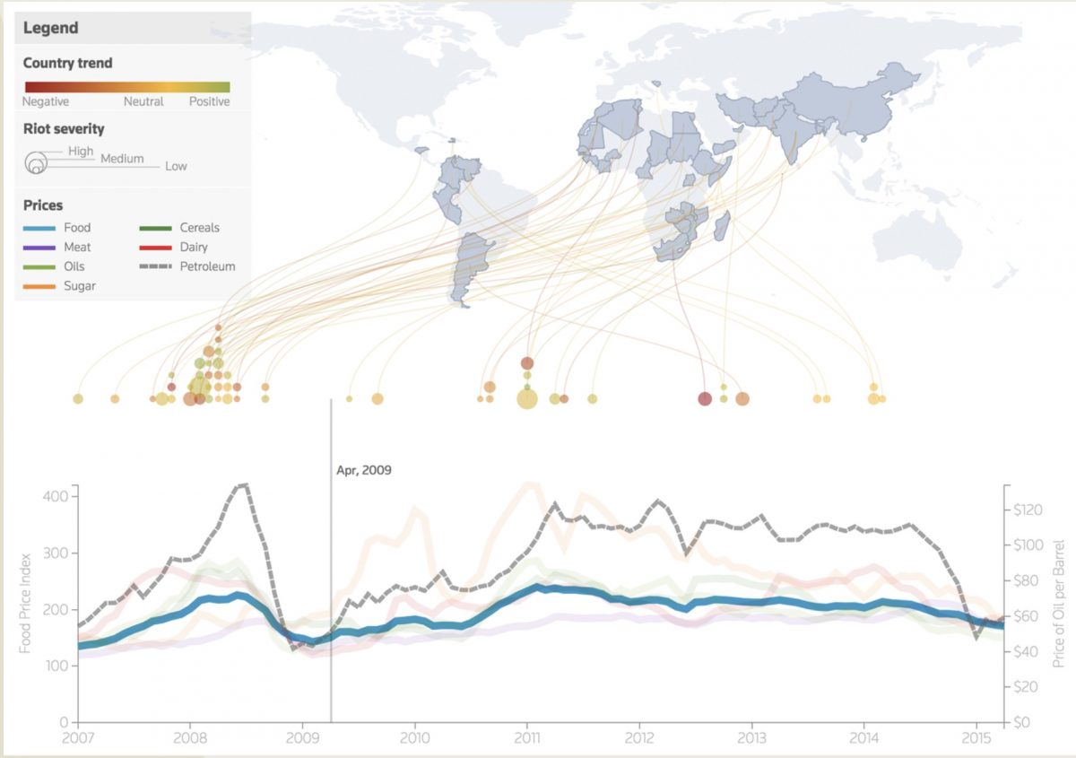
Romer: We’ll go back to the early days of the data science lab at Thomson Reuters. There was a project called “9 Billion Bowls.” This was a news content piece taking this topic of, “Humanity is supposed to have 9 billion people by the year 2050.” How can we get there? How does that work?
My group had a few different data sets about food scarcity and unrest – riots and upheavals and things that have happened over the world over a period of time that were due to problems with food. The spreadsheet was pretty messy, honestly, but we actually had to back up all of these data points that somebody popped into the spreadsheet. You have to go in not saying, “I’m going to prove my conclusion that I already know.” You have to go in and say, “It may not be that.”
When designing a graphic, how do you develop the intuition for what is more visually appealing?
Usually, I start in black and white or grayscale. Make everything gray so you’re not distracted by these colors because color and shape and size and all these elements – it’s a very powerful effector of your attention. You also want to figure out who your audience is. There’s that calibration of: Who’s consuming this? How much time do they have to consume it? How much of their attention can I expect to get? A lot of times in the professional world, those things are actually constrained for you. If it’s open ended, it is actually really hard. And I would say, pay a lot of attention to visuals that impress you in some way to catch your eye and collect them and start to make notes on what are the common elements.
Can you talk about the struggles or limitations of working on these kinds of projects?
If you’re a creative person, the reality is that there’s this kind of administrative overhead. There’s this level of overhead that doesn’t have much to do with the things that you love to do. And so, as you become more senior or if you’re a manager, it becomes harder to protect your time and harder to be more efficient with your work. It gets further away [from creative work], in a sense, because there’s all these other work pressures.
Say you’re working with a team, do you storyboard? What was your brainstorm process?
The first step is to question the brief and make sure it is a substantial question or topic area that the data supports. Then, think of the audience who’s going to consume this, what format it’s going to be on – is it a website, or will it be on a phone? Next, what are our constraints?
Then based on all of those things, you would start to think out, like, what if we could show this part, what works for that part? Then you want to mock things up. Then you run it by your team for feedback and whoever the stakeholder is; you want to have touch points with them and say, “This is what we’re thinking.” You get the feedback and you just keep going until the deadline.
What is your advice for people who are trying to get more involved in data journalism?
You’d want to find a project that’s a topic you’re really interested in, so that you’re drawn to it and you really want to know if you have questions around it and find the answers. I think the fastest way is to find a friend who does know something about data analysis or about how to source data. Then the third piece [of advice] would be to just look at books or online or data visualization conferences or awards. There’s a million people who’ve made amazing things out there. Identify some things that really resonate with you and imitate them. It is really hard, but you’ll get there.

- How Brian Romer approaches data visualizations - January 25, 2024


