How designer Nadieh Bremer teaches herself new skills to continue visualizing data in new ways
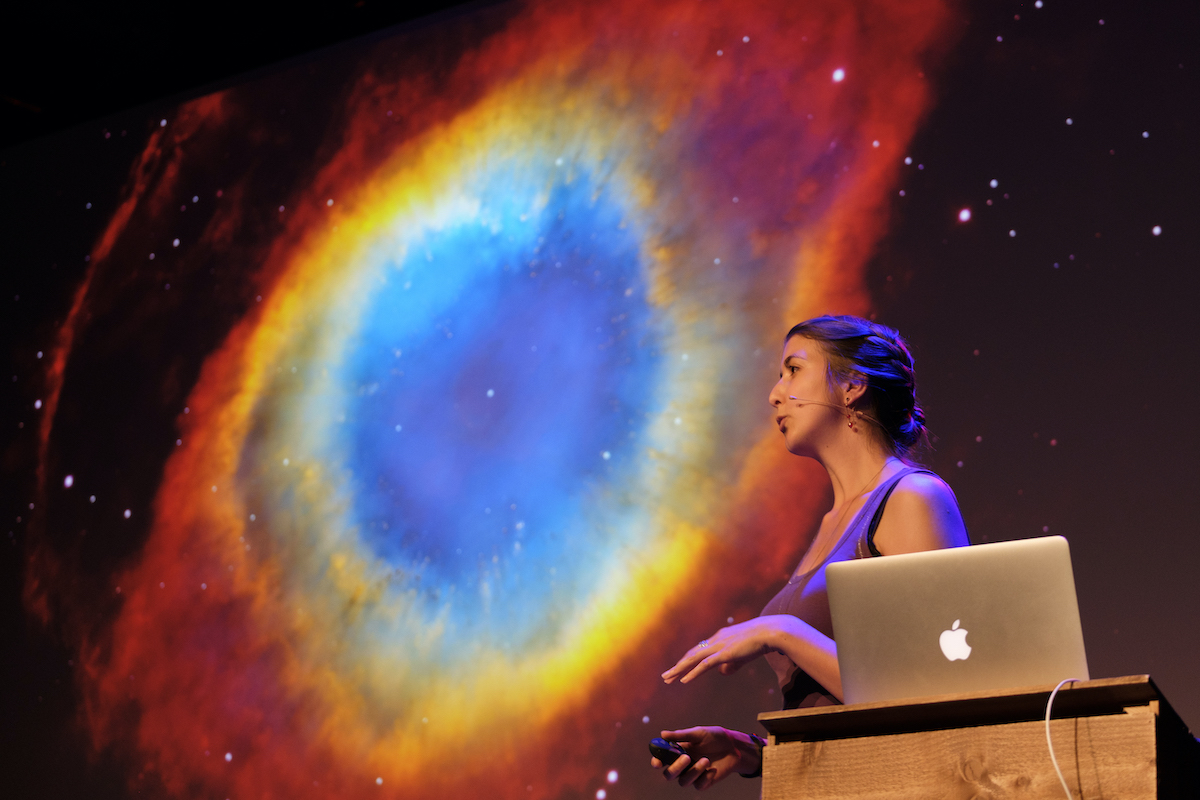
If you are passionate about telling data-driven stories more engagingly, you should not miss out on Nadieh Bremer, a freelance data visualization designer and artist with a background in astronomy and data science.
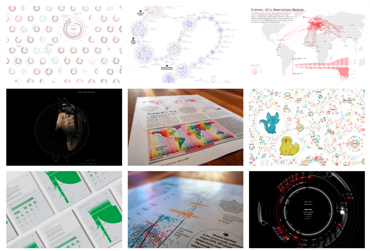
Using mainly D3.js to create her visualizations, Bremer showcases the possibility of visualizing data beyond the common bar charts, line charts or scatter plots.
She was the winner of the Rising Star in Information is Beautiful Awards in 2016. She is also the winner of Best DataViz this year in the World Digital Media Awards.
Her past working partners include the Guardian, The New York Times, Google News Lab, Scientific American and The World Bank. Her popular personal blog, Visual Cinnamon, shares the behind-the-scenes process of her creative data visualizations.
We spoke to Bremer about how she approaches her work and keeps her skills fresh. The following conversation has been edited for length and clarity.
You’ve been learning new skills like Blender and three.js. Can you tell us why you are learning these things and how you manage your time?
I’ve been doing data visualization for a few years now, and it’s always based on Javascript, SVG and perhaps some HTML5 Canvas. But I want to be able to do more. I see people on Twitter, making these gorgeous images, not necessarily data visualization, but other kinds of artworks and designs. I felt like there’s something there that I could incorporate into data visualization.
I block some hours a week. And that’s going to be learning.
I know that’s not possible if you are working for an employer, which is the situation I was in when I was starting out. I had to do it in my evenings and on weekends. It’s not easy. It requires dedication.
With learning Blender I’m now in the process I used to be in with D3.js years ago, where I am basically reading the code I copied and only understand maybe 5% of what it does. And it’s erroring all the time.

How do you get the hang of a technique? Do you suggest project-based learning or you have other ways to learn things more quickly?
What works best for me is that I start out by either having an online tutorial or a book to complete the basics, which generally is just an introduction, telling you how to create a bar chart or a scatter plot. Once I’ve read what the absolute basics are, I still don’t know it. I wouldn’t be able to use it, but it’s not scary anymore. Then I go into a project-based version.
For example, I want to create a bar chart that looks like in music equalizer. How would that work? I need to create small rectangles stacked on top of each other. I need to be able to color the rectangles differently based on their height. And then it’s lots and lots and lots of Googling and slowly building it up.
Especially the first time it goes really slow because everything was new. Even with the examples that you read on Stack Overflow or in other code snippets, it was challenging to pick out the right parts because you’re not quite sure what makes it works.
How do you deal with frustration when learning new skills?
I do feel frustrated by not understanding all the parts of my code, but I am fine with just moving on. I will start something new and, maybe in the next project, I suddenly understand something that I couldn’t figure out before. The more projects you do, the more small things you’ll pick up. After doing many projects, you will slowly build up a mental model and understand more. At the moment, when you are confused by something, just be aware that this is a thing. It’s happening, and it’s part of the process.
When you work with other people, what roles do you take?
I’ve worked in a situation when there are more data science people. I let them do all of the data parts. I gave input on asking questions about the data, asking from different angles, then I did all the data visualization.
I’ve also worked with magazines like Scientific American, where I had an art director to work with. She knows the topics and data well. I would make the sketch and show it to her. She would decide the parts she wanted to highlight. Most of the discussion happened in the design phase.
There was one [project] that I worked for Google News Lab on how people use Google Search to understand their pets better. I hired an animator. We were like two completely separate things. She was doing the animations and I was doing the rest of the page. The only thing that I had to tell her was, “I think we want to do something with a cat who likes boxes.” She would send me back some rough ideas. That time I was more like the art director.
I’ve also done projects with journalists. One of them is for the Guardian about homeless people being bused around the country. Shirley Wu was also in the team. She has a computer science background, so she did more on the programming side. I took on the data scientist part. And we both did the visualizations.
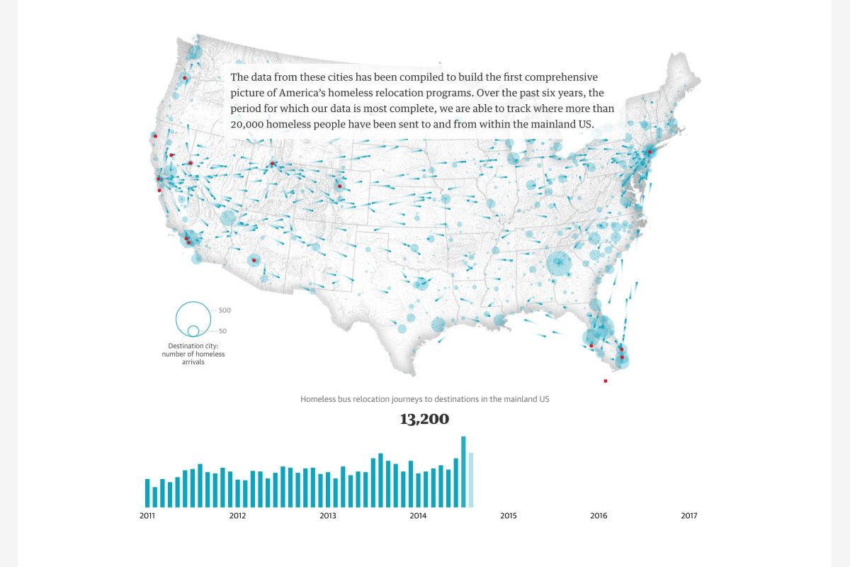
The name of the Guardian project was Bussed Out. Can you share more about how it came together?
First, the Guardian team requested the data from cities and shelters across the US. I cleaned and analyzed it. Then the whole team gathered for two days to figure out the story. This part was crucial to me because I had to make sure that the analysis was interpreted correctly.
They would ask if we can say it this way? And I was the one saying, “Yes,” or “No, you can’t. you have to be more careful and see it that way.” It’s a back-and-forth process.
I walked the team through the whole dataset. In the end, we had several conclusions that we wanted to tell and the journalist team started writing an initial story. Whenever they had questions, I collated the numbers for them.
I also took on some of the data visualization parts and Shirley took the others. She was also the one getting all the elements (text, visuals, images, videos, styling) together on a page.
How can we avoid being biased or producing misleading data results?
That’s a tricky one. I mean, there’s already a bias in the data that you get.
My advice would be working with data more often, knowing how to handle data, not being afraid when you hear words like standard deviation and getting an awareness of where your blind spots might be in general with data.
For example, with the Bussed Out piece, one of the tricky things was that we had requested data from the cities and shelters for all the bus tickets. But there were still shelters from which we did not get the data. So we couldn’t generally conclude that the most popular destination is a specific place. This conclusion is only for the data we have.
Can you share with us the projects you’re working on now?
I’m going to work on an extension for work I did last year for UNESCO about visualizing intangible cultural heritage. I will be looking at cultural heritage versus sustainable development goals. I have another really fun project starting in January, which will have an astronomy focus.

- How designer Nadieh Bremer teaches herself new skills to continue visualizing data in new ways - October 31, 2019
- Jaime Settle on how social media polarizes America - October 17, 2019
- How I visualized “Trump” mentions in hip-hop songs using D3 - September 23, 2019