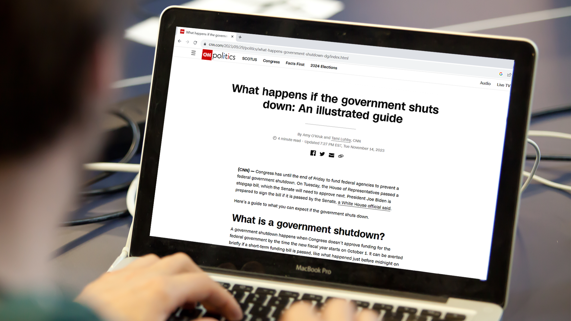
How CNN’s guide visualized real-world impacts of a government shutdown
The latest near shutdown of the government confused a lot of people across the United States. Many don’t know or understand what exactly happens during a shutdown and which federal agencies shut down with it.
Amy O’Kruk, a CNN data and graphics editor on their Digital Visual News team wrote, created and led a guide that explained all of the different facets of a government shutdown.
What made you consider turning a government shut down into a data visualization?
O’Kruk: [My boss and I] were talking about the government shutdown that was obviously happening. She asked me if there was anything that we could do in that space. There wasn’t a lot of clarity around what a government shutdown is. And that’s just because it is complex and every government shutdown is different.
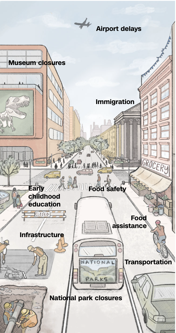
I kind of [had] this intuition that a lot of readers were searching for well, “How is this going to affect my daily life?” So, I took that very literally. I want to draw a scene from daily life. I want to make this as concrete as possible when we’re talking about these really abstract things. So, I did a city street that, if you lived in New York or [Washington] D.C. or whatever, might be familiar to you. We point out the courthouse and there’s immigration, immigration cases, backlogs. There’s a plane in the sky because airports are going to be terribly delayed.
What was the process to pull this piece together?
I love to do digital drawing with the Procreate app on the iPad. The first step for a story like this would be drafting the initial drawing. This was a bit challenging because I knew that there was going to be a lot of annotations. So, especially in the beginning, there was a little bit of back and forth between me exporting what I had drawn in Procreate and bringing it into [Adobe] Illustrator and then seeing what parts of the drawing would be covered with the annotations because I had drafted them.
I also just want to really emphasize that I don’t even consider myself good at drawing. I’m not somebody who can sit across from somebody and draw a still life or a portrait. I think the wonderful thing about the technologies that we’re working with today is that there’s a lot of tools and tips and drawing apps that you can use to execute something like this.
The drawing is one point perspective, which means that there’s a vanishing point. In Procreate, you can use a drawing guide that will put that one point perspective grid over what you’re crafting so that it’s a really nice guide for when you’re drawing. And there are lots of other little kinds of tricks that I felt like I used.
What were some of the difficulties you faced?
I was even struggling at one point with drawing the car that was in the bottom right hand corner and the cyclist, just because the perspective was tough. I’m trying to draw this from my mind, from reality and I’m losing it because shapes are not making sense to me anymore. So, I actually went on this 3D modeling website called Sketchfab, and it’s just where people can buy and sell 3D models. And I just looked up a generic car and a generic cyclist, and I used my mouse to turn them into the right direction and use that as a reference for the drawing. So, there’s lots of little things that you can do.
Color is always really important and always really difficult because it’s going to be so important. I wanted to go with a more muted color palette for this, just to be respectful; the seriousness of the topic and that this is an issue that’s affecting millions of Americans in some parts of their daily lives. I ended up actually pulling that muted color palette from a Parisian card stationery. And that’s just something that ended up giving me a bunch of watercolor, softer pastel colors that worked for this piece. After that, it was just making sure that it would work for desktop and mobile and actually making sure that the interactivity worked.
Was there a reason you made this visualization interactive?
For mobile, we made it interactive specifically because the annotations would have covered too much of the drawing. And so that would have seeded the purpose of we’re trying to illustrate something, so let’s show the illustration. That’s why it’s really helpful in visual journalism to have a wide toolkit or to work on a team where people have a lot of different expertises because we were able to combine, in that case, some digital drawing skills. It’s a little bit of HTML and then it was a little bit of JavaScript to take those HTML elements and be able to show and hide things depending on what readers wanted more context on. So, it was a very deliberate design decision on our part.

Do you have any advice for people looking to get into data journalism?
If I’m talking to a journalist who is starting out a little bit more, this was a piece that used a bunch of different skill sets. And I think it’s really important when you’re young to give yourself the space to try a bunch of different things. I started my career as a reporter because I didn’t even know that visual journalism was an option. And now working in visual journalism, it’s incredible that you can specialize in mapmaking or data analysis or digital illustration or interactive development, whatever it might be. And so you really need to give yourself some grace and some time to just see what speaks to you and go down these different avenues, because you can really end up pulling a bunch of things together.

- WCBS New York’s Digital Content Creator Maggie Cole on laying the path for a new role - January 14, 2025
- How CNN’s guide visualized real-world impacts of a government shutdown - December 13, 2023


