How The New York Times produced a visual explainer of the SARS-CoV-2 coronavirus
The novel coronavirus is much more than a sphere wrapped in spike proteins. Back in April, The New York Times published a visual explainer of the proteins and genome of SARS-CoV-2, based on an analysis of an early strain isolated from a patient in Wuhan, China. The project is one of several visual explainers of the novel coronavirus produced by journalist Carl Zimmer and Jonathan Corum, a science graphics editor at the Times.
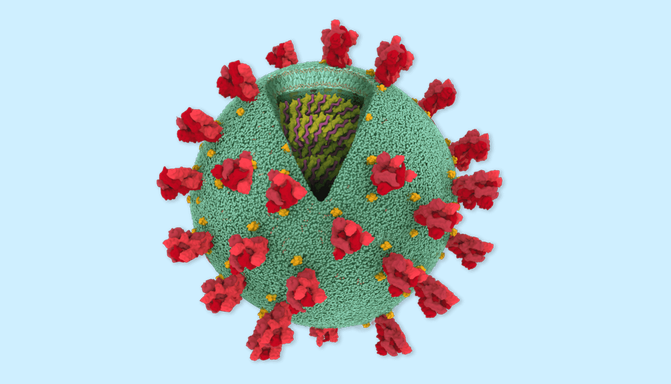
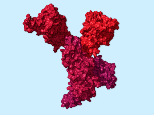
The article opens with a spherical model of the coronavirus by Maria Voigt of the RCSB Protein Data Bank. The explainer goes on to provide an even more microscopic look into the molecular makeup of SARS-CoV-2. Based on protein models from Yang Zhang’s Research Group at the University of Michigan, Corum developed the 3D protein structures using PyMOL, a molecular visualization tool commonly employed by scientists to study proteins.
“This is certainly the first time that we have done anything on this scale. We’ve never featured a whole bunch of genes and their proteins in this kind of format,” said Zimmer, who writes the “Matter” column for the Times. “So that was fun to do a first like that.”
Zimmer specializes in writing about basic biology and is also the author of thirteen books, including “A Planet of Viruses.” For the Times, he has covered the fundamentals of viruses and vaccines for other viral outbreaks, including the Zika virus, Ebola virus and malaria.
To help readers better understand Covid-19, Zimmer and Corum have made other illustrated explainers walking people through the process by which SARS-CoV-2 invades human cells and how virus mutations spread. They also created a tracker of vaccine candidates by clinical trial phase and, with freelance science writer Knvul Sheikh, produced a visual explainer of the different types of coronavirus vaccines currently in development.
Storybench spoke with Zimmer about the research and skills involved in writing and creating a news interactive about SARS-CoV-2.
Could you describe this partnership that you have with Jonathan? How does that collaboration usually pan out, starting from an article idea?
In the beginning of March, the science team really started to shift over to most of us working almost entirely on Covid-19 … I said to my editor, “Do you want me to work on a basic explanation of the coronavirus? Because I bet that a lot of people really could use some basic information, just to find a place to start.” And [my editor] told me that Jonathan had already had that idea as well, so he just connected us by email.
[Jonathan] had already been opening up the virology textbooks. He had been doing a lot of homework already. So we just very quickly kind of agreed that the best thing to do would be to work together to sort of figure out a kind of a storybook structure. These things almost look to me like children’s books: with a big illustration and some text, turn the page, another big illustration, some more text.
[Readers] really appreciated just a basic explanation. Part of the problem with news is that we’re all rushing to report on the very latest findings or developments that we forget that people aren’t walking around, reading about coronaviruses in a textbook – they have their own lives to deal with. And so, if the coronavirus is suddenly throwing the world upside down, you should really just start by saying, “OK, but what’s a coronavirus?”
Then we sort of got more ambitious. So that genome infographic … took me a lot of work because I basically had to call some virologists and go gene by gene to check with them about what, if anything, we understood about the gene. Meanwhile, Jonathan was teaching himself how to make 3D visualizations of these proteins, which is unbelievable. I just love working with people who can do things that I could never ever do.
Can you describe how experts help inform your writing? How early on were they involved in the genome/protein story?
I’m doing my research and then I reach out to experts and I’m like, “This is a project we’re doing. Would you be able to help?” I know that I’m making a big ask because I’m calling up coronavirus experts who are literally in the middle of running experiments hoping to find a cure for this pandemic. That’s a lot to ask from people. But scientists have recognized that a big part of their job is telling as many people as possible about what they’re learning, what they know, what they don’t know. And so, places like The New York Times can tell those sorts of stories and reach a lot of people.
For the genome one, I started combing through the scientific literature. Almost all of the scientific literature that you could look at about this particular coronavirus, you’re actually looking at other coronaviruses. You’re looking at the coronavirus that causes SARS, the coronavirus that causes MERS. SARS-CoV-2 is brand new and people have barely begun to study it. There are few papers that have been published in peer-reviewed journals. There are a fair number of preprints that have come out, but they are of mixed quality. And then there’s just a whole lot we know because all coronaviruses are fairly similar; so they all have a spike protein.
So anyway… I would contact scientists and ask them questions. Then Jonathan and I would try to put everything together. We would go back and fact-check with the scientists and say, “Does that look good to you? Does this sound right?” A lot of times we’d realize that there were things we needed to fix: pictures needed to be changed, sentences needed to be deleted or fixed because we were wrong. So it was like a cycle, but I’m reaching out with scientists from the beginning.
What was it like coming up with the different names/subtitles for each protein?
We wanted to basically come up with a rogues’ gallery of proteins that this virus uses to make us sick. We didn’t want to be technical and dry. We wanted to look for metaphors that could grab people’s attention, give them an idea, give them the gist of something that this protein does, and then we can get into the details in the sections. So I just sort of went through and tried to think of something that would work well in those titles.
Did you have to test out the article on a non-scientific reader before publishing?
Every piece goes through multiple rounds of editing with several editors looking it over. That may include an editor at the science desk, but that may also include an editor who really doesn’t deal that much with science. And that’s good because those editors – well, they’re not flooded with science and science jargon everyday, so they may look at something to say, “This doesn’t make sense to me.” And then we know that we have to work harder on that.
Why was it important to create an article like this specifically for the public?
This is a way to sort of give people a tour of the workings of this virus. How is it that something with 29 genes can do so much? It’s an interesting way to sort of unpack those questions. You can also talk about the disease … by just going through protein by protein, gene by gene. For example, once you understand what a particular protein does and how important it is to the virus, you can see how a drug that could stop it would be potentially really useful. That can be very enlightening to people, and it makes the whole situation less mysterious.
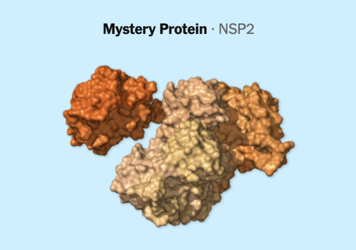
At the same time, it’s actually really important to make clear all the stuff that scientists don’t know about this virus. So there are a bunch of genes in this genome where we don’t really know what they do. We just don’t. And there are a bunch of genes where they seem to do a whole lot of different things, and we may understand one or two of those things well, but they’re doing other things as well that we don’t understand. It’s not even clear if this virus even uses … some of these genes. Whenever you’re doing any journalism on this virus, we have to make sure people understand that we’re just getting to know it.
That’s why you included all the mystery proteins?
Yeah, well, you know, if you’re going to include all the proteins, you got to include all the proteins. But then, if you’re going to describe what they all do, sometimes you’re going to have to just shrug your shoulders and say, “Welp, we don’t know.”
What are some tips to cut down the science jargon to make it more non-science friendly?
You just have to check that you’re not slipping into jargon and just think about ways to convey something in a more straightforward way. I mean we’re not making a textbook here, so what’s more useful is to sort of give people an accurate but general sense of what’s going on. You just keep constantly thinking about the language and think about, “Are there more accessible ways of saying everything?”
What has the response been like from readers?
Quite positive. People have reached out in the comments on these pieces and on social media, so it’s been really gratifying to see that this can be really helpful. And scientists themselves seem to appreciate it. There are definitely some scientists who study viruses who can say, “OK, now I can show my parents what I do.” But I think also there’s some scientists who say like, “Oh, this is actually useful for me, and I’m going to hold onto this.”
And it seems that when people want to explain some of these things, like “How do mutations spread?” – it can be very useful just to say, “Well here’s a link. You can see visually how this happens.”
Do you have anything else to add?
Well, I don’t think we’re done. I hope we’re not done. Jonathan has a lot of other things we’ve got to work on. But you know, there are a number of other big Covid topics I can see turning into this kind of visual explanation, so I hope there will be more projects to come.
Images credit: The New York Times ; Coronavirus spherical model: Maria Voigt, RCSB Protein Data Bank
- Behind the scenes at ‘How to Save a Planet,’ a climate solutions podcast - January 29, 2021
- How the podcast ‘Science Vs’ investigated a 1971 virus conspiracy - January 11, 2021
- How The New York Times visualized racist historical redlining and urban heat - September 17, 2020