Behind the Scenes

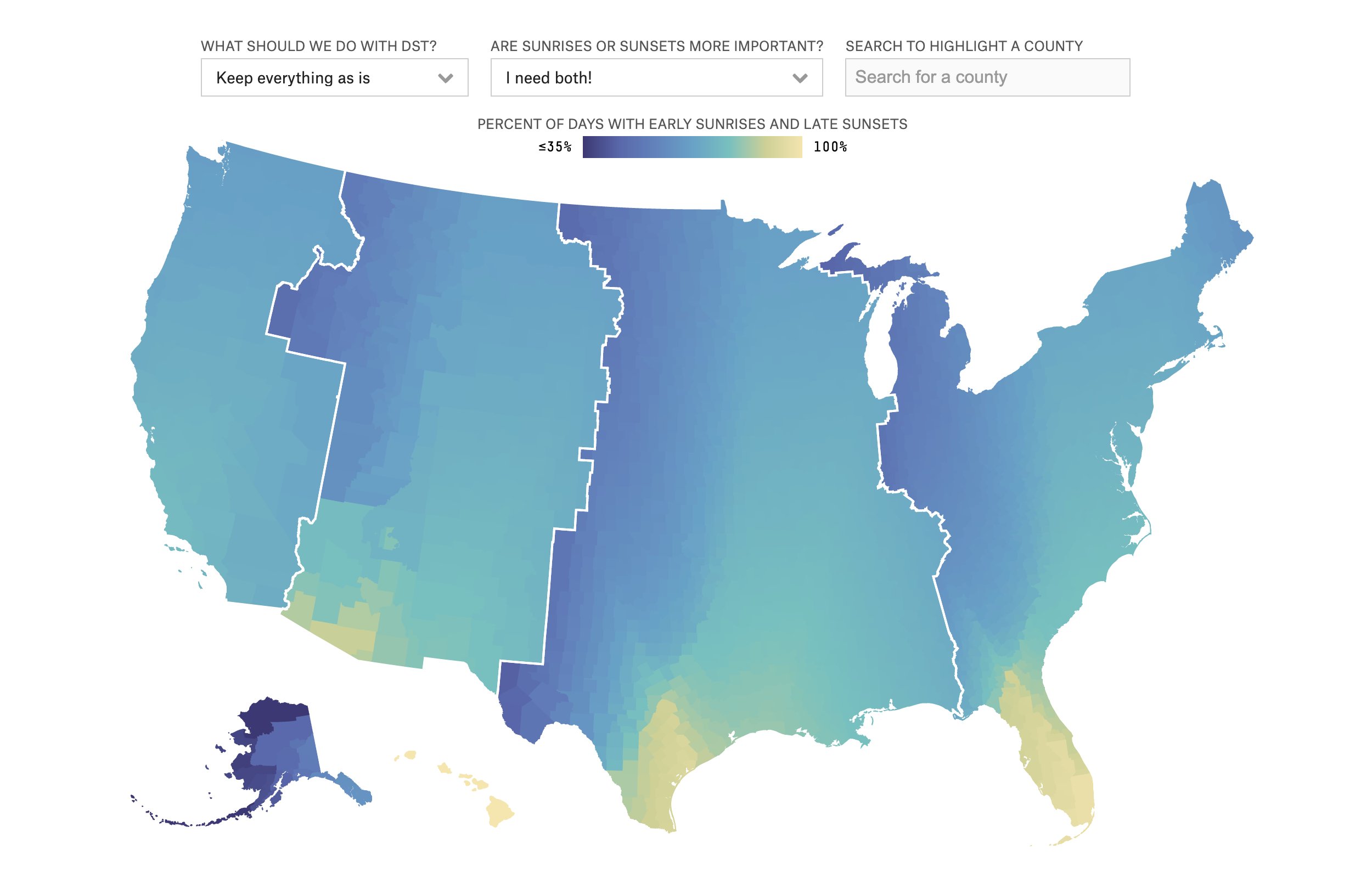
How FiveThirtyEight covered the daylight savings discussion

If you live in the Northern Hemisphere, you probably have an opinion on whether or not you like daylight savings time changes. When we set our clocks forward an hour in March every year, we are bound to hear grumbles about dark mornings. American’s strong opinions on the topic even led the U.S. Senate to pass a bill in 2022 to make daylight savings time permanent. 

What would the real effects of using only standard time or only daylight savings time be on different parts of the United States? Do people care more about sunset time or sunrise time?

Ryan Best, a visual journalist at FiveThirtyEight and a team of other journalists sought out to answer these questions using data visualization in the article “Can You Make Winter Less Dark?” They used U.S. census data as well as other data libraries to compile the information into an engaging, interactive map. Storybench sat down with Best to find out more.

This interview has been edited for clarity and length. 

Ryan Best (left) FiveThirthyEight logo (right).

What gave you the idea to write the article “Can You Make Winter Less Dark?”

This idea came from conversations with some of our politics writers and science writers about how a lot of people had strong feelings about Daylight Savings time, how we implement it, forgetting that we need to change the clocks, and frustrations around the clocks changing at a certain time. There really isn’t a good solution that everyone across the country would be happy with, so the idea is to present that in an interactive way to say, “Daylight Savings time sucks. No one’s really happy with it right now, but can you make it better? Is there a situation that you think you can do to improve it? Can we have the same rules across the country that everyone’s happy with?” The short answer is no. It’s way too complicated to do exactly that, so that’s where the story idea really came from.

Can you talk about the process of going through U.S. Census data and picking out what should be showcased?

We actually just use the census data mostly for boundaries and shape files and geographic files. From the census, we got county outlines. I think timezone outlines came from the Department of Transportation. In order to get county lines and state lines, we actually did additional data processing on top of it and used some GIS software. There were some counties that needed to change the geography that came from the census. Some notable examples were counties that stretched over multiple time zones and the Navajo Nation in New Mexico, Arizona, and Nevada. The Navajo Nation itself does recognize Daylight Saving Time, but Arizona as a state does not recognize Daylight Savings Time. Once we got county lines for each of these areas, we used software to compute the center point of each of those counties and then used a library to convert all of those locations to sunrise-sunset times and aggregate how many days in the year there are with ‘reasonable certain sunrises and sunsets.’

Why did you decide to display your findings in an interactive map?

A big reason for why we decided to use a map was because geography was a very important part of understanding this data. When you look at maps of where the sunrises and sunsets, you see the patterns and you see how the sun rises and what that looks like across the country. Because the data is rooted in geography, you really need to understand the geography to see the results of the data. That’s why the map was very front and center.

DON’T MISS  “The Immigration Experience” humanizes the history of immigration law. Here's how.

Also, people really enjoy maps. The map of the United States, for American news readers, is very recognizable so that is a splashy visual that we thought people would really engage with. We did think people would care about where they live. They would want to say “what is it like not only for the country as a whole, but for me?” We wanted to keep the map and the whole country map at the forefront, but we also thought people would want to see their own location, too. So, there’s an opportunity to hover over and see specific counties if you want to look at your location.

We didn’t put state outlines in here because we really wanted the rich visuals and the color changes to be highlighted in the forefront and we didn’t want to have white lines or black lines cutting through those. But, given the geographic nature of the data and the story we were trying to tell, and the recognizability of the visual, we thought that the map was the best way to go in terms of the visual.


"Data visualization does a really good job of taking a bunch of complex information and distilling it down into a way that people can understand it."
Ryan Best
Visual Journalist

Did you run into any challenges while designing this article?

The biggest challenge was deciding the right level of interactivity, the right focus, and what are the filters and and what is the right level of detail in those filters. We considered having people change what the threshold of an early sunrise and late sunset is. We considered a lot of different options.

One of the most visual challenges, that we also spent probably the most time on, was just specifically with the color. The color here is really important because it is the primary visual mechanism to portray the differences of a lot of ‘good days’ with good sunsets and sunrises or not as many ‘good days.’ There was an interesting aspect of deciding what should be the brighter or darker colors, because a lot of times you think of a more saturated color as more of something but in this example, it’s almost the opposite. The darkest colors and the most saturated colors here are at the lower end of the spectrum because we want it to feel like the country was dark. At the higher end of the spectrum are the lighter colors, which typically a lot of times kind of mean fewer of something because they’re lighter and less heavy on the page. But in this instance, because we’re talking about brightness and a day in the sun, we wanted the yellow brighter yellows to be more of something. There was a lot of tweaking at the margins of what the colors were and when they break from this darker blue purple to turquoise to aqua to yellow. That was a challenge that took a lot of tweaking and a lot of refining over the course of the design process.

DON’T MISS  How journalists visualized cancer risk from workplace chemicals
Photo Illustration by Dan Dao / Getty Images

What are the advantages of using data visualization in a data-driven story?

There are a couple of big advantages in my mind. I feel like people get excited by [visuals that are] very colorful, flashy on the page, that break up paragraphs of text. You’re going to automatically get a good amount of attention on those. I also think that it is another way to ingest information. I think different people have different ways that they ingest information and understand information better and data visualization offers a lot of different mechanisms to do that. 

I think the amount of information, packed densely into one place in a data visualization, is way more than you can get with text. In this example, it will fit on the screen at once to show every county in the United States, have some kind of impression of how bright or dark that location is based on the number of days with early sunsets or late sunrises, and the ability to look at every county and see detail behind that. That is hundreds and hundreds and hundreds of data points that if you wanted to put in a table or put into text, you would have just basically a sea of information that isn’t accessible. Data visualization does a really good job of taking a bunch of complex information and distilling it down into a way that people can understand it in text. 

How important was it to have a team working on this project together?

I just wanted to highlight the massive amount of work that all the other writers on this piece did. This is one of the few projects at FiveThirtyEight that we have a lot of people on the byline, which is a nice luxury to have. We did a bunch of ideation together. We did a lot of iterations of what the map should be portraying, what we should be looking at, what the colors should be, and how we write around it all. They were really fun to work with for this. It was a good part of this project that there was a lot for us to draw from and a lot of conversation already around this topic. 

Kate Deskey
Latest posts by Kate Deskey (see all)

Leave a Reply

Your email address will not be published. Required fields are marked *

Get the latest from Storybench

Keep up with tutorials, behind-the-scenes interviews and more.